Getting Started
The GIS Bubble Map is an advanced form of Bubble Chart, which uses GIS Points to specify bubble positions, making them correspond to GIS and WMS layers that can be used to add detail to the map.GIS Bubble Map Tutorial
1. Click on the Create link and select Report to begin building your report.

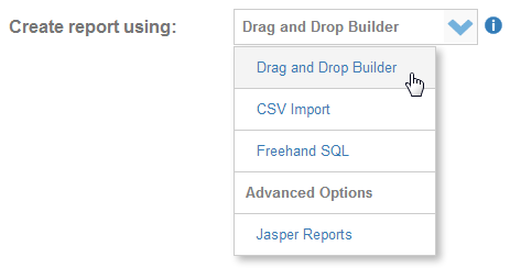
2. You should now be on the Initialise Report page. Select the Drag and Drop Builder as the build tool.
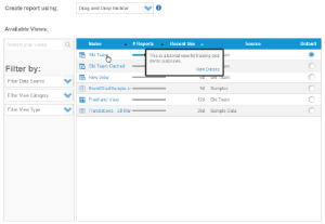
3. Select Ski Team as the View.
4. Now click the  button to proceed.
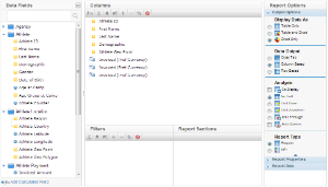
5. From the Athlete category, drag in Athlete ID, First Name, Last Name, and Demographic
6. From the Athlete Location category, drag in the Athlete Geo Point
7. Now drag in your metrics, in this example Invoice (Pref Currency) is used three times, as a SUM, MAX, and AVERAGE.
8. Ensure the display is set to Chart Only.
9. Click the Next image to continue.
10. On the output page click on the Chart Icon to edit the chart and set up your Chart.
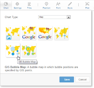
11. From the Chart Menu select Map. Next, select the GIS Bubble Map type. Click Save to complete your selection.

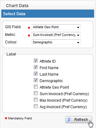
12. You will now see the Chart Data section updated with fields relevant to GIS Maps.
13. Select:
GIS Field: Athlete Geo Point
Metric: Sum Invoice (Pref Currency)
Colour: Demographic
Label: Athlete ID, First Name, Last Name
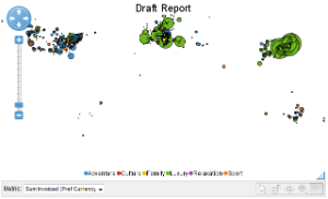
14. Click Refresh to display your chart.

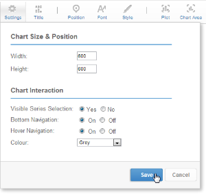
15. In the Chart Format options, select Visible Series Selection and turn on the Hover Navigation, setting the colour to Blue.
16. Click Save to update your chart.
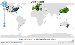
17. Your chart should now look something like this.
Adding a WMS Layer
1. Now add a WMS layer to the map that will be used as a background.
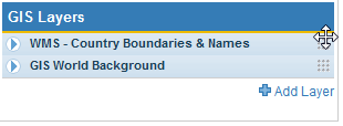
2. Click on the  Add Layer link
3. Select the WMS Layer tab and click on the WMS – Coastlines, Land, and Ocean layer.
4. Add the GIS World Background layer as well, as you did for the previous map.

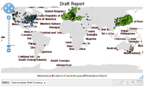
5. Your chart should now look like this one. While this does have the additional information required, it doesn’t look very good.
6. The WMS layer needs to be above the background, and the white needs to be changed to transparent.
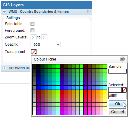
7. Drag the WMS layer by clicking on the right hand side of the heading bar in the series settings and drag it to above the background layer.
8. Change the Transparent colour to White (#FFFFFF).
9. Set the Zoom Levels to 3 to 0. This will mean that this layer will only be displayed once you have zoomed in twice.
10. Click Refresh to view your updated chart.
11. You should now have a chart that looks like this
12. You are able to zoom in and out using the navigation and select different series to display as bubble size.
13. Save and Close your chart.