Overview
Type | Icon | When to Use |
|---|---|---|
Meter |
| You want to measure the rate of change of a measure against pre-defined targets. Useful for dashboard reporting. |
Thermometer |
| Vertical representation of the meter chart, indicating a range of qualitative indicators. |
Dial |
| Used to communicate key performance indicators. |
Numeric Display |
| Shows the value of a metric on a digital display. |


Chart Data Options
Option | Description |
|---|---|
Measure | Typically a numeric value such as $. An item that you want to measure on your Chart |
Meter Chart Tutorial
Summary
In order to set up a Meter Chart you will need:
- Create a report with chart display
- Select a field to use as the Measure
- Create your chart, selecting Meter as the type
- Provide the Measure option
- Customise the Chart as required
- Proceed to the Output step
- Apply Conditional Formatting if the chart requires it
- Save your report
Tutorial
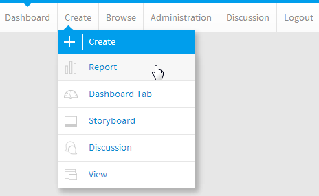
1. Click the Create link in the main navigation bar of the system, and select the Report option.
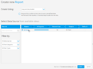
2. You will now be on the Report Initialisation page. Ensure the Drag and Drop Builder has been selected to use for report creation.
3. Click on the Ski Team view in order to use the fields defined within it for creating the report.
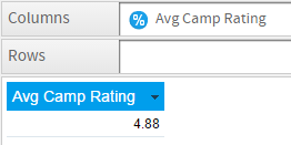
4. Add Camp Rating to Columns.
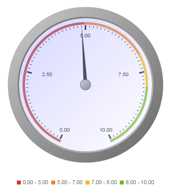
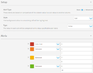
5. Apply basic Conditional Formatting to Avg Camp Rating following these rules:
- Red < 5
- Orange Between 5 and 7
- Yellow Between 7 and 8
- Green Between 8 and 10
The conditional formatting will be used to highlight the meter in order to indicate how the metric is tracking against a goal.
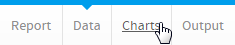
6. Proceed to the Charts step of the builder.
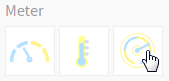
7. Select the Dial chart from the Meter section of the charts panel on the right of the screen.
The Chart Data options for Meter charts are the same, so this exercise can be used for any of those types, just by changing the selection made in this step to Meter or Thermometer.
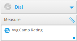
8. Set the Measure to * Avg Camp Rating*
9. Save your report