Page History
...
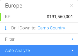
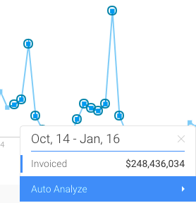
Tooltips are a great way of finding out values of data points. Hovering the cursor over a chart point will reveal the tooltip to reveal exact values and interact with the data.
The table below shows the type of details you can see in a tooltip:
...
Colour-coded Multiple Values
In case of multiple data in charts, the tooltips easily distinguishes between them by marking each value with a different colour. The example below shows this for a time series chart:
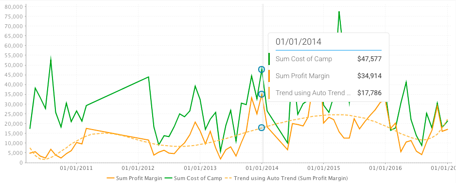
Total Values Calculated
For multiple values, the total is also included in the tooltip, along with the individual ones.

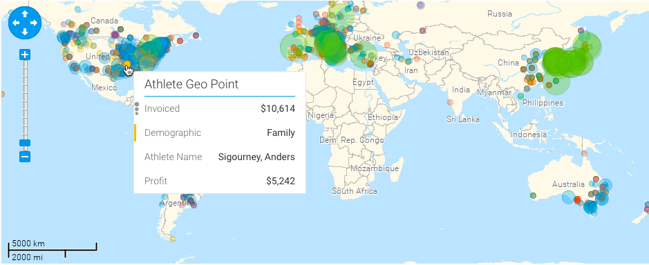
Chart Type Icons
Icons will appear in the tooltip based on the type of data displayed in the chart. For example, for scatter charts, the following icon will be shown in the tooltip:
...
...
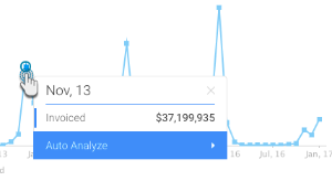
Tooltip Functions
Here are some of the functions you can perform using the tooltip:
| Expand | ||
|---|---|---|
| ||
You can view the exact value of a data point, or multiple data points using the tooltip. On making the tooltip appear, you will be able to also view any functions that can be performed.
|
...