Page History
...
| Table of Contents | ||
|---|---|---|
|
Overview
| Styleclass | ||
|---|---|---|
| ||
The Chart step formatting menu bar provides you with all the formatting options for your chart. You can use these options to change settings such as the legend, background, axis and label.
...
Note: the menus and items contained within them will change based on the type of chart you are using.
Reset
| Styleclass | ||
|---|---|---|
| ||
The Reset menu allows you to reset your chart or formatting options:
...
- Formatting: this will reset your formatting selections, but keep the chart type and field selections defined.
- Chart: this will reset your chart, including all formatting, field, and chart type selections, returning it to an empty state.
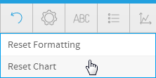
Chart Settings
| Styleclass | ||
|---|---|---|
| ||
The chart format options are the most dynamic options and are based on the type of chart selected. For example for a pie chart you will be able to set the shadow colour and exploding slice options. The common options found in the chart format drop down include interactivity options such as visible series selection.
...
| Expand | ||||||||||||||||||||||||||||||||||||||||||||||||||||||||
|---|---|---|---|---|---|---|---|---|---|---|---|---|---|---|---|---|---|---|---|---|---|---|---|---|---|---|---|---|---|---|---|---|---|---|---|---|---|---|---|---|---|---|---|---|---|---|---|---|---|---|---|---|---|---|---|---|
| ||||||||||||||||||||||||||||||||||||||||||||||||||||||||
|
...
| Expand | ||||||||
|---|---|---|---|---|---|---|---|---|
| ||||||||
|
Title
| Styleclass | ||
|---|---|---|
| ||
The title option allows you to change the title of the chart as well as the style – such as the font settings.
...
| Expand | ||||||||
|---|---|---|---|---|---|---|---|---|
| ||||||||
|
Legend
| Styleclass | ||
|---|---|---|
| ||
The Legend is a box that identifies the patterns or colours that are assigned to the data series or categories in a chart. This section of the menu lets you set the following options.
...
| Expand | ||||||||||||||||||||||
|---|---|---|---|---|---|---|---|---|---|---|---|---|---|---|---|---|---|---|---|---|---|---|
| ||||||||||||||||||||||
|
Axis
| Styleclass | ||
|---|---|---|
| ||
A line bordering the chart plot area used as a frame of reference for measurement. The y axis is usually the vertical axis and contains data. The x-axis is usually the horizontal axis and contains categories.
...
| Expand | ||||||||||||
|---|---|---|---|---|---|---|---|---|---|---|---|---|
| ||||||||||||
The Axis scale drop down lets you determine the scale dimensions. Generally you will only be able to set the Y Axis attributes – unless you are using XY charts in which case you can set both X & Y attributes.
|
Background
| Styleclass | ||
|---|---|---|
| ||
The Background options let you set the style and colour of the main chart elements such as the plot and chart areas. You can apply elements such as background images and or gridlines.
...
| Expand | ||||||||
|---|---|---|---|---|---|---|---|---|
| ||||||||
The entire chart and all its elements are described as the chart area. The drop down options let you set the background colours applied to the chart area.
|
Labels
| Styleclass | ||
|---|---|---|
| ||
Labels can be added to charts to print out the values of the data point onto the chart in text format. Charts that support labels include line, pie, and bar charts. Note: These settings will differ according to the selected chart type.
...
| Expand | ||||||||||||||||
|---|---|---|---|---|---|---|---|---|---|---|---|---|---|---|---|---|
| ||||||||||||||||
|
Series
| Styleclass | ||
|---|---|---|
| ||
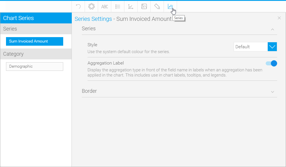
Series
| Expand | ||||||||||||||||
|---|---|---|---|---|---|---|---|---|---|---|---|---|---|---|---|---|
| ||||||||||||||||
|
...
| Expand | ||||||||||
|---|---|---|---|---|---|---|---|---|---|---|
| ||||||||||
|
Category
| Expand | ||||||||
|---|---|---|---|---|---|---|---|---|
| ||||||||
|
...
| Expand | ||||||||
|---|---|---|---|---|---|---|---|---|
| ||||||||
|
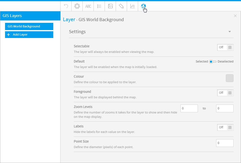
GIS Settings
| Styleclass | ||
|---|---|---|
| ||
| Expand | ||||||||||||||||||
|---|---|---|---|---|---|---|---|---|---|---|---|---|---|---|---|---|---|---|
| ||||||||||||||||||
|
Combination Charts
| Styleclass | ||
|---|---|---|
| ||
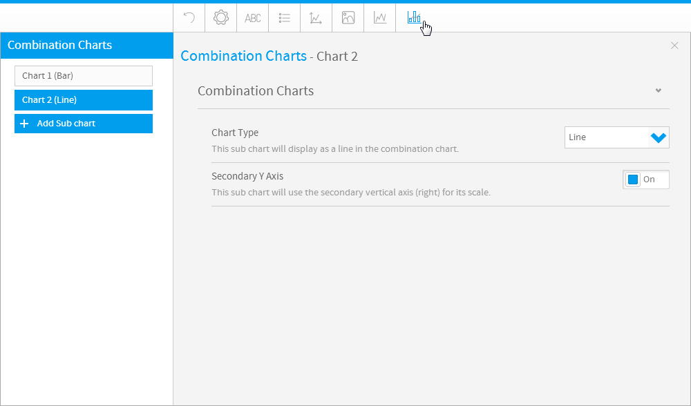
| Expand | ||||||
|---|---|---|---|---|---|---|
| ||||||
|
| horizontalrule |
|---|
| Styleclass | ||
|---|---|---|
| ||