Page History
...
| Table of Contents | ||
|---|---|---|
|
Overview
| Styleclass | ||
|---|---|---|
| ||
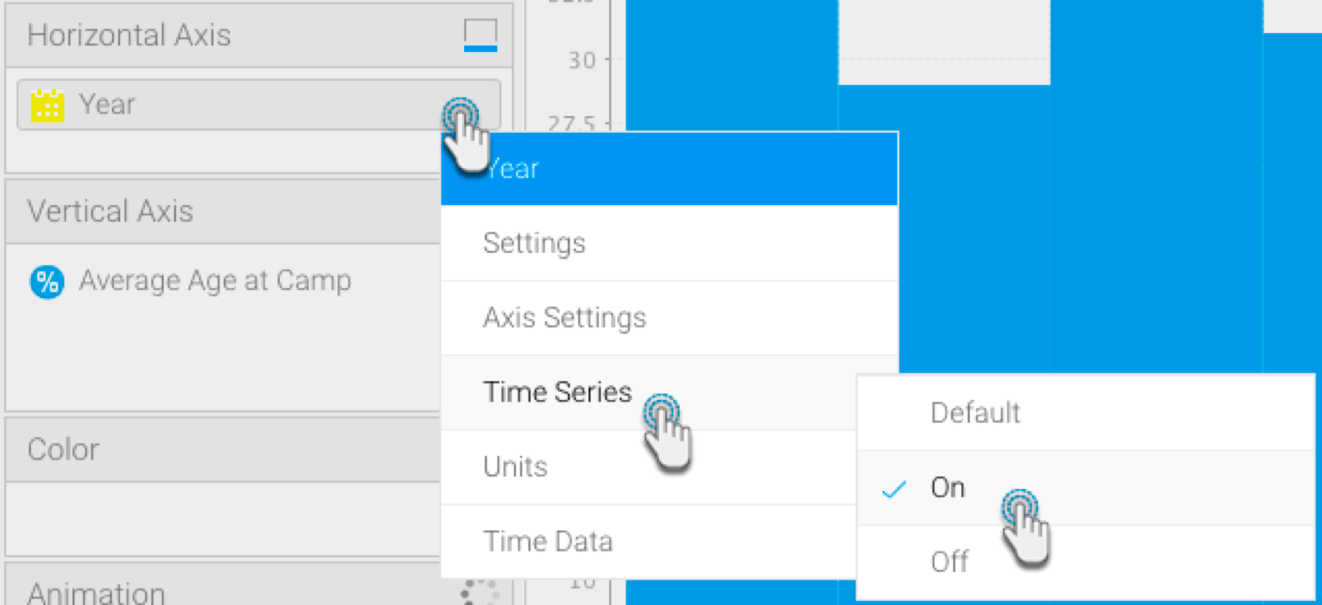
Time Series charts a series of data points, presented against an x axis that displays time in uniform intervals. Opposed to categorical charts, time series effectively shows gaps in the data through the use of these uniform time intervals.
| HTML |
|---|
<iframe width="700" height="394" src="https://www.youtube.com/embed/0ZAY1dZ_kdo?color=white" frameborder="0" allowfullscreen></iframe> |
Enabling this option when using a date or timestamp as a Label in a chart also provides additional functionality:
...
These functions are discussed below.
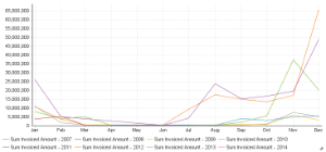
Yearly Comparison
| Styleclass | ||
|---|---|---|
| ||
If you have a line chart which is time series spanning more than one year range, you can use this option to split the single line into 12 month groups for easy comparison. When using this option the units are set to month and cannot be changed.
...
- Enable Yearly Comparison through the chart Settings menu
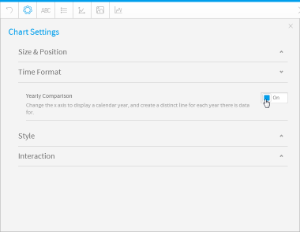
- Your line chart will now appear with a seperate line for each available year
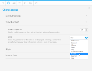
Units
| Styleclass | ||
|---|---|---|
| ||
Allows you to select the time granularity of the chart independant of the table.
...
- Select the desired Units (granularity) in the chart Settings menu
Visible Unit Selection
| Styleclass | ||
|---|---|---|
| ||
Allows the user select the time granularity of the chart independant of the table.
...
- Enable the Visible Unit Selection option through the chart Settings menu
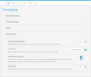
- Your chart will now have a list of available units for the user to select from
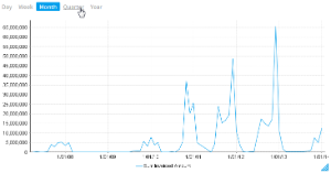
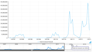
Date Slider
| Styleclass | ||
|---|---|---|
| ||
Allows the user to zoom in and out of time banded data.
| HTML |
|---|
<iframe width="700" height="394" src="https://www.youtube.com/embed/-l7KRn7P2Q4?color=white" frameborder="0" allowfullscreen></iframe> |
- Enable the Date Slider option through the chart Settings menu
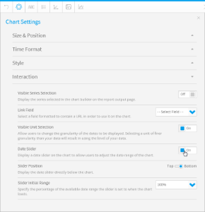
- Your chart will now have a slider the user can manipulate to view subsets of the data
...
- Create a time series chart, using a time value. (You may want to select a non-auto chart which best distinguishes between colours, such as a bar chart.)
- Turn on the time series through the time field’s menu, by selecting Time Series and then On.
- Drag a metric field to the colour field in your chart builder.
- The colours of the chart data will change according to the value of the applied metric field. A legend will also appear at the bottom to help distinguish between the colour range.
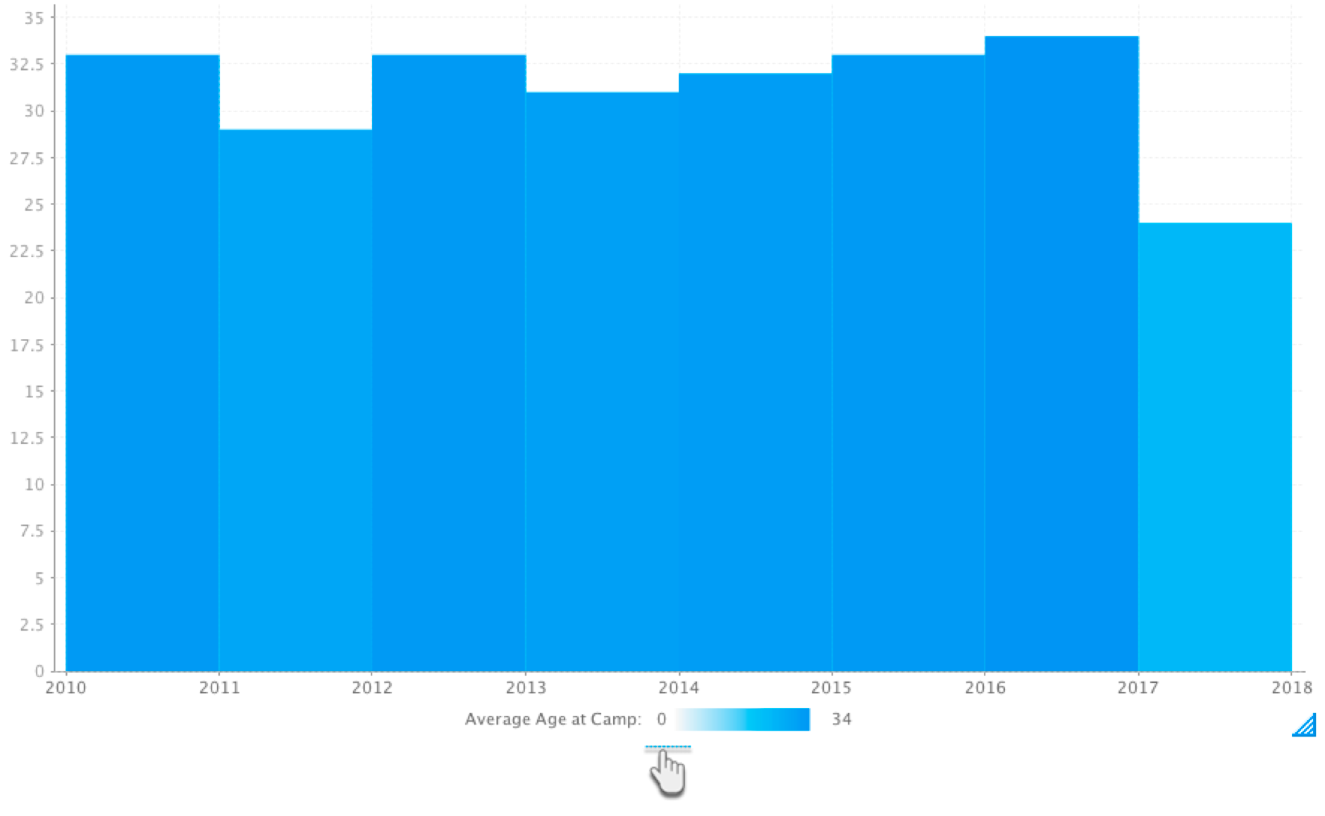
- As seen in our example above, the 2017 bar has an average age of 24, and is therefore a lighter shade of colour than the 2010 bar which has an average age of 33.
| Anchor | ||||
|---|---|---|---|---|
|
Control Null Behaviour
| Styleclass | ||
|---|---|---|
| ||
If your data is missing any values (that is, it contains NULL values), then you can select how to control the gap in time granularity. Time granularity refers to the date or timestamp unit of your chart (millisecond, second, minute, hours, day, week, month, quarter, or year). You can choose to do the following to control the gap:
break the line where there are gaps in time granularity,
skip over the missing values without filling in the gaps with any additional values,
or, treat each missing value as zero.
Note: This functionality is provided for all variations of line charts that support continuous time series, including auto-charts, line charts, stepped charts, combination charts, and overlay chart.
Ensure that your time series chart is set to continuous.
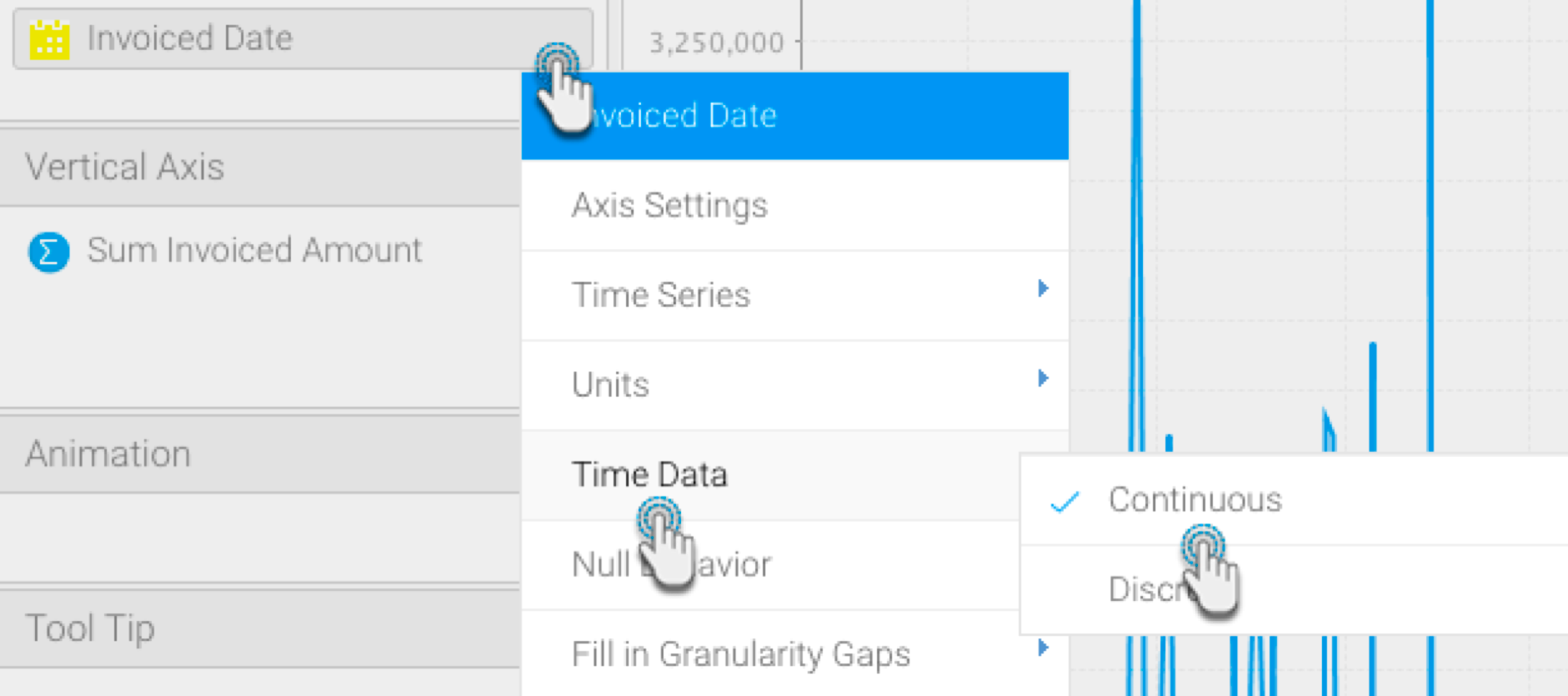
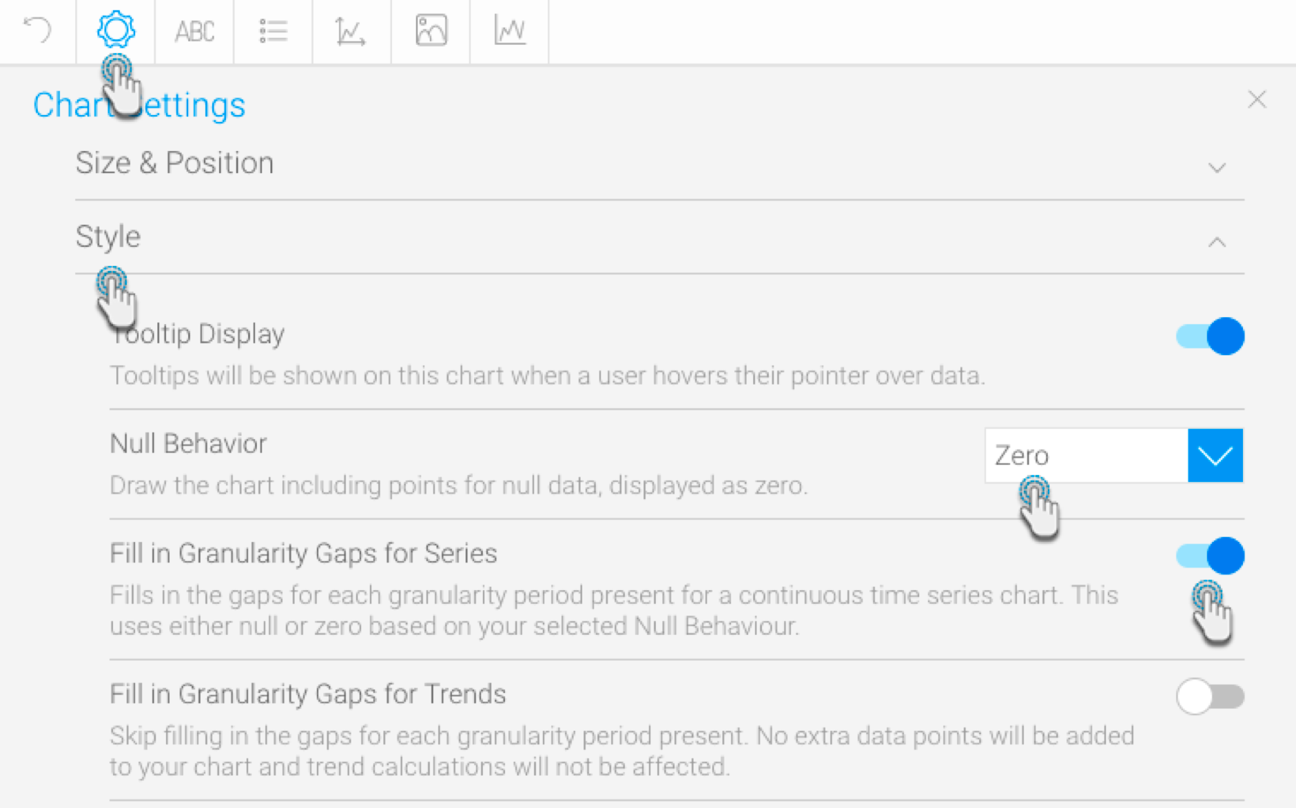
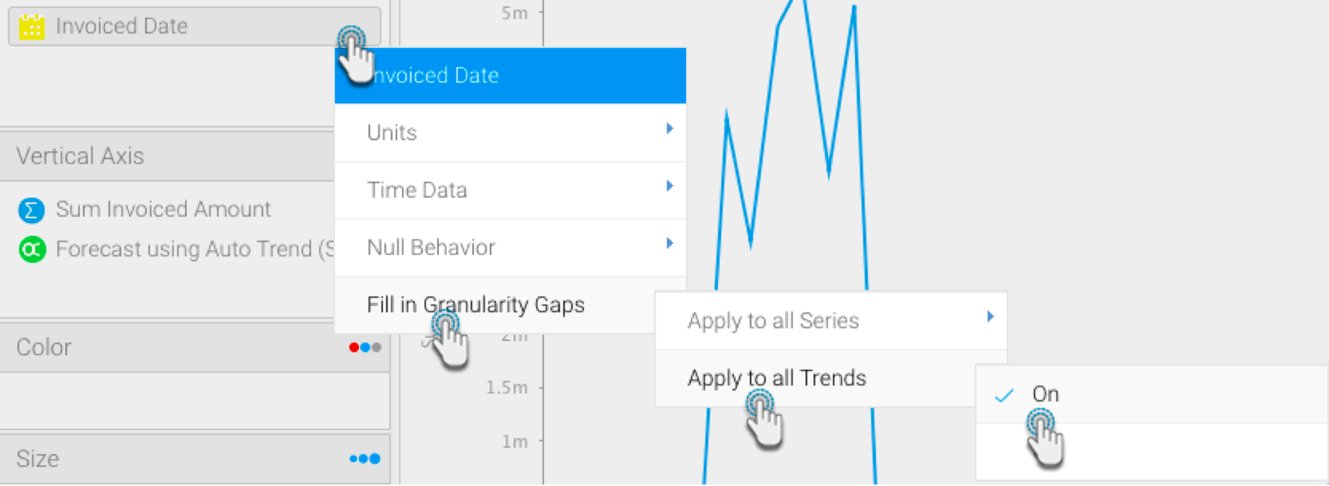
Click on the date field menu arrow, and choose the Fill in Granularity Gaps option. Select Apply to all Series. Then choose On. This will enable the Null Behaviour functionality for your line chart.
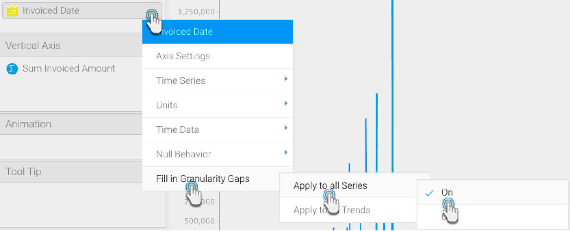
Next, choose the Null Behaviour option from the date field menu. Then select how you want the null values to be treated (click <here> for details on these values-link to above details)
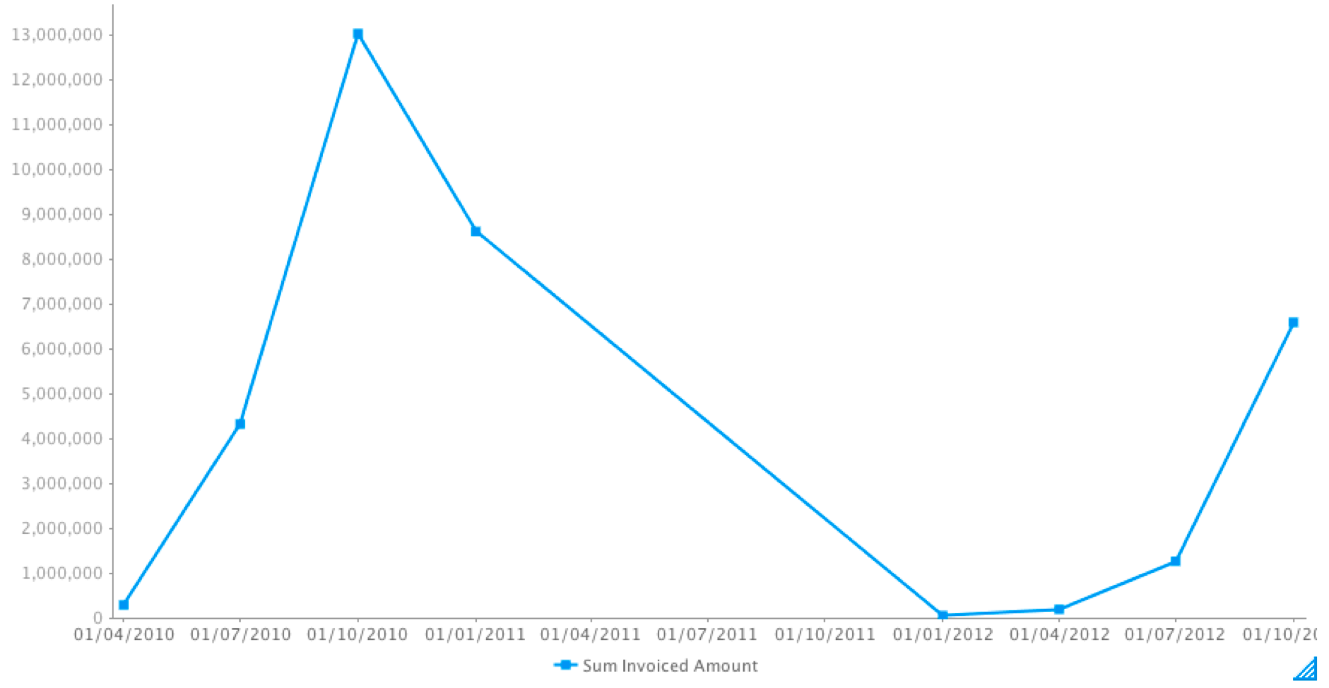
If Break is selected, the data will not be visible.
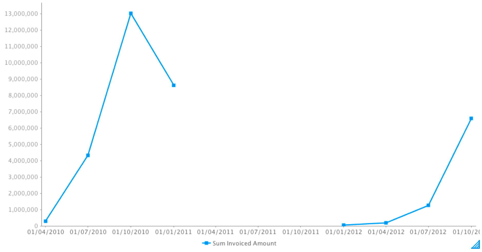
If Skip is selected, the line will be joined (this is the default behaviour of continuous time series charts).
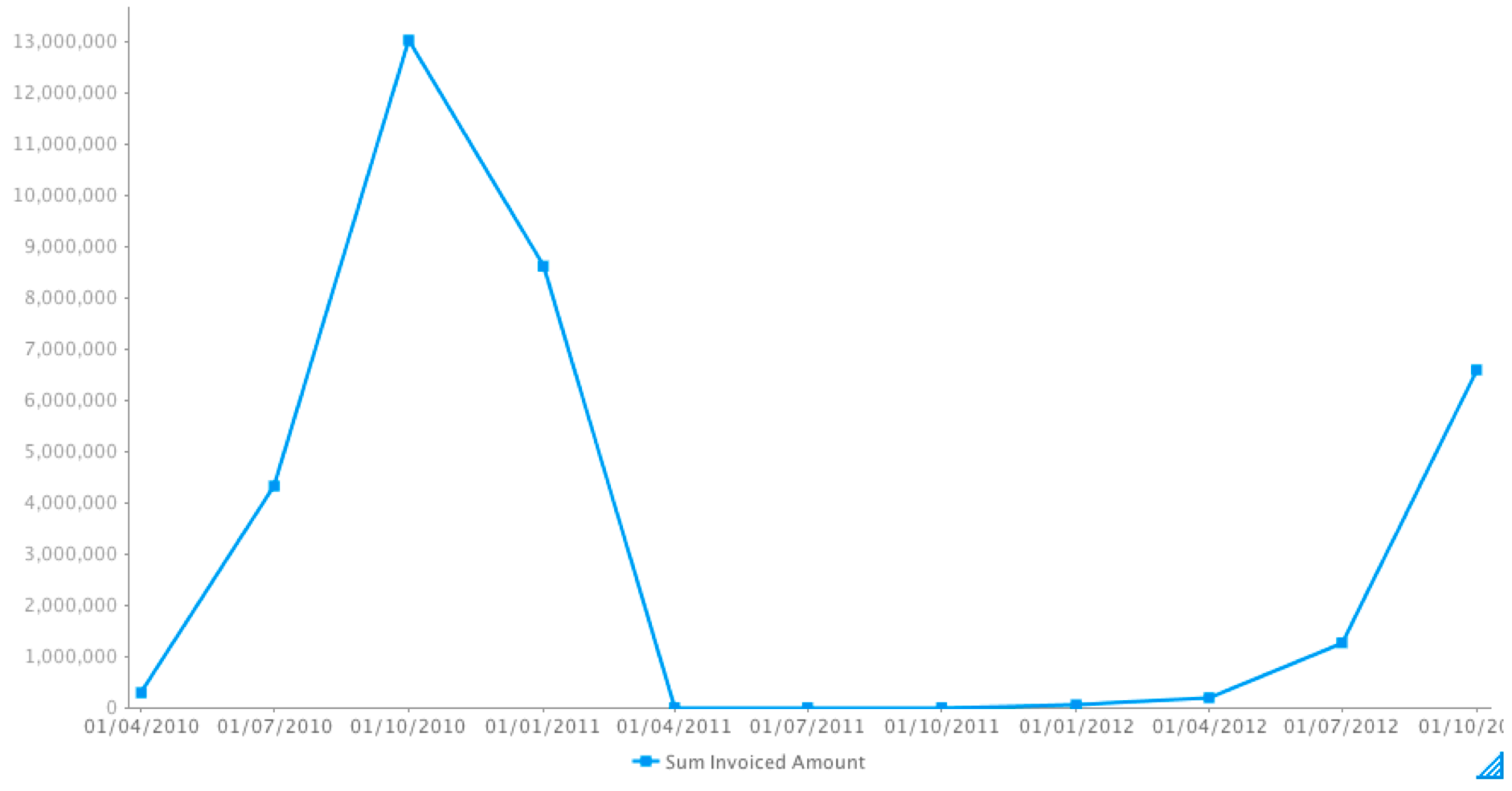
If Zero is selected, then the missing gap will be treated as zero values.
Simultaneously, you can use these settings through the chart settings option.
You can also apply the null behaviour to a trend line, when a Chart Function (such as Trend, Average, or Accumulation) is used. To enable this, switch on the Apply to all Trends setting from the date field’s menu (or the chart settings option).
| horizontalrule |
|---|
| Styleclass | ||
|---|---|---|
| ||