Overview
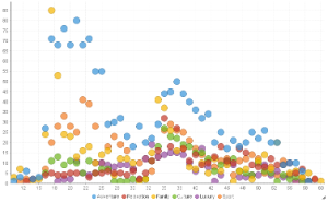
Can be used with categorical, sequential or time-series data. Bubble size and location combine to effectively display 3-D data on a 2-D chart.Chart Data Options
Option | Description |
|---|---|
Horizontal Axis | Select the metric or date to use as the x axis measurement. |
Vertical Axis | Select the metric or date to use as the y axis measurement. |
Size | Optional: Select a metric to set the size of each bubble. |
Colour | Optional: You can select one field to split your values by colour. |
Scatter Chart Tutorial
Summary
In order to set up a Scatter Chart you will need:
- Create a report with chart display
- Select a field to use as the Horizontal Axis
- Select a field to use as the Vertical Axis
- Select a field to use as the Size (optional field)
- Select a field to use as the Colour (optional field)
- Create your chart, selecting Scatter as the type under the Analytical heading
- Provide the Horizontal Axis, Vertical Axis, Size, and Colour options
- Customise the Chart as required
- Proceed to the Output step
- Save your report
Tutorial
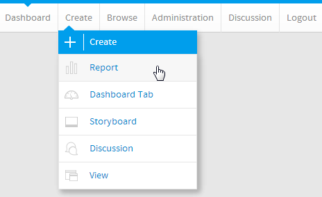
1. Click the Create link in the main navigation bar of the system, and select the Report option.
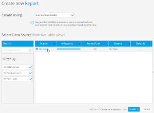
2. You will now be on the Report Initialisation page. Ensure the Drag and Drop Builder has been selected to use for report creation.
3. Click on the Ski Team view in order to use the fields defined within it for creating the report.
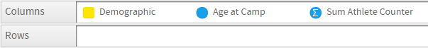
4. Add Age at Camp, Demographic, and Athlete Counter to Columns.
5. Remove the aggregation from the Age at Camp field.
6. Proceed to the Charts step of the builder.
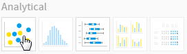
7. Select the Scatter chart from the Analytical section of the charts panel on the right of the screen.
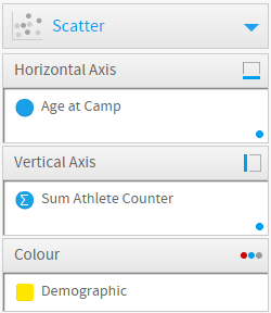
8. Set the following components:
- Horizontal Axis: Age at Camp
- Vertical Axis: Sum Athlete Counter
- Colour: Demographic
9. Save your report