Page History
...
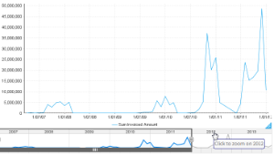
- Enable the Date Slider option through the chart Settings menu
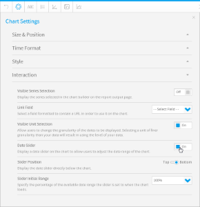
- Your chart will now have a slider the user can manipulate to view subsets of the data
Date
...
Format Options
Change the date format on your charts to a different style. This is available for all charts that support time series.
...
Create a report with at least one date value.
Navigate to the chart section.
Select a chart that supports the time series. Ensure that you use the date field.
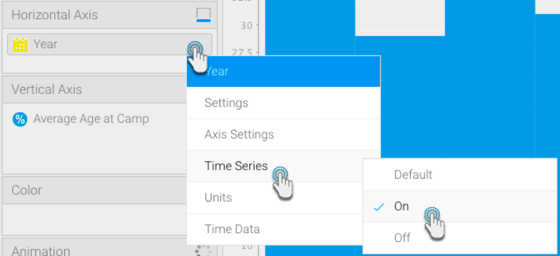
Click on the series setting button in the chart builder’s header.

Select the date field from the left side panel.
Choose and apply a date format.

Display Metric in Colour Field
You can add a metric value to the colour field when creating a time series chart. This will allow the metric field’s values to be represented in the chart with the help of colours.
- Create a time series chart, using a time value. (You may want to select a non-auto chart which best distinguishes between colours, such as a bar chart.)
- Turn on the time series through the time field’s menu, by selecting Time Series and then On.
- Drag a metric field to the colour field in your chart builder.
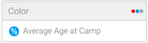
- The colours of the chart data will change according to the value of the applied metric field. A legend will also appear at the bottom to help distinguish between the colour range.
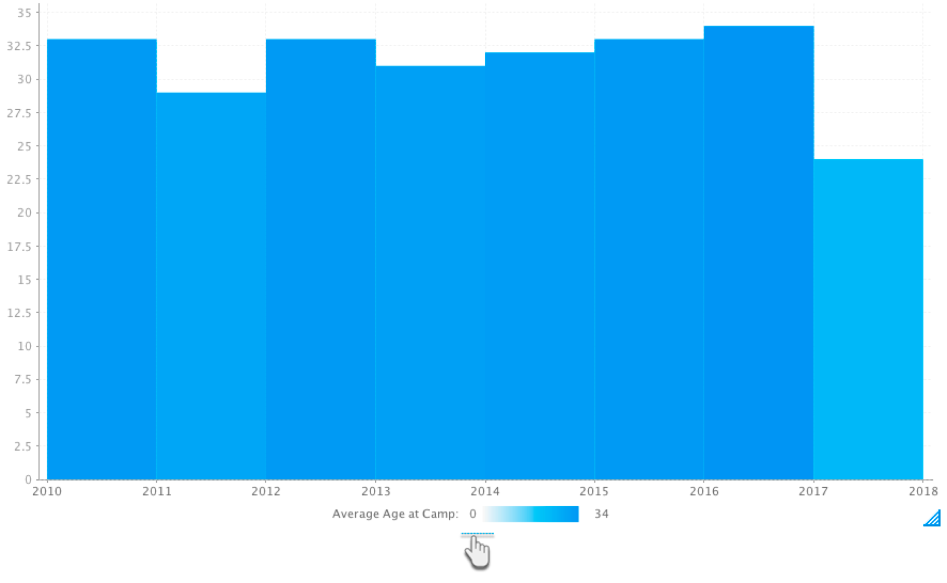
- As seen in our example above, the 2017 bar has an average age of 24, and is therefore a lighter shade of colour than the 2010 bar which has an average age of 33.
| horizontalrule |
|---|
| Styleclass | ||
|---|---|---|
| ||
...