Page History
...
Overview
| Styleclass | ||
|---|---|---|
| ||
...
Reset
| Styleclass | ||
|---|---|---|
| ||
...
Chart Settings
| Styleclass | ||
|---|---|---|
| ||
...
Title
| Styleclass | ||
|---|---|---|
| ||
...
Legend
| Styleclass | ||
|---|---|---|
| ||
...
Axis
| Styleclass | ||
|---|---|---|
| ||
...
| Expand | ||||||||||||
|---|---|---|---|---|---|---|---|---|---|---|---|---|
| ||||||||||||
The Axis scale drop down lets you determine the scale dimensions. Generally you will only be able to set the Y Axis attributes – unless you are using XY charts in which case you can set both X & Y attributes.
|
Background
| Styleclass | ||
|---|---|---|
| ||
...
Labels
| Styleclass | ||
|---|---|---|
| ||

| Expand | ||||||||||||||||||||
|---|---|---|---|---|---|---|---|---|---|---|---|---|---|---|---|---|---|---|---|---|
| ||||||||||||||||||||
|
| Expand | ||||||||||||||||
|---|---|---|---|---|---|---|---|---|---|---|---|---|---|---|---|---|
| ||||||||||||||||
|
...
Series
| Styleclass | ||
|---|---|---|
| ||
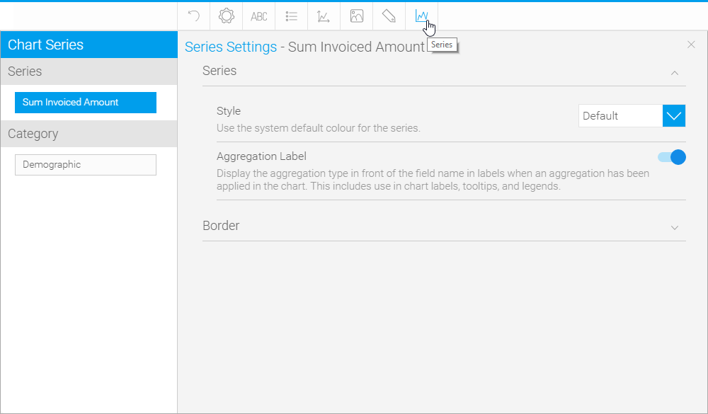
Series
| Expand | ||||||||||||||||
|---|---|---|---|---|---|---|---|---|---|---|---|---|---|---|---|---|
| ||||||||||||||||
|
...
GIS Settings
| Styleclass | ||
|---|---|---|
| ||
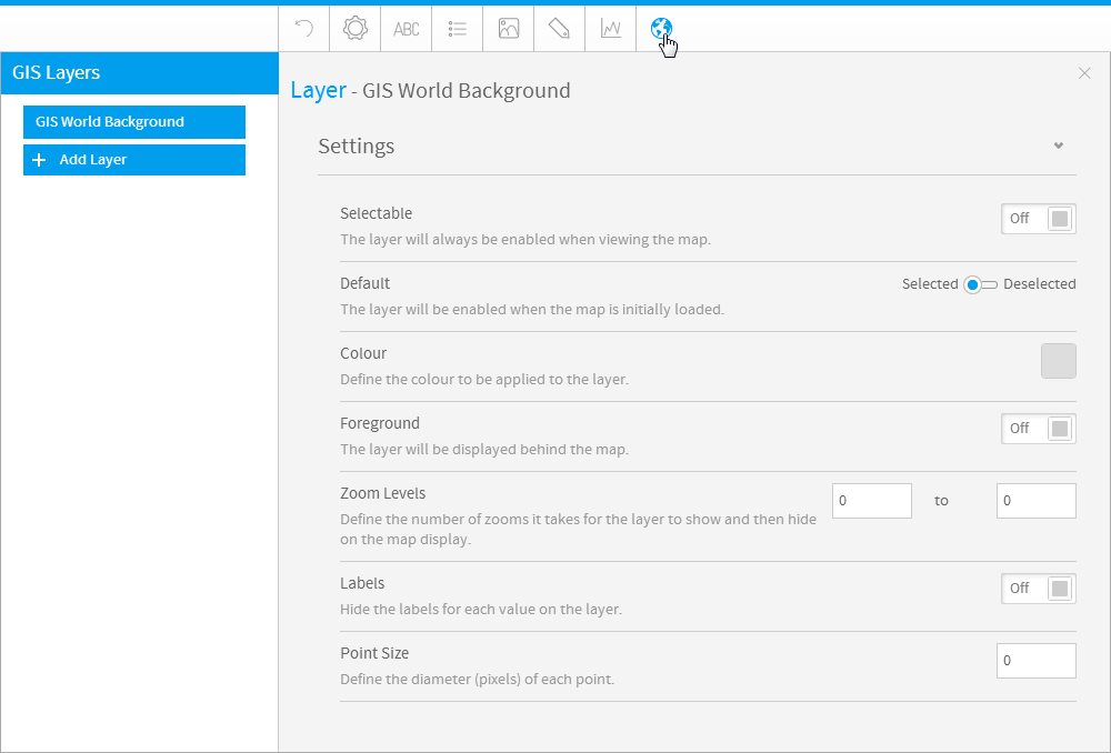
| Expand | ||||||||||||||||||
|---|---|---|---|---|---|---|---|---|---|---|---|---|---|---|---|---|---|---|
| ||||||||||||||||||
|
...
Combination Charts
| Styleclass | ||
|---|---|---|
| ||
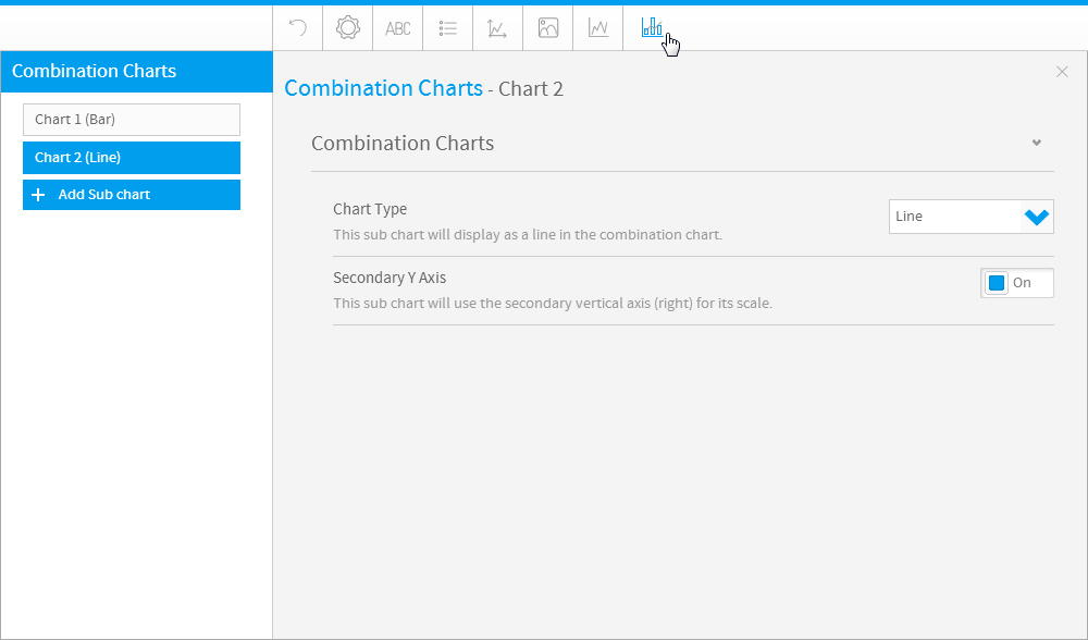
| Expand | ||||||
|---|---|---|---|---|---|---|
| ||||||
|
...
| horizontalrule |
|---|
| Styleclass | ||
|---|---|---|
| ||