Page History
...
Open a Signal alert to explore its analysis in detail. (You can access this page via the Signal alert in your Timeline, or through the Signal list screen.) The main Signal is represented as an annotation in the time series chart. (See here for further info on this.) This section covers how to interact with a Signal’s detail page.
Below is an example of an outlier detection signal. Note that the main Signal chart and some other details will differ according to the different types of Signals.


Number | Signals function |
1 | The auto generated narrative describes the nature of the Signal, along with the time window in which it occurred. For instance, the referenced example clearly mentions a spike of 67% occurred on 28/10/2015. |
2 | This is the Signal time-series chart that shows the history of the specific metric - dimension combination. It displays the main Signal annotation (visibly more prominent in blue), along with other related Signals that have occurred during that time line (the grey-colored annotations). You can use the annotations to learn about each of these Signals, and even explore the previous ones. (These time series charts will differ depending on the type of analysis.) Click here for more information. |
3 | The time slider that lets your expand or reduce the time window of the time-series chart. |
4 | This right side Explore panel offers options to display or hide components on the time-series chart. This gives you flexibility into how much detail you want to see and data you want to compare. Click here to learn about each of these. |
5 | The Discussion tab lets you leave comments and collaborate with other users on this Signal. |
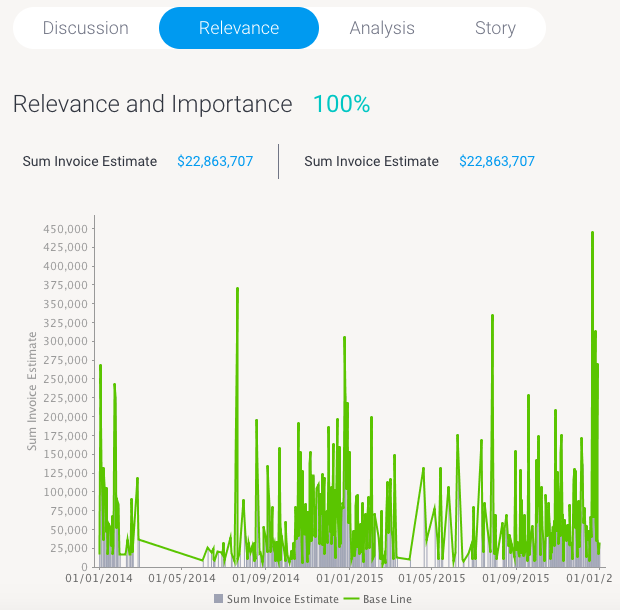
6 | The Relevance chart depicts the importance of the Signals data in relation to all other data that the user has access to. |
7 | The Explanation Analysis tab provides automatically-generated visualizations and narratives about possible underlying causes. Yellowfin Assisted Insights functionality is utilized here to perform additional analysis on the Signal to explain why a signal has occurred. |
8 | You can write a Story to give a human context or perspective on the Signal, by yourself or invite another user to write one. Signal users will be able to read a published Story in this tab. Stories is a Yellowfin product ideal for data collaboration. To learn more about it, click here. |
9 | The +Chart to Story button takes a screenshot of the time series chart (in its current state) and adds it to the story. Note that it doesn’t take you into the Story Builder. |
10 | Lets you watch/unwatch the Signal. This adds the Signal to your watch list, and sends alerts when other users interact with this user. |
| 11 | This Actions buttons lets you perform a number of actions on this Signal, such as owning or assigning it, sharing it, dismissing or closing the Signal. |
12 | Rate the importance of the Signal. |
1213 | Exit the Signals detail page. |
...
- You can hide this panel by clicking on the icon on its top-left corner.


- And bring it up again, by clicking on the expand icon.

| Section | ||||||||||||||||||||||||||
|---|---|---|---|---|---|---|---|---|---|---|---|---|---|---|---|---|---|---|---|---|---|---|---|---|---|---|
|


...
| Anchor | ||||
|---|---|---|---|---|
|
Relevance
Click on the Relevance tab to understand the relevance and importance of this Signal in relation to all your other data. A visual representation of this Signal’s importance is provided.

...
| Anchor | ||||
|---|---|---|---|---|
|
...
Analysis
The Yellowfin Assisted Insights provides automated analysis of your data through visualizations and natural language narratives. It is used here to suggest the cause of a signal, and provide underlying reasons for why it occurred.


...
| Anchor | ||||
|---|---|---|---|---|
|
...