Page History
...
These allow users to create charts directly on the dashboard canvas without going through Yellowfin Data Discovery’s report builder. This is done by using the Blueprint Widgets, which include some of the most widely used chart types. Quick Charts are created using Blueprint widgets, which include some of the most widely used chart types, and choosing the Simple Report creation option.
Note: For more advanced reporting, use Yellowfin’s Data Discovery.
...
Chart icon | Chart name | Description |
|---|---|---|
| Number chart | For charts with numeric report results. |
| Pie chart | For pie or ring charts. |
| Column chart | For charts with vertical columns. |
| Line chart | For time series charts. These can appear as line or area chart. |
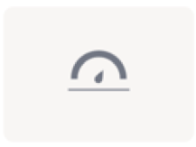
| Meter chart | For meter charts. |
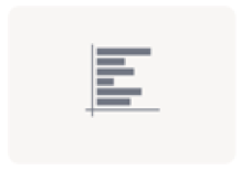
| Bar chart | For horizontal bar charts. |
Basic Tutorial
A Quick Chart can instantly be created by dragging a Blueprint Widget and using the properties panel to configure the chart.
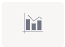
| Overlay chart* | For charts where a line chart is overlaid on a bar chart. The line chart emphasizes a trend and the bar chart emphasizes specific values. |
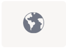
| Map chart* | For map charts to showcase geographical data. |
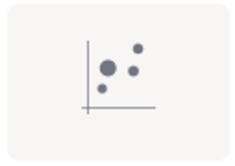
| Scatter chart* | For a scatter plot chart, where points are not joined. |
| Heat grid* | For a chart that plots the intensity of a metric across multiple categories. |
* These widgets are currently only used as Blueprints, without the functionality to extend them to Quick Charts. Users can, however, use the Advanced Report option to create these charts via the Chart builder in Yellowfin Data Discovery.
...
Basic Tutorial
A Quick Chart can instantly be created by dragging a Blueprint Widget and using the properties panel to configure the chart.
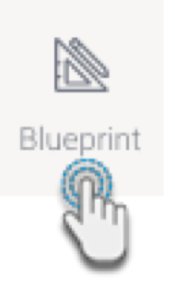
- Click on the Blueprint button on the left side to expand its panel.
- Drag a chart type of your choice onto the canvas. You can position and resize it to fit your design.
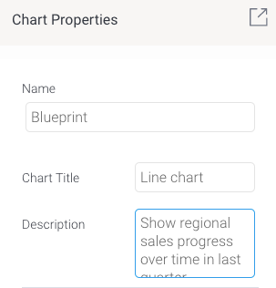
You can add a title and description for it in its properties panel (make sure the Blueprint Widget is selected on the canvas to make its properties panel appear).
Tip Use the Activity Stream button (bottom right of the screen) to discuss and collaborate with other team members on your Blueprint further.
To create a Quick Chart (created directly in the dashboard) or even an advanced chart (created in the report builder, but added here upon publish), proceed with the following steps.
Click on Create Report. You’ll be faced with two options:
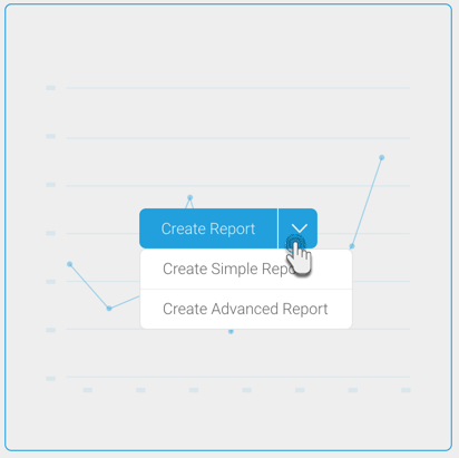
Create Simple Report: This option allows you to create a Quick Chart within the dashboard canvas.
Create Advanced Report: This allows you to create an advanced report. On doing so, you will exit the dashboard and navigate to the report builder in Yellowfin Data Discovery. Create a report as per normal, and publish it. Then close the Report page to jump back into the dashboard where your newly created advanced report will be displayed.
In this tutorial, we’ll be creating a Quick Chart, using the Create Simple Report button. Click on it to bring up the following form.
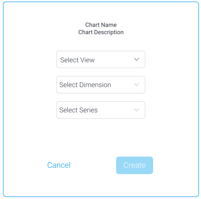
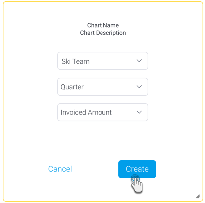
Select a view from the list. Then select a dimension and series (metric) field for the chart.
Click on the Create button.
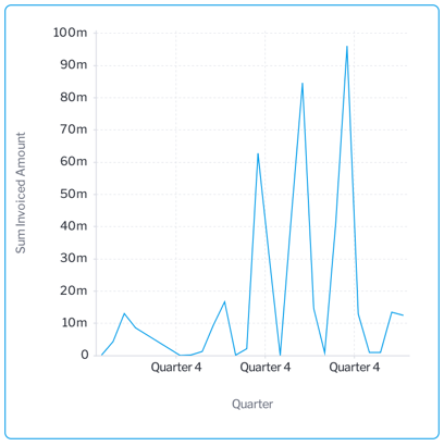
This will create a simple chart directly on the dashboard, as shown in the example below.
To further configure this chart, open the chart’s property panel, which will display additional
Click on the Blueprint button on the left side to expand its panel.- Drag a chart type of your choice onto the canvas. You can position and resize it to fit your design.
- You can add a title and description for it in its properties panel (make sure the Blueprint Widget is selected on the canvas to make its properties panel appear).
Tip Use the Activity Stream button (bottom right of the screen) to discuss and collaborate with other team members on your Blueprint further.
To generate a Quick Chart, click on the Select a View button on the newly added blueprint chart widget.
Select on a view name from the popup that appears.
The chart properties panel will appear displaying its configuration details. This is where you define the chartfields, which vary for each chart type. Each chart will also differ based on the minimum set of fields to be defined for it.

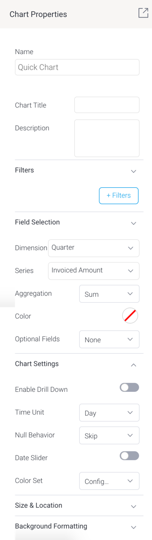
- You may define a new filter condition in your chart by using the +Filters button.
- Expand First, expand the Field Selection section and choose the data fields.
Then in the Chart Settings section
, define additional settings.Next, define additional settings for series in the Series Formatting section.settings.
Note Refer to the chart type section below for further details on their specific configurations.
- You will notice your chart autogenerating with each field and configuration you define. You do not require additional steps to save the chart.
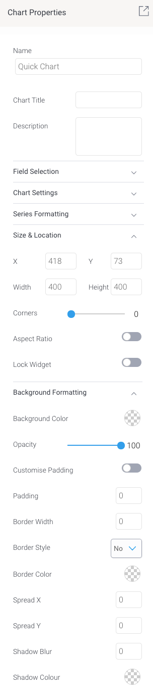
- You may update other properties of this widget, such as its size and location on the canvas, and background details. See the properties panel for details on all widget properties.
...
| Section | ||||||||||||||||||||||||||||||||||||||||||||||||||||||||||||||||||
|---|---|---|---|---|---|---|---|---|---|---|---|---|---|---|---|---|---|---|---|---|---|---|---|---|---|---|---|---|---|---|---|---|---|---|---|---|---|---|---|---|---|---|---|---|---|---|---|---|---|---|---|---|---|---|---|---|---|---|---|---|---|---|---|---|---|---|
| ||||||||||||||||||||||||||||||||||||||||||||||||||||||||||||||||||
Quick Charts in Imported Dashboards
Imported dashboards containing Quick Charts, will have the Quick Charts appear in the ‘Report’ widget panel, and behave as regular report objects, meaning users will not be able to further configure them as Quick Charts (i.e. via the Properties panel). These charts can however be viewed and edited as regular reports in the dashboard.