Page History
...
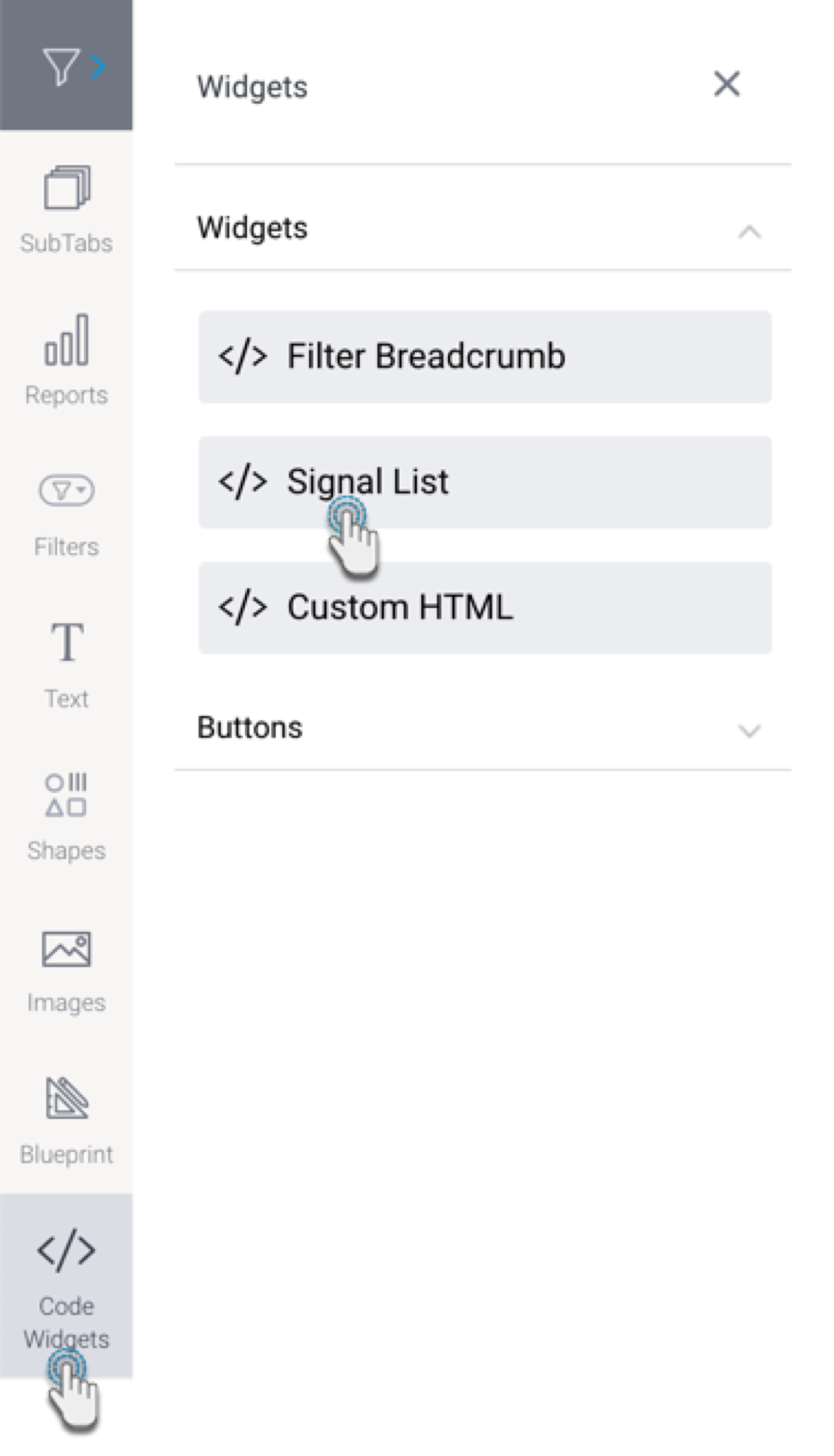
The following types of code widgets are available in Yellowfin out-of-the-box.
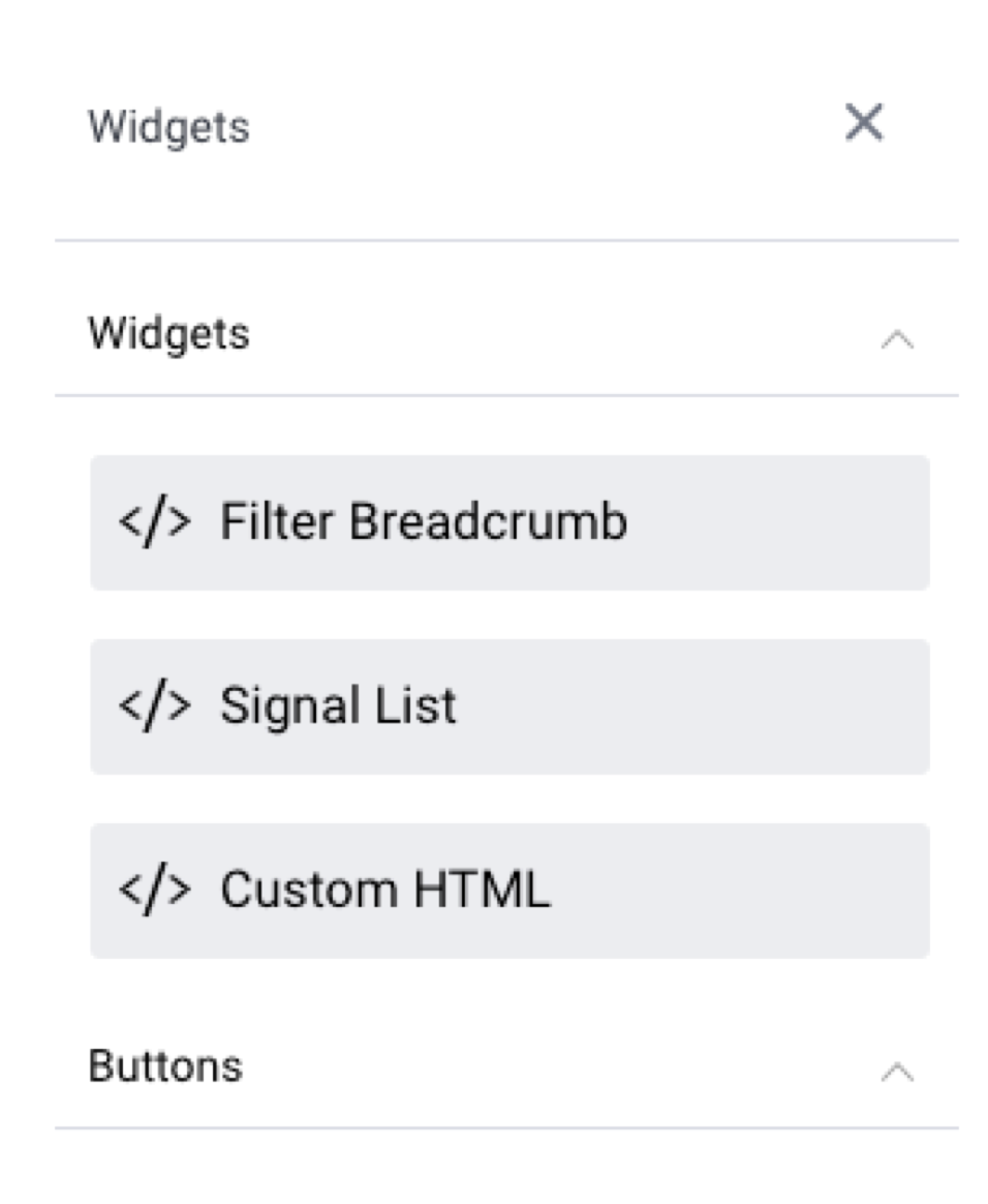

Code Widget type | Description | Filter Breadcrumb | Used to display a filter breadcrumb trail to aid in filter navigation on the presentation. Learn more.|
|---|---|---|---|
Add a Signal List to a presentation. | |||
Drag in this widget anywhere on your slide, and then jump to Code Mode to instantly start coding HTML within the widget’s tags. | Expand this section to add buttons that perform actions and functions on a presentation. |
User-generated Code Widgets
...
Here's how to use the out-of-the-box Yellowfin Code Widgets.
| Anchor |
|---|
| filterbreadcrumbs |
Filter Breadcrumbs
This widget displays a breadcrumb trail of selected filter values on your presentation. This is useful when you have co-dependent filters (where one filter selection updates another filter’s values), and you wish to display which filter values a presentation user has applied.
...
| Anchor | |||
|---|---|---|---|
|
Custom HTML
...
| Note |
|---|
Ensure that you have the ‘Code Mode’ role function enabled for this to work properly. |
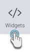
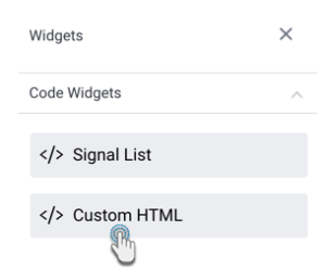
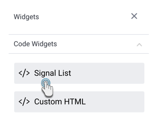
- Click on the Code Widgets button on the left.

- From the Code Widgets section in the list that appears, drag the Custom HTML widget onto the slide.

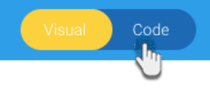
- Switch to Code Mode through to toggle on top of the presentation.
- From the list of objects on the left, click on the Custom HTML object to highlight or navigate to the exact code section. Tip: this object list displays all objects added to the presentation and is used to find the exact code for a particular object so it can be edited.
- Once located, enter your HTML code into the widget’s code.
- If you navigate back to Visual Mode, you will be able to see the output of your HTML content.
...
This tutorial shows you how to add a Signals List widget, and configure it by applying filters to view Signals based on your preference. This allows you to control the Signals that will appear in this list.
- Click on the Code Widgets Widgets button, and expand the Code Widgets section (expanded by default).
- Drag the Signal List widget onto the slide.
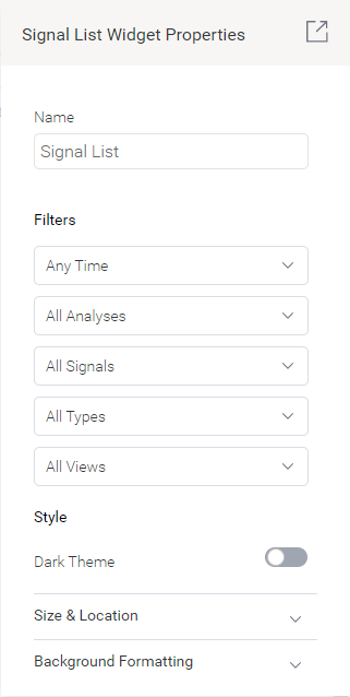
- Upon doing so, the Properties panel will be updated to show properties of this widget.

- You can select filters values to filter the signal widget list. The available options allow you to view Signals according to:

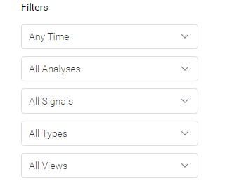
- Time:
- Signal Status: this includes Signals added to your watch list, ones that were recently viewed, those that have been closed, or dismissed signals.
- Time: view signals according to a pre-selected time range, such as those occurring in the last 30 days. Choose Anytime if you do not want to limit signals according to time.
- Views: display signals Signal Analysis jobs: this filters Signals that were detected within a specified viewby a specific analysis configuration job.
- Signal Status: this includes Signals added to your watch list, ones that were recently viewed, those that have been closed, or dismissed signals.
- Signal Type: display signals of a specific type, such as only show Spikes and Drops.
- Views: display signals that were detected within a specified view.
- Note that the list will be saved according to the filters applied. This ‘filtered’ list will appear on the presentation.
- Refer to the properties section for a description on all properties related to this widget and how to configure them.
...
Property name | Description |
|---|---|
Name | Allows you to update the name of the signal widget. |
Filters | This section offers multiple filters that you may update your signal widget list by. These are covered in the Signal filter section above. |
Style | |
Light Dark theme | Enable this toggle to display the Signal widget widget in a light dark theme, or disable it to keep the dark light theme. |
Size & location | |
X | Specify the x coordinates of the top left corner of the signal widget, in order to position it exactly on your presentation slide. |
Y | Specify the y coordinates of the top left corner of the signal widget, in order to position it exactly on your presentation slide. |
Height | Specify the height of the currently selected signal widget, in pixels, in order to resize it exactly. Note that the Signal widget width does not have a configuration field as it is not adjustable for this widget. |
Lock widget | Enable this toggle to lock the signal widget in its location. This stops you from moving or resizing it. This holds true even when selecting multiple widgets on the slide. Note that the quick chart can still be customized. |
...