Page History
| Anchor | ||||
|---|---|---|---|---|
|
| Table of Contents | ||
|---|---|---|
|
Overview
| Styleclass | ||
|---|---|---|
| ||
Area |
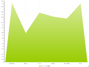
| You want to emphasize the magnitude of change over time. Use an area chart to show how much the value of a measure changes over time. |
Stacked Area |
| You want to emphasise the magnitude of change over time, while comparing multiple categories. |


Chart Data Options
Option | Description |
|---|---|
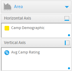
Horizontal Axis | This is the category label for the X axis |
Vertical Axis | Typically a numeric value such as $. An item that you want to measure on your Chart |
Colour | This option is only available if you have a cross tab data set available and is used to determine the colour applied for cross tab series data. |
Area Chart Tutorial
| Styleclass | ||
|---|---|---|
| ||
Summary
In order to set up an Area Chart you will need:
- Create a report with chart display
- Select a field to use as the Horizontal Axis
- Select a field to use as the Vertical Axis
- Select a field to use as the Colour (if you have decided to create a cross tab report)
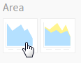
- Create your chart, selecting Area as the type
- Provide the Horizontal Axis, Vertical Axis, and Colour options
- Customise the Chart as required
- Proceed to the Output step
- Save your report
Tutorial
| Section | ||||||||||||||||
|---|---|---|---|---|---|---|---|---|---|---|---|---|---|---|---|---|
|
| Section | ||||||||||
|---|---|---|---|---|---|---|---|---|---|---|
|
| Section | ||||||||||
|---|---|---|---|---|---|---|---|---|---|---|
|
| Section | ||||||||||
|---|---|---|---|---|---|---|---|---|---|---|
|
| Section | ||||||||||
|---|---|---|---|---|---|---|---|---|---|---|
|
| Section | ||||||||||
|---|---|---|---|---|---|---|---|---|---|---|
|
| Section | ||||||||||
|---|---|---|---|---|---|---|---|---|---|---|
|
| horizontalrule |
|---|
| Styleclass | ||
|---|---|---|
| ||