Name of the filter. This can be edited. This name appears in the dashboard code mode, making it easy to edit the filter code.
Auto height
Automatically adjusts the height of a filter widget according to the items in it. Turn off to manually define the filter height in a textbox. This option is only available if a filter widget is added to a static container. Note that the widget heights can also be changed by manually dragging the widget border, in which case this option will get switched off.
Height
Height of the filter in pixels. This is available if the Auto Height option is turned off.
Global
Enable this toggle to make your filter lists globally available. Global filters are present for all sub tabs in the dashboard. So if disabled, this filter will only be available for a specific sub tab.
Note that this only works for left or right container filters, not filters added to a dashboard content area.
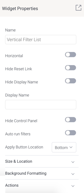
Horizontal
Enable this to display your filter in a horizontal alignment. By default filters are vertically aligned.
Hide reset link
Allows you to hide the filter reset option.
Hide display name
Allows you to hide the filter display name.
Display name
Display name of the filter, that appears on the filter panel. This can be edited.
Hide control panel
Allows you to hide control buttons on a filter panel for the end user. These include bookmark, reset, and apply buttons. Dashboard users will not be able to use these filter features.
Auto run filters
Enable this toggle to automatically run reports when filter values are selected or changed, without using the ‘Apply’ button. Note: Administrators can also set a time delay, where the reports are run after a specified time once values are selected. This is done through the Content Settings > Report Settings > Builder Setting > Filter Run Delay setting.
Apply button location
Allows you to specify the location of the filter control panel, including the 'Apply' button. You can choose to display the button and controls at the top or bottom of the filter panel, or in both locations.
Size & Location
X
Specify the x coordinates of the top left corner of the filter widget, in order to position it exactly on your dashboard canvas.
Y
Specify the y coordinates of the top left corner of the filter widget, in order to position it exactly on your dashboard canvas.
Width
Specify the width of the filter widget, in pixels, in order to resize it exactly.
Height
Specify the height of the filter widget, in pixels, in order to resize it exactly.
Corners
This option allows you to define the roundness of your filter widget border corners. Tip: For maximum circular edges, enter half the value of the widget height. For example, if the height is 400 pixels, then set the edge value to 200 pixels. Moreover, any value greater than 200 for the edge, will have no further effect in this example.
Rotation
Specify the amount you wish to rotate your widget clockwise, in degrees. To rotate anti-clockwise, specify a negative value.
Aspect ratio
Enable this toggle to maintain the aspect ratio. This means the widget maintains its shape, but its size can be increased or decreased.
If this is disabled, the widget can be stretched out of shape either vertically or horizontally.
Lock widget
Enable this toggle to lock the filter widget in its location. This stops you from moving or resizing the widget. This holds true even when selecting multiple widgets on the canvas.
Background formatting
Background color
Allows you to specify a background color for the filter widget.
Opacity
Allows you to specify the transparency of the background color on the widget.
Customise padding
This option allows you to define a custom padding or buffer around the filter widget, in pixels. This includes padding for each side to the widget. If disabled, you can still define an overall padding size.
Padding top
When custom padding is enabled, this allows you to define padding to be added to the top of the widget.
Padding bottom
When custom padding is enabled, this allows you to define padding to be added to the bottom of the widget.
Padding right
When custom padding is enabled, this allows you to define padding to be added to the right of the widget.
Padding left
When custom padding is enabled, this allows you to define padding to be added to the left of the widget.
Padding
This allows you to define an overall padding size for the filter widget. This size, defined in pixels will be constant on each side of the widget. To add different sized padding on any of the sides, enable the Customise Padding option.
Border width
This allows you to specify the thickness of the widget border.
Note: to make the widget border visible, you must define values for all three border properties.
Border style
This allows you to select a style for the widget border. Options include: dashed, solid, dotted, groove, and more.
Border color
This allows you to specify the color of the widget border.
Horizontal shadow
This option allows you to define the horizontal shadow size, in pixels.
Vertical shadow
This option allows you to define the vertical shadow size, in pixels.
Shadow blur
This option allows you to define the sharpness of the shadow. The smaller the value, the sharper and more defined the shadow will be. For a blurry or softer shadow, provide a bigger value.
Shadow color
This option allows you to set a color for the shadow.
Actions
Click Event
Select an event that will trigger when the selected widget is clicked. Event options include:
None:Use this if you do not wish the widget to trigger an event.
Next sub tab:Navigates the user to the next tab within the same dashboard.
Previous sub tab:Navigates the user to the previous tab within the same dashboard.
Reset filters:Allows users to clear filter selections, or in case default values are set, then reset filters to their default values.
Reset dashboard:Refreshes the dashboard by clearing any user interactivity performed on it, as well as removing all applied filters.
Go to report:Navigates users to a specified report. This report can be specified by providing its report UUID.
Go to sub tab:Navigates to any sub tab in the same dashboard, where the sub tab is specified by its order number. For example to jump to the forth sub tab, enter 4 in the sub tab # field. Note that the sub tab order starts from number 1.
Go to URL: Navigates to an external link or page using the specified URL. You can also choose to open the new link in a new tab or window or in the current window. (See the below URL and Target settings for more information.)
Report ID
If navigating to a report using the ‘Go to report’ click event, provide the UUID of the report.
Sub Tab #
If navigating to a sub tab using the ‘Go to sub tab’ click event, enter the order number of the sub tab.
URL
If navigating to an external page using the ‘Go to URL’ click event, provide the full URL of the page.
Target
If navigating to an external page using the ‘Go to URL’ click event, specify the page target. Options include:
New Tab/Window:Opens the URL page in a new tab or window, depending on your browser’s settings. Note: The default for most browsers is a window, however users can use computer shorts (Ctrl in Windows, and Cmd in Mac) to open in a new tab instead.
Current Window:Open the page in the current window.
Parent Frame:If Yellowfin is embedded as an iFrame, the new page will open (that is, its contents will appear) in the parent frame. Note that the parent frame is the one within which the Yellowfin frame is embedded.
Current Frame: If Yellowfin is embedded as an iFrame, the contents of the URL page will open in the current frame. Note that the current frame is the one which embeds Yellowfin.