Note: these property options will differ based on the selected dashboard template; the dashboard layouts will have limited properties options, whereas the canvas will have all.
Property name
Description
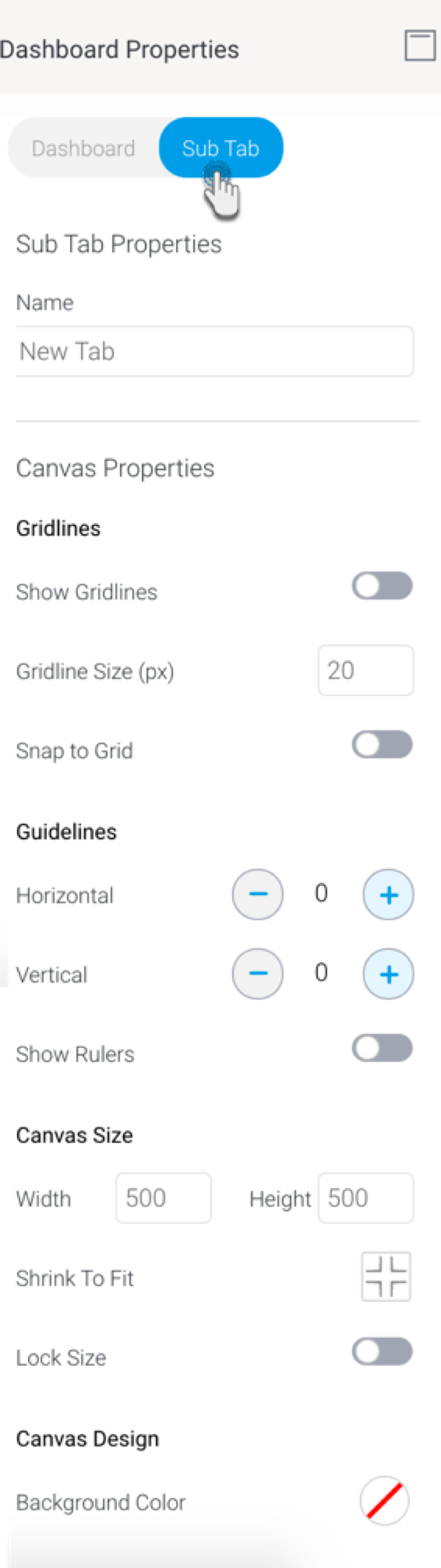
Name
View or update the name of the sub tab.
Canvas properties
Properties available only on a dashboard canvas. Note that these will not be provided for static layouts.
Report Menu
Show Report Menu
This controls the visibility of the menu that pops up on all reports added to the canvas. Options include:
Inherit: The report menu will inherit the visibility setting from the admin level. Note that the report menu is also controlled at the admin level, and individual report level.
Never: (Default selection) The report menu will never appear. Use this to hide the menu from appearing in published dashboards. Note that it still appears on hover in edit mode.
Always: The report menu will always appear. For static layout dashboard, this will make the menu appear constantly in both edit and published modes; however for canvas dashboards, it will continue to hover in edit mode, and always appear in published mode.
Hover: The report menu will only appear as long as users hover over it.
Note that the canvas level setting selected here will override the admin level setting.
Gridlines
Show gridlines
Enable this toggle to make gridlines appear on the sub tab canvas. These can be used as a guide when laying out widgets.
Gridline size
Specify the size of the grids in the gridlines (in pixels).
Snap to Grid
Enabled this toggle to align all new objects to gridlines. Note: if objects were added prior to enabling this setting, they will not align automatically; they will need to be moved manually.
Guidelines
Horizontal
Allows you to add up to 2 horizontal guidelines on the canvas. These are visual guides that can be moved to aid in the design of your canvas.
Note: you can easily drag a line to a different location.
Vertical
Allows you to add up to 2 vertical guidelines on the canvas. These are visual guides that can be dragged to aid in the design of your canvas.
Show rulers
Allows you to display rulers across the top and left of your canvas, which can be used to place guidelines more accurately.
Canvas Size
Width
Specify the width of the sub tab canvas.
Height
Specify the height of the sub tab canvas.
Shrink to fit
Click on this to shrink the canvas size to the minimum size to fit all current objects. This will remove unnecessary whitespace from the canvas.
Lock size
Enable this toggle to lock the size of the dashboard canvas. This will prevent the canvas from being manually dragged or resized.
Canvas Design
Background color
Specify a background color for the sub tab canvas. Click to select a color; this brings up the color picker.