Page History
| Table of Contents | ||
|---|---|---|
|
| Anchor | ||||
|---|---|---|---|---|
|
| Table of Contents | ||
|---|---|---|
|
Overview
Overview
Instant Insights allow you to rapidly uncover insights in your data with minimal effort. Yellowfin can provide a deeper explanation of the data you're seeing, or compare two data points on a chart to understand differences.
Upon performing Instant Insights, a report is generated by Yellowfin in the background and saved in the configuration database, which forms the basis for the Instant Insights charts and narratives. If the insights are discarded by the user, these reports will be unused. The system will perform a check for these orphan reports every 48 hours, and delete the unused ones.
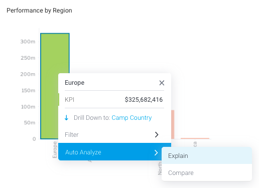
The Instant Insights feature is accessed Instant Insights are enabled via the Auto Analyze option available in the chart tooltip . This leads to dropdown menu on a dashboard. Auto Analyze offers two options: Explain and Compare. Refer to the procedures below to understand how both of these work.
| Tip |
|---|
Instant Insights must be configured at the view level by an admin before making it available to users. |
| Notetip |
|---|
| This feature Instant Insights is not available for all chart types . See; see the list of limitations below .Only users with the appropriate security functions are able to access this feature. Learn more about these here. |
| Styleclass | ||
|---|---|---|
| ||
Explain
Using this optionWhen selecting Explain, Yellowfin will explain detail the underlying data drivers that impact the particular metric you have chosen. In our the example below, the business user has we've selected Sales for Europe and then chosen the Explain option from the tooltip. Yellowfin will access additional data elements from the underlying data view , and then run a series of algorithms to determine statistically relevant insights and present these back to the user.
- Locate the chart that you want to analyze (perhaps there is a spike or pattern in the data that you are interested in).Navigate to a dashboard
- Right-click on a chart element (a bar in a bar chart, or a data point), or hover your cursor over it to bring up the tooltip.the element for 2 seconds to display the tooltip dropdown menu
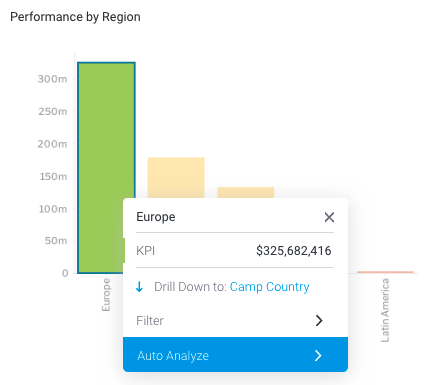
- Click on the Auto Analyze option, and then select Explain.
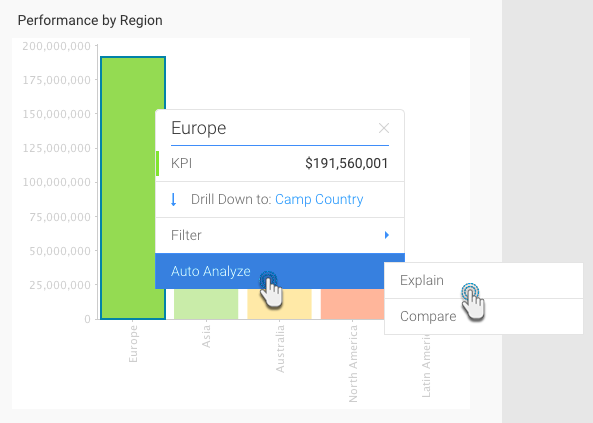
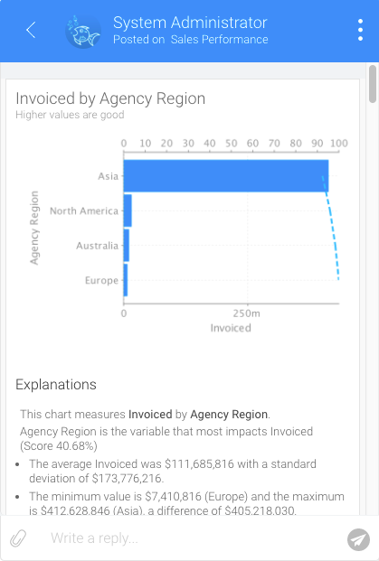
A new The Auto Analysis panel will appear, displaying the results of the analysis process. These insight results will be displayed in order of statistical relevance.
note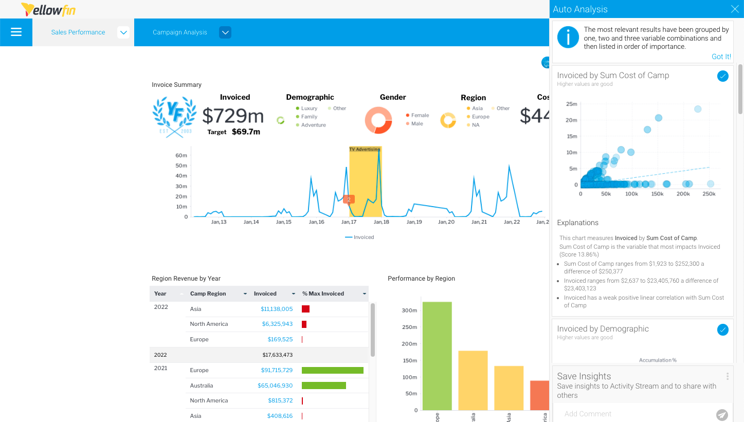
The chart type selected by Yellowfin depends on the type of data. For example, if the values are both metrics, then a scatter plot graph will be generated.
A narrative explanation is also provided with each of the charts, allowing you to better interpret the results of the analysis.
Yellowfin will generate a natural language analysis, and also display the most appropriate charts for your insights (depending on the data), in this case selecting a scatter plot because both values are metrics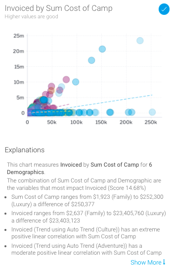
- Click on the chart to view an enlarged version
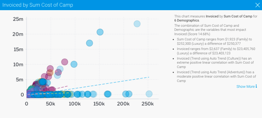
- Click on Show More at the end of the explanations, analysis to view the complete set of narratives that are explanations provided with your insight.
| Styleclass | ||
|---|---|---|
| ||
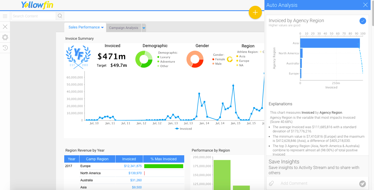
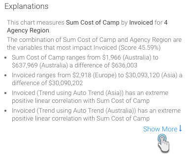
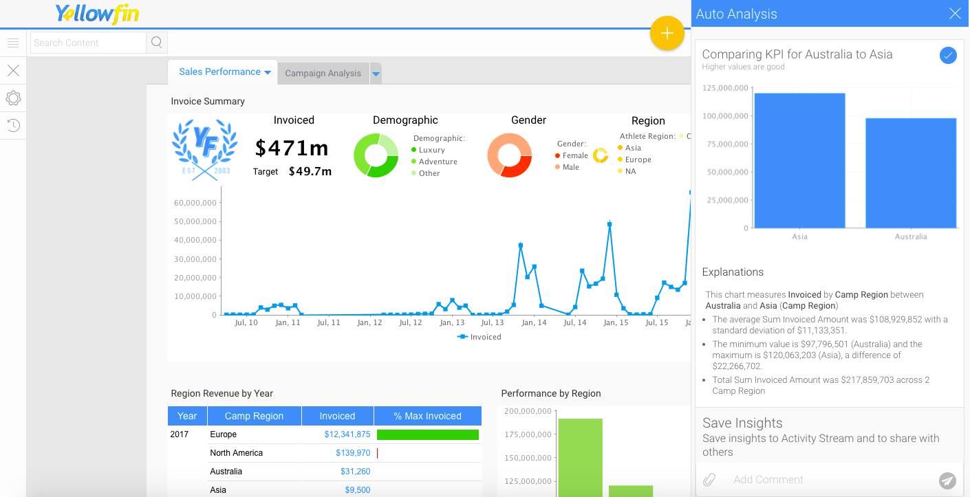
Compare
Using this optionWhen selecting Compare, Yellowfin will analyze the data that best explains to explain the difference in values for a particular metric between two dimension or date values. For In the example , in the screen shot below – the business user has below, we’ve selected Sales for Asia, and then chosen the Compare option from the tooltip . The user can then compare Asia to select another region as a point of comparison. Yellowfin will access additional data elements from the underlying data view , and then run a series of algorithms to determine statistically relevant drivers of difference and present these back to the user. The steps are:.
- Navigate to a dashboardNavigate to the chart that you want to analyze (perhaps there is a large difference between two elements on a chart that you are interested in exploring).
- Right-click on a chart element (a bar in a bar chart, or a data point), or hover your cursor over it over the element for 2 seconds to display the tooltip dropdown menu
Alternatively, you can click and drag over two chart elements, or hold the Shift key to select two elements you’d like to compare, then right-click to bring up the tooltip .dropdown menu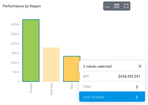
- Click on the Auto Analyze option, and then select Compare.
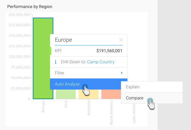
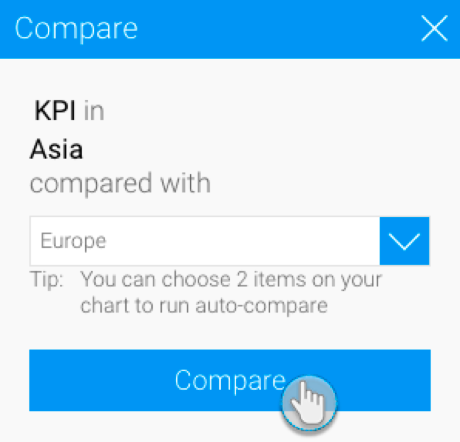
The Compare popup will appear if only one element is selected, allowing you to choose a second data set for comparison - Select the data that you want you’d like to compare to from the dropdown list in the popup that appears., and click the Compare button
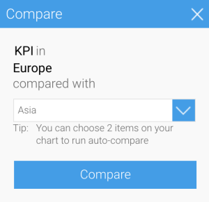
- Click on the Compare button .
to perform the analysis
The Auto Analysis panel will appear, displaying insight results in order of statistical relevance
Yellowfin will generate a natural language analysis, and also display the most appropriate charts for your insights (depending on the data) - Alternatively, you can select two bars to compare by clicking and dragging the cursor over them (brushing).
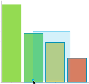
- Or, clicking on one, pressing the Shift key and selecting the other one. The result of the comparison will appear in an Auto Analysis panel displaying charts with explanations, based on your selected data.
Click on Show More at the end of the
...
- analysis to view the complete set of
...
- explanations provided with your insight
...
On performing Assisted Insights, a report is generated by Yellowfin in the background and saved in the configuration database, which is the basis for the auto insights charts and narratives. If the insights get discarded by the user, these reports will be unused. The system will carry out a check for these orphan reports every 48 hours, and delete the unused ones. | ||
| Styleclass | ||
|---|---|---|
| ||
Editing
...
insights
Yellowfin’s Instant Insights functionality analyzes your data and generates useful insights. The system enables allows you to create a new report from the insights that were generated - , including the charts that appear in the Auto Analysis panel. The report that is generated can be used like any other Yellowfin report. In this wayWith this feature, you can turn interesting insights discovered by Yellowfin , into reports that you can run regularly and include in add to your dashboards.
| Tip |
|---|
This function is only available for uses with report editing security access. |
This tutorial will show you how to create a new report from your Instant Insights.
- On Upon generating Instant Insights, the Auto Analysis panel will appear, displaying the insights produced by Yellowfin.
Select the charts that you want to edit or view the reports of, by clicking on their select icon.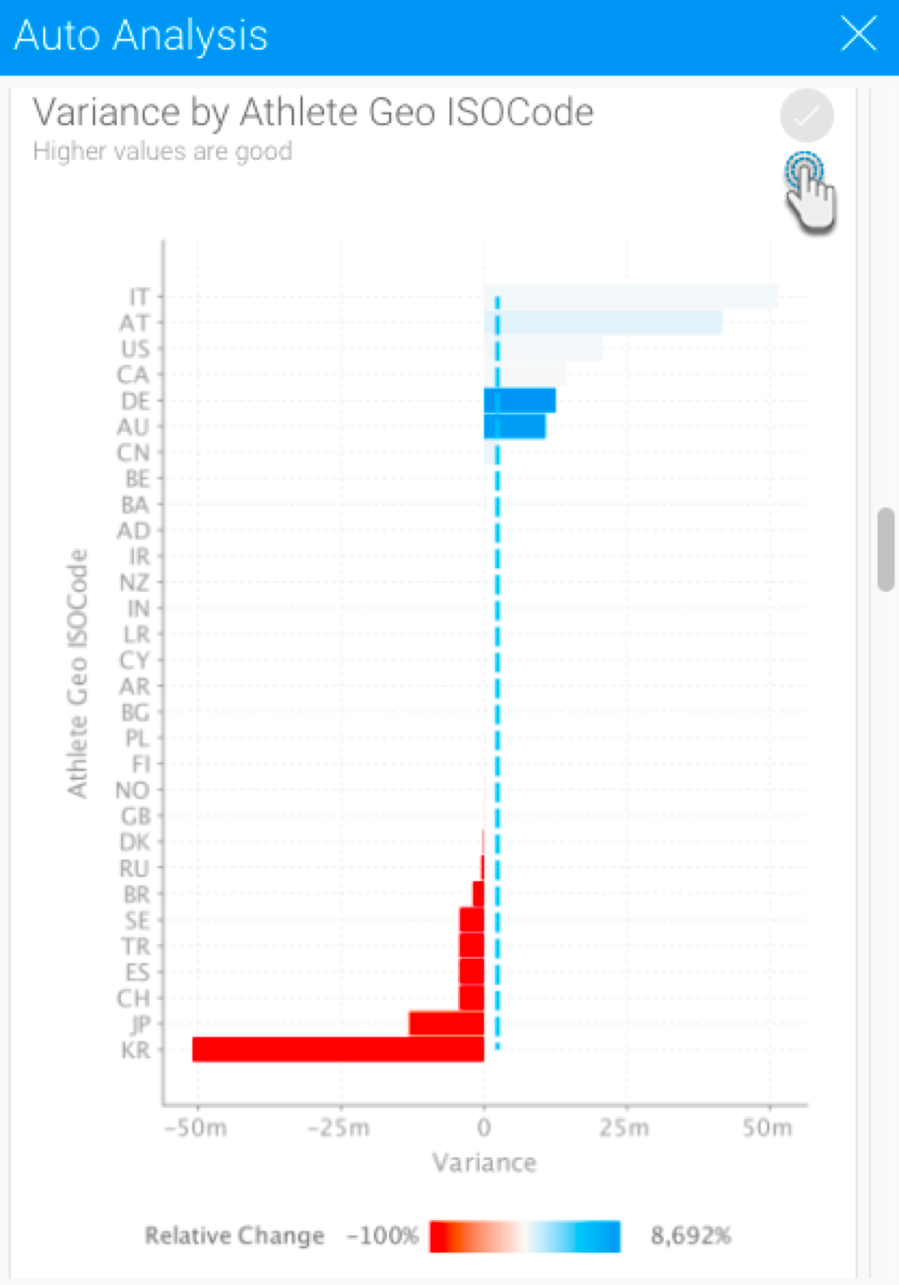
Note: All the charts will be selected by default; un-select the ones that you don’t want to edit or view in detail, by clicking - on their select icon.Click on the round tick button
 in the top right-hand corner to select or deselect each insight you would like to view or edit in the report builder
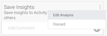
 - Click on the menu option button
 in the Save Insights panelbox, and click Edit Analysis. Note: This function is only available to users with report editing security access. (If you choose
Select the Discard option instead, then the Insights will be discarded, to discard the insights without saving the report.)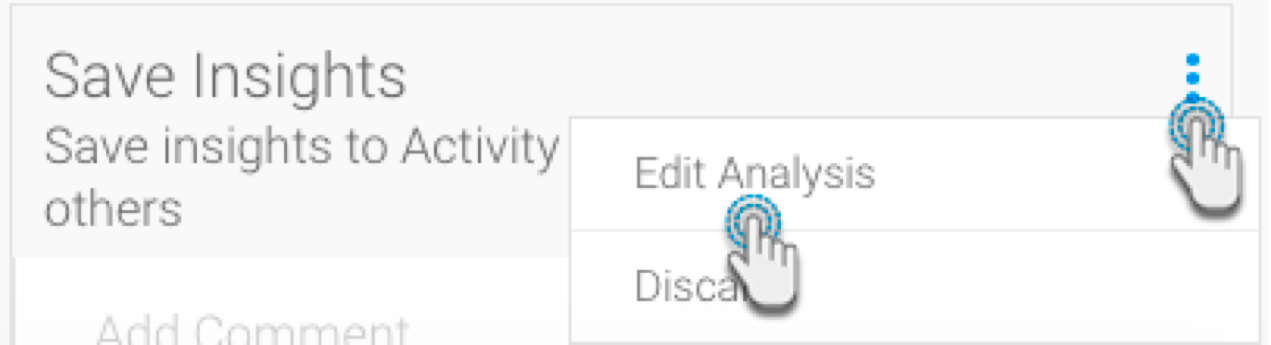
An alert will appear indicating informing users that editing the analysis will prevent them from publishing the results on the activity steam. To continue, click Yes.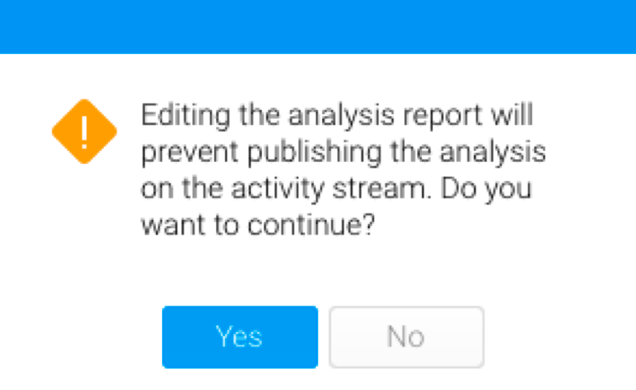
You will be taken to the Report builder, where you can view the reports and charts that you have selected.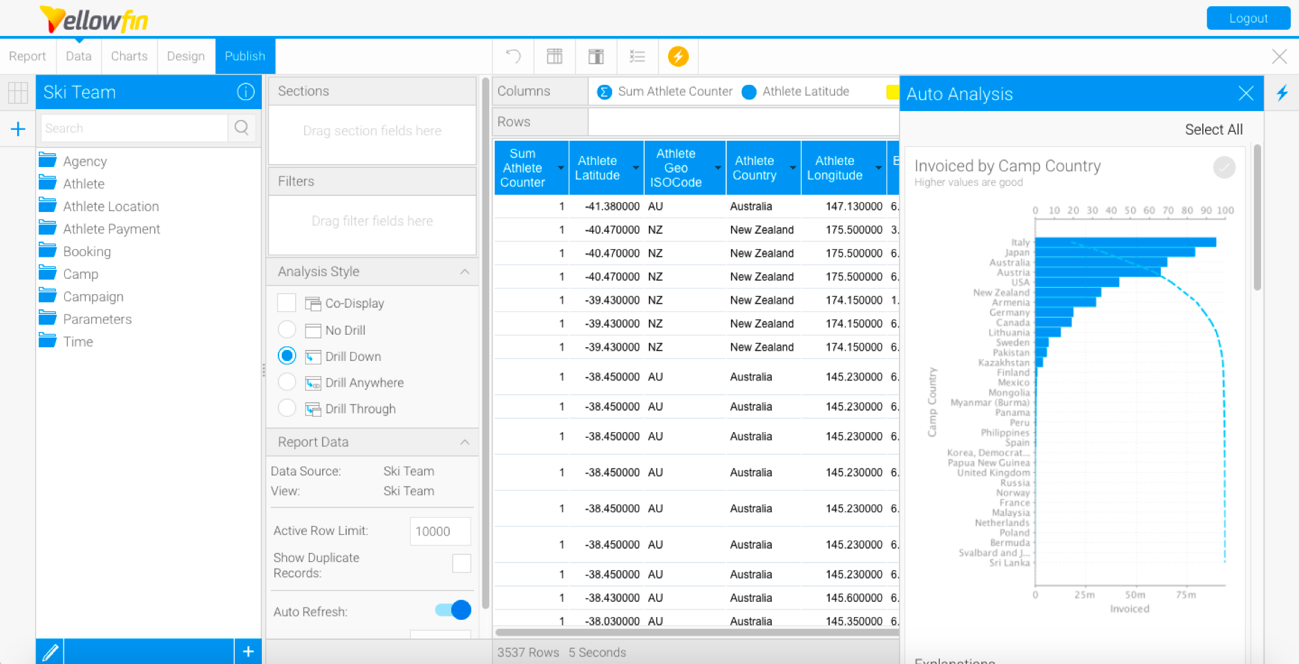
If you wish to make any changes to the reports, you can do that here.
- Click the Yes button to continue
The report builder will be displayed, allowing you to view and edit the report produced by Yellowfin based on your selected insights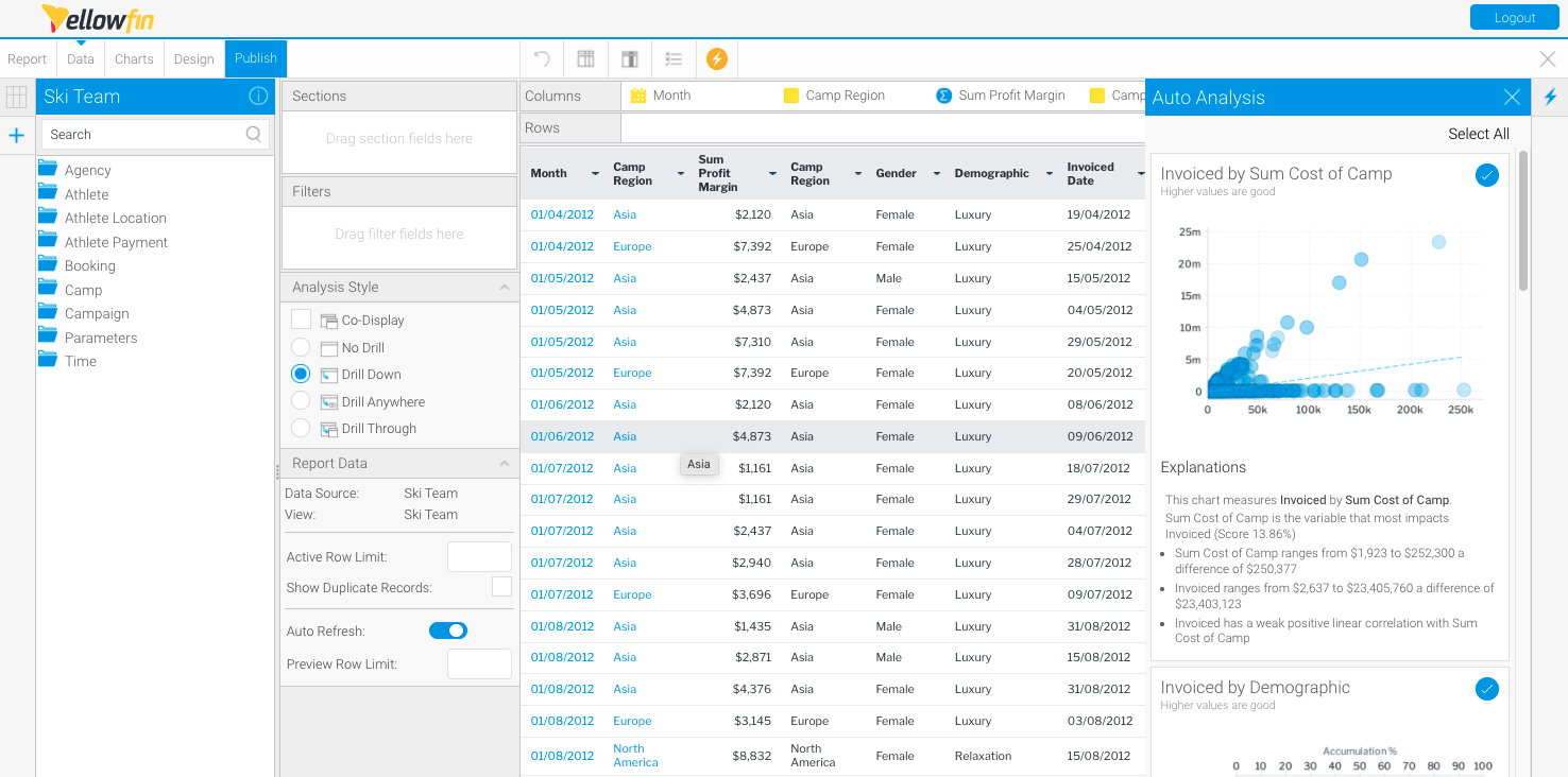
To see an enlarged version of a chart and clear narratives, simply click on it.
Note: To close the Auto Analysis panel, simply click on the Insightsbutton on the right-hand side of the screen.
To update charts, click on the Charts button to navigate to the Chart Builder.
You can edit the chart(s) further if you wish to.
You can click the Insights button to reopen the Auto Analysis panel at anytime on the report builder- Click on Charts in the toolbar to access the chart builder
The chart builder will be displayed, allowing you to view and edit charts produced by Yellowfin based on your selected insights
- To save your insights report, click the Publish button
Then save the new report by clicking on the Publish button.
Provide report details, and select it’s destination folder, and then click Save.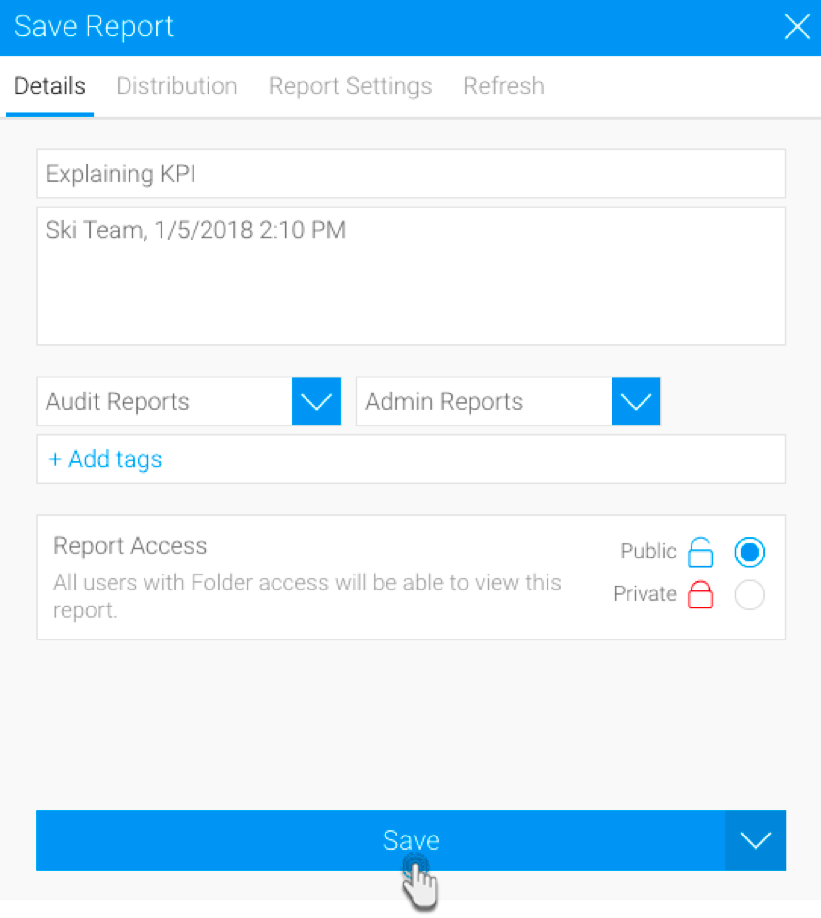
These reports and charts can now be used in the same way as any other Yellowfin reports.

| Styleclass | ||
|---|---|---|
| ||
Sharing
...
insights
Once insights appear in the Auto Analysis panel, you can save these to the activity stream to be used viewed later, or to share them with other users.
- Navigate to a dashboard
- Right-click on a chart element (a bar in a bar chart, or a data point), or hover your cursor over the element for 2 seconds to display the tooltip dropdown menu
- Click on Auto Analyze, then select Explain or Compare
The Auto Analysis panel will appear, displaying insight results in order of statistical relevance - Click on the round tick button
 in the top right-hand corner to select or deselect each insight you would like to share
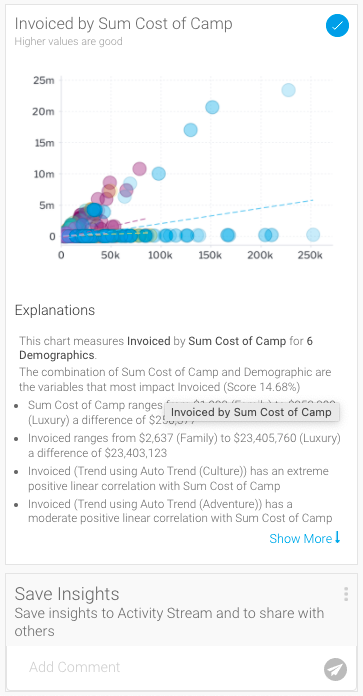
Note the Save Insights box - Choose the insights that you wish to save.
- Insights can be saved or shared using the Save Insights section at the bottom of the Auto Analysis Assisted Insights panel.

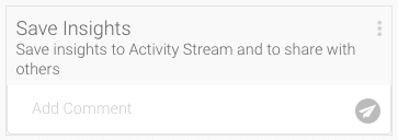
- Enter Add a comment .You can also attach a file by using the attachment icon.
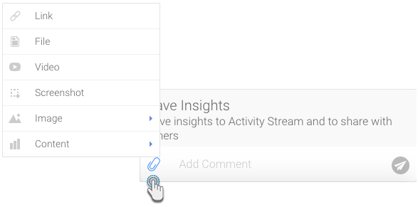
Then click on the send icon.
This will be added to the activity stream of the chart or dashboard. (For more information on the activity stream, click here.)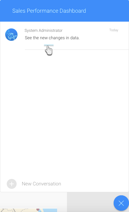 and click the Send
  buttonto post your insights to your timeline
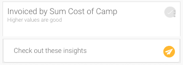
Your insights will be displayed on your timeline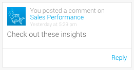
- Click on this comment to view the saved insights in the activity stream.
| Styleclass | ||
|---|---|---|
| ||
...
| Anchor | ||||
|---|---|---|---|---|
|
Limitations
This functionality is currently unsupported Instant Insights is not supported for the following chart types.
...
| Chart | Type |
|---|---|
Auto |
...
Any chart with more than one |
...
dimension in the X or Y |
...
axes. |
Analytical |
...
| |
Area | Stacked Area. |
Bar |
|
Column |
...
|
...
|
...
|
Financial |
...
All types. | |
Line | Z- |
...
Chart. | |
Map | All types |
...
. |
...
Meter | All types |
...
. |
Special purpose |
...
|
...
|
...
|
| Styleclass | ||
|---|---|---|
| ||
...