In this section we will look into the features and functionalities available on the different screens of our iOS app.
Note
Some of these functionalities are not made available for iOS phones, due to their compact size.
Anchor
homescreen
homescreen
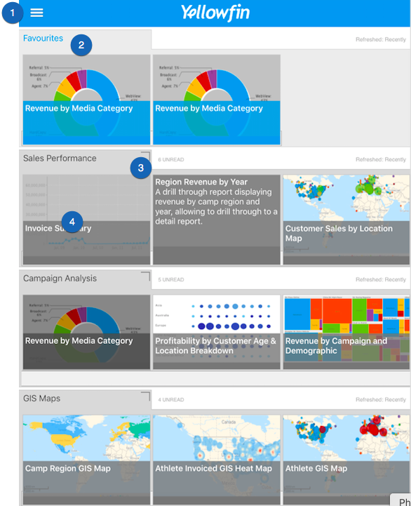
Navigating the Home Screen
Upon successfully logging in to your Yellowfin app, the first screen you will view is the app's home screen. This is what it looks like:
Section
Column
width
30
Column
No.
Features
Description
1.
Main menu
Expands to reveal the main navigation menu of this app. See below for further information on this.
2.
Favourites
A separate panel that shows all the reports and charts that have been marked as favourite.
3.
View dashboard
The icon at the top-right edge of a dashboard thumbnail is used to view that dashboard.
4.
View reports and charts
You can also directly view a report or chart by tapping on one.
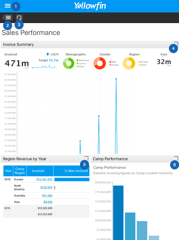
Understanding the Dashboard Features
Here's a quick look at the different features available on a specific dashboard.
Section
Column
width
30
Column
No.
Features
Description
1.
Main menu
Expands to reveal the main navigation menu of this app. See below for more details on this menu.
2.
Home screen
This button will return you to the home screen.
3.
Refresh
Use this button to refresh your dashboard.
4, 5, 6.
View reports and charts
These icons at the edge of each report or chart are used to view their details, as well as perform other functionalities on them.
Anchor
reportscreen
reportscreen
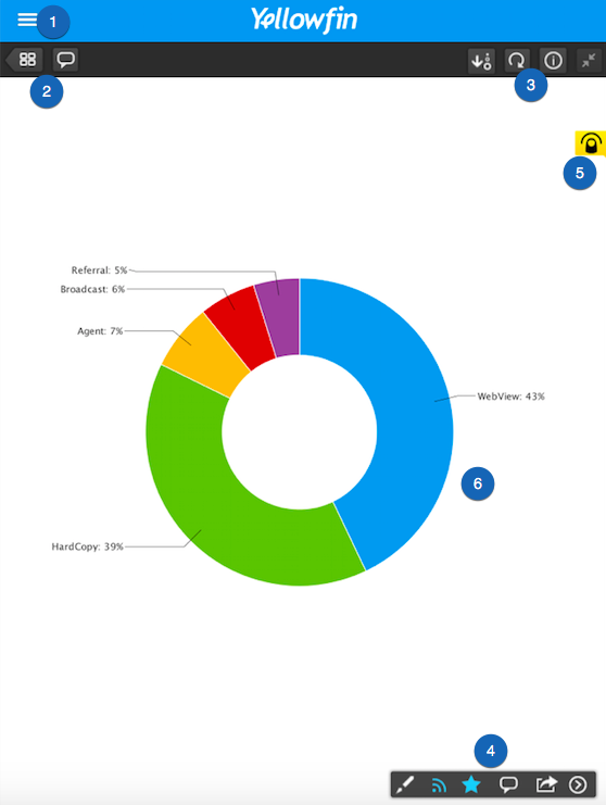
A Look into the Report Detail Screen
Click on a report or a chart to view its details, and a look at the range of features offered. Here's an example of what it looks like, along with a description of its features.
Section
Column
width
30
Column
No.
Features
Description
1.
Main menu
Reveals the main menu of the app. See below to learn more about this.
2, 3, 4.
Report icons
These icons allow you to perform different functions on the report. Click here to learn more about these.
5.
Drill through alert
This icon alerts you to the fact that this report contains drill through information.
6.
Report/Chart
The report or chart itself.
Anchor
mainmenu
mainmenu
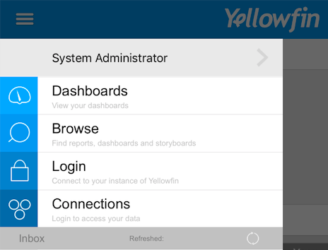
Main Menu
Click on the main menu icon on the left side, to see the features of this menu. Here's what it looks like when expanded:
Section
Column
width
25
Column
Features
Description
User profile
Click on your user name to view your profile. Through this feature, you can also update your avatar, username and/or password.
Dashboards
This redirects you to the home screen with all the dashboards.
Browse
Use the browse screen to search for dashboards, storyboards and reports.
Login
This feature is used to log in to the app. You can use it to log in as another user if you have multiple accounts.
Connections
Use this button to establish connections to your Yellowfin instances.
Anchor
reporticons
reporticons
Report Icons
There are various report icons, located on the report screen, that lets you perform different reporting functionalities.
Note
Note that not all icons will appear for all reports. Some only appear if a certain functionality is included in the report.
Icon
Features
Description
Dashboard
Returns you to the main dashboard screen.
Comments
Displays report comments and replies. Use this to add new comments too.
Filter
Shows report filter fields, if there are any added.
Map layers
Shows data layers on a GIS map, if any are included.
Time slider
Displays a time slider to filter the report according to time.
Sort
To sort the report in an ascending or descending order.
Refresh
To refresh the report.
Information
Brings up an information panel on the report.
Expand/Shrink
Shrinks the report screen to make a dashboard panel appear on the side. Click on it again to expand the report screen.
Draw
To draw on the report.
Subscribe
To subscribe to the report, so you could receive its copies with updates.
Favourite
To mark the report as a favourite item.
Share
To share or distribute the report.
Next page
To move to the next page on the report, if there are more than one pages.