Page History
| Anchor | ||||
|---|---|---|---|---|
|
| Table of Contents | ||
|---|---|---|
|
...
Yellowfin offers a range of out-of-the-box actions that can be assigned to a button. These include:
...
are
...
:
- Ask a Question
- Go to Report
- Go to URL
- Go to Sub Tab
- Next Sub Tab
- Previous Sub Tab
- Reset Filters
- Reset Dashboard Refreshes the dashboard by clearing any user interactivity performed on it, as well as removing all applied filters.
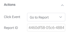
- Go to report: Navigates users to a specified report. This report can be specified by providing its report UUID.
- Go to sub tab: Navigates to any sub tab in the same dashboard, where the sub tab is specified by its order number. For example to jump to the forth sub tab, enter 4 in the sub tab # field.
- Go to URL: Navigates to an external link or page using the specified URL. You can also choose to open the new link in a new tab or window or in the current window.
Scroll down to the Action Button properties table for more information on these.
...
- Click on the Widgets button on the left.
- In the list that appear, expand the Buttons section. A selection of pre-designed buttons will appear.
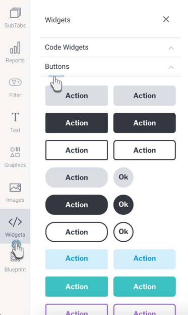
- Drag any design you prefer (you can further customize it) onto your canvas.
- Then in the button’s property panel, expand the Actions section, and select a click event for this button. Yellowfin offers multiple types of events a button could trigger upon click, however users may also define a custom event via Code Mode.
- Provide any additional information if your selected event requires it. For example, enter the UUID of the report to navigate to, if the Go To Report action is selected.
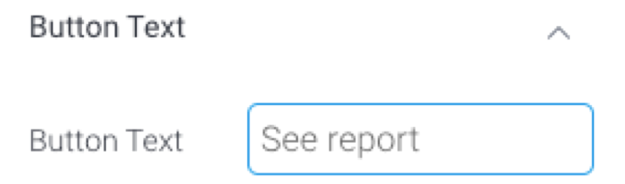
- To change the text that appears on the button, expand the Button Text section, and update the text. Ensure this reflects the action you want your users to perform.
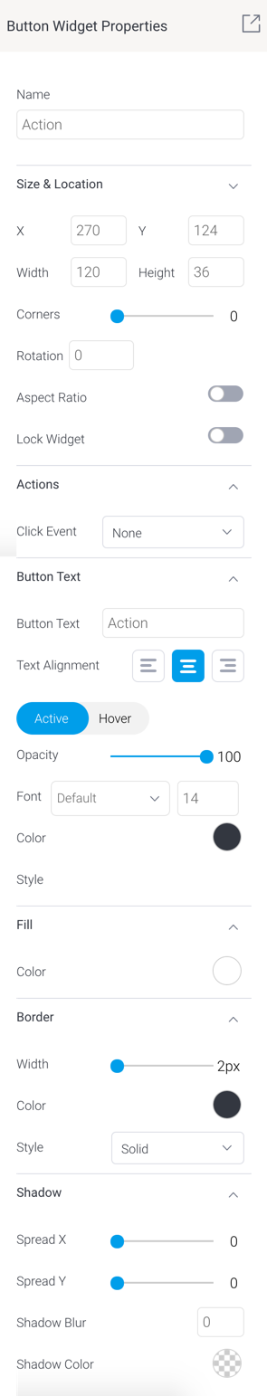
- You may also further customize the button, including rendering a different style for when a user hovers over the button. See the section on button properties for a description on all customization properties.
- To test your button’s functionality, enter the Preview mode and use the action button on it.
| Styleclass | ||
|---|---|---|
| ||
| top |
...
Action Button properties
| Section | ||||||||||||||||||||||||||||||||||||||||||||||||||||||||||||||||||||||||||||
|---|---|---|---|---|---|---|---|---|---|---|---|---|---|---|---|---|---|---|---|---|---|---|---|---|---|---|---|---|---|---|---|---|---|---|---|---|---|---|---|---|---|---|---|---|---|---|---|---|---|---|---|---|---|---|---|---|---|---|---|---|---|---|---|---|---|---|---|---|---|---|---|---|---|---|---|---|
| ||||||||||||||||||||||||||||||||||||||||||||||||||||||||||||||||||||||||||||
| Styleclass | ||
|---|---|---|
| ||
| top |
...