Page History
...
| Table of Contents | ||
|---|---|---|
|
Overview
| Styleclass | ||
|---|---|---|
| ||
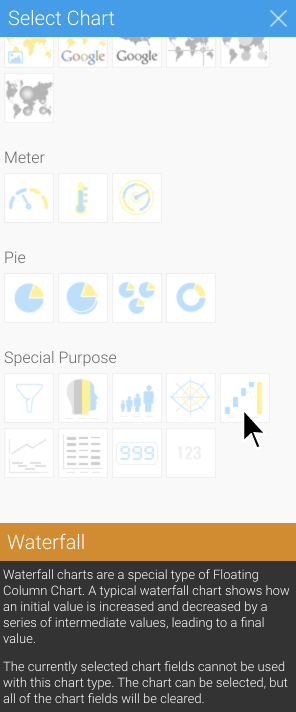
Waterfall charts are a special type of Floating Column Chart. A typical waterfall chart shows show how an initial value is has increased and/or decreased by a series of intermediate values, leading to a final value.
...
Waterfall chart data options
Option | Description |
|---|---|
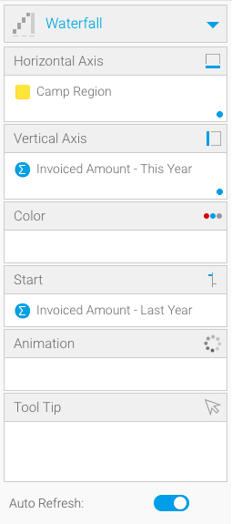
Horizontal Axis | Must be a dimension. This is the category label for the X axis. |
Vertical Axis | Typically a numeric value such as $. An item that you want to measure on your Chart |
...
Must be a metric. This is the category label for the Y axis. | |
| Color | Can be a metric or a dimension. The color field must match the horizontal axis field when a dimension is used. |
| Start | Must be a metric. This option configures the starting value of the chart. |
| Animation | Must be a date or time field. |
Formatting options
Start column
The start column features unique formatting options. For more information, refer to the Chart Formatting page.
Total column
The total column features unique formatting options. For more information, refer to the Chart Formatting page.
| Styleclass | ||
|---|---|---|
| ||
...
Summary
In order to set up a Waterfall Chart you will need:
- Create a report with chart display
- Select a field to use as the Horizontal Axis
- Select a field to use as the Vertical Axis
- Create your chart, selecting Proportional Infographic as the type under the Special Purpose heading
- Provide the Horizontal Axis and Vertical Axis options
- Customise the Chart as required
- Proceed to the Output step
- Save your report
...
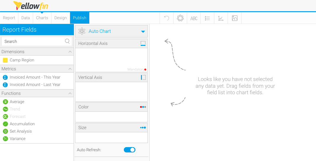
Creating a waterfall chart
- Create a new Report
Use your mouse to drag your data from the left panel to the Columns, Sections and Filters fields
Waterfall charts require one dimension and at least one metric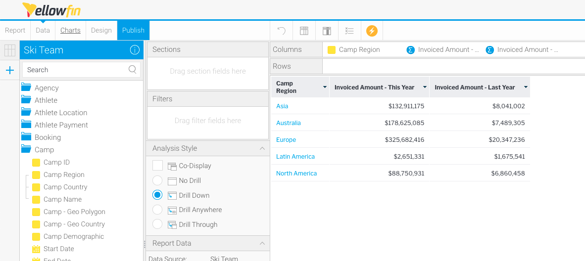
- Click Charts to create your chart
- Click Auto Chart, then click Select Chart Type
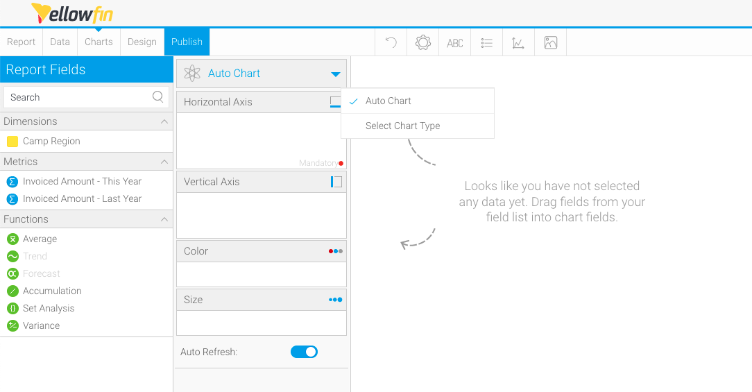
The Select Chart panel will slide in from the right-hand side of the page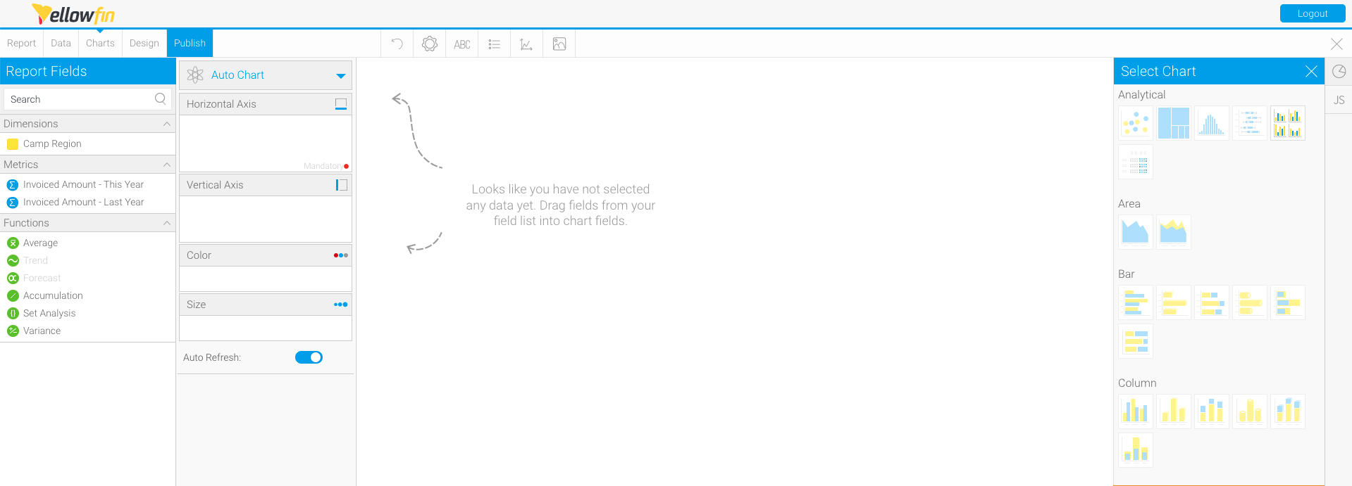
- Scroll on the Select Chart panel until you reach Special Purpose charts, and click Waterfall as the chart type
- Use your mouse to drag a dimension from the left panel to the Horizontal Axis field
- Use your mouse to drag a metric from the left panel to the Vertical Axis field
The chart will render automatically once your data is selected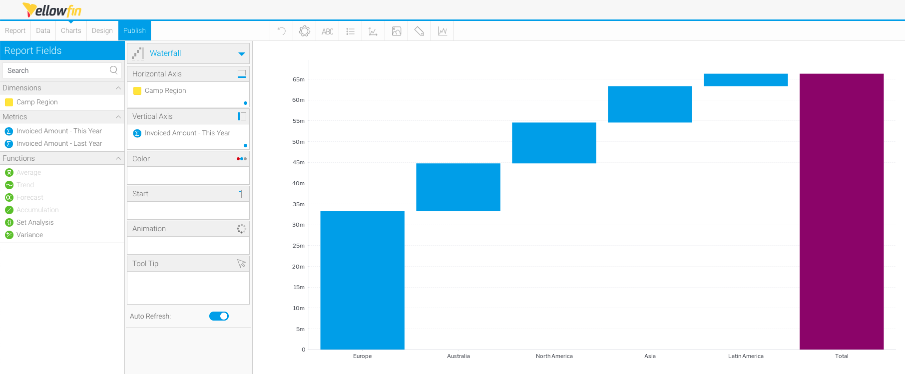
- To add a start column to the chart, use your mouse to drag a metric to the Start field
The chart will re-render automatically once your data is selected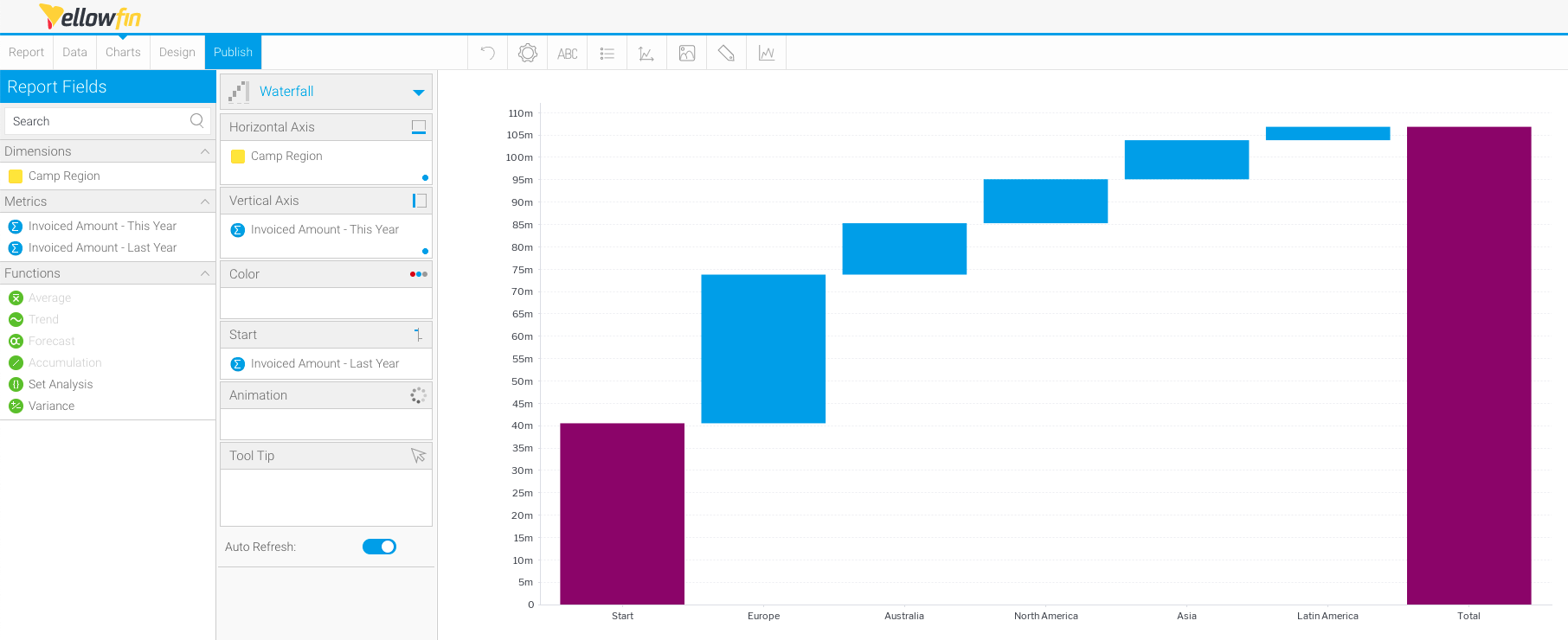
| Styleclass | ||
|---|---|---|
| ||
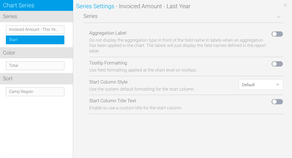
Adding start and total columns
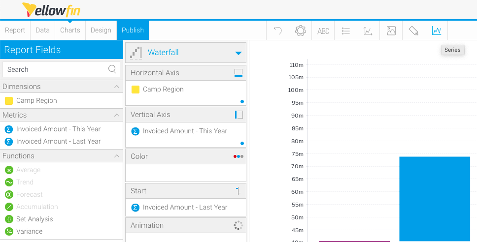
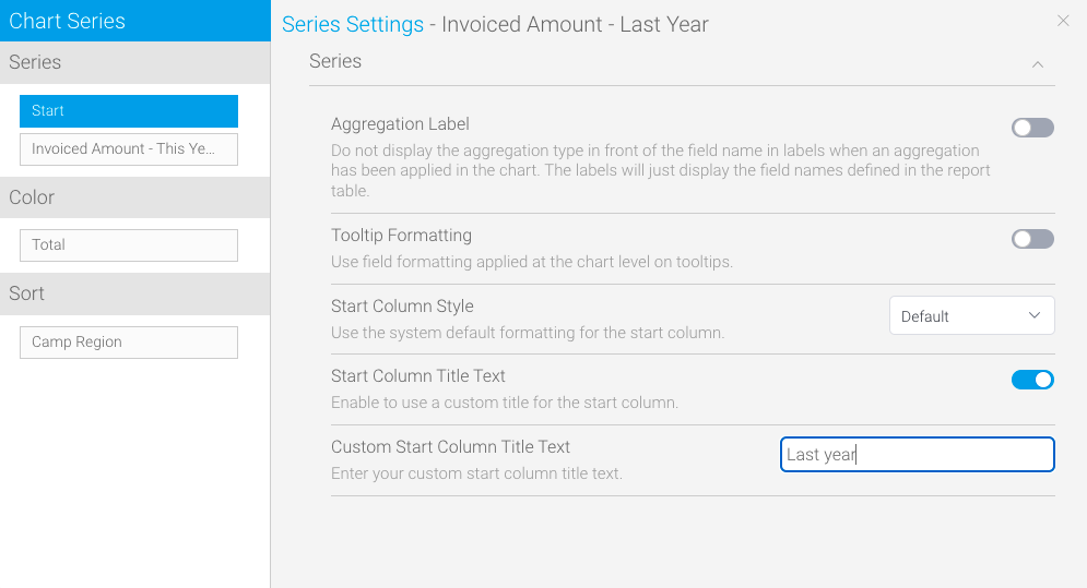
- Click on the Series tool in the toolbar
- Click on Start in the left column, and toggle on the Start Column Title Text to customize the start column title
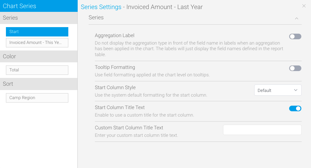
- Click on the text entry field to add your custom title
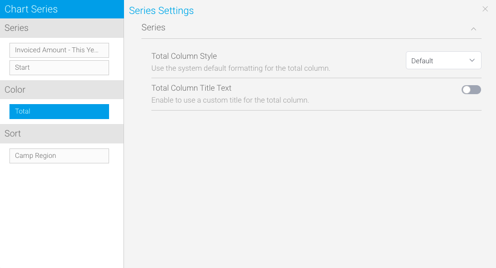
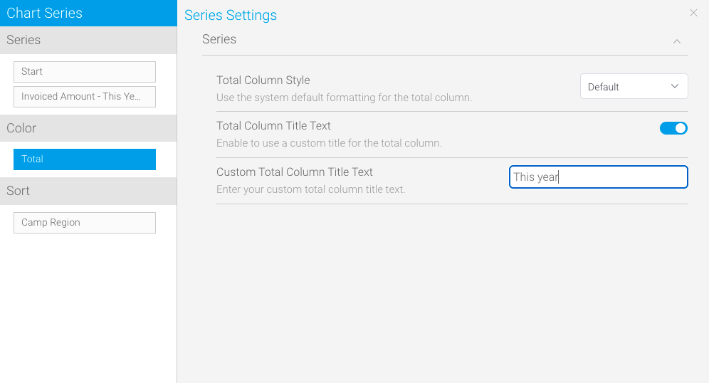
- Click on Total in the left column, and toggle on the Total Column Title Text to customise the total column title
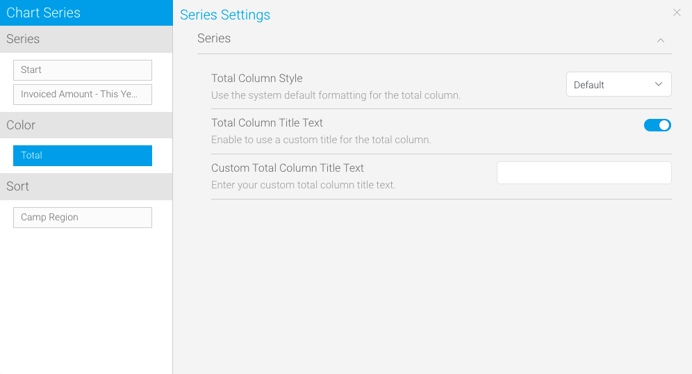
- Click the text entry field to add your custom title
- Close the Series Setting panel by clicking the X in the top-right corner
The chart will re-render automatically and display the custom start and total column titles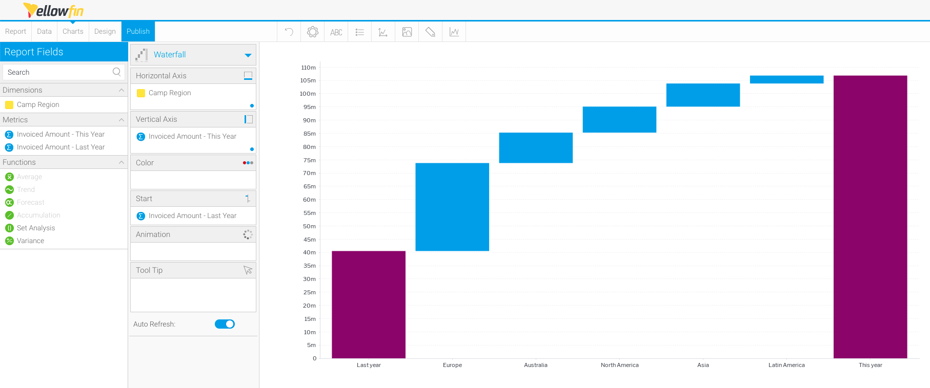
| Styleclass | ||
|---|---|---|
| ||
...