Page History
| Anchor | ||||
|---|---|---|---|---|
|
Overview
| Styleclass | ||
|---|---|---|
| ||
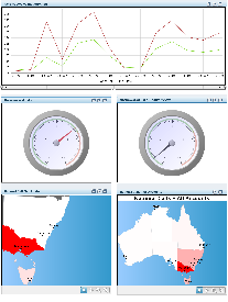
Yellowfin's dashboard allows you to display all key reports on a single page, using tabs to organise by subject and type. The tab feature also allows you to search your public repository for enabled reports and add them to a selected tab, or grant access to pre-built public tabs.
| HTML |
|---|
<iframe width="700" height="394" src="https://www.youtube.com/embed/3pClzgzOZRA?color=white" frameborder="0" allowfullscreen></iframe> |
The following image displays the main features of the dashboard:
...
| Section | ||||||||||
|---|---|---|---|---|---|---|---|---|---|---|
|
| horizontalrule |
|---|
| Styleclass | ||
|---|---|---|
| ||