Page History
...
| Expand | ||||
|---|---|---|---|---|
| ||||
|
| Expand | ||||||||||||
|---|---|---|---|---|---|---|---|---|---|---|---|---|
| ||||||||||||
|
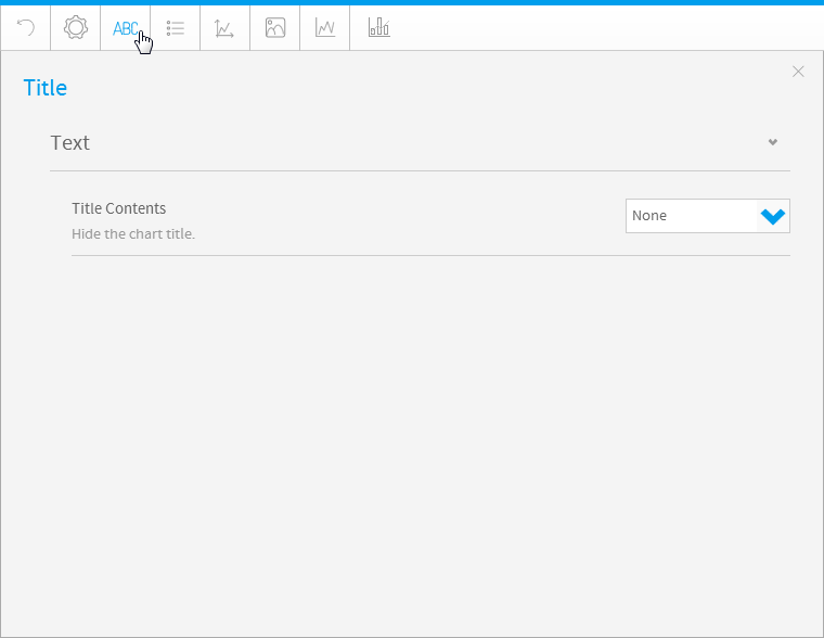
Title
| Styleclass | ||
|---|---|---|
| ||
| Expand | ||||||||
|---|---|---|---|---|---|---|---|---|
| ||||||||
|
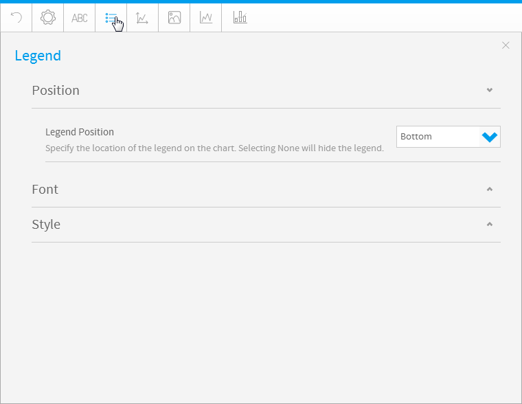
Legend
| Styleclass | ||
|---|---|---|
| ||
| Expand | ||||
|---|---|---|---|---|
| ||||
|
| Expand | ||||
|---|---|---|---|---|
| ||||
|
| Expand | ||||||||||
|---|---|---|---|---|---|---|---|---|---|---|
| ||||||||||
|
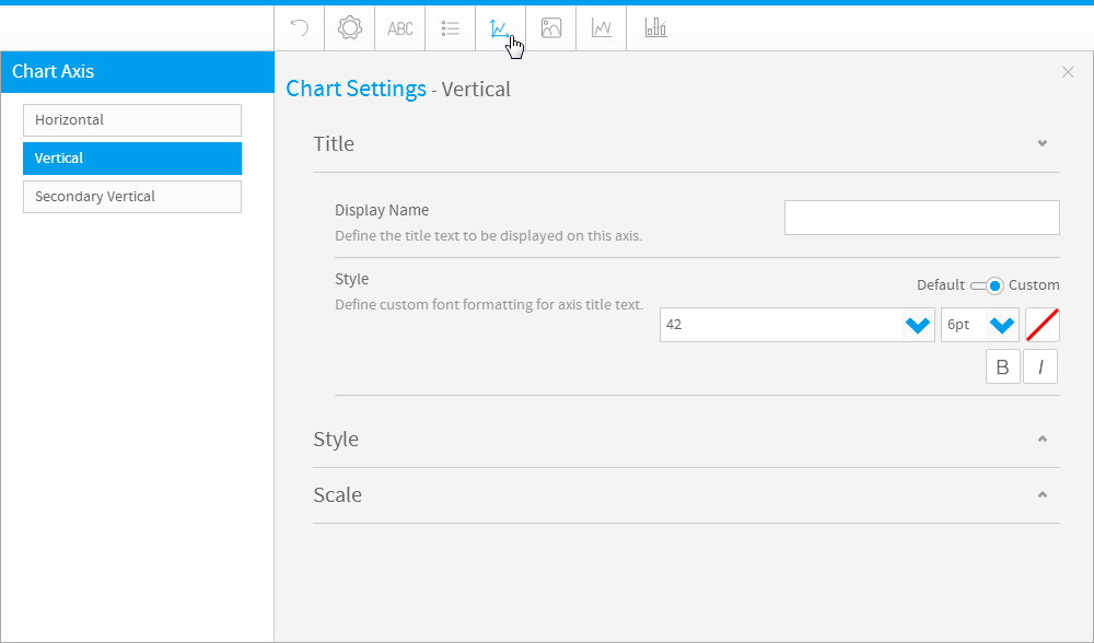
Axis
| Styleclass | ||
|---|---|---|
| ||
| Expand | ||||||
|---|---|---|---|---|---|---|
| ||||||
|
| Expand | ||||||||||||||||||||||||||||||||||||||
|---|---|---|---|---|---|---|---|---|---|---|---|---|---|---|---|---|---|---|---|---|---|---|---|---|---|---|---|---|---|---|---|---|---|---|---|---|---|---|
| ||||||||||||||||||||||||||||||||||||||
The Axis style drop down lets you determine the formats to be applied to axis.
|
| Expand | ||||||||||||
|---|---|---|---|---|---|---|---|---|---|---|---|---|
| ||||||||||||
The Axis scale drop down lets you determine the scale dimensions. Generally you will only be able to set the Y Axis attributes – unless you are using XY charts in which case you can set both X & Y attributes.
|
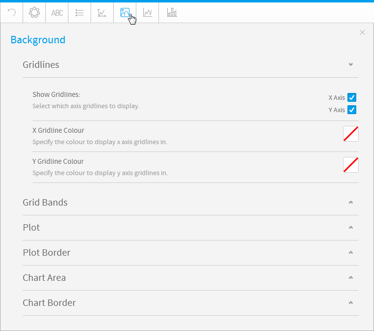
Background
| Styleclass | ||
|---|---|---|
| ||
| Expand | ||||||||
|---|---|---|---|---|---|---|---|---|
| ||||||||
Gridline options are available for all category charts, bubble and scatter charts.
|
| Expand | ||||||
|---|---|---|---|---|---|---|
| ||||||
Gridline options are available for all category charts, bubble and scatter charts.
|
|
| Expand | ||||||||||||
|---|---|---|---|---|---|---|---|---|---|---|---|---|
| ||||||||||||
|
| Expand | ||||||||
|---|---|---|---|---|---|---|---|---|
| ||||||||
|
Title
| Styleclass | ||
|---|---|---|
| ||
| Expand | ||||||||
|---|---|---|---|---|---|---|---|---|
| ||||||||
|
Legend
| Styleclass | ||
|---|---|---|
| ||
| Expand | ||||
|---|---|---|---|---|
| ||||
|
| Expand | ||||
|---|---|---|---|---|
| ||||
|
| Expand | ||||||||||
|---|---|---|---|---|---|---|---|---|---|---|
| ||||||||||
|
Axis
| Styleclass | ||
|---|---|---|
| ||
| Expand | ||||||
|---|---|---|---|---|---|---|
| ||||||
|
| Expand | ||||||||||||||||||||||||||||||||||||||
|---|---|---|---|---|---|---|---|---|---|---|---|---|---|---|---|---|---|---|---|---|---|---|---|---|---|---|---|---|---|---|---|---|---|---|---|---|---|---|
| ||||||||||||||||||||||||||||||||||||||
The Axis style drop down lets you determine the formats to be applied to axis.
|
| Expand | ||||||||||||
|---|---|---|---|---|---|---|---|---|---|---|---|---|
| ||||||||||||
The Axis scale drop down lets you determine the scale dimensions. Generally you will only be able to set the Y Axis attributes – unless you are using XY charts in which case you can set both X & Y attributes.
|
Background
| Styleclass | ||
|---|---|---|
| ||
| Expand | ||||||||
|---|---|---|---|---|---|---|---|---|
| ||||||||
Gridline options are available for all category charts, bubble and scatter charts.
|
| Expand | ||||||||||||
|---|---|---|---|---|---|---|---|---|---|---|---|---|
| ||||||||||||
Gridline options are available for all category charts, bubble and scatter charts.
| ||||||||||||
| Expand | ||||||||||||
| ||||||||||||
The plot area is the area bounded by the axes, including all data series. The drop down options let you set the background colours applied to the plot area.
|
| Expand | ||||||||||||
|---|---|---|---|---|---|---|---|---|---|---|---|---|
| ||||||||||||
The plot area is the area bounded by the axes, including all data series. The drop down options let you set the background colours applied to the plot area.
|
| Expand | ||||||||||||
|---|---|---|---|---|---|---|---|---|---|---|---|---|
| ||||||||||||
The plot area is the area bounded by the axes, including all data seriesThe entire chart and all its elements are described as the chart area. The drop down options let you set the background colours applied to the chart plot area.
| ||||||||||||
| Expand | ||||||||||||
| ||||||||||||
|
| Expand | ||||||||||
|---|---|---|---|---|---|---|---|---|---|---|
| ||||||||||
The The entire chart and all its elements are described as the chart area. The drop down options let you set the background colours applied to the chart area.
|
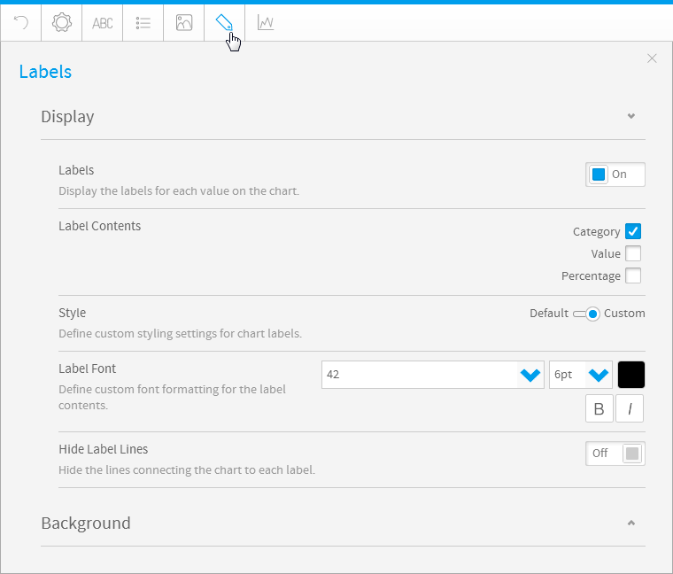
Labels
| Styleclass | ||
|---|---|---|
| ||
|
| Expand | |||||||||||||
|---|---|---|---|---|---|---|---|---|---|---|---|---|---|
| |||||||||||||
The entire chart and all its elements are described as the chart area. The drop down options let you set the background colours applied to the chart area. | |||||||||||||
| Expand | |||||||||||||
| title | Display
|
| Expand | ||||||||||||||||
|---|---|---|---|---|---|---|---|---|---|---|---|---|---|---|---|---|
| ||||||||||||||||
|
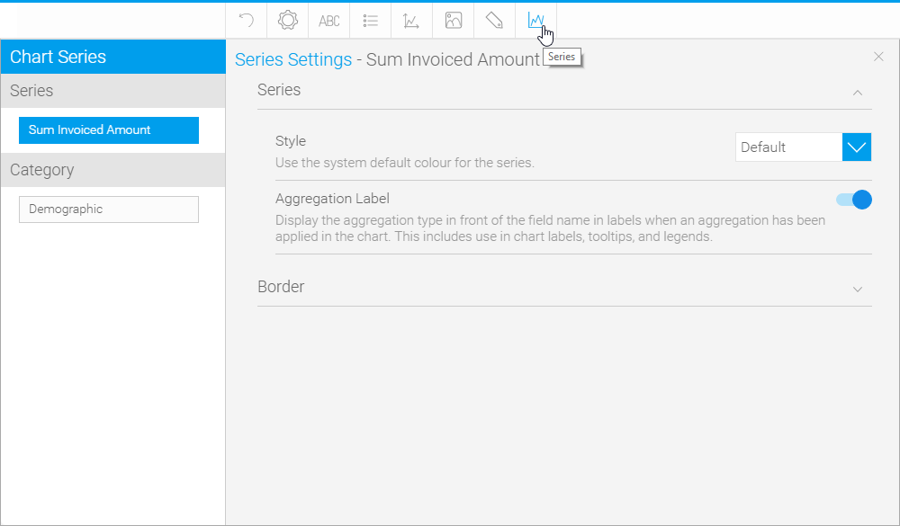
Series
| Styleclass | ||
|---|---|---|
| ||
|
Labels
| Styleclass | ||
|---|---|---|
| ||
| Expand | ||||||||||||
|---|---|---|---|---|---|---|---|---|---|---|---|---|
| ||||||||||||
|
| Expand | ||||||||||||||
|---|---|---|---|---|---|---|---|---|---|---|---|---|---|---|
| ||||||||||||||
| Expand | ||||||||||||||
| ||||||||||||||
| ||||||||||||||
| Expand | ||||||||||||||
| ||||||||||||||
|
Series
| Styleclass | ||
|---|---|---|
| ||
Series
| Expand | ||||||||||||||
|---|---|---|---|---|---|---|---|---|---|---|---|---|---|---|
| ||||||||||||||
|
| Expand | ||||
|---|---|---|---|---|
| ||||
|
|
| Expand | ||||||
|---|---|---|---|---|---|---|
| ||||||
|
| Expand | ||||||||||
|---|---|---|---|---|---|---|---|---|---|---|
| ||||||||||
|
| Expand | ||||
|---|---|---|---|---|
| ||||
|
| Expand | ||||||||||
|---|---|---|---|---|---|---|---|---|---|---|
| ||||||||||
|
Category
| Expand | ||||||||
|---|---|---|---|---|---|---|---|---|
| ||||||||
|
| Expand | ||||||||||
|---|---|---|---|---|---|---|---|---|---|---|
| ||||||||||
| ||||||||||
| Expand | ||||||||||
| ||||||||||
Wiki Markup | |
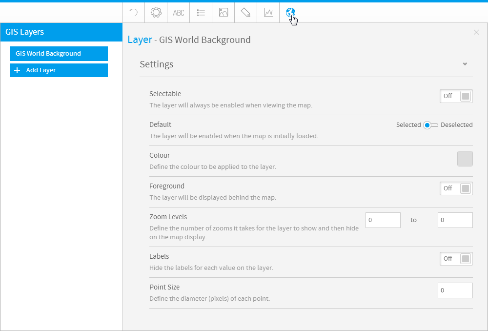
GIS Settings
| Styleclass | ||
|---|---|---|
| ||
...