Page History
| Table of Contents | ||
|---|---|---|
|
Section Overview
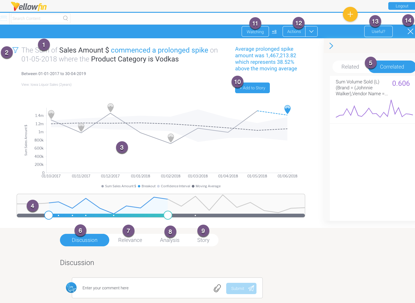
Open a Signal alert to explore its analysis in detail. (You can access this page via the Signal alert in your Timeline, or through the Signal list screen.) The main Signal is represented as an annotation in the time series chart. (See here for further info on this.) This section covers how to interact with a Signal’s detail page.
Below is an example of an outlier detection signal. Note that the main Signal chart and some other details will differ according to the different types of Signals.

Number | Signals function |
|---|---|
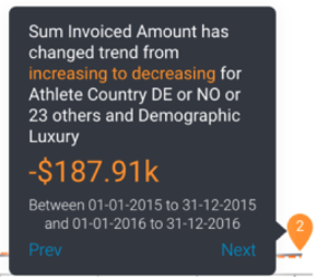
1 | The auto generated narrative describes the nature of the Signal, along with the time window in which it occurred. Tip: Color foreshadowing is applied to highlight good (as blue) or bad (orange) results. |
| 2 | This filter icon shows that this Signal is filtered, meaning it’s a result of a subset of the filtered data. Click on it to view the filter values. |
3 | This is the Signal time-series chart that shows the history of the specific metric - dimension combination. It displays the main Signal annotation, along with other related Signals that have occurred during that time line. You can use the annotations to learn about each of these Signals, and even explore the previous ones. (These time series charts will differ depending on the type of analysis.) Click here for more information. |
4 | The time slider that lets you expand or reduce the time window of the time-series chart. Signal annotations appearing in the time series chart are also visible in the time slider (presented as white dots). |
5 | This right side panel offers options to compare the main time-series chart with other related or correlated data charts. Click here to learn more. |
6 | The Discussion tab lets you leave comments and collaborate with other users on this Signal. |
7 | The Relevance chart depicts the importance of the Signals data in relation to all other data that the user has access to. |
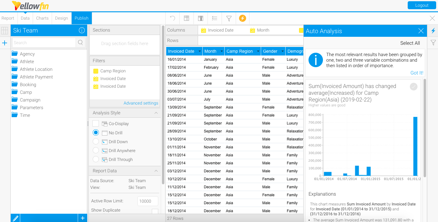
8 | The Analysis tab provides automatically-generated visualizations and narratives about possible underlying causes. Yellowfin Assisted Insights functionality is utilized here to perform additional analysis on the Signal to explain why a signal has occurred. |
9 |
You can write a Story to give a human context or perspective on the Signal, by yourself or invite another user to write one. Signal users will be able to read a published Story in this tab.
The Story tab displays all the stories that the current Signal’s main time series chart is added to; there could be any number of linked stories. Readers can read published stories, or if in draft mode, users with collaboration access can view or edit these stories. Note: |
Must have Yellowfin Stories to see this feature. Click here to learn more about it. | |
10 | The + |
Add to Story button takes a screenshot of the time series chart (in its current state) and adds it to |
a specified story. |
Learn more about this process below. Note: Must |
have Yellowfin Stories to see this feature. | |
11 | This Watch button lets you watch/unwatch the Signal. This adds the Signal to your watch list, and sends alerts when other users interact with this Signal. |
| 12 | This Actions buttons lets you perform a number of actions on this Signal, such as owning or assigning it, sharing it, dismissing or closing the Signal. These interactions are covered here in detail. |
13 | Rate the usefulness of the Signal. Click here to learn more. |
14 | Exit the Signals detail page. |
...
| Anchor | ||||
|---|---|---|---|---|
|
Signals time series chart
...

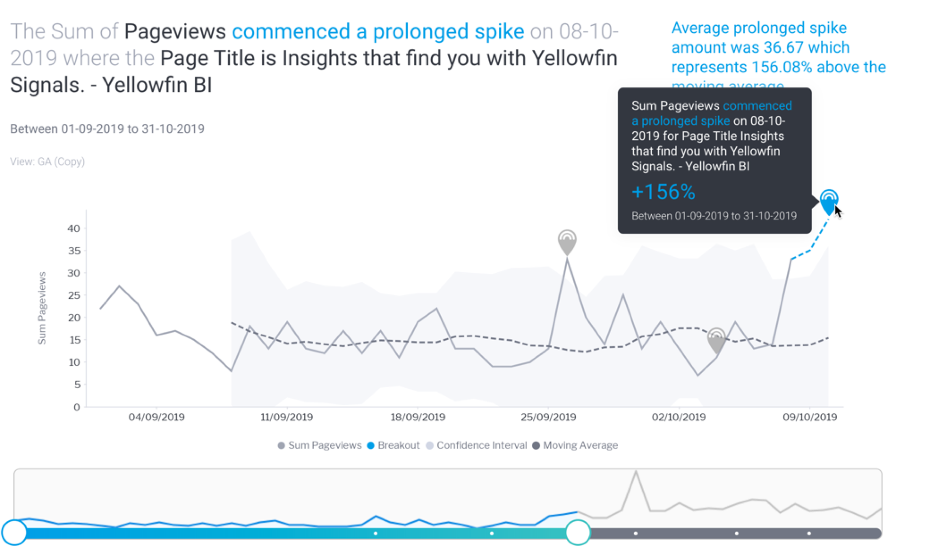
The Signal time-series chart shows the history of the specific metric - dimension combination. These time series charts will differ depending on the type of analysis.
Signal annotations
Main annotations
...
Hover over the main Signal annotation; this will bring up a tooltip that displays information on the Signal.

Other Signals annotation
Other previously generated Signals are also visible as annotations on the time series chart. These are Signals that occur in the same time window, for the same dimension granularity. You can view the detail of that signal by hovering over the signal annotation. You can click on the Explore button to open the Signal page for that Signal.

Chart analysis
The time series chart displays different types of analysis based on the nature of the Signal.
Moving Average
The moving average calculated for Signals follows a particular calculation, and therefore will be different from the moving average calculated on a report. This is because the Signal algorithms incorporate a smoothing mechanism to limit the impact of outlier values (such as Spike, Drops) on the shape of the moving average curve. So the curves are unlikely to ever look the same, especially in the presence of one or more outliers.
...
| Anchor | ||||
|---|---|---|---|---|
|
Compare Related or Correlated Charts
Yellowfin offers options to allow you to compare the main time-series chart with related or correlated data charts.
Related
...
Time-series line charts for other metrics from the same data view.
Correlated
...
...
The Signals engine looks at all of your data (in different views and databases) to see if there are data patterns similar to the current time series. This lets you know of possible relationships in your business, even if the matching patterns in data are not from the same data set, not even the same metrics or dimensions. These correlation lines will let you compare and explore these relationships in data. Clicking on a correlated line will bring it up on the main time series chart to show you the two lines together.
For admins: Correlation analysis can be disabled through algorithm parameters in Signals analysis configuration.
Note: The Related and Correlated data charts are placed in a specific order, the more closely related or correlated a chart to the Signal, the higher up in the panel it will be.
Correlation factor
The value in this panel shows the correlation factor against each correlated metric. This allows users to understand the strength of a correlation.
To understand how correlated a correlated chart is to the main signals data, the following rules apply:
- A value closer to 1 means it is more correlated.
- A value closer to 0 is less correlated.
- A value closer to -1 is oppositely correlated (that is, correlated but opposing each other).

Here's how to compare either of these charts:
- Bring up the panel on the right side, by clicking on the expand icon.


- You can hide this panel by clicking on the icon on its top-left corner.


- To compare related charts, click on any one of the charts under the Related section.
- Or click on Correlated, and select a chart from that section to compare with the main time-series chart.


- The chart line will appear on the main time-series chart for comparison.


...
| Anchor | ||||
|---|---|---|---|---|
|
...
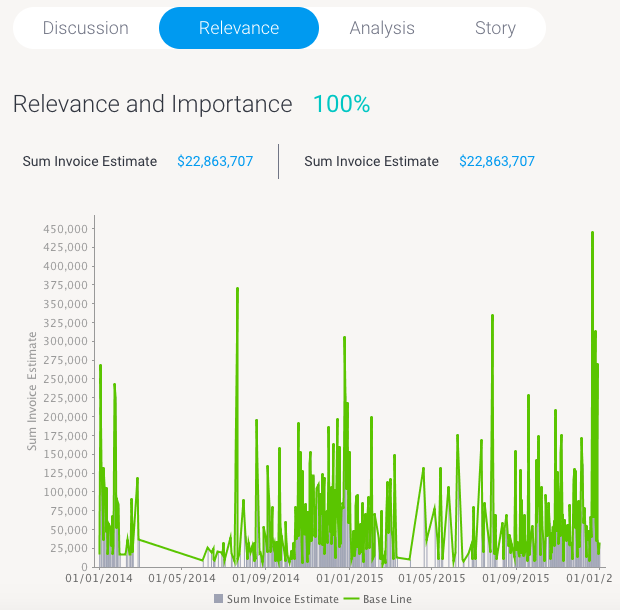
The Relevance chart compares the Signals time series data (in grey, that is the metric being analyzed (represented with grey lines) with that of the baseline data (in green lines). Baseline refers to the overall dataset in which the Signal is generated, along with any access filters if applied. If Signal filtering is applied, then the baseline will include these filters as well.
Note that Relevance information is not available where the metric being analyzed contains a mix of positive and negative signed values. However if all values are either positive or negative, then relevance will be calculated.
Click on the Relevance tab to understand the relevance and importance of this Signal in relation to all your other data.

...
| Anchor | ||||
|---|---|---|---|---|
|
...
The Yellowfin Assisted Insights provides an automated analysis of your data through visualizations and natural language narratives. It is used here to suggest the cause of a signal, and provide underlying reasons for why it occurred.


The automated analysis results are only provided if there is data available to generate useful results, otherwise a message will appear, providing the exact reasoning the analysis was not generated.


Draft of Analysis
...
- Click on the Open Draft Analysis button to view the automated analysis in the report builder. This always creates a separate draft version of the analysis report, meaning the original report will not be changed if you made alterations.
- Click Open when the pop up appears.

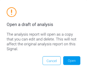
- The report will open in the report builder, ready to be updated or saved.

...
| Anchor | ||||
|---|---|---|---|---|
|
A Story on Signals
Create a Story on this Signal yourself, or assign someone to write one, to provide a full picture on why this insight occurred.
Note: If another user has already started a Story for this Signal, then you will not be able to contribute to this story, unless they invite you to. Collaborators and Authors will be able to view a draft Story by using the Open Story button.
Signal Stories
You can add the Signal chart to multiple Stories, and manage them via the Signals section.
Adding Signal to Story
- To If you want to embed the Signal chart into your a Story, click on the +Chart Add to Story button on the top-right corner.

When you’re ready to write a Story on your Signal, expand the Story tab, and click on Start Story.

- In the popup that appears, add the chart to an existing draft story by clicking on its Add to Story button.

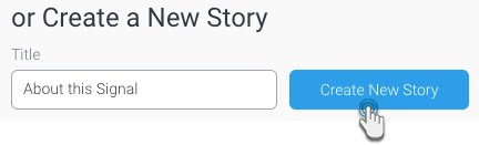
- Alternatively, you can also create a new story and add the chart to it. Enter a name for the story, and click the Create New Story button.
- On adding the chart to a story, the following popup will appear.
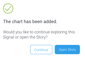
- You can either open the story now, or click Continue to stay on the Signals page (and work on the story later)You will be taken in to the Story builder, to work on your story. To learn more about Yellowfin Stories and how to create one, click here.Note: if you have already started the Story and haven’t published it yet, then this button will be labelled as Contribute to Story.
- When a story is published, it will appear in its entirety in this panel.
- To edit this story, you will have to locate it outside of this Signals page. The changes will need to be published before they can appear on the Signals page.
- If the Story is deleted, it will no longer appear on the Signals page. You can however, create a new Story for this Signal.
Request for a Story
You can even request another user to create a Story on the Signal, provided no one has already claimed this Story. Simply click on the Request Story button, and assign a task to a user, much as you would create any Yellowfin task. Note that the requester need not have the “create” Story role enabled, they will still be able to request for it.

...
| Anchor | ||||
|---|---|---|---|---|
|
Manage Stories
Click on the Story tab on a Signals page to view and manage each story that the current Signal chart is added to.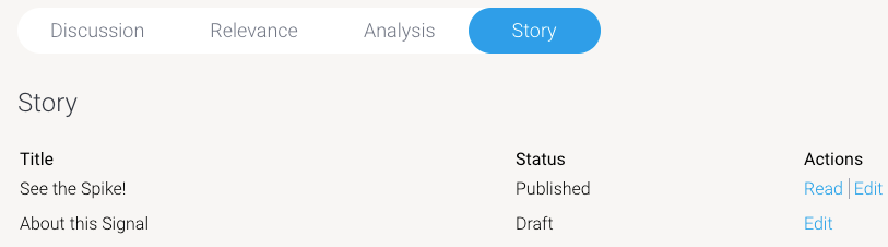
You can perform the following actions on these stories.
- Read - if the story is published (or in draft), click Read to open it.
- Edit - if a story is still a draft, and you have author, or colla