Page History
| Table of Contents | ||
|---|---|---|
|
| Anchor | ||||
|---|---|---|---|---|
|
Overview
This guide teaches how to perform Assisted Discovery through Yellowfin's Report Builder.
| Note |
|---|
Ensure that the user using this functionality has the correct security access function to do so. Click here to learn more about this. |
Procedure
...
| Info |
|---|
The Assisted Insights feature only works with standards reports; it doesn’t support cross-tab reports and sub query reports. When building a report for Assisted Insights, only add values to the columns section. |
allows Yellowfin to automatically generate charts and insights through the report builder. The feature is activated using the Smart Analysis button on the report builder toolbar when the required data is added to the columns fields. An Insight Wizard helps provide the context for the analysis, and uses that information to generate charts and explanations, as opposed to a manual data discovery process.
The Insight Wizard contains the following options:
| Option | Description |
|---|---|
| Explain Metric | Select this option to |
...
better explain a single metric. Yellowfin will identify related data that |
...
influences the chosen metric. |
...
|
...
from the next |
...
dropdown. | |
| Compare Metrics | Select this option to compare the values and drivers of two chosen metrics. |
...
| For example, |
...
| comparing Actual Revenue (metric) to Planned Revenue (metric). |
...
| Compare Dates |
...
Select this option to compare a single metric across two time periods. You will need to |
...
configure the following information using the dropdown menus:
|
...
|
...
|
...
For example, |
...
comparing Actual Revenue (metric) for Sales Date (date field) from this year to last year (time periods). |
...
...
| Compare Dimensions |
...
Select this option to compare a metric across two dimensions. You will need to |
...
configure the following information using the dropdown menus:
For example, |
...
comparing Invoiced Amount (metric) between Regions (dimension) Asia and Europe (dimension values). |
...
...
| Higher values are | Select whether higher numeric values are ‘good’ or ‘bad’ for the analysis result |
...
. For example, |
...
a higher profit margin value is typically good, but a high cost value is typically bad. | |
| Fields to Analyze | Select or |
...
deselect specific fields to |
...
narrow down |
...
the |
...
analysis |
...
. For example, remove any fields that are not likely to be relevant, such as Date of Birth. Removing fields can |
...
help to improve the processing time of your analysis |
...
. | |
Number of unique values allowed in a field | Set the maximum number of values for Yellowfin to include in the analysis. For example, setting the value at 500 for will only include the first 500 values for the selected fields. |
| Tip |
|---|
Assisted Discovery must be configured at the view level by an admin before making it available to users. |
| Tip |
|---|
Assisted Discovery can only be performed on standard reports with at least one metric and 2 dimensions. Cross-tab reports, sub query reports, and reports containing only dimensions are not supported. When building a report for Assisted Insights, only add values to the columns section. |
| Styleclass | ||
|---|---|---|
| ||
Using Assisted Discovery
Note: the Report Builder toolbar has been updated in recent versions of Yellowfin. Images in this section depict the legacy toolbar that was present in versions 9.12 and earlier.
This guide outlines how to perform Assisted Discovery when building reports.
Click the Create button and click Report to create a new report
Use your mouse to drag your data from the left panel to the Columns fields
To activate Assisted Discovery for a chart, select at least 1 metric and 2 dimensions
- Click on the Smart Analysis
 button on the report builder toolbar
The Insight Wizard dialog box will appear, allowing you to customize your discovery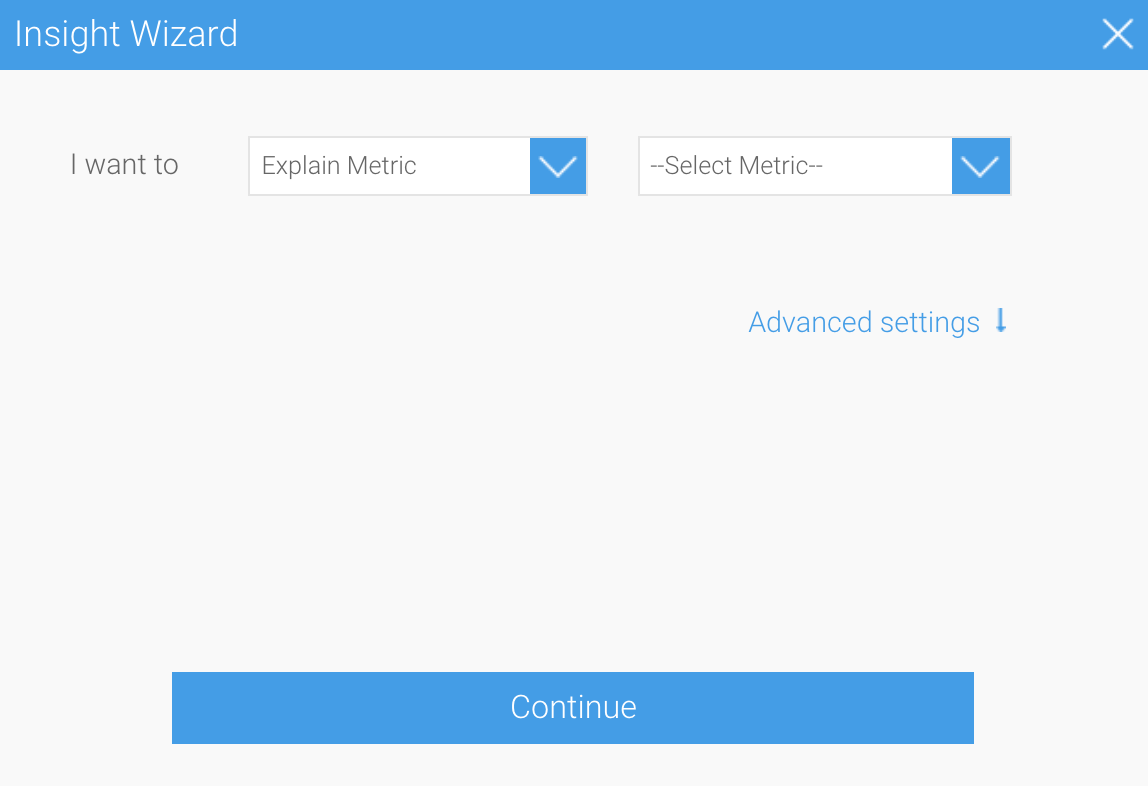
- From the left dropdown, select Explain Metric as the type of analysis you would like to perform
Selecting this option will allow Yellowfin to discover the drivers for a single metric, or compare metrics and dimensions to understand differences
- Expand the Advanced Settings option
The Insight Wizard allows you to apply additional preferences to your chart
- Click the Higher values are dropdown, and select Good to provide the context for Yellowfin that higher values in your data are considered to be desirable
- Select all fields within the Fields to Analyze box you would like Yellowfin to analyze
You can deselect or select any fields you to wish to either narrow down or expand the scope of the analysis - Set the maximum number of unique values allowed in the fields
In this case, we only want the first 500 unique field values included in the analysis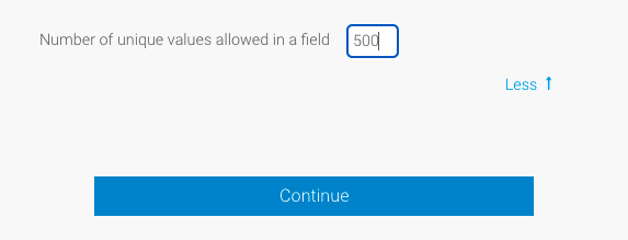
- Click on the Continue button to perform the analysis
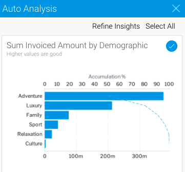
The Auto Analysis panel will appear in the report builder on the right-hand side of the screen, displaying the results of the analysis
Yellowfin will generate a natural language analysis, and also display the most appropriate charts for your insights (depending on the data)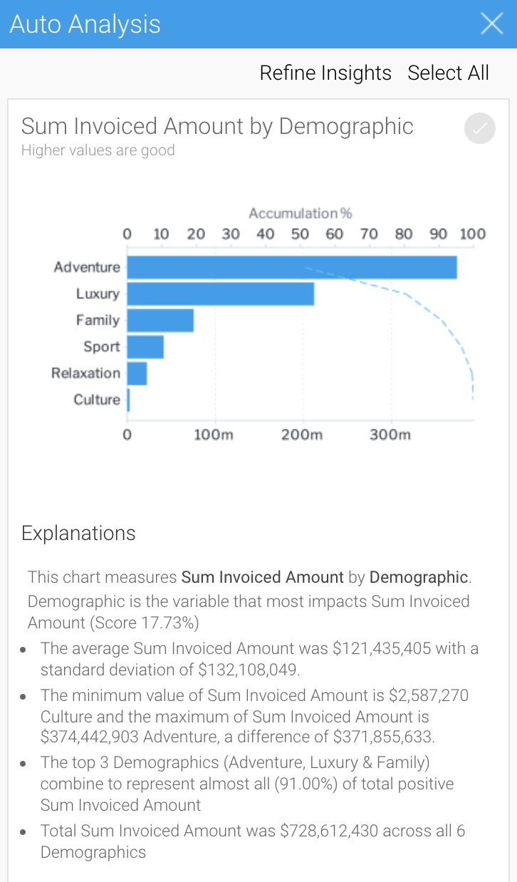
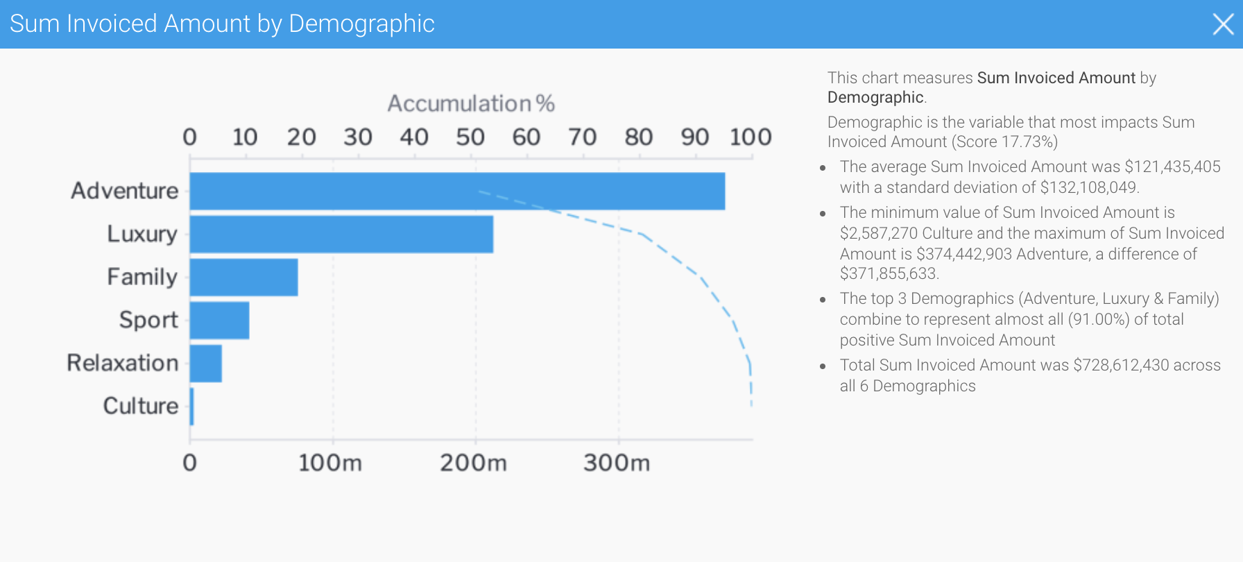
- Click on the chart to view an enlarged versions
- Click on the round tick button
 in the top right-hand corner to select or deselect each insight to save to the chart builder
You can Click on the de-select all button to remove all the fields from selection. - Or click on the select all button to choose them all.
- Click on the Continue button after providing the details.
- A narrative explanation is also provided with each of the charts, allowing you to better interpret the results of the analysis.
- You can also click on a chart to see an enlarged version of it in a popup.
To select a chart to add it to the Chart Builder, click on its selection icon. You can include multiple charts in your report this way. Or select all of them by using the Select All option.
You can also go back to the Insights Wizard to choose a different type of analysis option by clicking on the Refine Insights button.
Once you have selected the charts you want to keep, proceed to the Chart Builder by clicking on the Charts button in the toolbar.
- Your chosen charts will already be there.
- Click Charts in the toolbar to proceed to the chart builder
The chart builder will be displayed, allowing you to view and edit the charts you selected from the Auto Analysis panel
You can view any You can still view the unselected automated charts by clicking on the insights icon Insights button on the right-hand side of the screen.
These charts can now be used to build and publish reports in the normal way.

A new Auto Analysis panel will appear in the report builder, displaying the results of the analysis process. These insight results will be generated based on the options that you selected in the previous step; and will be displayed in order of statistical relevance.
| Note |
|---|
The chart type selected by Yellowfin depends on the type of data. For example, if the values are both metrics, then a scatter plot graph will be generated. |


You have now
...
created relevant report content with a fraction of the effort it would normally take to analyze data and build reports. These charts can be used to build and publish reports in the usual way.
...
If you choose to re-run the Assisted Discovery process, the charts from the previous analysis will be removed from the Auto Analysis panel
...
, but will remain
...
in the
...
chart builder
...
.
| Notetip |
|---|
On performing Assisted Insights, a report is generated by Yellowfin in the background and saved in the configuration database, which is the basis for the auto insights charts and natural language narratives. If you choose to discard the insights get discarded by the user, these , the reports will not be unusedused. The system will carry out a check for these orphan reports every 48 hours, and delete the any that are unused ones. |
Changing Data Set
. |
| Styleclass | ||
|---|---|---|
| ||
Changing the data set
Yellowfin allows you to You can change the data set of your an Assisted Discovery report, even after auto insights have been created.
...
Navigate to the Data section of the Report Builder.
...
Click Yes to delete the current auto generated insights (except for the selected charts, which will still appear in the Chart builder, even with the Auto Analysis panel gone). This allows you to start your Assisted Discovery from scratch.
...
But if you click No, your insights (including the Insights panel) will be maintained, even though the data set will have changed.
Once a data set is altered, you have the following Assisted Discovery options:
- Perform a new Smart Analysis on the new data set, deleting all unsaved insights in the process.
- Don’t perform a new Smart Analysis on the new data set, retaining existing insights.
| Tip |
|---|
Both options allow you to manually configure your data and build new charts. |
The following steps describe the process of performing Assisted Discovery with a new data set.
- Open a published report with Assisted Discovery auto analysis applied
- Click on Data in the report builder toolbar and add or remove metrics or dimensions to the Columns field for that report
- Click on the Smart Analysisbutton
 on the report builder toolbar
A popup alert will appear
- Click No to retain your previous insights and cancel the Smart Analysis request, even though the data set has changed
The report builder will be displayed, and previously saved insights will remain - Click the Insights button on the right-hand side of the screen to view previously saved insights
Note that your previous insights will remain in the Auto Analysis panel - Click the Insights button on the right-hand side of the screen to close the Auto Analysis panel
- To develop new insights from the new data set, click on the Smart Analysis button on the report builder toolbar
A popup alert will appear - Click Yes to delete the current insights and begin the process from scratch
Previously saved insights from the Auto Analysis panel will remain in the chart builder, but all other insights in the panel will be deleted
...
| Styleclass | ||
|---|---|---|
| ||
...