Page History
| Anchor | ||||
|---|---|---|---|---|
|
Overview
This guide teaches how to perform Assisted Discovery
With the introduction of Automated Insights, performing data analysis has become extremely easy. This feature allows you to perform automated insight discovery with the help of advanced algorithms, saving you from manually identifying relevant insights and performing time-consuming data exploration. Yellowfin’s narrative engine automatically interprets your findings for you, along with selecting an appropriate visualization.
This functionality is carried out through Yellowfin's Report Builder.
...
| Note |
|---|
Ensure that the user using this functionality has the role permissions correct security access function to do so. Click here to learn more about this. |
How to use this feature:
...
Procedure
Create a new report using the Report Builder in the normal way. Drag in the values that you want included in the report.
Automated insights
,Info The Assisted Insights feature only works with standards reports
Automated; it doesn’t support cross-tab reports and sub query reports. When building a report for
Assisted Insights, only add values to the columns section.
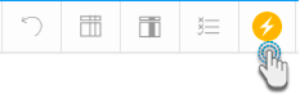
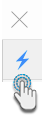
- Click on the Smart Analysis button.
- An Insight Wizard will appear. Use it Next, you need to make some selections so that the Insight Wizard it generates the most appropriate insights.
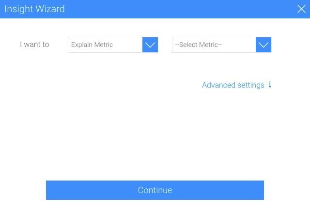
- Select Next, you will need to select the type of analysis that you want to do, for . For example understanding the drivers for a single metric, or comparing metrics or dimensions to understand differences. Depending on the option selected, additional information needs to be provided. These options are described below.
- Here’s a quick an overview of these options:
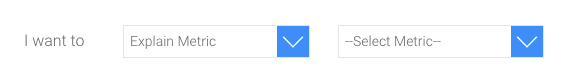
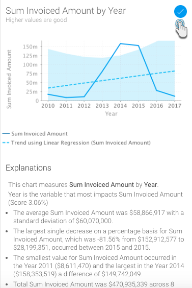
- Explain Metric: Choose this option to allow Yellowfin to better explain a single metric. Yellowfin will identify related data that most influences the chosen metric. The specific metric of interest needs to be selected from the next drop down. For example, you may want to understand Actual Revenue (metric).
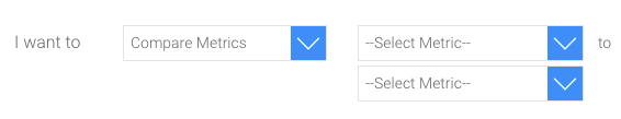
- Compare Metrics: This option compares the values and drivers of two chosen metrics. For example, you may want to compare Actual Revenue (metric) to Planned Revenue (metric).
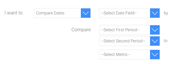
- Compare Dates: Use this option to compare a single metric across two time periods. You will need to select the specific date field that represents the time period, the metric you want to compare, and the two time periods that you want to compare. For example, you may want to compare Actual Revenue (metric) for Sales Date (date field) from this year to last year (time periods).
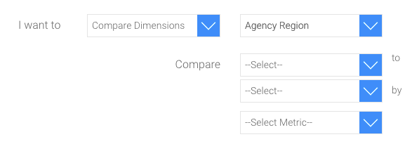
- Compare Dimensions: Use this option to compare a metric across two dimensions. You will need to select the dimension that you want to compare, the metric that you are comparing, and then the specific values of the dimension. For example, you may want to compare Actual Revenue Invoiced Amount (metric) between Regions (dimension) Asia and Europe (dimension values).
- Explain Metric: Choose this option to allow Yellowfin to better explain a single metric. Yellowfin will identify related data that most influences the chosen metric. The specific metric of interest needs to be selected from the next drop down. For example, you may want to understand Actual Revenue (metric).
- You can expand the Advanced Settings option to apply a few additional preferences to your automated chart creation.
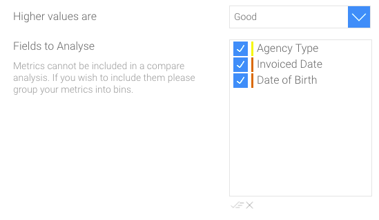
- Let the wizard know whether higher data values are good or bad for the result you have in mind. For example, higher values of Sales are good.
- You can also select and deselect specific fields to be included in the analysis to narrow down the data you wish Yellowfin to perform the background analysis on. For example, remove any fields that are not likely to be relevant, for example Customer IDsuch as Date of Birth. Removing fields can also make your analysis run faster.
- Click on the de-select all button to remove all the fields from selection.
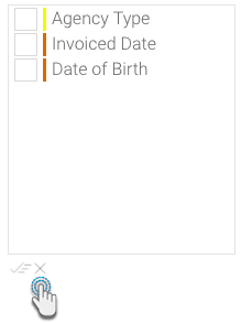
- Or click on the select all button to choose them all.
- Click on the de-select all button to remove all the fields from selection.
- Click on the Continue button after providing the additional details.
A new insights Auto Analysis panel will appear in the report builder, displaying the results of the analysis process. These insight results will be generated based on the options that you selected in the previous step; and will be displayed in order of statistical relevance.
These insight results will be generated based on the options that you selected in the previous step; and will be displayed in order of statistical relevance.Note The chart type selected by Yellowfin depends on the type of data. For example, if the values are both metrics, then a scatter plot graph will be generated.
- A narrative explanation is also provided with each of the charts, allowing you to better interpret the results of the analysis.
- Double-You can also click on a chart to see an enlarged version of it in a popup.
- To select a chart to add it to the Chart Builder, click on its selection icon or click on its add icon to select it. This will copy the selected chart to the chart builder page. You can include multiple charts in your report this way. Or select all of them by using the Select All option.
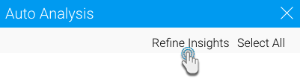
- You can also go back to the Insights Wizard to choose a different type of analysis option by clicking on the Refine Insights button.
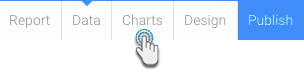
- Once you have selected the charts you want to keep, click on the charts toolbar option to open proceed to the Chart Builder by clicking on the Charts button in the toolbar.
- Your chosen charts will already be there.
- You can still view the other unselected automated charts , that you did not select, by clicking on . the insights button icon on the right side of the screen.
These charts can now be used to build and publish reports in the normal way. You have now rapidly created relevant report content with a fraction of the effort it would normally take to analyse analyze data and build reports.
Note If you perform the smart analysis these assisted discovery steps again, the charts from the previous analysis will be removed from the Insights Auto Analysis panel; however the ones you had selected will remain on the Chart builder page.


| Note |
|---|
On performing Assisted Insights, a report is generated by Yellowfin in the background and saved in the configuration database, which is the basis for the auto insights charts and narratives. If the insights get discarded by the user, these reports will be unused. The system will carry out a check for these orphan reports every 48 hours, and delete the unused ones. |
Changing Data Set
You can change the data set of your report, even after auto insights have been created.
Navigate to the Data section of the Report Builder.
Add or remove fields from the report. On doing so, a popup alert will appear.
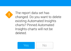
Click Yes to delete the current auto generated insights (except for the selected charts, which will still appear in the Chart builder, even with the Auto Analysis panel gone). This allows you to start your Assisted Discovery from scratch.
But if you click No, your insights (including the Insights panel) will be maintained, even though the data set will have changed.
| Styleclass | ||
|---|---|---|
| ||