Page History
| Anchor | ||||
|---|---|---|---|---|
|
| Table of Contents | ||
|---|---|---|
|
...
multiple types of content can be displayed together
...
. A Canvas can be used for display on:
- Reports
- Dashboards
- Storyboards
...
To add a Canvas to a dashboard or storyboard, use the same steps you would with any normal single chart report.
Widgets
...

...
Charts
Any chart created during the Charts step of the report builder can be added to a Chart canvas. To add a chart to the canvas:
| Expand | ||
|---|---|---|
| ||
|
Image
Images can be added to the canvas to add context to the data shown.
To add an image to the canvas:
| Expand | ||
|---|---|---|
| ||
|
Text
Text can be added to the canvas to add context, heading, or notes related to the data shown in charts. To add text to the canvas:
| Expand | ||
|---|---|---|
| ||
|
Rectangle
Rectangles can be added to the canvas for use around or behind other widgets. To add a rectangle to the canvas:
| Expand | ||
|---|---|---|
| ||
|
Icon
Icons can be used to add context and draw attention to data displayed in charts. To add an icon to the canvas:
| Expand | ||
|---|---|---|
| ||
|
Note: icons will not appear in exports or emailed versions of the chart canvas.
Component Actions
| Styleclass | ||
|---|---|---|
| ||
Resize
In order to resize a chart or widget added to the Multi-Chart Canvas, simply drag the bottom-right corner of the component to the desired size.
Reposition
In order to reposition a chart or widget added to the Multi-Chart Canvas, simply click and drag the component to the required area of the canvas.
Send to Back
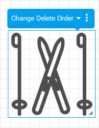
The order of items displayed on the canvas can be changed by sending some items to the back and others to the front. Click the Send to Back icon on an item you wish to be displayed underneath another.
Bring to Front
The order of items displayed on the canvas can be changed by sending some items to the back and others to the front. Click the Bring to Front icon on an item you wish to be displayed on top of another.
Delete
Once added to the canvas, charts and widgets can be deleted if they are no longer required. Click on the Delete icon to remove an item from the canvas.
Canvas Actions
| Styleclass | ||
|---|---|---|
| ||
Shrink to Fit
Once all the required content has been added to, and positioned on the canvas you have the option to shrink the canvas size to fit the components. This removes any empty space around the edges of the canvas.
Activate
Once all the required content has been added to the canvas and any sizing and position adjustments have been made, the canvas should be activated.
Edit
In order to edit an active canvas, the edit button will need to be clicked.
Resize Guides
When the canvas is being resized by the user guides are displayed to show the standard dashboard and storyboard boundaries. This gives the user an idea of the sizing in relation to where the canvas will be finally displayed.
When using the canvas, there are a range of options you can adjust to suit your needs. To access these options, click on the  settings icon in the top right corner of the canvas.

You will then see the Canvas Properties panel, which can be dragged around the screen to suit your needs.
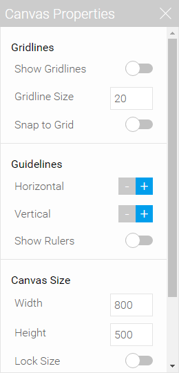
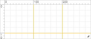
Gridlines
These settings allow you to define which visual guides will be displayed to aid in the design of your canvas.
| Option | Description |
|---|---|
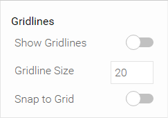
| Show Gridlines | This option allows you to toggle the display of gridlines in the background of your canvas. These can be used as a guide when laying out your widgets. |
| Gridline Size | This option allows you to define the size of the grid used by the gridlines setting (see above) in pixels. |
| Snap to Grid | This option allows you to require all widgets to align to gridlines if enabled, ensuring the layout adheres to your grid. |
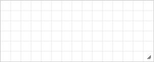
Guidelines
These settings allow you to define where special guides are displayed to aid in the design of your canvas. These lines differ to gridlines as they are individual lines running vertically or horizontally across the canvas for a single specific location.
| Option | Description |
|---|---|
| Horizontal | This option allows you to add or remove horizontal guides on your canvas, as well as specifying the pixel location. |
| Vertical | This option allows you to add or remove vertical guides on your canvas, as well as specifying the pixel location. |
| Show Rulers | This option allows you to toggle the display of rulers across the top and left of your canvas, which can be used to place guidelines more accurately. |
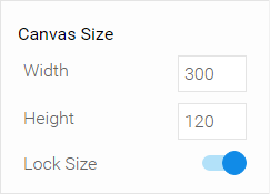
Canvas Size
These settings allow you to define the size of your canvas display in pixels. This can be especially useful when you require an exact size for a specific purpose.
| Option | Description |
|---|---|
| Width | This allows you to specify the width of your canvas, in pixels. |
| Height | This allows you to specify the height of your canvas, in pixels. |
| Lock Size | This allows you to lock the size of your canvas, so that it cannot be resized by dragging during the design process. |
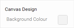
Canvas Design
This setting allows you to define the background colour of your canvas.
| Option | Description |
|---|---|
| Background Colour | This allows you to specify the colour of the background of your canvas. Especially useful when designing a canvas to be placed on a coloured background or image, such as on a storyboard slide. |
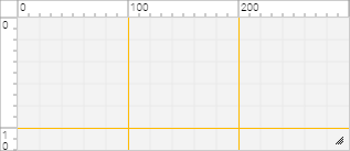
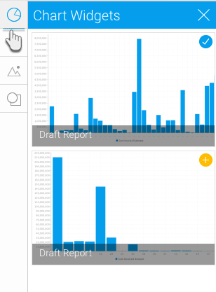
Chart Widgets
| Styleclass | ||
|---|---|---|
| ||
 If a chart has already been added to the canvas, it will have the
  icon, but if it is still to be used, it will have the
  icon. Simply drag an available chart from the list on the canvas to use it.
Once added, selecting a chart widget on the canvas will give you access to some basic options, outlined below.
| Option | Description |
|---|---|
| Edit | This allows you to return to the Charts step of the report builder and adjust the selected chart. From here you can return to the canvas by proceeding to the Design step of the builder. |
| Delete | This allows you to remove the selected chart from your canvas. This will not delete the chart from your report builder entirely. |
| Order | This allows you to change the order that widgets are displayed in the canvas on the Z-plane, by moving the currently selected chart. The available options are:
|
| Menu | This allows you to open the Chart Widget Properties menu for the selected chart and adjust a range of options. |
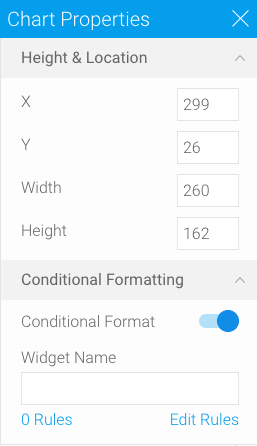
Chart Widget Properties
Clicking on the  icon will allow you to access more detailed settings for the selected chart widget.
| Option | Description |
|---|---|
| Height & Location | |
| X | Specify the x coordinates of the top left corner of the currently selected widget, in order to position it exactly on your canvas. |
| Y | Specify the y coordinates of the top left corner of the currently selected widget, in order to position it exactly on your canvas. |
| Width | Specify the width of the currently selected widget, in pixels, in order to resize it exactly. |
| Height | Specify the height of the currently selected widget, in pixels, in order to resize it exactly. |
| Conditional Formatting | |
| Conditional Format | Enable this button to apply conditional formatting to your chart. (Note: You need at least two charts to make this work.) |
| Widget Name | Assign a name to your chart widget. |
| Edit Rules | Click on this to apply conditional formatting rules to your chart widget. |
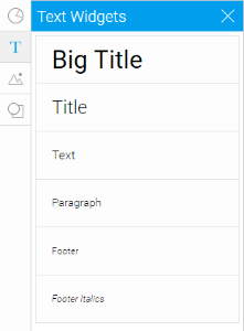
Text Widgets
| Styleclass | ||
|---|---|---|
| ||
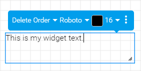
Once added, selecting a text widget on the canvas will give you access to some basic options, outlined below.
| Option | Description |
|---|---|
| Delete | This allows you to remove the selected text widget from your canvas. |
| Order | This allows you to change the order that widgets are displayed in the canvas, by moving the currently selected text widget. The available options are:
|
| Font | This allows you to select a different font to apply to the selected text widget. |
| Colour | This allows you to select a different colour to apply to the selected text widget. |
| Size | This allows you to select a different font size to apply to the selected text widget. |
| Menu | This allows you to open the Text Widget Properties menu for the selected text and adjust a range of options. |
Text Widget Properties
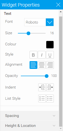
Clicking on the icon will allow you to access more detailed settings for the selected text widget.
| Option | Description | |||
|---|---|---|---|---|
| Text | ||||
| Font | This allows you to select a different font to apply to the selected text widget. | |||
| Size | This allows you to select a different font size to apply to the selected text widget. | |||
| Colour | This allows you to select a different colour to apply to the selected text widget. | |||
| Style | This allows you to apply a formatting style to the selected text widget, from the following options;
| |||
| Alignment | This allows you to align the contents of the selected text widget, using one of the following options;
| |||
| Opacity | This allows you to define how transparent (see-through) the contents of the selected text widget is. | |||
| Indent | This allows you to add or remove indentation within the contents of the selected text widget. | |||
| List Style | This allows you to add numbered or bullet point lists to the content so of the selected text widget. | |||
| Spacing | ||||
| Line | Leading. This allows you to define the amount of spacing between each line of content in the selected text widget. The higher the number, the more space allocated. | |||
| Chars | Tracking. This allows you to define the amount of spacing between each character in the selected text widget. The higher the number, the more space allocated. | |||
| Height & Location | ||||
| X | Specify the x coordinates of the top left corner of the currently selected widget, in order to position it exactly on your canvas. | |||
| Y | Specify the y coordinates of the top left corner of the currently selected widget, in order to position it exactly on your canvas. | |||
| Width | Specify the width of the currently selected widget, in pixels, in order to resize it exactly. | |||
| Height | Specify the height of the currently selected widget, in pixels, in order to resize it exactly. | |||
| Rotation | Specify the amount your wish to rotate your widget clockwise, in degrees. | |||
| Conditional Formatting | ||||
| Conditional Format | Enable this button to apply conditional formatting to your text widget. | |||
| Widget Name | Assign a name to your text widget. | |||
| Edit Rules | Click on this to apply conditional formatting rules to your text widget. | |||
Image Widgets
| Styleclass | ||
|---|---|---|
| ||
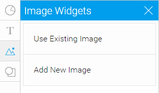
When selecting images, you will use the Image Manager lightbox, which allows you to search existing images, or upload new files.
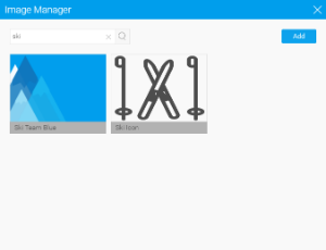
Once added, selecting a text widget on the canvas will give you access to some basic options, outlined below.
| Option | Description |
|---|---|
| Change | This allows you to select a different image file to use with the currently selected image widget. |
| Delete | This allows you to remove the selected image widget from your canvas. |
| Order | This allows you to change the order that widgets are displayed in the canvas, by moving the currently selected image widget. The available options are:
|
| Menu | This allows you to open the Image Widget Properties menu for the selected image and adjust a range of options. |
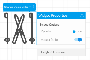
Image Widget Properties
Clicking on the icon will allow you to access more detailed settings for the selected image widget.
| Option | Description |
|---|---|
| Image Options | |
| Opacity | This allows you to define how transparent (see through) the image of the selected text widget is. The higher the number, the stronger the appearance. |
| Aspect Ratio | This allows you to toggle whether the image should maintain the original aspect ratio. Maintaining aspect ratio means that the image is the same shape as the original image, just scaled up or down. Disabling this option will allow the image to be stretched out of shape either vertically or horizontally. |
| Height & Location | |
| X | Specify the x coordinates of the top left corner of the currently selected widget, in order to position it exactly on your canvas. |
| Y | Specify the y coordinates of the top left corner of the currently selected widget, in order to position it exactly on your canvas. |
| Width | Specify the width of the currently selected widget, in pixels, in order to resize it exactly. |
| Height | Specify the height of the currently selected widget, in pixels, in order to resize it exactly. |
| Rotation | Specify the amount your wish to rotate your widget clockwise, in degrees. |
| Conditional Formatting | |
| Conditional Format | Enable this button to apply conditional formatting to your image widget. |
| Widget Name | Assign a name to your image widget. |
| Edit Rules | Click on this to apply conditional formatting rules to your image widget. |
Shape Widget
| Styleclass | ||
|---|---|---|
| ||
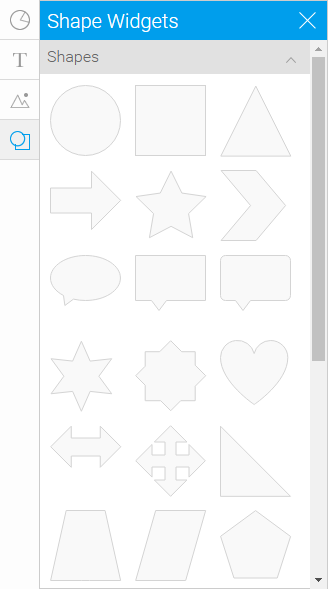
There are three types of shape widgets, as listed below:
| Name | Description | Screenshot |
|---|---|---|
| Shape | Lets you choose any type of shape to add to your chart or reports. |  |
| Line | Apply a line to your report or chart using this. | 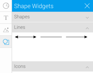 |
| Icon | Add an icon to your report or chart. | 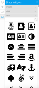 |
Once added, selecting a shape widget on the canvas will give you access to some basic options, outlined below.
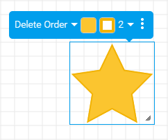
| Option | Description |
|---|---|
| Delete | This allows you to remove the selected shape widget from your canvas. |
| Order | This allows you to change the order that widgets are displayed in the canvas, by moving the currently selected shape widget. The available options are:
|
| Fill Colour | This allows you to select a different fill colour to apply to the middle of the currently selected shape widget. |
| Stroke Colour | This allows you to select a different stoke colour to apply to the outline of the currently selected shape widget. |
| Stroke Width | This allows you to specify a thickness for the outline of the currently selected shape widget. |
| Menu | This allows you to open the Shape Widget Properties menu for the selected shape widget and adjust a range of options. |
Shape Widget Properties
Clicking on the icon will allow you to access more detailed settings for the selected shape widget.

| Option | Description |
|---|---|
| Shape Options | |
| Fill Colour | This allows you to select a different fill colour to apply to the middle of the currently selected shape widget. |
| Stroke Colour | This allows you to select a different stoke colour to apply to the outline of the currently selected shape widget. |
| Stroke Width | This allows you to specify a thickness for the outline of the currently selected shape widget. |
| Fill Opacity | This allows you to define how transparent (see through) the fill colour of the selected shape widget is. The higher the number, the stronger the appearance. |
| Height & Location | |
| X | Specify the x coordinates of the top left corner of the currently selected widget, in order to position it exactly on your canvas. |
| Y | Specify the y coordinates of the top left corner of the currently selected widget, in order to position it exactly on your canvas. |
| Width | Specify the width of the currently selected widget, in pixels, in order to resize it exactly. |
| Height | Specify the height of the currently selected widget, in pixels, in order to resize it exactly. |
| Rotation | Specify the amount your wish to rotate your widget clockwise, in degrees. |
| Conditional Formatting | |
| Conditional Format | Enable this button to apply conditional formatting to your shape widget. |
| Widget Name | Assign a name to your shape widget. |
| Edit Rules | Click on this to apply conditional formatting rules to your shape widget. |
...
...