Page History
...
| Table of Contents | ||
|---|---|---|
|
Overview
| Styleclass | ||
|---|---|---|
| ||
This page allows administrators to configure a wide range of defaults and formatting settings for content that fall under the following tabs:
...
Report Settings
| Styleclass | ||
|---|---|---|
| ||

| Expand | ||||||||||||||||||||||||||||||||||||||||||||||||||||||||
|---|---|---|---|---|---|---|---|---|---|---|---|---|---|---|---|---|---|---|---|---|---|---|---|---|---|---|---|---|---|---|---|---|---|---|---|---|---|---|---|---|---|---|---|---|---|---|---|---|---|---|---|---|---|---|---|---|
| ||||||||||||||||||||||||||||||||||||||||||||||||||||||||
| ||||||||||||||||||||||||||||||||||||||||||||||||||||||||
...
| Expand | ||||||||||||||
|---|---|---|---|---|---|---|---|---|---|---|---|---|---|---|
| ||||||||||||||
|
Chart Settings
| Styleclass | ||
|---|---|---|
| ||

| Expand | ||||||
|---|---|---|---|---|---|---|
| ||||||
|
...
| Expand | ||||||||||||||||||
|---|---|---|---|---|---|---|---|---|---|---|---|---|---|---|---|---|---|---|
| ||||||||||||||||||
|
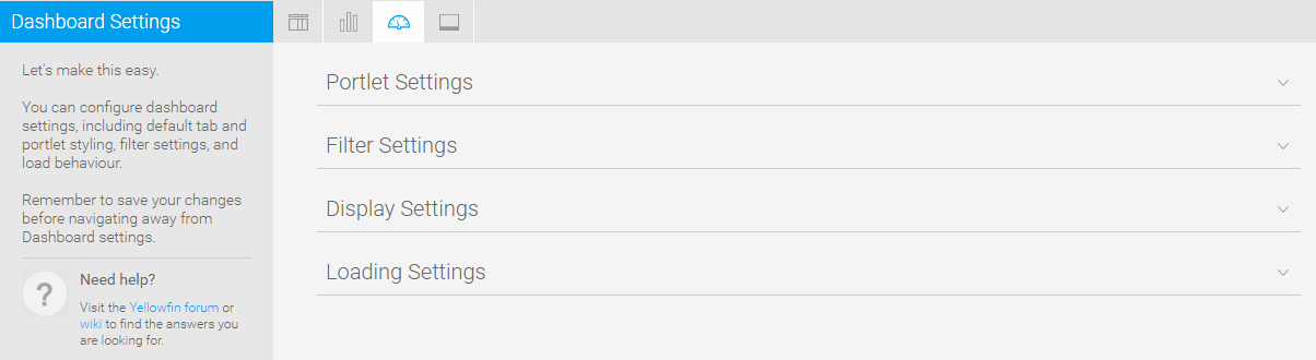
Dashboard Settings
| Styleclass | ||
|---|---|---|
| ||
| Expand | ||||||
|---|---|---|---|---|---|---|
| ||||||
|
...
| Expand | ||||||||||||||||
|---|---|---|---|---|---|---|---|---|---|---|---|---|---|---|---|---|
| ||||||||||||||||
|
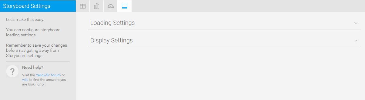
Storyboard Settings
| Styleclass | ||
|---|---|---|
| ||
| Expand | ||||||
|---|---|---|---|---|---|---|
| ||||||
|
...
| Expand | ||||
|---|---|---|---|---|
| ||||
|
| horizontalrule |
|---|
| Styleclass | ||
|---|---|---|
| ||