Page History
...
| Table of Contents | ||
|---|---|---|
|
Overview
| Styleclass | ||
|---|---|---|
|
...
This The Content Setting page allows administrators to configure a wide range of defaults and formatting settings for content. Navigate to Menu > Administration > Content Settings and change the settings that fall under the following tabs:

- Report Settings20709819Chart Settings
- 20709819
- Dashboard Settings20709819Storyboard Settings
- 20709819
- Browse Signal Settings
...
Report Settings
| Styleclass | ||
|---|---|---|
|
...

| Expand | ||||||||||||||||||||||||||||||||||||||||||||||||||||||||||||||||||||||||||||||||||||||||||||||||
|---|---|---|---|---|---|---|---|---|---|---|---|---|---|---|---|---|---|---|---|---|---|---|---|---|---|---|---|---|---|---|---|---|---|---|---|---|---|---|---|---|---|---|---|---|---|---|---|---|---|---|---|---|---|---|---|---|---|---|---|---|---|---|---|---|---|---|---|---|---|---|---|---|---|---|---|---|---|---|---|---|---|---|---|---|---|---|---|---|---|---|---|---|---|---|---|---|
| ||||||||||||||||||||||||||||||||||||||||||||||||||||||||||||||||||||||||||||||||||||||||||||||||
| ||||||||||||||||||||||||||||||||||||||||||||||||||||||||||||||||||||||||||||||||||||||||||||||||
| Expand | ||||||||||
|---|---|---|---|---|---|---|---|---|---|---|
| ||||||||||
|
| Expand | ||||||||
|---|---|---|---|---|---|---|---|---|
| ||||||||
|
...
| Expand | ||||||||||
|---|---|---|---|---|---|---|---|---|---|---|
| ||||||||||
|
...
| Expand | ||||||||||||||||||||||
|---|---|---|---|---|---|---|---|---|---|---|---|---|---|---|---|---|---|---|---|---|---|---|
| ||||||||||||||||||||||
|
...
|
| Expand | ||||
|---|---|---|---|---|
| ||||
|
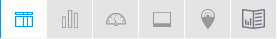
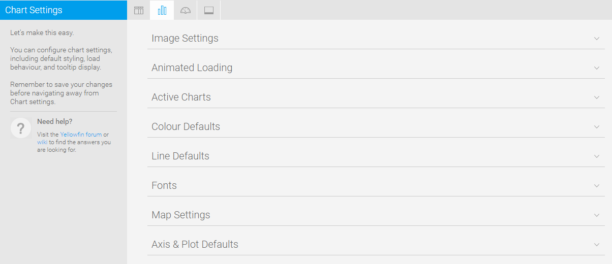
Chart Settings
| Styleclass | ||
|---|---|---|
|
...

| Expand | ||||||
|---|---|---|---|---|---|---|
| ||||||
|
...
| Expand | ||||||||||||||||
|---|---|---|---|---|---|---|---|---|---|---|---|---|---|---|---|---|
| ||||||||||||||||
|
| Expand | ||||||||||||||||
|---|---|---|---|---|---|---|---|---|---|---|---|---|---|---|---|---|
| ||||||||||||||||
|
...
| Expand | ||||||||||||||||
|---|---|---|---|---|---|---|---|---|---|---|---|---|---|---|---|---|
| ||||||||||||||||
|
| Expand | ||||||||||||||||||
|---|---|---|---|---|---|---|---|---|---|---|---|---|---|---|---|---|---|---|
| ||||||||||||||||||
|
...
Dashboard Settings
| Styleclass | ||
|---|---|---|
|
...


| Expand | ||||||
|---|---|---|---|---|---|---|
| ||||||
|
...
| Expand | ||||||||||||||||
|---|---|---|---|---|---|---|---|---|---|---|---|---|---|---|---|---|
| ||||||||||||||||
|
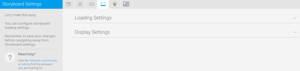
Storyboard Settings
| Styleclass | ||
|---|---|---|
|
...

| Expand | ||||||
|---|---|---|---|---|---|---|
| ||||||
|
...
| Expand | ||||
|---|---|---|---|---|
| ||||
|
horizontalrule
| Anchor | ||||
|---|---|---|---|---|
|
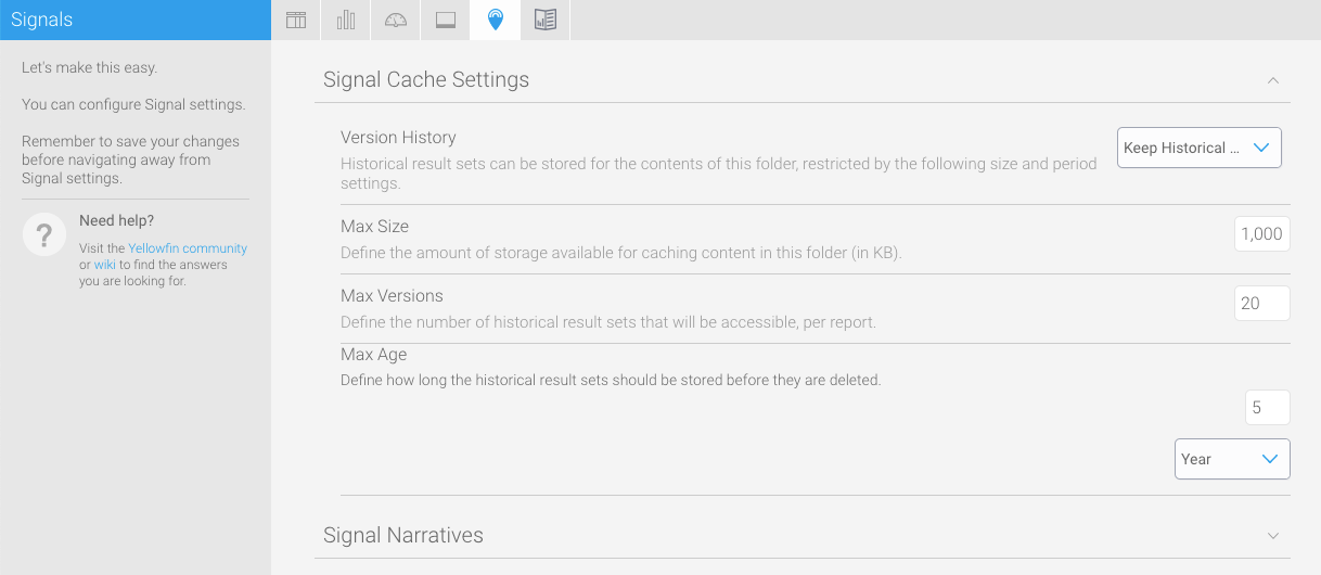
Signals Settings
| Styleclass | ||
|---|---|---|
| ||
| Expand | ||||||||||
|---|---|---|---|---|---|---|---|---|---|---|
| ||||||||||
These settings maintain the cache that stores reports created for Signal analysis.
|
| Expand | ||||
|---|---|---|---|---|
| ||||
|
Content Settings
| Styleclass | ||
|---|---|---|
|
...
...
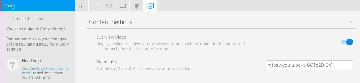
These settings relate to Yellowfin Stories and other content.
| Expand | ||||||
|---|---|---|---|---|---|---|
| ||||||
These settings maintain the cache that stores reports created for Signal analysis.
|
| horizontalrule |
|---|
| Styleclass | ||
|---|---|---|
| ||
...