Page History
...
Overview
| Styleclass | ||
|---|---|---|
| ||
The Content Setting page allows administrators to configure a wide range of defaults and formatting settings for content. Navigate to Menu > Administration > Content Settings and change the settings that fall under the following tabs:
...
Report Settings
| Styleclass | ||
|---|---|---|
| ||

| Expand | ||||||||||||||||||||||||||||||||||||||||||||||||||||||||||||||||||||||||||||||||||||||||||||||||||||||||||||||||||
|---|---|---|---|---|---|---|---|---|---|---|---|---|---|---|---|---|---|---|---|---|---|---|---|---|---|---|---|---|---|---|---|---|---|---|---|---|---|---|---|---|---|---|---|---|---|---|---|---|---|---|---|---|---|---|---|---|---|---|---|---|---|---|---|---|---|---|---|---|---|---|---|---|---|---|---|---|---|---|---|---|---|---|---|---|---|---|---|---|---|---|---|---|---|---|---|---|---|---|---|---|---|---|---|---|---|---|---|---|---|---|---|---|---|---|
| ||||||||||||||||||||||||||||||||||||||||||||||||||||||||||||||||||||||||||||||||||||||||||||||||||||||||||||||||||
| ||||||||||||||||||||||||||||||||||||||||||||||||||||||||||||||||||||||||||||||||||||||||||||||||||||||||||||||||||
| Expand | ||||||||||||||||||||||||||||||||||||||||||||||||||||||||||||||||||||||||||||||||||||||||||||||||||||||||||||||||||
| ||||||||||||||||||||||||||||||||||||||||||||||||||||||||||||||||||||||||||||||||||||||||||||||||||||||||||||||||||
Option | Description |
|---|---|
Filter Location | Select the default location for User Prompt filters to be displayed on the Report page. |
Filter Width | Select the default length for User Prompt filter values display. |
Drill Through Popup | Allow Drill Through reports to display in a lightbox if configured to use the 'Popup New Window' option. |
| title | Private Reports |
|---|
Option
Description
Allow Share
This will allow Private Report Writers to assign other users access to their report.
Watermark
Select an image to use as a watermark on Private Reports. (Optional)
Report Marker
Enter text to be used as a marker below the description for all Private Reports. (Optional)
| title | Public Reports |
|---|
Option
Description
Watermark
Select an image to use as a watermark on Public Reports.
Report Marker
Enter text to be used as a marker below the description for all Public Reports.
| title | Builder Settings |
|---|
Option
Description
...
| |||||||||||
| Expand | ||||||||||
|---|---|---|---|---|---|---|---|---|---|---|
| ||||||||||
|
| Expand | ||||||||
|---|---|---|---|---|---|---|---|---|
| ||||||||
|
| Expand | ||||||||||
|---|---|---|---|---|---|---|---|---|---|---|
| ||||||||||
|
| Expand | ||||||||||||||||||||||||
|---|---|---|---|---|---|---|---|---|---|---|---|---|---|---|---|---|---|---|---|---|---|---|---|---|
| ||||||||||||||||||||||||
|
| Expand | ||||
|---|---|---|---|---|
| ||||
|
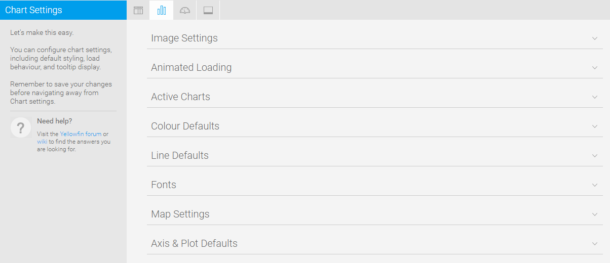
Chart Settings
| Styleclass | ||
|---|---|---|
| ||

| Expand | ||||||
|---|---|---|---|---|---|---|
| ||||||
|
...
| Expand | ||||||||||||||||
|---|---|---|---|---|---|---|---|---|---|---|---|---|---|---|---|---|
| ||||||||||||||||
|
| Expand | ||||||||||||||||
|---|---|---|---|---|---|---|---|---|---|---|---|---|---|---|---|---|
| ||||||||||||||||
|
...
| Expand | ||||||||||||||||||
|---|---|---|---|---|---|---|---|---|---|---|---|---|---|---|---|---|---|---|
| ||||||||||||||||||
|
| Expand | ||||||||||||||||||
|---|---|---|---|---|---|---|---|---|---|---|---|---|---|---|---|---|---|---|
| ||||||||||||||||||
|
...
Dashboard Settings
| Styleclass | ||
|---|---|---|
| ||


| Expand | ||||||
|---|---|---|---|---|---|---|
| ||||||
|
...
| Styleclass | ||
|---|---|---|
| ||

| Expand | ||||||
|---|---|---|---|---|---|---|
| ||||||
|
...
| Expand | ||||||||||
|---|---|---|---|---|---|---|---|---|---|---|
| ||||||||||
These settings maintain the cache that stores reports created for Signal analysis.
|
...
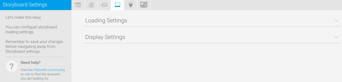
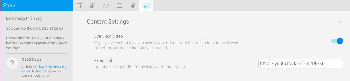
These settings relate to Yellowfin Story Stories and other Yellowfin content.
| Expand | ||||||
|---|---|---|---|---|---|---|
| ||||||
These settings maintain the cache that stores reports created for Signal analysis.
|
...
| horizontalrule |
|---|
| Styleclass | ||
|---|---|---|
| ||