Page History
...
| Table of Contents | ||
|---|---|---|
|
Overview
| Styleclass | ||
|---|---|---|
| ||
The Chart step formatting menu bar provides you with all the formatting options for your chart. You can use these options to change settings such as the legend, background, axis and label.
...
Note: the menus and items contained within them will change based on the type of chart you are using.
Reset
| Styleclass | ||
|---|---|---|
| ||
The Reset menu allows you to reset your chart or formatting options:
- Formatting: this will reset your formatting selections, but keep the chart type and field selections defined.
- Chart: this will reset your chart, including all formatting, field, and chart type selections, returning it to an empty state.
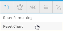
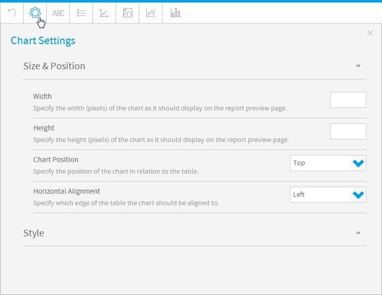
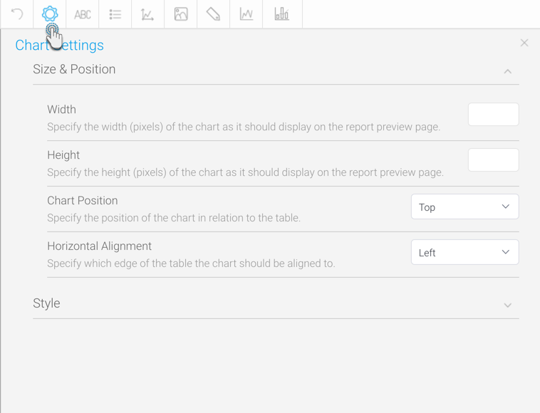
Chart Settings
| Styleclass | ||
|---|---|---|
| ||
The chart format options are the most dynamic options and are based on the type of chart selected. For example for a pie chart you will be able to set the shadow colour color and exploding slice options. The common options found in the chart format drop down include interactivity options such as visible series selection.
| Expand | ||||||||||
|---|---|---|---|---|---|---|---|---|---|---|
| ||||||||||
|
| Expand | ||||||
|---|---|---|---|---|---|---|
| ||||||
|
| Expand | ||||||||||||||||||||||||||||||||||||||||||||||||||||||||||||||||||||||||||||||||||||||||||||||||||||||||||
|---|---|---|---|---|---|---|---|---|---|---|---|---|---|---|---|---|---|---|---|---|---|---|---|---|---|---|---|---|---|---|---|---|---|---|---|---|---|---|---|---|---|---|---|---|---|---|---|---|---|---|---|---|---|---|---|---|---|---|---|---|---|---|---|---|---|---|---|---|---|---|---|---|---|---|---|---|---|---|---|---|---|---|---|---|---|---|---|---|---|---|---|---|---|---|---|---|---|---|---|---|---|---|---|---|---|---|
| ||||||||||||||||||||||||||||||||||||||||||||||||||||||||||||||||||||||||||||||||||||||||||||||||||||||||||
Colour
Shadow Colour
| ||||||||||||||||||||||||||||||||||||||||||||||||||||||||||||||||||||||||||||||||||||||||||||||||||||||||||
| Expand | ||||||||||||||||||||||||||||||||||||||||||||||||||||||||||||||||||||||||||||||||||||||||||||||||||||||||||
| ||||||||||||||||||||||||||||||||||||||||||||||||||||||||||||||||||||||||||||||||||||||||||||||||||||||||||
Option | Description | |||||||||||||||||||||||||||||||||||||||||||||||||||||||||||||||||||||||||||||||||||||||||||||||||||||||||
Visible Series Selection | Define whether the user can select which series to display when viewing the report. | |||||||||||||||||||||||||||||||||||||||||||||||||||||||||||||||||||||||||||||||||||||||||||||||||||||||||
Series Selection Style | Only available on Time Series charts, select from different display options for the series selection. | |||||||||||||||||||||||||||||||||||||||||||||||||||||||||||||||||||||||||||||||||||||||||||||||||||||||||
Link Field | Select a field formatted to contain a URL in order to use it as a link on the chart. | |||||||||||||||||||||||||||||||||||||||||||||||||||||||||||||||||||||||||||||||||||||||||||||||||||||||||
Visible Unit Selection | Allow users to change the granularity of the dates to be displayed. Selecting a unit of finer granularity than your data will result in using the level of your data. | |||||||||||||||||||||||||||||||||||||||||||||||||||||||||||||||||||||||||||||||||||||||||||||||||||||||||
Date Slider | Display a date slider on the chart to allow users to adjust the date range of the chart. | |||||||||||||||||||||||||||||||||||||||||||||||||||||||||||||||||||||||||||||||||||||||||||||||||||||||||
Slider Position | Define where the date slider will be displayed on the chart. | |||||||||||||||||||||||||||||||||||||||||||||||||||||||||||||||||||||||||||||||||||||||||||||||||||||||||
Slider Initial Range | Specify the percentage of the available date range the slider is set to when the chart loads. | |||||||||||||||||||||||||||||||||||||||||||||||||||||||||||||||||||||||||||||||||||||||||||||||||||||||||
Bottom Navigation | Display navigation buttons in a bar directly below the map. | |||||||||||||||||||||||||||||||||||||||||||||||||||||||||||||||||||||||||||||||||||||||||||||||||||||||||
Hover Navigation | Display navigation hovered over the top left of the map. | |||||||||||||||||||||||||||||||||||||||||||||||||||||||||||||||||||||||||||||||||||||||||||||||||||||||||
Hover Navigation Colour | Select the colour of the navigation hovered over the top left of the map. | |||||||||||||||||||||||||||||||||||||||||||||||||||||||||||||||||||||||||||||||||||||||||||||||||||||||||
| Expand | ||||||||||||||||||||||||||||||||||||||||||||||||||||||||||||||||||||||||||||||||||||||||||||||||||||||||||
|
Option | Description |
|---|---|
Latitude | Define the latitude boundaries of the map. This allows you to reduce the area displayed on the map. |
Longitude | Define the longitude boundaries of the map. This allows you to reduce the area displayed on the map. |
| title | Day Colour |
|---|
Option
Description
Sunday
Define the colour to be applied to the Sunday value row.
Monday
Define the colour to be applied to the Monday value row.
Tuesday
Define the colour to be applied to the Tuesday value row.
Wednesday
Define the colour to be applied to the Wednesday value row.
Thursday
Define the colour to be applied to the Thursday value row.
Friday
Define the colour to be applied to the Friday value row.
Saturday
Define the colour to be applied to the Saturday value row.
| title | Box & Whisker |
|---|
Option | Description |
|---|---|
Show Median | Enable/disable the display of the median value for each label row. |
Show Mean | Enable/disable the display of the mean value for each label row. |
| title | Histogram |
|---|
Option
Description
Bin Count
Specify the number of bins, or intervals, is based on the number of unique values in the dataset. There are three options available here:
- Auto - the number of bins, or intervals, is automatically calculated by Yellowfin.
- Values - the number of bins, or intervals, is based on the number of unique values in the data set.
- Manual - the number of bins, or intervals, is manually defined by the chart creator.
Define the number of bins, or intervals, to be used for the histogram.
Note: only available when Bin Count is set to Manual.
| title | Financial |
|---|
Option
Description
Up Colour
Define the colour to fill the candlestick when displaying an upwards trend value.
Down Colour
Define the colour to fill the candlestick when displaying a downwards trend value.
Line Colour
Define the colour to be used for the line or border.
Colour
Define the colour to be used for the volume columns.
Axis Position
Display the vertical axis of the volume columns on the left or right of the chart.
| title | Numeric Display |
|---|
Title
| Styleclass | ||
|---|---|---|
| ||
The title option allows you to change the title of the chart as well as the style – such as the font settings.
...
| title | Text |
|---|
...
Option
...
Description
...
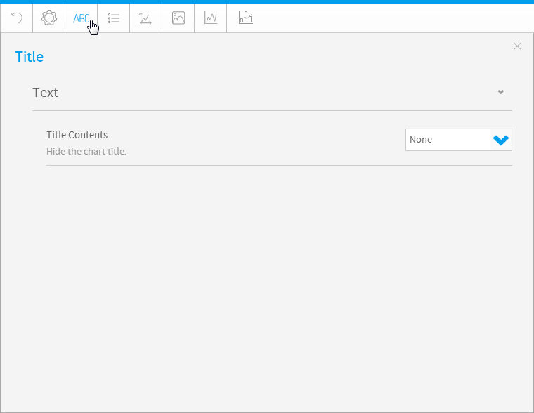
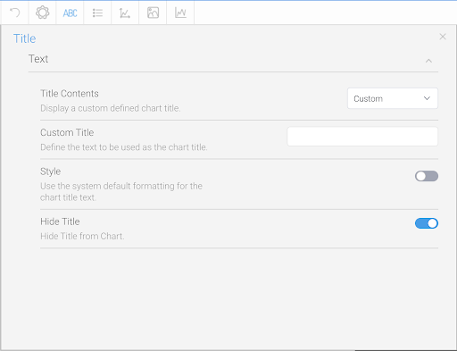
Title Contents
...
Define what should be shown in the Chart Title area.
- Auto Title: Display a title that is automatically generated based on the fields used in the chart. Note: only available for Auto Charts.
- ReportName: Display the report name as the title of the chart.
- AnimationField: Display the value of the animation field for each frame as the chart title.
- Metric: Display the name of the currently selected series as the chart title.
Note: the chart has to be a single metric series selection. This means that it can only display one metric at a time. To do this just add one metric to the chart and then enable series selection, rather than adding all metrics and allowing users to toggle multiple at a time. - Custom: Display a custom defined chart title.
- None: Hide the chart title.
...
Custom Title
...
Display a custom defined chart title.
...
Style
...
Use the system default formatting for the chart title text.
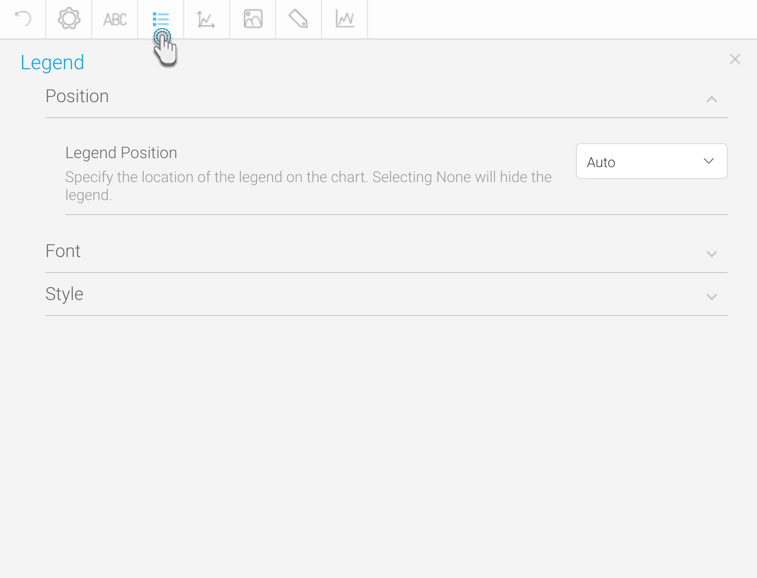
Legend
| Styleclass | ||
|---|---|---|
| ||
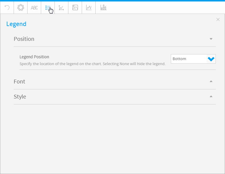
The Legend is a box that identifies the patterns or colours that are assigned to the data series or categories in a chart. This section of the menu lets you set the following options.
...
| title | Position |
|---|
Option | Description |
|---|---|
Legend Position | Specify the location of the legend on the chart. Selecting None will hide the legend. |
...
| title | Font |
|---|
Option | Description |
|---|---|
Style | Define the formatting for chart legend text. |
...
| title | Style |
|---|
...
Option
...
Description
...
Background Colour
...
Define the background colour for the legend area of the chart.
...
Border
...
Specify the border type for the legend area of the chart.
...
Conditional
...
Limit the number of values displayed in the legend area of the chart.
...
Limit
...
Specify a limit for the number of values displayed in the legend area of the chart.
...
Enable this button to set a limit to the number of items in the legend. If the item number exceeds this limit, then the legend will not be displayed.
Tip: This helps in stopping a really big legend from being displayed if it contains too many items. (Reveals the Limit option once enabled.)
...
Select a shape for the chart’s legend items using this drop down. You can choose between the square or circle shapes, or even a line.
Tip: The default shape will be based on the selected chart. For example, bar or column charts will have square icons in their legends, whereas line charts or trend items will show lines by default.
...
Use this to show or hide trend items in the legend.
Tip: This is a useful feature if you have too many trend items and want to hide them in the legend. The trend lines will still appear in the chart, however.
...
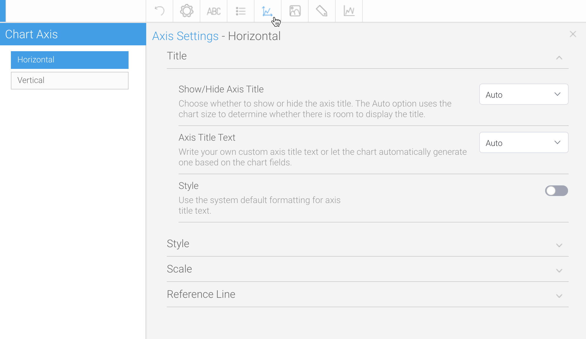
Axis
| Styleclass | ||
|---|---|---|
| ||
A line bordering the chart plot area used as a frame of reference for measurement. The y axis is usually the vertical axis and contains data. The x-axis is usually the horizontal axis and contains categories.
...
| title | Title |
|---|
Option | Description |
|---|---|
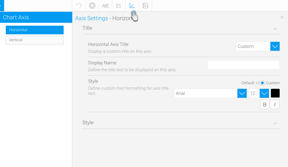
Axis Title | Note: This option is only specific to auto-charts. This drop down menu lets you choose whether to display the auto generated title (Auto), enter a manual one (Custom) or not display a title at all (None). |
| Display Name | Define the title text to be displayed on this axis. |
Style | Define the formatting for axis title text. |
...
| title | Style |
|---|
The Axis style drop down lets you determine the formats to be applied to axis.
Option | Description |
|---|---|
Show Axis | Display the axis on the chart if enabled. |
| Show Tick Marks | Enable this feature to display tick marks on your axis. |
Show Arrow | Display an arrow on the end of the axis bar. |
| Axis Style | Use this option to view axis customization fields. (This will reveal the Colour and Thickness settings.) |
Colour | Define the colour of the axis bar. |
Thickness | Define the thickness of the axis bar. |
Margin | Define the spacing between the edges of the axis and the first and last categories. |
Abbreviate Label | Label text will be abbreviated to display partial values. |
Rotate Axis Label | Specify which angle the axis labels are displayed in relation to the axis bar. This allows you to rotate long labels to display more text. |
Category Spacing | Define the size of the spacing between each category grouping on the axis. |
Series Spacing | Define the size of the spacing between each series within a category grouping on the axis. |
Prefix | Define a prefix to be applied to the values displayed on the axis. This is a character to display before the value, such as $. |
Suffix | Define a suffix to be applied to the values displayed on the axis. This is a character to display after the value, such as %. |
Decimal Places | Define the number of decimal places to display on the axis label text. |
Desired Trend | Display an arrow in the corner of the chart to demonstrate the desired trend. |
Axis Location | Specify which side of the chart the axis is displayed on. |
| Show Tick Labels | Enable this feature to display the labels showing tick values. (This reveals the Label Font option.) |
Label Font | Define the font formatting for axis label text. |
Secondary Prefix | Define a prefix to be applied to the values displayed on the axis. This is a character to display before the value, such as $. |
Secondary Suffix | Define a suffix to be applied to the values displayed on the axis. This is a character to display after the value, such as %. |
Secondary Dec. Places | Define the number of decimal places to display on the axis label text. |
...
| title | Scale |
|---|
The Axis scale drop down lets you determine the scale dimensions. Generally you will only be able to set the Y Axis attributes – unless you are using XY charts in which case you can set both X & Y attributes.
|
| Expand | ||||||||||||||||||||||
|---|---|---|---|---|---|---|---|---|---|---|---|---|---|---|---|---|---|---|---|---|---|---|
| ||||||||||||||||||||||
|
| Expand | ||||||
|---|---|---|---|---|---|---|
| ||||||
|
| Expand | ||||||||||||||||
|---|---|---|---|---|---|---|---|---|---|---|---|---|---|---|---|---|
| ||||||||||||||||
|
| Expand | ||||||
|---|---|---|---|---|---|---|
| ||||||
|
| Expand | ||||||||
|---|---|---|---|---|---|---|---|---|
| ||||||||
|
| Expand | ||||||||||||
|---|---|---|---|---|---|---|---|---|---|---|---|---|
| ||||||||||||
|
| Expand | ||||||||
|---|---|---|---|---|---|---|---|---|
| ||||||||
|
Title
The title option allows you to change the title of the chart as well as the style – such as the font settings.
| Expand | ||||||||||
|---|---|---|---|---|---|---|---|---|---|---|
| ||||||||||
|
Legend
The Legend is a box that identifies the patterns or colors that are assigned to the data series or categories in a chart. This section of the menu lets you set the following options.
| Expand | ||||
|---|---|---|---|---|
| ||||
|
| Expand | ||||
|---|---|---|---|---|
| ||||
|
| Expand | ||||||||||||||||||||||||||||
|---|---|---|---|---|---|---|---|---|---|---|---|---|---|---|---|---|---|---|---|---|---|---|---|---|---|---|---|---|
| ||||||||||||||||||||||||||||
|
Axis
A line bordering the chart plot area used as a frame of reference for measurement. The y axis is usually the vertical axis and contains data. The x-axis is usually the horizontal axis and contains categories.
| Expand | ||||||||||
|---|---|---|---|---|---|---|---|---|---|---|
| ||||||||||
|
| Expand | ||||||||||||||||||||||||||||||||||||||||||||||||||||||||
|---|---|---|---|---|---|---|---|---|---|---|---|---|---|---|---|---|---|---|---|---|---|---|---|---|---|---|---|---|---|---|---|---|---|---|---|---|---|---|---|---|---|---|---|---|---|---|---|---|---|---|---|---|---|---|---|---|
| ||||||||||||||||||||||||||||||||||||||||||||||||||||||||
The Axis style drop down lets you determine the formats to be applied to axis.
|
| Expand | ||||||||||
|---|---|---|---|---|---|---|---|---|---|---|
| ||||||||||
The Scale section lets you determine the scale dimensions. Generally you will only be able to set the Y Axis attributes — unless you are using XY charts in which case you can set both X and Y attributes.
|
| Expand | ||||||||||||||||||
|---|---|---|---|---|---|---|---|---|---|---|---|---|---|---|---|---|---|---|
| ||||||||||||||||||
Allows you to add one or more reference lines to a numeric axis. This is a visual line that appears on the chart at a specified position. More than one reference lines can be added by using the Add Item option.
|
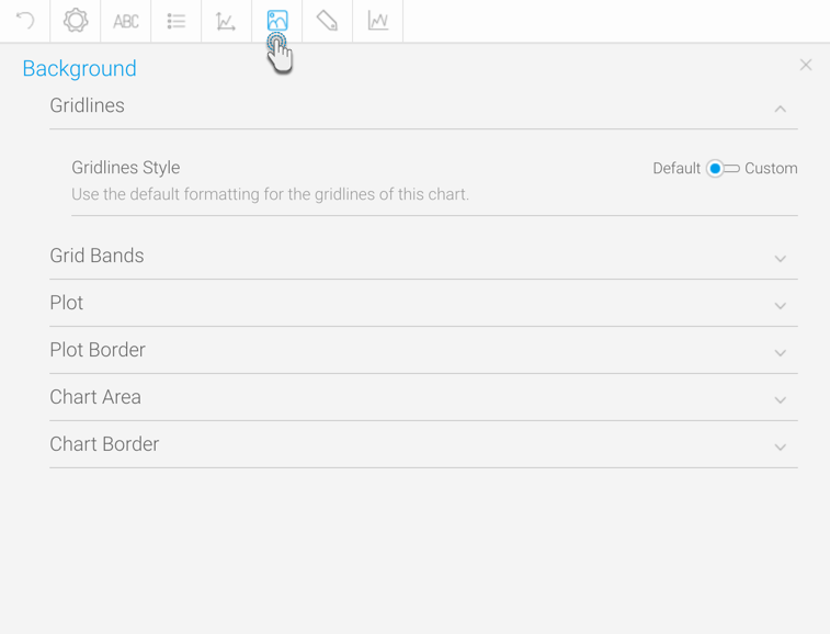
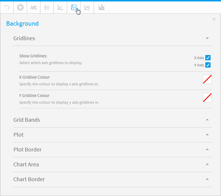
Background
The Background options let you set the style and color of the main chart elements such as the plot and chart areas. You can apply elements such as background images and or gridlines.
| Expand | ||||||||||
|---|---|---|---|---|---|---|---|---|---|---|
| ||||||||||
|
| Expand | ||||||
|---|---|---|---|---|---|---|
| ||||||
Gridline options are available for all category charts, bubble and scatter charts.
|
| Expand | ||||||||||||
|---|---|---|---|---|---|---|---|---|---|---|---|---|
| ||||||||||||
The plot area is the area bounded by the axes, including all data series. The drop down options let you set the background colors applied to the plot area.
|
| Expand | ||||||||
|---|---|---|---|---|---|---|---|---|
| ||||||||
The plot area is the area bounded by the axes, including all data series. The drop down options let you set the background colors applied to the plot area.
|
| Expand | ||||||||||||
|---|---|---|---|---|---|---|---|---|---|---|---|---|
| ||||||||||||
The entire chart and all its elements are described as the chart area. The drop down options let you set the background colors applied to the chart area.
|
| Expand | ||||||||
|---|---|---|---|---|---|---|---|---|
| ||||||||
The entire chart and all its elements are described as the chart area. The drop down options let you set the background colors applied to the chart area.
|
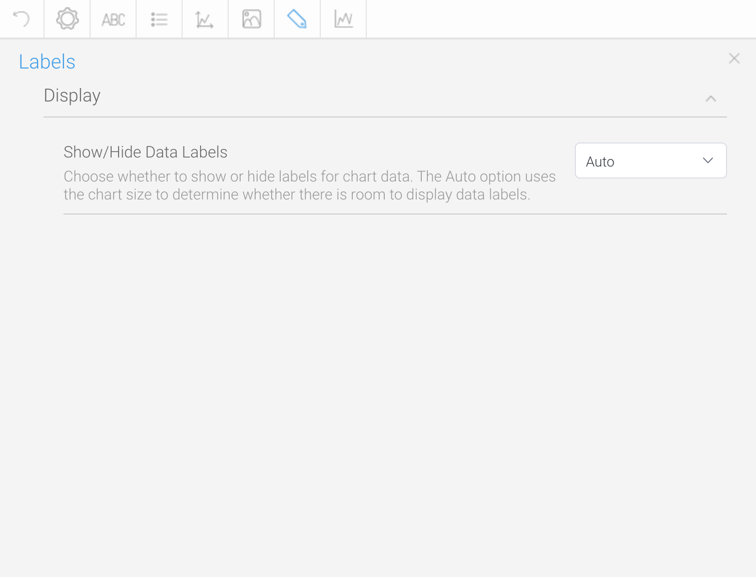
Labels
Labels can be added to charts to print out the values of the data point onto the chart in text format. Charts that support labels include line, pie, bar charts, and more. Note: These settings will differ according to the selected chart type.
| Expand | ||||||||||||||||||||||||
|---|---|---|---|---|---|---|---|---|---|---|---|---|---|---|---|---|---|---|---|---|---|---|---|---|
| ||||||||||||||||||||||||
|
| Expand | ||
|---|---|---|
|
...
Option
...
Description
...
Scale
...
Define the boundaries of the axis.
...
Lower Bound
...
Define a custom starting point for the axis.
...
Upper Bound
...
Define a custom cut-off point for the axis.
...
Scale Unit
...
Define the scale unit for the axis. Labels will be displayed at these increments, or multiples of the unit.
...
Reference Line
...
Define the position (by providing the exact value or by selecting a drop down option), colour, and label for this reference line. More than one reference lines can be added by using the Add Item option.
Background
| Styleclass | ||
|---|---|---|
| ||
The Background options let you set the style and colour of the main chart elements such as the plot and chart areas. You can apply elements such as background images and or gridlines.
| Expand | |||||||||||||||||
|---|---|---|---|---|---|---|---|---|---|---|---|---|---|---|---|---|---|
|
Option | Description |
|---|---|
Show Gridlines | Select which axis gridlines to display. |
X Gridline Colour | Specify the colour to display x axis gridlines in. |
Y Gridline Colour | Specify the colour to display y axis gridlines in. |
| title | Grid Bands |
|---|
Gridline options are available for all category charts, bubble and scatter charts.
Option | Description |
|---|---|
Band Colour | Define the colour to be used for grid band shading on the chart. |
Band Opacity | Select the opacity percentage of the grid band shading on the chart. The lower the percentage, the more transparent it is. |
| title | Plot |
|---|
The plot area is the area bounded by the axes, including all data series. The drop down options let you set the background colours applied to the plot area.
Option | Description |
|---|---|
Style | Specify the background shading style for the plot. |
Direction | Specify the gradient shading style for the plot background colour. |
Colour | Specify the colour(s) to be used in the plot background. |
Image | Select an image to use for the plot background. |
Image Opacity | Select the opacity percentage of the plot background image. The lower the percentage, the more transparent it is. |
| title | Plot Border |
|---|
The plot area is the area bounded by the axes, including all data series. The drop down options let you set the background colours applied to the plot area.
Option | Description |
|---|---|
Style | Define the border style for the plot. |
Colour | Define the colour of the border for the plot. |
Width | Define the width of the border for the plot. |
| title | Chart Area |
|---|
Option | Description |
|---|---|
Style | Specify the background shading style for the |
label. | |
Direction | Specify the gradient shading style for the |
label background |
color. |
Color | Specify the |
color(s) to be used in the |
label background. |
Shadow Color | Select |
Image Opacity
Select the opacity percentage of the chart background image. The lower the percentage, the more transparent it is.
| title | Chart Border |
|---|
the color to be used as the shadow effect on the chart labels. |
Border |
The entire chart and all its elements are described as the chart area. The drop down options let you set the background colours applied to the chart area.
Option
Description
Define the border style for the |
label. |
Border Color | Define the |
color of the border for the labels of the chart. | |
Border Width | Define the width of the border for the labels of the chart. |
...
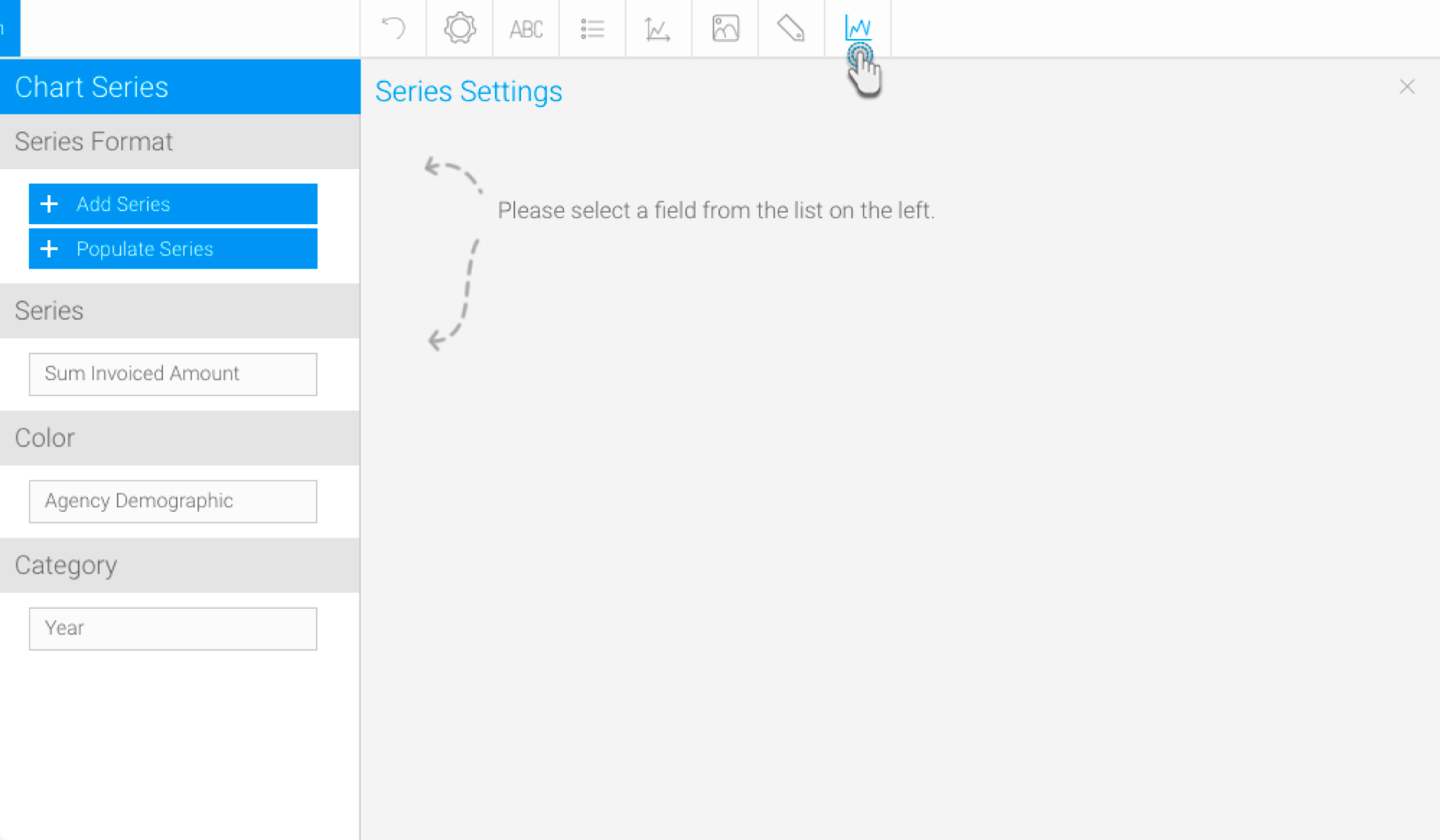
Series
...
| Styleclass | ||
|---|---|---|
| ||
Labels can be added to charts to print out the values of the data point onto the chart in text format. Charts that support labels include line, pie, and bar charts. Note: These settings will differ according to the selected chart type.
Series Format
To update the formatting of a selected, individual value in a series (i.e. a singular value of the dimension field). Ensure to select a non auto chart to format the series.
This includes the following buttons on the left-side panel:
- +Add Series - This button is used to format a series existing in the data set of the selected dimension color field. Note that it does not create a new series; the series specified here should match a value in the selected field. Click on this button, and provide the series formatting details.
- +Populate Series - This button is used to retrieve all the series values from the selected dimension field, and add them to this column. You can them select each one and format them.
| Expand | ||||||||||||||||||
|---|---|---|---|---|---|---|---|---|---|---|---|---|---|---|---|---|---|---|
| ||||||||||||||||||
|
| Expand | ||||||
|---|---|---|---|---|---|---|
| ||||||
Customize the border of the selected value. This refers to the data value represented in the charts, and the legend.
|
| Expand | ||||||||||
|---|---|---|---|---|---|---|---|---|---|---|
| ||||||||||
|
Series
| Expand | ||||||||||||||||||
|---|---|---|---|---|---|---|---|---|---|---|---|---|---|---|---|---|---|---|
| ||||||||||||||||||
| Expand | ||||||||||||||||||
| ||||||||||||||||||
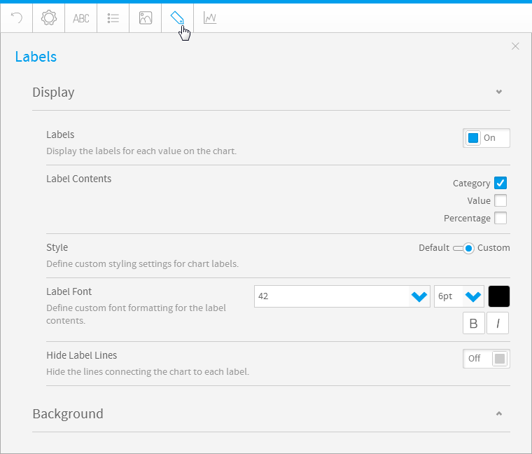
Option | Description | |||||||||||||||||
Labels | Display the labels for each value on the chart. | |||||||||||||||||
Label Contents | Specify the contents of the label, if applicable.
| |||||||||||||||||
Style | Define the formatting for chart labels. | |||||||||||||||||
Label Font | Define the custom font formatting for the label contents. | |||||||||||||||||
Hide Label Lines | Display or hide the lines connecting the chart to each label. | |||||||||||||||||
| Align Value Label | Choose the position of value labels. Options include:
Note: This setting is specific to bar charts. | |||||||||||||||||
| Rotate Value Label | Specify the angle the value labels are displayed, in relation to the axis. Note: This setting is specific to bar charts. | |||||||||||||||||
| Show Long Labels | If enabled, labels that do not fit a horizontal bar will be moved to the end of the bar. If disabled, the labels that do not fit, will not be displayed at all. Ensure that the time series functionality is disabled for this to work. Note: This setting is specific to bar charts. | |||||||||||||||||
| Overlapping Labels | Specify how labels that overlap other labels or data points are displayed. Choose to hide them or show the overlapping labels anyway. Note: This setting is specific to line charts. | |||||||||||||||||
| Expand | ||||||||||||||||||
| ||||||||||||||||||
Direction Specify the gradient shading style for the label background colour. Colour Specify the colour(s) to be used in the label background. Shadow Colour Select the colour to be used as the shadow effect on the chart labels. Border Define the border style for the label. Border Colour Define the colour of the border for the labels of the chart. Border Width Define the width of the border for the labels of the chart. |
Series
| Styleclass | ||
|---|---|---|
| ||
Series Format
To update the formatting of a selected, individual value in a series (i.e. a singular value of the dimension field). Ensure to select a non auto chart to format the series.
This includes the following buttons on the left-side panel:
- +Add Series - This button is used to format a series existing in the data set of the selected dimension color field. Note that it does not create a new series; the series specified here should match a value in the selected field. Click on this button, and provide the series formatting details.
- +Populate Series - This button is used to retrieve all the series values from the selected dimension field, and add them to this column. You can them select each one and format them.
|
| Expand | ||||||
|---|---|---|---|---|---|---|
| ||||||
|
| Expand | ||||||||||
|---|---|---|---|---|---|---|---|---|---|---|
| ||||||||||
|
| Expand | ||||
|---|---|---|---|---|
| ||||
|
| Expand | ||||||||||||||
|---|---|---|---|---|---|---|---|---|---|---|---|---|---|---|
| ||||||||||||||
| ||||||||||||||
| Expand | ||||||||||||||
| ||||||||||||||
| Option | Description | |||||||||||||
| Series Format | Name of the selected value of the series. It should match a data value from the data field for these settings to apply. | |||||||||||||
| Style | Choose if a style should be specified for the series value. Options include:
| |||||||||||||
| Custom Color | Specify if a custom color should be applied only to this value. | |||||||||||||
| Direction | Choose the direction the gradient should follow. (This only applied to gradient styling.) | |||||||||||||
| Color | The color to be applied to the selected value. In case of gradience, choose the inner and outer colors. | |||||||||||||
| Shapes | Define whether line shapes are on, off, or system default. | |||||||||||||
| Thickness | Define the width of the line in pixels. | |||||||||||||
| Line Style | Define the style of the series line as solid, dashed, or dotted. | |||||||||||||
| Expand | ||||||||||||||
| ||||||||||||||
| Option | Description | |||||||||||||
| Color | Customize the border color. | |||||||||||||
| Width | Choose the border width. Select from thin, medium, and thick. | |||||||||||||
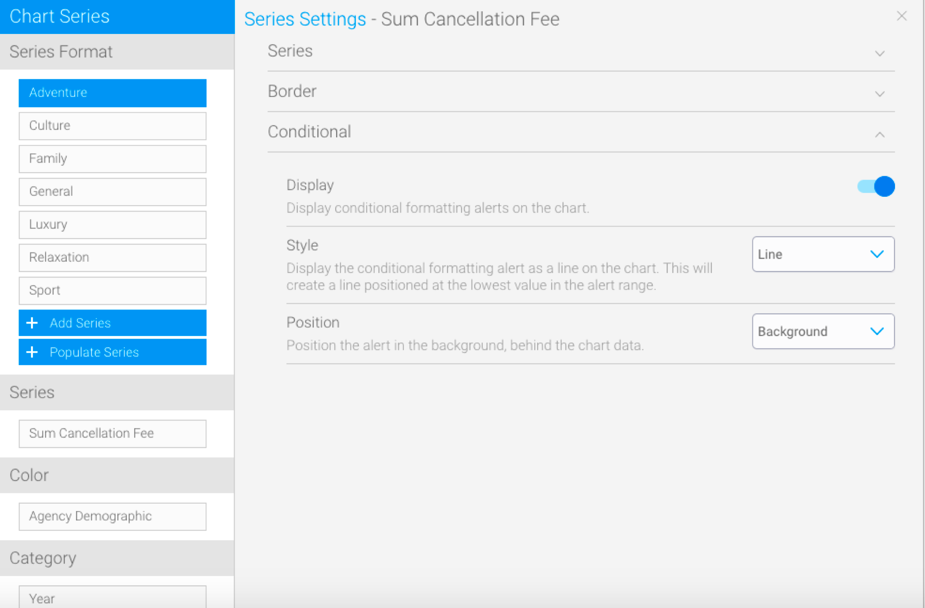
| Expand | ||||||||||||||
| ||||||||||||||
Option | Description | Display | Use this toggle to apply a conditional formatting rule on the chart. | Style | Define how to display the conditional formatting rule on the chart. Options include: Line: displays the rule as a line, which will be
Position | Specify how the conditional formatting rule should be positioned
|
Color
| Expand | ||||
|---|---|---|---|---|
| ||||
|
...
|
...
Series
...
| title | Series |
|---|
...
Option
...
Description
...
Style
...
Specify the shading style for the series.
...
Direction
...
Select the direction of the gradient shading to be applied to the series.
...
Colour
...
Define the colour(s) to be applied to the series.
...
Combination Sub Chart
...
Specify which sub chart this series belongs to. This will define the type of chart, and which vertical axis it will use.
...
Shapes
...
Define whether line shapes are on, off, or system default.
...
Thickness
...
Define the width of the line in pixels.
...
| title | Border |
|---|
Option | Description |
|---|---|
Colour | Define a colour for the outline of the series. |
Width | Define the width of the outline of the series. |
...
| title | Colour |
|---|
...
Option
...
Description
...
Style
...
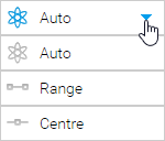
Define the colour set and bounds to be applied to the series.
...
This is where you can define the bounds of the colour when using a gradient or colour set. Options include:
- Auto - this automatically works out the min and max values of the chart.
- Range - this allows you to provide the min and max values for the bounds of the chart colour range.
- Centre - this allows you to provide the mid point value for the chart colour range.
...
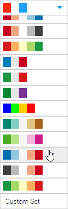
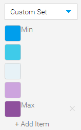
This allows you to select from a list of pre-defined colour sets for your chart, or alternatively define your own.
Pre-defined Colour Sets
| Custom Colour Set
|
...
| title | Animation |
|---|
Option | Description |
|---|---|
Speed | Define how long each frame is displayed for. |
...
| title | Conditional |
|---|
...
Option
...
Description
...
Display
...
Enable/Disable the display of conditional formatting alerts on the chart.
...
Style
...
Select how to display the alerts on the chart from three styles:
- Area: display the conditional formatting alert as a range on the chart. This will create a block of colour for the whole range of the alert.
- Bar: display the conditional formatting alert by highlighting bars that fall into the alert range.
- Line: display the conditional formatting alert as a line on the chart. This will create a line positioned at the lowest value in the alert range.
...
Position
...
Define whether the alert should be displayed in the foreground (in front) of the chart, or in the background (behind) the chart.
| HTML |
|---|
<iframe width="700" height="394" src="https://www.youtube.com/embed/YWCKaHNIOWU?color=white" frameborder="0" allowfullscreen></iframe> |
Color
...
| title | Sort |
|---|
...
Specify how to display the legend values. Options include:
- Alphanumeric: displays the legend values alphanumerically. This means any custom sorting options applied to the field will be ignored.
- Table: displays the legend values according to the output of the table. This means that if a field has custom sorting applied through the use of Ref Code, then this sorting order is applied.
...
Define the direction in which the values of the chart should be sorted. Options include:
- Ascending: order the values from low to high.
- Descending: order the values from high to low.
...
| title | Color |
|---|
The color applied to the chart will be based on the selection made here.
...
Category
...
| title | Sort |
|---|
...
Specify how the data in the chart is ordered, from one of these options;
- Data Order - order this data based on the order the values appear in the report table.
- Alphanumeric - order this data based on the values in the chart, alphabetically.
- ReferenceCode - order this data based on the values in the chart, by Reference Code custom sort order.
- Series - order this data based on the values in the Sort Series field.
...
|
| Expand | ||||||||
|---|---|---|---|---|---|---|---|---|
| ||||||||
The color applied to the chart will be based on the selection made here.
|
| Expand | ||||||||||
|---|---|---|---|---|---|---|---|---|---|---|
| ||||||||||
The following formatting options are applicable for waterfall charts.
|
Category
| Expand | ||||||||
|---|---|---|---|---|---|---|---|---|
| ||||||||
|
| Expand | ||||||||
|---|---|---|---|---|---|---|---|---|
| ||||||||
|
| Expand | ||||||||||||||
|---|---|---|---|---|---|---|---|---|---|---|---|---|---|---|
| ||||||||||||||
Allows you to remove dimensions/categories from charts, in order to decrease the chart size. This is ideal for situations in which charts contain too many categories, making it difficult to view them properly. This feature allows you to select a specific number of categories to display. Supported bar types: Bars, areas, line (except Z charts), auto charts (with only a single dimension field). Note: This does not work for charts with dimension colors.
|
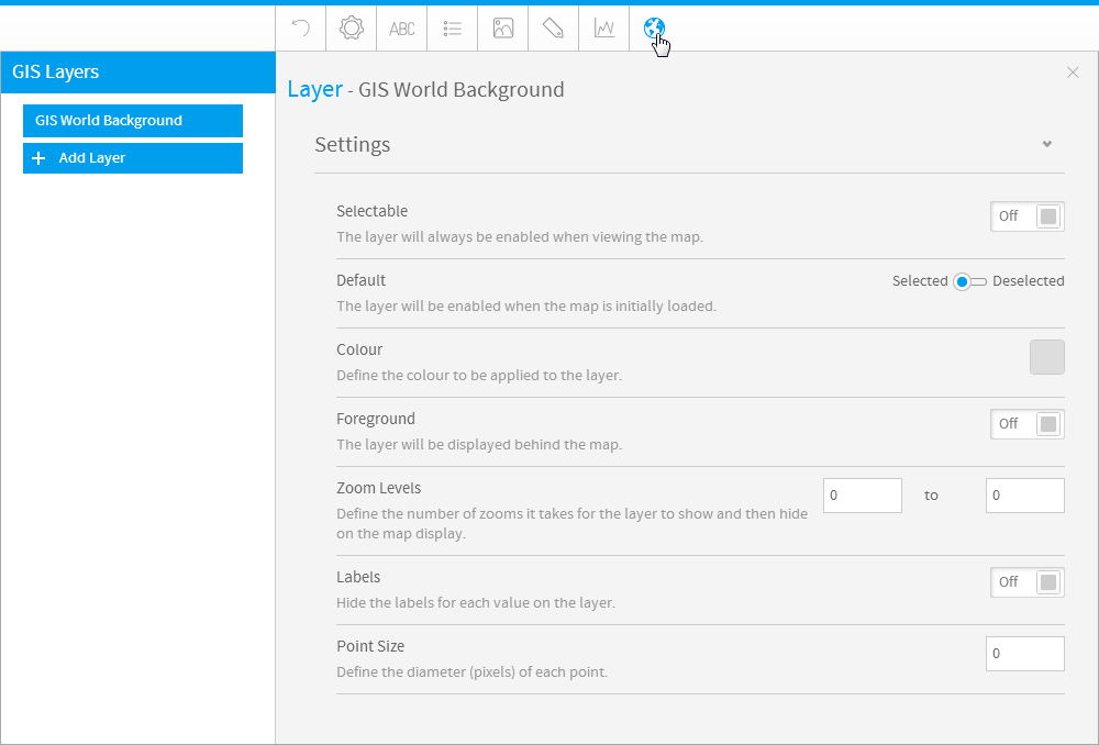
GIS Settings
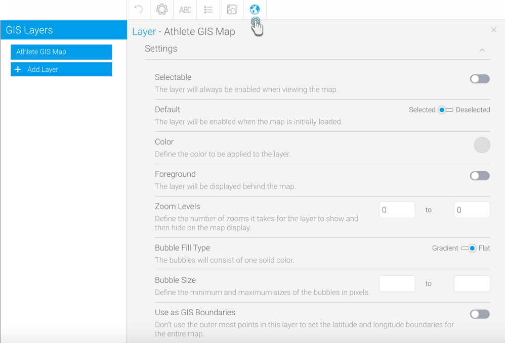
...
| title | Highlight |
|---|
...
GIS Settings
| Styleclass | ||
|---|---|---|
| ||
| Expand | |||||||||||||||||||
|---|---|---|---|---|---|---|---|---|---|---|---|---|---|---|---|---|---|---|---|
| |||||||||||||||||||
Labels Display the labels for each value in the layer. Point Size Define the diameter (pixels) of each point. Bubble Fill Type Define the shading effect to be applied to the bubbles. |
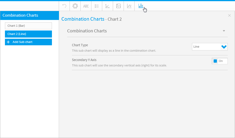
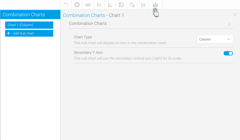
Combination Charts
| Styleclass | ||
|---|---|---|
| ||
|
Combination Charts
| Expand | ||||||
|---|---|---|---|---|---|---|
| ||||||
|
| horizontalrule |
|---|
| Styleclass | ||
|---|---|---|
| ||
...