Page History
...
The chart format options are the most dynamic options and are based on the type of chart selected. For example for a pie chart you will be able to set the shadow colour color and exploding slice options. The common options found in the chart format drop down include interactivity options such as visible series selection.
...
| Expand | |||||||||||||||||||||||||||||||||||||||||||||||||||||||||||||||||||||||||||||||||||||||||||
|---|---|---|---|---|---|---|---|---|---|---|---|---|---|---|---|---|---|---|---|---|---|---|---|---|---|---|---|---|---|---|---|---|---|---|---|---|---|---|---|---|---|---|---|---|---|---|---|---|---|---|---|---|---|---|---|---|---|---|---|---|---|---|---|---|---|---|---|---|---|---|---|---|---|---|---|---|---|---|---|---|---|---|---|---|---|---|---|---|---|---|---|
| |||||||||||||||||||||||||||||||||||||||||||||||||||||||||||||||||||||||||||||||||||||||||||
|
...
| Expand | ||||||||||||||||||||||
|---|---|---|---|---|---|---|---|---|---|---|---|---|---|---|---|---|---|---|---|---|---|---|
| ||||||||||||||||||||||
|
...
| Expand | ||||||||||||||||
|---|---|---|---|---|---|---|---|---|---|---|---|---|---|---|---|---|
| ||||||||||||||||
|
...
| Expand | ||||||||||||
|---|---|---|---|---|---|---|---|---|---|---|---|---|
| ||||||||||||
|
...
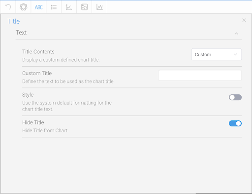
The title option allows you to change the title of the chart as well as the style – such as the font settings.

| Expand | ||||||||
|---|---|---|---|---|---|---|---|---|
| ||||||||
|
Legend
|
Legend
The Legend is a box that identifies the patterns or colors that are assigned to the data series or categories in a chart. This section of the menu The Legend is a box that identifies the patterns or colours that are assigned to the data series or categories in a chart. This section of the menu lets you set the following options.
...
| Expand | ||||
|---|---|---|---|---|
| ||||
|
| Expand | ||||||||||||||||||||||||||||||||
|---|---|---|---|---|---|---|---|---|---|---|---|---|---|---|---|---|---|---|---|---|---|---|---|---|---|---|---|---|---|---|---|---|
| ||||||||||||||||||||||||||||||||
|
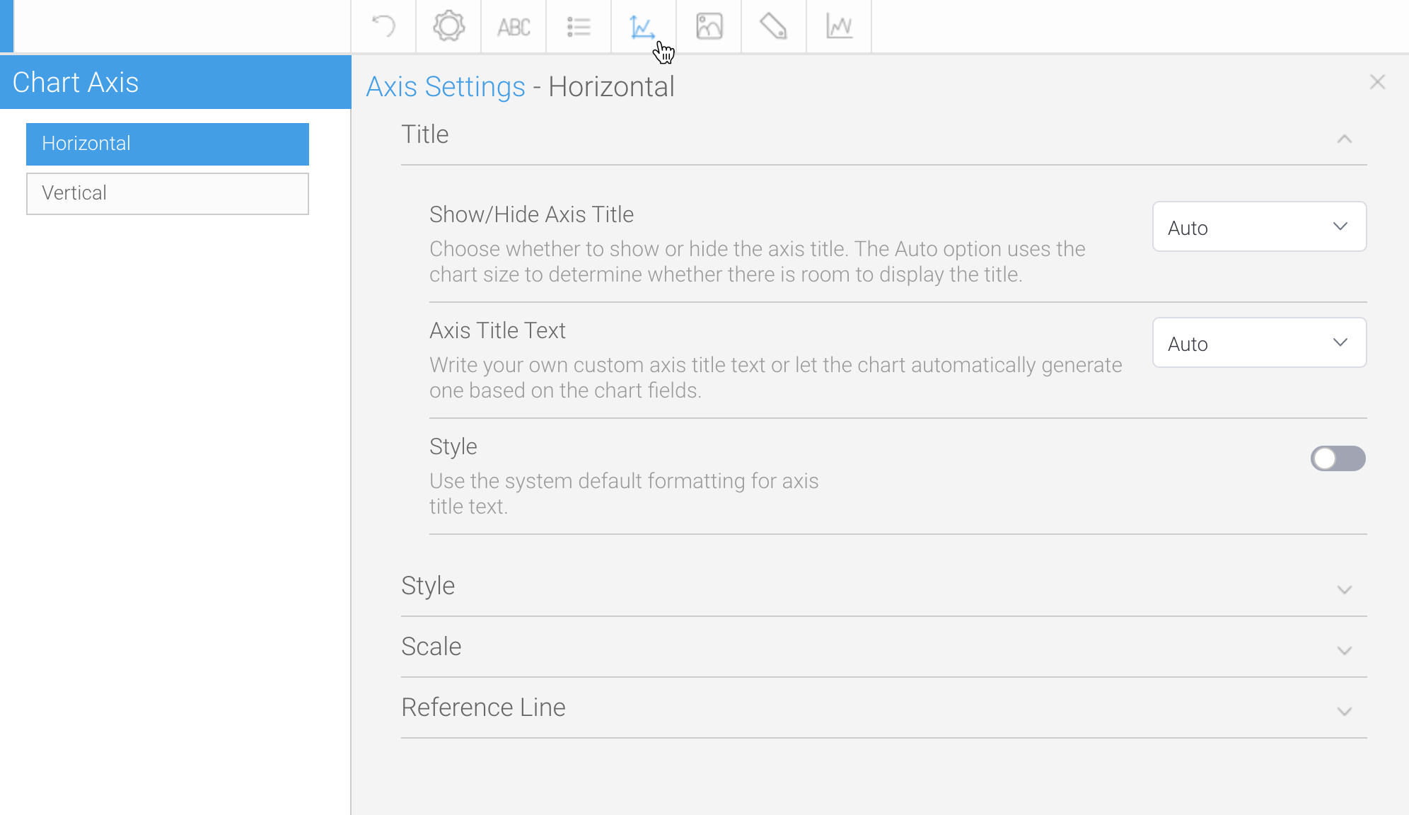
Axis
A line bordering the chart plot area used as a frame of reference for measurement. The y axis is usually the vertical axis and contains data. The x-axis is usually the horizontal axis and contains categories.

| Expand | ||||||||||||
|---|---|---|---|---|---|---|---|---|---|---|---|---|
| ||||||||||||
|
...
| Expand | ||||||||||||||||||||||||||||||||||||||||||||||||||||||||||||||||
|---|---|---|---|---|---|---|---|---|---|---|---|---|---|---|---|---|---|---|---|---|---|---|---|---|---|---|---|---|---|---|---|---|---|---|---|---|---|---|---|---|---|---|---|---|---|---|---|---|---|---|---|---|---|---|---|---|---|---|---|---|---|---|---|---|
| ||||||||||||||||||||||||||||||||||||||||||||||||||||||||||||||||
The Axis style drop down lets you determine the formats to be applied to axis.
|
| Expand | ||||||||||||
|---|---|---|---|---|---|---|---|---|---|---|---|---|
| ||||||||||||
The Axis scale drop down Scale section lets you determine the scale dimensions. Generally you will only be able to set the Y Axis attributes – — unless you are using XY charts in which case you can set both X & and Y attributes.
|
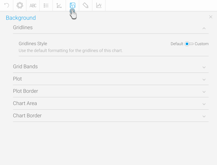
Background
The Background options let you set the style and colour of the main chart elements such as the plot and chart areas. You can apply elements such as background images and or gridlines.
|
| Expand | ||||||||||||||||||
|---|---|---|---|---|---|---|---|---|---|---|---|---|---|---|---|---|---|---|
| ||||||||||||||||||
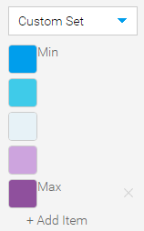
Allows you to add one or more reference lines to a numeric axis. This is a visual line that appears on the chart at a specified position. More than one reference lines can be added by using the Add Item option.
|
Background
The Background options let you set the style and color of the main chart elements such as the plot and chart areas. You can apply elements such as background images and or gridlines.
| Expand | ||||||||||
|---|---|---|---|---|---|---|---|---|---|---|
| ||||||||||
|
| Expand | ||||||||||||
|---|---|---|---|---|---|---|---|---|---|---|---|---|
| ||||||||||||
Gridline options are available for all category charts, bubble and scatter charts.
| ||||||||||||
| Expand | ||||||||||||
|
Option | Description |
|---|---|
Show Gridlines | Select which axis gridlines to display. |
X Gridline Colour | Specify the colour to display x axis gridlines in. |
Y Gridline Colour | Specify the colour to display y axis gridlines in. |
| title | Grid Bands |
|---|
Gridline options are available for all category charts, bubble and scatter charts.
Option | Description |
|---|---|
Band Colour | Define the colour to be used for grid band shading on the chart. |
Band Opacity | Select the opacity percentage of the grid band shading on the chart. The lower the percentage, the more transparent it is. |
| title | Plot |
|---|
The plot area is the area bounded by the axes, including all data series. The drop down options let you set the background colours applied to the plot area.
Option | Description |
|---|---|
Style | Specify the background shading style for the plot. |
Direction | Specify the gradient shading style for the plot background colour. |
Colour | Specify the colour(s) to be used in the plot background. |
Image | Select an image to use for the plot background. |
Image Opacity | Select the opacity percentage of the plot background image. The lower the percentage, the more transparent it is. |
| title | Plot Border |
|---|
The plot area is the area bounded by the axes, including all data series. The drop down options let you set the background colours applied to the plot area.
Option | Description |
|---|---|
Style | Define the border style for the plot. |
Colour | Define the colour of the border for the plot. |
Width | Define the width of the border for the plot. |
| title | Chart Area |
|---|
The entire chart and all its elements are described as the chart area. The drop down options let you set the background colours applied to the chart area.
Option | Description |
|---|---|
Style | Specify the background shading style for the chart. |
Direction | Specify the gradient shading style for the chart background colour. |
Colour | Specify the colour(s) to be used in the chart background. |
Image | Select an image to use for the chart background. |
Image Opacity | Select the opacity percentage of the chart background image. The lower the percentage, the more transparent it is. |
| Expand | ||||||||
|---|---|---|---|---|---|---|---|---|
| ||||||||
The entire chart and all its elements are described as the chart areaplot area is the area bounded by the axes, including all data series. The drop down options let you set the background colours colors applied to the chart plot area.
|
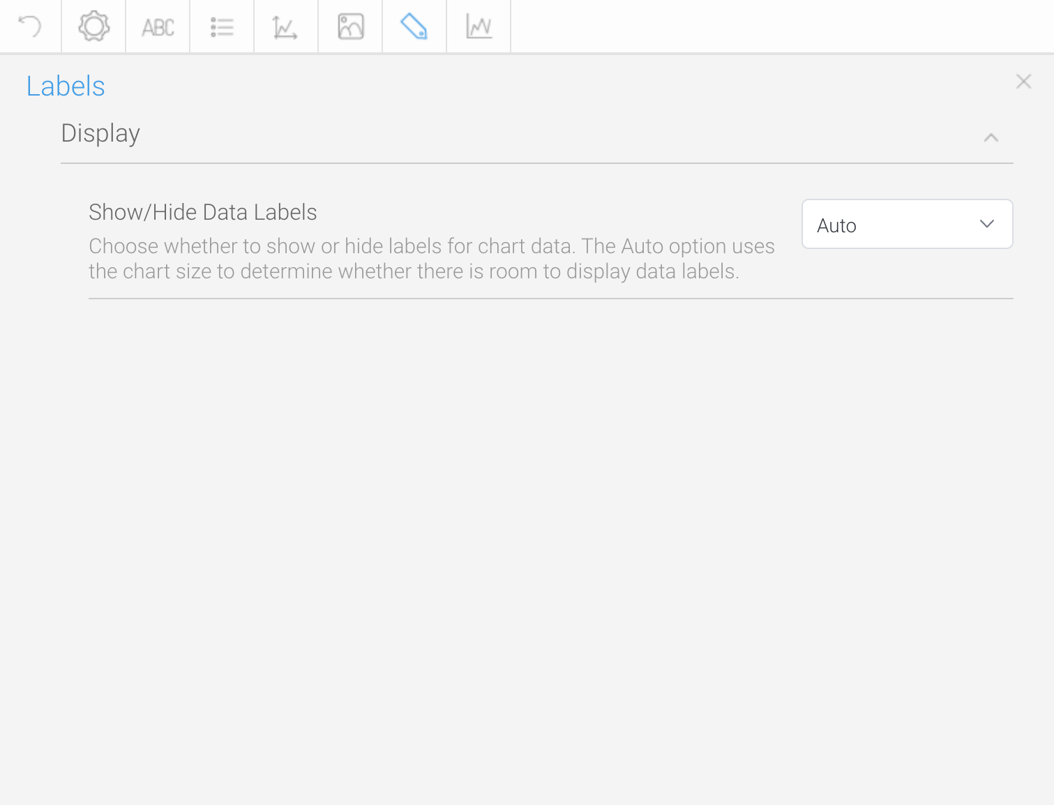
Labels
Labels can be added to charts to print out the values of the data point onto the chart in text format. Charts that support labels include line, pie, bar charts, and more. Note: These settings will differ according to the selected chart type.

...
| title | Display |
|---|
...
Option
...
Description
...
Labels
...
Show or hide labels for values on the chart. Options include:
- Auto: (Default selection) Display the labels automatically where appropriate for each value on the chart. For charts, such as pie, they disappear if the chart size is too small.
- Show: Display the labels for each value on the chart. The rest of the label settings (discussed below) will only appear when this option is selected.
- Hide: Hide the labels for each value on the chart.
...
Label Contents
...
Specify the contents of the label, if applicable.
- Category: this is the dimension value.
- Value: this is the metric value.
- Percentage: this is the % of total for the metric value.
...
Style
...
Define the formatting for chart labels.
...
Label Font
...
Define the custom font formatting for the label contents.
...
Hide Label Lines
...
Display or hide the lines connecting the chart to each label.
...
Choose the position of value labels. Options include:
Centered: Displays the value label in the center of the bar.
Axis aligned: The value label is position according to the axis.
Above: The value label is displayed outside the bar.
Note: This setting is specific to bar charts.
...
Specify the angle the value labels are displayed, in relation to the axis.
Note: This setting is specific to bar charts.
...
If enabled, labels that do not fit a horizontal bar will be moved to the end of the bar. If disabled, the labels that do not fit, will not be displayed at all.
Ensure that the time series functionality is disabled for this to work.
Note: This setting is specific to bar charts.
...
Specify how labels that overlap other labels or data points are displayed. Choose to hide them or show the overlapping labels anyway.
Note: This setting is specific to line charts.
...
| title | Background |
|---|
...
Option
...
Description
...
Style
...
Specify the background shading style for the label.
...
Direction
...
Specify the gradient shading style for the label background colour.
...
Colour
...
Specify the colour(s) to be used in the label background.
...
Shadow Colour
...
Select the colour to be used as the shadow effect on the chart labels.
...
Border
...
Define the border style for the label.
...
Border Colour
...
Define the colour of the border for the labels of the chart.
...
Border Width
...
Define the width of the border for the labels of the chart.
Series
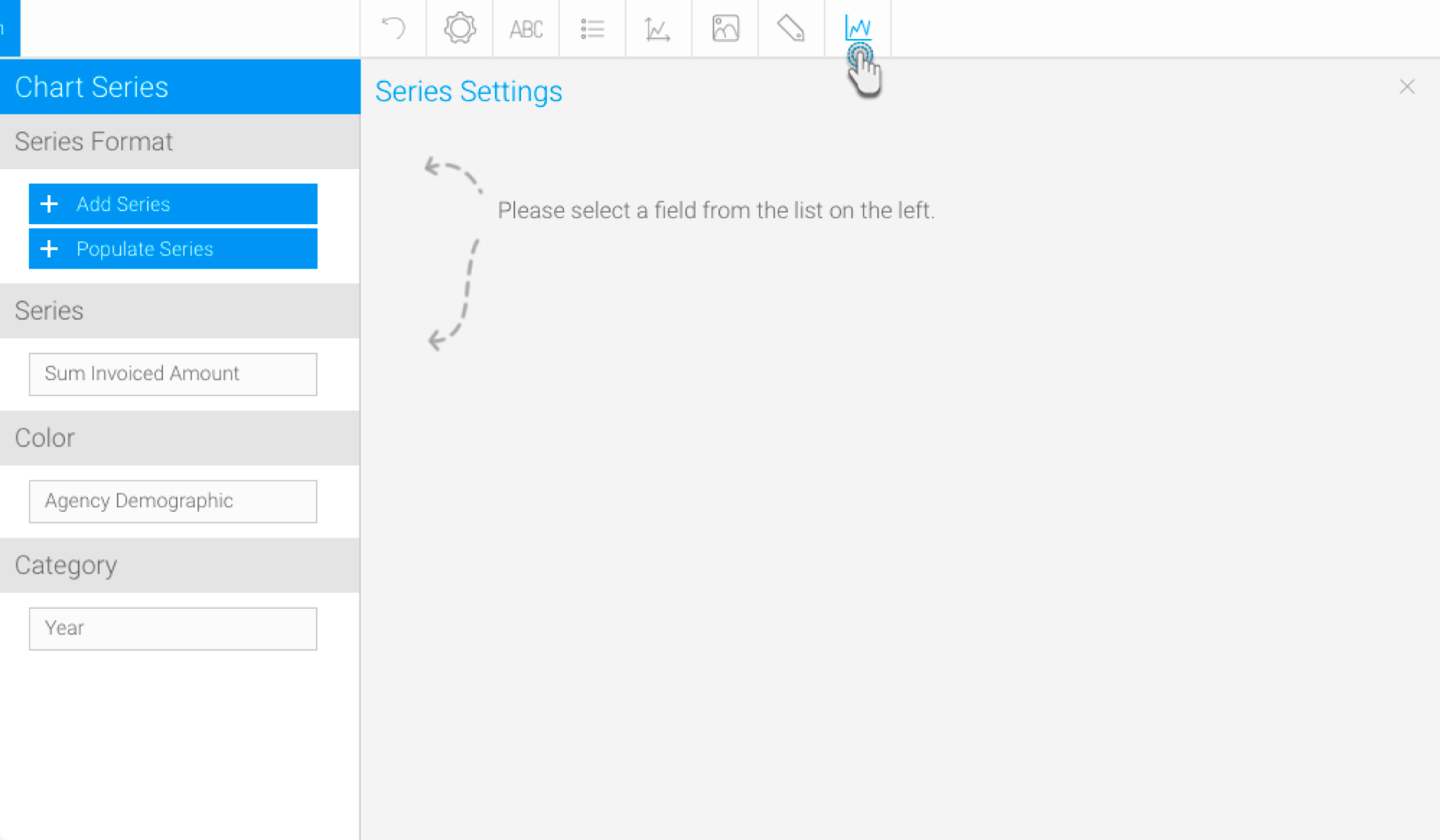
Series Format
To update the formatting of a selected, individual value in a series (i.e. a singular value of the dimension field). Ensure to select a non auto chart to format the series.
This includes the following buttons on the left-side panel:
- +Add Series - This button is used to format a series existing in the data set of the selected dimension color field. Note that it does not create a new series; the series specified here should match a value in the selected field. Click on this button, and provide the series formatting details.
- +Populate Series - This button is used to retrieve all the series values from the selected dimension field, and add them to this column. You can them select each one and format them.
...
| title | Series |
|---|
...
Choose if a style should be specified for the series value. Options include:
- Default: Select this to apply the default settings to the selected series value.
- Solid: Select this to specify a custom solid color for the selected value.
- Gradient: Choose this to specify custom gradient colors for the selected value.
...
| title | Border |
|---|
Customize the border of the selected value. This refers to the data value represented in the charts, and the legend.
...
| title | Conditional |
|---|
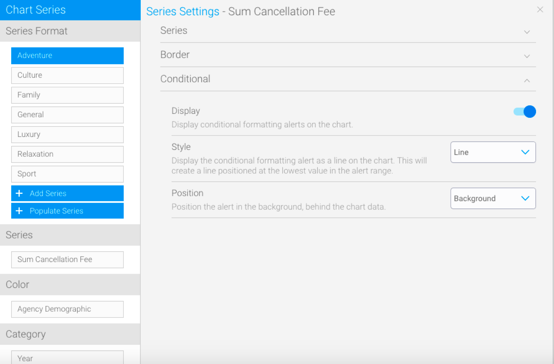
| Note |
|---|
This section only appears if conditional formatting has been applied in the report, and the color field has not been used in the chart builder. |
|
| Expand | ||||||||
|---|---|---|---|---|---|---|---|---|
| ||||||||
The plot area is the area bounded by the axes, including all data series. The drop down options let you set the background colors applied to the plot area.
|
| Expand | ||||||||||||
|---|---|---|---|---|---|---|---|---|---|---|---|---|
| ||||||||||||
The entire chart and all its elements are described as the chart area. The drop down options let you set the background colors applied to the chart area.
|
| Expand | ||||||||
|---|---|---|---|---|---|---|---|---|
| ||||||||
The entire chart and all its elements are described as the chart area. The drop down options let you set the background colors applied to the chart area.
|
Labels
Labels can be added to charts to print out the values of the data point onto the chart in text format. Charts that support labels include line, pie, bar charts, and more. Note: These settings will differ according to the selected chart type.
| Expand | ||||||||||||||||||||||||
|---|---|---|---|---|---|---|---|---|---|---|---|---|---|---|---|---|---|---|---|---|---|---|---|---|
| ||||||||||||||||||||||||
|
| Expand | ||||||||||||||||
|---|---|---|---|---|---|---|---|---|---|---|---|---|---|---|---|---|
| ||||||||||||||||
|
Series
Series Format
To update the formatting of a selected, individual value in a series (i.e. a singular value of the dimension field). Ensure to select a non auto chart to format the series.
This includes the following buttons on the left-side panel:
- +Add Series - This button is used to format a series existing in the data set of the selected dimension color field. Note that it does not create a new series; the series specified here should match a value in the selected field. Click on this button, and provide the series formatting details.
- +Populate Series - This button is used to retrieve all the series values from the selected dimension field, and add them to this column. You can them select each one and format them.
| Expand | ||||||||||||||
|---|---|---|---|---|---|---|---|---|---|---|---|---|---|---|
| ||||||||||||||
|
...
Define how to display the conditional formatting rule on the chart. Options include:
- Line: displays the rule as a line, which will be positioned at the lowest value in the alert range.
- Area: displays the rule as a range on the chart. Creates a block of color for the whole range of the formatting rule.
...
Specify how the conditional formatting rule should be positioned. Options include:
- Background: displays the rule behind the chart data.
- Foreground: displays the rule in front of the chart data.
Series
| Expand | ||||||||||||||||||||
|---|---|---|---|---|---|---|---|---|---|---|---|---|---|---|---|---|---|---|---|---|
| ||||||||||||||||||||
| ||||||||||||||||||||
| Expand | ||||||||||||||||||||
| ||||||||||||||||||||
Option | Description | |||||||||||||||||||
Colour | Define a colour for the outline of the series. | |||||||||||||||||||
Width | Define the width of the outline of the series. | |||||||||||||||||||
|
| Expand | |||||||||
|---|---|---|---|---|---|---|---|---|---|
| |||||||||
Customize the border of the selected value. This refers to the data value represented in the charts, and the legend.
| |||||||||
| Expand | |||||||||
|
Option | Description |
|---|---|
Speed | Define how long each frame is displayed for. |
| title | Conditional |
|---|
Option
Description
Display
Enable/Disable the display of conditional formatting alerts on the chart.
Style
Select how to display the alerts on the chart from three styles:
- Area: display the conditional formatting alert as a range on the chart. This will create a block of colour for the whole range of the alert.
- Bar: display the conditional formatting alert by highlighting bars that fall into the alert range.
- Line: display the conditional formatting alert as a line on the chart. This will create a line positioned at the lowest value in the alert range.
Position
Define whether the alert should be displayed in the foreground (in front) of the chart, or in the background (behind) the chart.
| HTML |
|---|
<iframe width="700" height="394" src="https://www.youtube.com/embed/YWCKaHNIOWU?color=white" frameborder="0" allowfullscreen></iframe> |
Color
|
| Expand | ||||||||||
|---|---|---|---|---|---|---|---|---|---|---|
| ||||||||||
|
Series
| Expand | ||||||||||||||||||||||||||||
|---|---|---|---|---|---|---|---|---|---|---|---|---|---|---|---|---|---|---|---|---|---|---|---|---|---|---|---|---|
| ||||||||||||||||||||||||||||
|
| Expand | ||||||
|---|---|---|---|---|---|---|
| ||||||
|
| Expand | ||||||||||
|---|---|---|---|---|---|---|---|---|---|---|
| ||||||||||
|
| Expand | ||||
|---|---|---|---|---|
| ||||
|
| Expand | ||||||||||
|---|---|---|---|---|---|---|---|---|---|---|
| ||||||||||
|
Color
| Expand | ||||||
|---|---|---|---|---|---|---|
| ||||||
|
| Expand | ||||||||
|---|---|---|---|---|---|---|---|---|
| ||||||||
The color applied to the chart will be based on the selection made here.
|
| Expand | ||||||||||
|---|---|---|---|---|---|---|---|---|---|---|
| ||||||||||
The following formatting options are applicable for waterfall charts.
| ||||||||||
| Expand | ||||||||||
| ||||||||||
| Option | Description | |||||||||
| Ordering | Specify how to display the legend values. Options include:
| |||||||||
| Sort Direction | Define the direction in which the values of the chart should be sorted. Options include:
| |||||||||
| Expand | ||||||||||
| ||||||||||
The color applied to the chart will be based on the selection made here.
|
Category
| Expand | ||||||||
|---|---|---|---|---|---|---|---|---|
| ||||||||
|
...
| Expand | ||||||||
|---|---|---|---|---|---|---|---|---|
| ||||||||
|
...
| Expand | ||||||||||||||
|---|---|---|---|---|---|---|---|---|---|---|---|---|---|---|
| ||||||||||||||
Allows you to remove dimensions/categories from charts, in order to decrease the chart size. This is ideal for situations in which charts contain too many categories, making it difficult to view them properly. This feature allows you to select a specific number of categories to display. Supported bar types: Bars, areas, line (except Z charts), auto charts (with only a single dimension field). Note: This does not work for charts with dimension colors.
|
...
| Expand | ||||||||||||||||||||||||
|---|---|---|---|---|---|---|---|---|---|---|---|---|---|---|---|---|---|---|---|---|---|---|---|---|
| ||||||||||||||||||||||||
|
...