Like what you see? Have a play with our trial version.

Versions Compared

Key

  • This line was added.
  • This line was removed.
  • Formatting was changed.

...

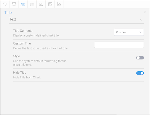
The title option allows you to change the title of the chart as well as the style – such as the font settings.

Image RemovedImage Added


Expand
titleText


Option

Description

Title Contents

Define what should be shown in the Chart Title area.

  • Auto Title: Display a title that is automatically generated based on the fields used in the chart. Note: only available for Auto Charts.
  • Report Name: Display the report name as the title of the chart.
  • Animation Field: Display the value of the animation field for each frame as the chart title.
  • Metric: Display the name of the currently selected series as the chart title. 
    Note: the chart has to be a single metric series selection. This means that it can only display one metric at a time. To do this just add one metric to the chart and then enable series selection, rather than adding all metrics and allowing users to toggle multiple at a time.
  • Custom: Display a custom defined chart title.
  • None: Hide the chart title.

Custom Title

Display a custom defined chart title.

Style

Use the system default formatting for the chart title text, or customize with your preferred typeface, font size, font decoration, font color and text alignment.

Hide Title

When this toggled is enabled, it will hide the title from the chart. It is the title on top of the chart itself that is hidden.

When a chart title is entered, the title can be seen when selecting a chart during creation of dashboard, story, and presentation, regardless whether the title is hidden or not.


Legend

The Legend is a box that identifies the patterns or colors that are assigned to the data series or categories in a chart. This section of the menu lets you set the following options.

...

Expand
titleDisplay


Option

Description

Show/Hide Data Labels

Show or hide labels for values on the chart. Options include:

  • Auto: (Default selection) Display the labels automatically where appropriate for each value on the chart. For charts, such as pie, they disappear if the chart size is too small.
  • Show: Display the labels for each value on the chart. The rest of the label settings (discussed below) will only appear when this option is selected.
  • Hide:  Hide the labels for each value on the chart.

Label Contents

Specify the contents of the label, if applicable.

  • Category: this is the dimension value.
  • Value: this is the metric value.
  • Percentage: this is the % of total for the metric value.
Label FieldIf your chart type could display a label on different fields, use this dropdown to choose the label field.

Style

Define the formatting for chart labels.

Label Font

Define the custom font formatting for the label contents.

Match label color with series color

Choose whether the label will inherit the series line color to which it is related.

This applies only to line chart types.

Hide Label Lines

Display or hide the lines connecting the chart to each label.

Align Value Label

Choose the position of value labels. Options include:

  • Centered: Displays the value label in the center of the bar.

  • Axis aligned: The value label is position according to the axis.

  • Above: The value label is displayed outside the bar.

Note: This setting is specific to bar charts.

Rotate Value Label

Specify the angle the value labels are displayed, in relation to the axis.

Note: This setting is specific to bar charts.

Show Long Labels

If enabled, labels that do not fit a horizontal bar will be moved to the end of the bar. If disabled, the labels that do not fit, will not be displayed at all.

Ensure that the time series functionality is disabled for this to work.

Note: This setting is specific to bar charts.

Overlapping Labels

Specify how labels that overlap other labels or data points are displayed. Choose to hide them or show the overlapping labels anyway.

Note: This setting is specific to line charts.


Expand
titleBackground


Option

Description

Style

Specify the background shading style for the label.

Direction

Specify the gradient shading style for the label background color.

Color

Specify the color(s) to be used in the label background.

Shadow Color

Select the color to be used as the shadow effect on the chart labels.

Border

Define the border style for the label.

Border Color

Define the color of the border for the labels of the chart.

Border Width

Define the width of the border for the labels of the chart.


...

Expand
titleColor


Option

Description

Style

Define the color set and bounds to be applied to the series.

Bounds

This is where you can define the bounds of the color when using a gradient or color set. Options include:

  • Auto - this automatically works out the min and max values of the chart.
  • Range - this allows you to provide the min and max values for the bounds of the chart color range.
  • Centre - this allows you to provide the mid point value for the chart color range.

Color Set

This allows you to select from a list of pre-defined color sets for your chart, or alternatively define your own.

Pre-defined Color Sets

Image Modified

Custom Color Set

Image Modified


Expand
titleAnimation


Option

Description

Speed

Define how long each frame is displayed for.


...