Page History
...
| Anchor | ||||
|---|---|---|---|---|
|
Dashboard creation basics
In this section, we will cover some of the basics of around creating a Dashboard.
| Anchor | ||||
|---|---|---|---|---|
|
Dashboard templates
When creating a new dashboard tab, you can choose a pre-built layout or a canvas. Here’s the difference:
- Dashboard Canvas: A flexible template that allows you to create a pixel-perfect design. There are no restrictions on object positioning so they can be positioned anywhere. Support for all dashboard content objects is provided on the canvas, along with functionality that allows authorized developers to create a highly customizable user experience.
- Dashboard static layouts: A range of pre-designed dashboard templates with established layouts, where you can drop in objects. These layouts have less flexibility in positioning objects compared to canvas, but and are simpler to build. Objects such as reports , and filters and text widgets can be added to these layouts.
Note: Your dashboard can contain any number of multiple tabs, and each tab can have use a different template. In this way, That means that canvas tabs can be built alongside layout tabs.
...
- Visual Mode: Shows a visual representation of the dashboard. Allows users to drag, drop and configure objects while this mode is enabled.
- Code Mode: Swap between visual and code modes with the bilateral editor and edit dashboard code with HTML, Javascript JavaScript and CSS. Authorized developers can extend dashboard functionality within Yellowfin and create rich application experiences. Learn more here. *Note that Code Mode is supported only in on the dashboard canvas.
Both the editor modes work seamlessly together, so changes made on in one mode will immediately be reflected on in the other one. This allows users to use them interchangeably and build a dashboard suitable for any purpose. These two types of modes help users of varying capabilities to come up with their ultimate dashboard design.
Developer-centric dashboard editing
Developers can create rich application experiences , by extending functionality with Code Mode, Code Widgetscode widgets, and Actions Buttonsactions buttons. Only authorized developers will be able to edit dashboard code using HTML, JavascriptJavaScript, and CSS.
Note that this coding functionality is only available in the canvason dashboard canvases; it is not supported in on dashboard layouts.
Refer to any of our wiki sections for more information on these:
...
Understanding the dashboard builder
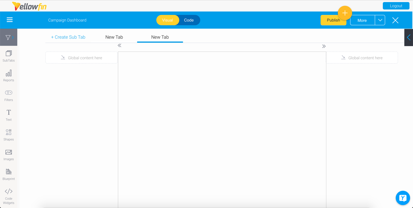
The following screenshot shows a fresh draft dashboard, and its features.

...
Number
...
Feature
...
Description
...
1
...
Dashboard sub tab template
...
The mid-section of a dashboard displays the selected sub tab template. This could either be the dashboard canvas, or a layout.
The dashboard canvas has a fully flexible layout, that allows you to drop objects, such as reports, filters, texts, images, shapes, and more, anywhere. Whereas, a dashboard layout has less flexibility but are simpler to build; if selected, you will not be able to use all the below dashboard features.
...
2
...
Global content container
...
Content containers on either side of the sub tab, are where you can drop global objects that are visible on the entire dashboard, not just specific sub tabs. The positioning of these objects will be fixed. These are ideal for adding filters.
...
3
...
Left side navigation filters
...
This button brings out a panel to apply filters. The panel shows all filters added to the dashboard, and serves as an alternate style of displaying filters. Learn more.
...
4
...
Sub tab button
...
Manage sub tabs contained in this dashboard. You can view a list of sub tabs, reorder them, open a tab, or create a new sub tab. Learn more.
...
5
...
Report Widgets
...
Search for and add existing reports to the dashboard. If the report has snapshots and bookmarks, you can add those too.
...
6
...
Filter Widgets
...
...
7
...
Text Widgets
...
Drag in a Text Widget onto the dashboard. Learn more.
...
8
...
Shape Widgets*
...
The Shape Widget panels allows you to include shapes, icons, and lines to your dashboard. Learn more.
Only supported in dashboard canvas.
...
9
...
Image Widgets*
...
Allows you to add a pre-existing image or a new one through the Image manager. Learn more.
Only supported in dashboard canvas.
...
10
...
Blueprint*
...
Allows users to wireframe a dashboard design, and upon further configuration, create Quick Charts directly on the dashboard.
Only supported in dashboard canvas.
...
11
...
...
...
12
...
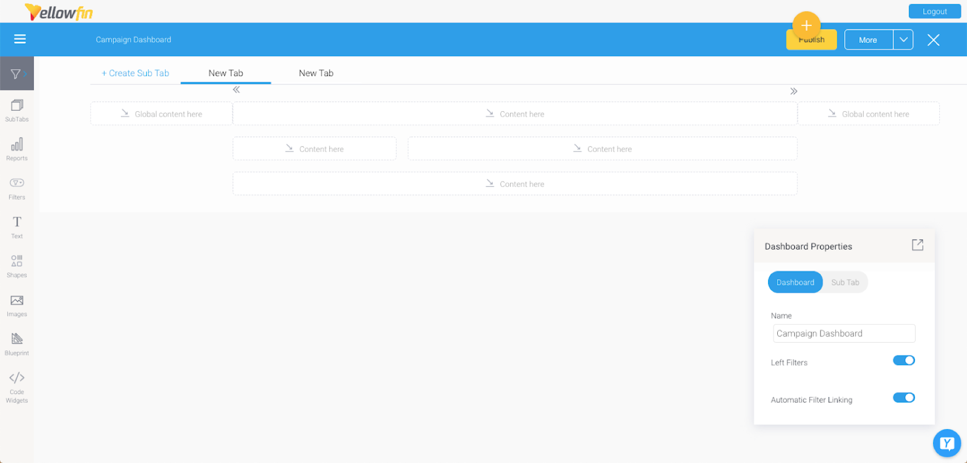
Dashboard name
...
Shows the name of the dashboard. Double-click here to update the dashboard name.
...
13
...
Create sub tab
...
Click on this option to add another sub tab to you dashboard. This initiates the tab creation process.
...
14
...
Sub tab name
...
Shows the name of the dashboard tab. Double-click here to update the sub tab name. Click on a name to open the sub tab.
...
15
...
Tab navigation
...
...
16
...
Visual Mode button
...
When editing a dashboard, click on this button to view and edit the dashboard visually. (As shown in the above example.)
...
17
...
Code Mode button*
...
Click on this button to view and edit the dashboard’s code. Learn more here.
...
18
...
Publish button
...
Use this to publish the dashboard, making it accessible to other users.
...
19
...
More button
...
This button lets you perform other actions on the dashboard. These include:
- Enter Preview mode: Jump to this mode to preview and test the dashboard in its working form, without publishing it.
- Error check: This runs a check to see if report links are working.
- Refresh dashboard: This takes the dashboard back to its default state.
- Rollback: This option rolls back to the previous version of the dashboard.
...
20
...
Properties panel
...
This panel displays configuration properties for the dashboard or any selected object. You can use this to configure and customize the selected dashboard object, including changing color, font, background, positioning, size and other details.
Note that this panel can be easily moved, hidden and expanded again.
...
21
...
Activity Stream
...
Allows users to collaborate with others. Learn more.
...
22
...
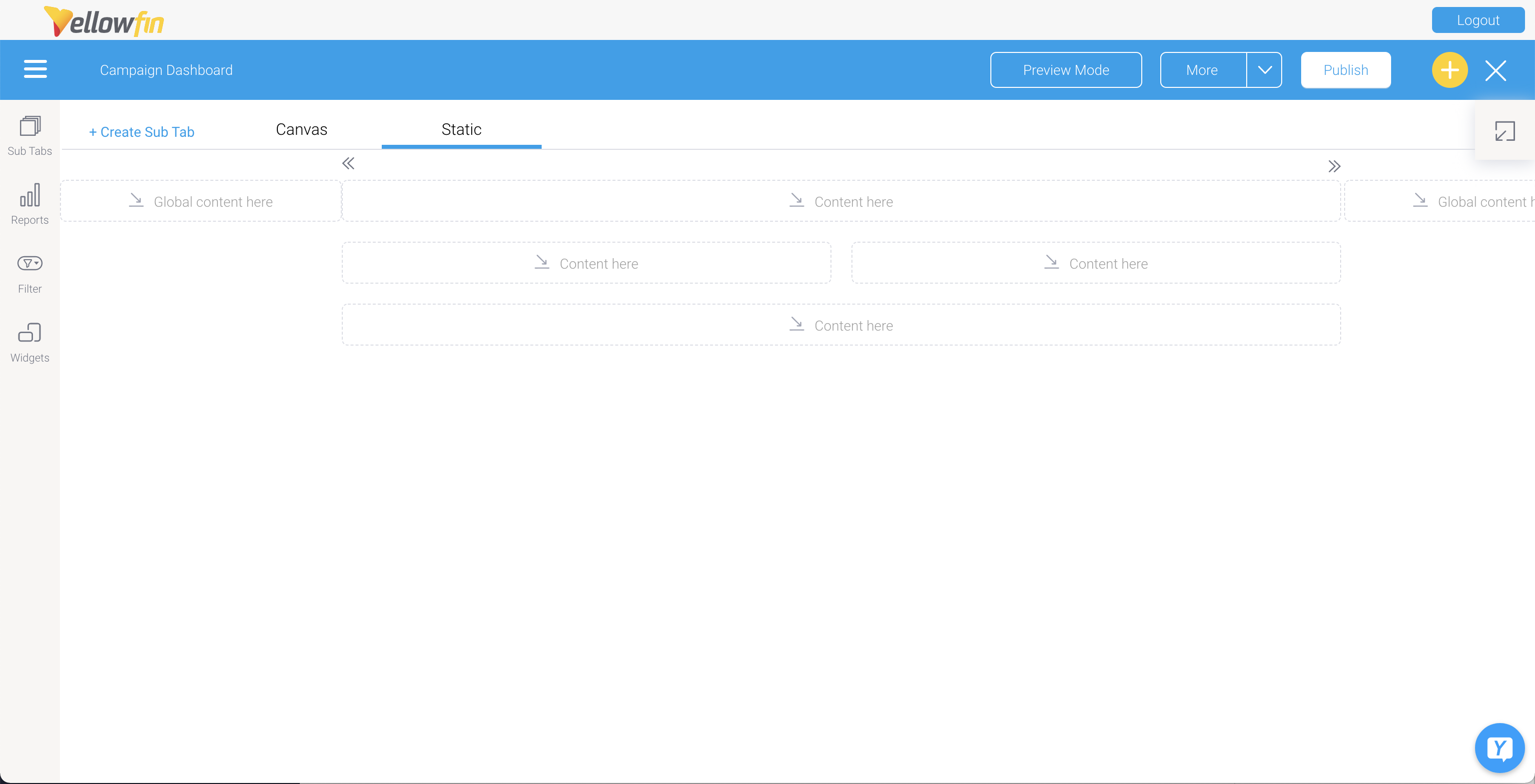
Exit button
...
Exits the dashboard builder. When existing, the following options will appear.
- Discard draft: delete the draft dashboard when closing it.
- Publish: Publish the dashboard. When publishing, you will need to define its name and description, select a folder to save it in, and specify user access details.
- Close: Close the dashboard builder. The dashboard will be auto-saved as draft.
...