Like what you see? Have a play with our trial version.

Versions Compared

Key

  • This line was added.
  • This line was removed.
  • Formatting was changed.
Comment: Updated with new 'Default line spacing

...

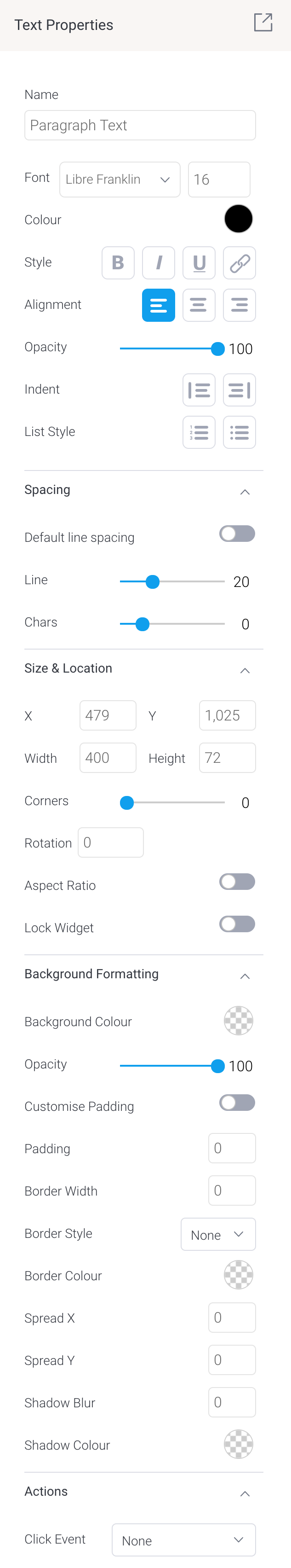
Tip for customizing text font: You can apply certain changes to only the selected or highlighted text within a text widget. Once these settings are defined, they will affect any new text entered. These settings include font type and size, color, style, opacity and indent.

Section


Column


Image RemovedImage Added


Column


Property name

Description

Name

Allows you to edit the system-generated default name of the selected text widget. Tip: Giving your widget an easy name, will allow you to further customize it in Code Mode.

Font

Lets you change the font type and size of the selected text. 

Color

Lets you specify the color of the selected text.

Style

Allows you to apply a formatting style to the selected text. Options include bold, italic, underlined, and adding URLs.

Alignment

Allows you to align the contents of the text widget.

Opacity

Allows you to define the transparency of the selected text. The lower the number on this slider, the more transparent the text will be.

Indent

Allows you to add or remove indentation within the text.  

List style

Allows you to format text as bullet points or a numbered list.

Spacing

Default line spacingThis is enabled by default. If you prefer to set your own line spacing, toggle this setting to disable it and use the manual Line option (described next) instead.

Line

This allows you to define the amount of spacing between each line of content in the selected text widget. The higher the number, the more space allocated.

Chars

This allows you to define the amount of spacing between each character in the selected text widget. The higher the number, the more space allocated.

Size & Location

X

Specify the x coordinates of the top left corner of the text widget, in order to position it exactly on your dashboard canvas.

Y

Specify the y coordinates of the top left corner of the text widget, in order to position it exactly on your dashboard canvas.

Width

Specify the width of the text widget, in pixels, in order to resize it exactly.

Height

Specify the height of the text widget, in pixels, in order to resize it exactly.

Corners

This option allows you to define the roundness of your text widget border corners. Tip: For maximum circular edges, enter half the value of the widget height. For example, if the height is 400 pixels, then set the edge value to 200 pixels. Moreover, any value greater than 200 for the edge, will have no further effect in this example.

Rotation

Specify the amount you wish to rotate your widget clockwise, in degrees. To rotate anti-clockwise, specify a negative value.

Aspect ratio

Enable this toggle to maintain the aspect ratio. This means the widget maintains its shape, but its size can be increased or decreased.

If this is disabled, the widget can be stretched out of shape either vertically or horizontally.

Lock widget

Enable this toggle to lock the text widget in its location. This stops you from moving or resizing the widget. This holds true even when selecting multiple widgets on the canvas. Note that the text widget can still be edited. 

Background formatting 

Background color

Allows you to specify a background color for the text widget. This refers to the area within the widget, excluding the text content.

Opacity

Allows you to specify the transparency of the background color on the widget.

Customise padding

This option allows you to define a custom padding or buffer around the text widget, in pixels. This includes padding for each side to the widget. If disabled, you can still define an overall padding size.

Padding top

When custom padding is enabled, this allows you to define padding to be added to the top of the widget.

Padding bottom

When custom padding is enabled, this allows you to define padding to be added to the bottom of the widget.

Padding right

When custom padding is enabled, this allows you to define padding to be added to the right of the widget.

Padding left

When custom padding is enabled, this allows you to define padding to be added to the left of the widget.

Padding 

This allows you to define an overall padding size for the text widget. This size, defined in pixels will be constant on each side of the widget. To add different sized padding on any of the sides, enable the Customise Padding option.

Border width

This allows you to specify the thickness of the widget border.

Note: to make the widget border visible, you must define values for all three border properties.

Border style

This allows you to select a style for the widget border. Options include: dashed, solid, dotted, groove, and more.

Border color

This allows you to specify the color of the widget border.

Horizontal shadow

This option allows you to define the horizontal shadow size, in pixels.

Vertical shadow

This option allows you to define the vertical shadow size, in pixels.

Shadow blur

This option allows you to define the sharpness of the shadow. The smaller the value, the sharper and more defined the shadow will be. For a blurry or softer shadow, provide a bigger value.

Shadow color

This option allows you to set a color for the shadow.

Actions
Click Event

Select an event that will trigger when the selected widget is clicked. Event options include:

  • None: Use this if you do not wish the widget to trigger an event.
  • Next sub tab: Navigates the user to the next tab within the same dashboard.
  • Previous sub tab: Navigates the user to the previous tab within the same dashboard.
  • Reset filters: Allows users to clear filter selections, or in case default values are set, then reset filters to their default values.
  • Reset dashboard: Refreshes the dashboard by clearing any user interactivity performed on it, as well as removing all applied filters.
  • Go to report: Navigates users to a specified report. This report can be specified by providing its report UUID. 
  • Go to sub tab: Navigates to any sub tab in the same dashboard, where the sub tab is specified by its order number. For example to jump to the forth sub tab, enter 4 in the sub tab # field. Note that the sub tab order starts from number 1.
  • Go to URL: Navigates to an external link or page using the specified URL. You can also choose to open the new link in a new tab or window or in the current window. (See the below URL and Target settings for more information.)
Report IDIf navigating to a report using the ‘Go to report’ click event, provide the UUID of the report.
Sub Tab #If navigating to a sub tab using the ‘Go to sub tab’ click event, enter the order number of the sub tab.
URLIf navigating to an external page using the ‘Go to URL’ click event, provide the full URL of the page.
Target

If navigating to an external page using the ‘Go to URL’ click event, specify the page target. Options include:

  • New Tab/Window: Opens the URL page in a new tab or window, depending on your browser’s settings. Note: The default for most browsers is a window, however users can use computer shorts (Ctrl in Windows, and Cmd in Mac) to open in a new tab instead.
  • Current Window: Open the page in the current window.
  • Parent Frame: If Yellowfin is embedded as an iFrame, the new page will open (that is, its contents will appear) in the parent frame. Note that the parent frame is the one within which the Yellowfin frame is embedded.
  • Current Frame:  If Yellowfin is embedded as an iFrame, the contents of the URL page will open in the current frame. Note that the current frame is the one which embeds Yellowfin.


...