Like what you see? Have a play with our trial version.

Versions Compared

Key

  • This line was added.
  • This line was removed.
  • Formatting was changed.

Table of Contents
classcontents

Overview

Add pre-designed shapes graphics to your dashboard by using Shape Widgetsthe Graphic widgets. This allows you to add shapes, arrow lines, or icons, by choosing from a selection of widgets.

...


Graphic Widget types

Name

Description

Shapes

Types of shapes that can be added to the canvas, such as a circle, or a square that you can expand, customize, and use as a border.

Lines

Types of lines that can be added to the canvas, such as arrows.
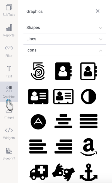
Icons

Types of icons that can be added to the canvas.


...


How to use

...

Graphic Widgets

  1. Click on the Shapes Graphics button on the left side of the screen, to expand its panel.
  2. Expand any of the sections within the panel (such as shape, lines or icons) and drag the selected widget anywhere on the dashboard canvas.
    Image Removed
    Image Added

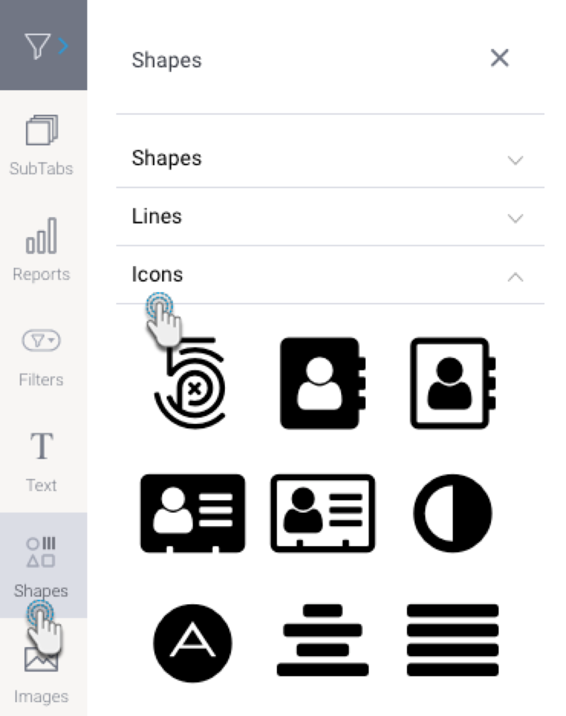
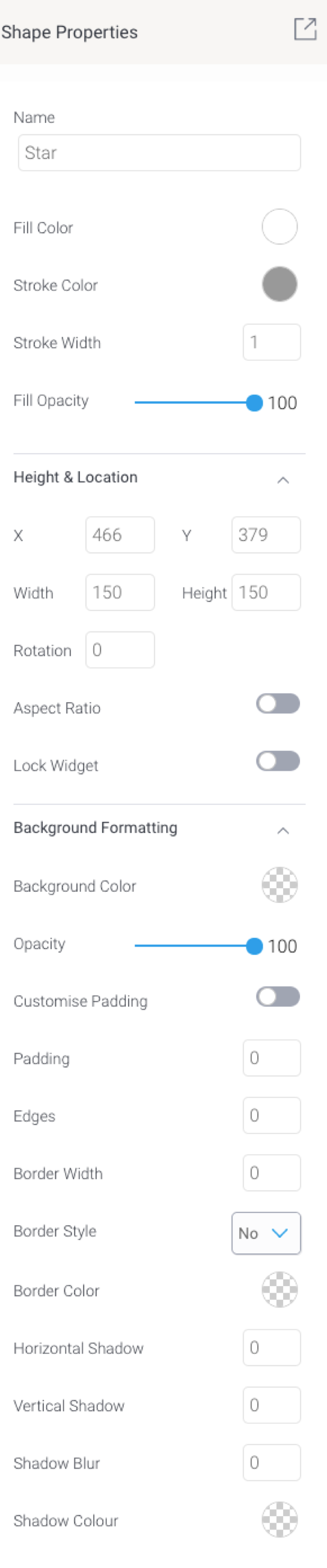
  3. You can customize a Shape Graphic Widget via its properties panel. This panel appears on the right side once the widget is selected. Refer to the properties section below to learn about the type of customization available via a shape, line, or icon widget.
  4. Additional options are available by right-clicking and using the menu that appears. Learn more about the menu options here.

...


...


Graphic properties

The table below explains the Shape Graphic Widget properties that can be used for customization.

...

Section


Column


Column

Note: Properties differ slightly depending on the selected graphic widget type, that is shape, icon or line widget type.

Property name

Description

Fill color

This option allows you to select a color for the inside of the shape.

Note: for lines such as arrows, this specifies the arrow head.

Stroke color

This option allows you to define a color for the outline or border of the selected shape.

Note: for icons such as arrows, this specifies the arrow line or body.

Stroke width

This allows you to define a thickness for the shape outline or border.

Fill opacity

This allows you to specify the transparency of the fill (inside) color of the selected shape. The higher the number, the stronger the color.

Size & Location

X

Specify the x coordinates of the top left corner of the shape widget, in order to position it exactly on your dashboard canvas.

Y

Specify the y coordinates of the top left corner of the shape widget, in order to position it exactly on your dashboard canvas.

Width

Specify the width of the currently selected widget, in pixels, in order to resize it exactly.

Height

Specify the height of the currently selected widget, in pixels, in order to resize it exactly.

Corners

This option allows you to define the roundness of the widget’s border corners. Tip: For maximum circular edges, enter half the value of the widget height. For example, if the height is 130 pixels, then set the edge value to 65 pixels. Moreover, any value greater than 65 for the edge, will have no further effect in this example.

Rotation

Specify the amount to rotate the selected shape widget clockwise, in degrees.

Aspect ratio

Enable this toggle to maintain the aspect ratio. This means when increasing or decreasing the shape widget’s size, it maintains its shape (i.e. the relationship between its width and height).

If this is disabled, the shape widget can be stretched out of shape either vertically or horizontally.

Lock widget

Enable this toggle to lock the shape widget in its location. This stops you from moving or resizing the widget. This holds true even when selecting multiple widgets on the canvas. Note that the shape widget can still be customized. 

Background formatting 

Background color

Allows you to specify a background color for the shape widget. This refers to the area within the widget, excluding the shape itself.

Opacity

Allows you to specify the transparency of the background color on the widget.

Customise padding

This option allows you to define a custom padding or buffer around the widget, in pixels, when enabled. This includes padding for each side to the widget. If disabled, you can still define an overall padding size.

Padding top

When custom padding is enabled, this allows you to define padding to be added to the top of the widget.

Padding bottom

When custom padding is enabled, this allows you to define padding to be added to the bottom of the widget.

Padding right

When custom padding is enabled, this allows you to define padding to be added to the right of the widget.

Padding left

When custom padding is enabled, this allows you to define padding to be added to the left of the widget.

Padding 

This allows you to define an overall padding size for the shape widget. This size, defined in pixels will be constant for each side of the widget. To add different sized padding on any of the sides, enable the Customise Padding option.

Border width

This allows you to specify the thickness of the widget border.

Note: to make the widget border visible, you must define values for all three border properties.

Border style

This allows you to select a style for the widget border. Options include: dashed, solid, dotted, groove, and more.

Border color

This allows you to specify the color of the widget border.

Horizontal shadow

This option allows you to cast a horizontal shadow on the widget by defining its size in pixels.

Vertical shadow

This option allows you to cast a vertical shadow on the widget by defining its size in pixels.

Shadow blur

This option allows you to define the sharpness of the shadow. The smaller the value, the sharper and more defined the shadow will be. For a blurry or softer shadow, provide a bigger value.

Shadow color

This option allows you to set a color for the shadow.


...