Page History
...
The following types of Blueprint Widgets are included in Yellowfin.
Chart icon | Chart name | Description |
|---|---|---|
| Number chart | For charts with numeric report results. |
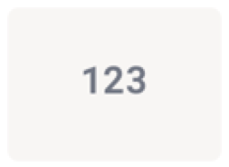
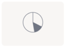
| Pie chart | For pie or ring charts. |
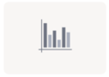
| Column chart | For charts with vertical columns. |
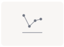
| Line chart | For time series charts. These can appear as line or area chart. |
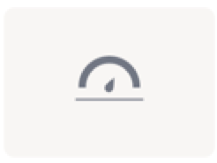
| Meter chart | For meter charts. |
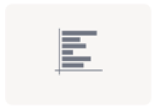
| Bar chart | For horizontal bar charts. |
...
Basic Tutorial
A Quick Chart can instantly be created by dragging a Blueprint Widget and using the properties panel to configure the chart.
...
Learn how to configure each type of blueprint chart widget to generate a chart on your dashboard.
Number chart
Field | Description/Instruction |
|---|---|
Field Selection | |
Metric | Choose a metric field for your number chart |
Pie chart
Field | Description/Instruction |
|---|---|
Field Selection | |
Category | Choose a dimension field as the pie chart category. (These will make up ‘slices’ of the pie.) |
Size | Select a series fields, which serves as your metric or measurement field. |
Chart Settings | |
Axis type | Select what type of chart to generate, pie or ring. |
Other segment % | Define a percentage limit for the ‘other’ category of the pie chart. That is, all values below this will be merged together to form the other category. |
Show legend | Allows you to show or hide legends on this chart. |
Show label | Allows you to show or hide labels on each category. |
Column chart
Define the following chart fields to generate a vertical column chart.
Field | Description/Instruction |
|---|---|
Field Selection | |
Dimension | Choose a dimension field for the chart. |
Series | Select a series fields, which serves as your metric or measurement field |
Optional Fields | This is an additional field you may select for a slightly more advanced chart. Note that you may only select one of the following options:
|
Second series | If ‘Second series’ is selected as the optional field, then select a second metric field to be added to the chart. |
Second Series Aggregation | Apply an aggregation value on the second series. You can aggregate the values with the following options:
|
Color set | If ‘Color set’ is selected as the optional field, then choose a dimension field as the color set. |
Function | If ‘Function’ is selected as the optional field, then select a chart function to be applied. Options include:
|
Chart Settings | |
Axis type | If the chart has a second series, then you can further configure the axis type. Options include:
|
Date unit | If you have selected a date dimension field, this setting allows you to change the date unit. Note: you cannot select a date unit lower than the unit defined in the view. |
Axis summary | Enable this setting to apply automatic abbreviation to axis labels. This is useful for charts with large numeric values. For example, 10,000,000 will be changed to 10m, making it easier to read. |
Sort dimension | Change the sort order of how dimension values are displayed. Sort these values by:
|
Sort order | Allows you to choose the sorting direction between ascending and descending.
|
Trim | If your dimension fields contain too many values to the point where it’s difficult to read your chart, you can use this setting to trim or cut out values from the chart.
|
Trim value | If value trim is enabled, specify the amount of values (N) to be cut out from the chart. |
Trim show other bar | Enable this to sum all trimmed out values together and display under a separate ‘Other’ field. |
Color property | Define the color property of the chart.
|
Series Formatting | This section allows you to set up formatting of the primary series in the chart. |
Color | Specify a color to display the primary/first series in. |
Second series Formatting | This section allows you to set up formatting of the secondary series in the chart, if specified. |
Color | Specify a color to display the second series in. |
Function settings | This section allows you to manage settings related to some of the chart functions. |
Accumulation type | If the accumulation function is enabled on the chart, you can choose whether this value should be |
displayed as the accumulative % of the total line, or the running total. | |
Value | If the Ref line function is selected, then specify the position of this line by providing the exact value. |
Label | If the Ref line function is selected, then provide its label. |
Color | If the Ref line function is selected, then specify its color. |
Line (or area) charts
Define the following chart fields to generate a line chart.
Field | Description/Instruction |
|---|---|
Field Selection | |
Dimension | Choose a dimension field for your quick chart. For line charts, these are limited to date fields to generate time series. |
Series | Select a series fields, which serves as your metric or measurement field. |
Series Aggregation | Apply an aggregation value on the series, you can aggregate the values with the following options:
|
Optional Fields | This is an additional field on your chart. Note that you may only select one of the following options:
|
Second series | If ‘Second series’ is selected as the optional field, then select a second metric field to be added to the chart. |
Second Series Aggregation | Apply an aggregation value on the second series. You can aggregate the values with the following options:
|
Color set | If ‘Color set’ is selected as the optional field, then choose a dimension field as the color set. |
Function | If ‘Function’ is selected as the optional field, then select a chart function to be applied. Options include:
|
Chart Settings | |
Enable drill down | Allows you to enable drill down functionality on chart. |
Chart style | Select what type of chart to generate, line or area. |
Date unit | If you have selected a date dimension field, this setting allows you to change the date unit. Note: you cannot select a date unit lower than the unit defined in the view. |
Null behaviour | Allows you to fill in any gaps, null or missing values in a time series chart. Options include:
|
Time slider | Allows you to include a time slider to the chart. |
Time unit selector | Allows you to prompt user to change time unit of chart. |
Default color property | Define the color property of the chart.
|
Series Formatting | This section allows you to set up formatting of the primary series in the chart. |
Color | Specify a color to display the primary/first series in. |
Second series Formatting | This section allows you to set up formatting of the secondary series in the chart, if specified. |
Color | Specify a color to display the second series in. |
Function settings | This section allows you to manage settings related to some of the chart functions. |
Accumulation type | If the accumulation function is enabled on the chart, you can choose whether this value should be displays as the accumulative % of the total line, or the running total. |
Trend type | If the Trend function is applied, then choose a trend type. Options include:
|
Forecast type | If the Forecast function is applied, then choose a trend type. Options include:
|
Value | If the Ref line function is selected, then specify the position of this line by providing the exact value. |
Label | If the Ref line function is selected, then provide its label. |
Color | If the Ref line function is selected, then specify its color. |
Meter chart
Define the following chart fields to generate a meter chart (also called a gauge chart). These are used to measure the rate of change of a measure against pre-defined targets.
Field | Description/Instruction |
|---|---|
Field Selection | |
Series | Select a series fields, which serves as your metric or measure field. |
Chart Settings | |
Target type | Allows you to select how to add a target value to the chart, to highlight it through needles or other indicators. Options include:
|
Target value | If Manual target type was selected, then provide the value of the target. |
Target (field) | If Field target type was selected, then choose a data field as the target (must be a numeric field). |
Target Aggregation | Apply an aggregation value on the target field. You can aggregate the values with the following options:
|
Bar chart
Define the following chart fields to generate a horizontal bar chart.
Field | Description/Instruction |
|---|---|
Field Selection | |
Dimension | Choose a dimension field for the chart. |
Series | Select a series fields, which serves as your metric or measurement field. |
Optional Fields | This is an additional field you may select for a slightly more advanced chart. Note that you may only select one of the following options:
|
Second series | If ‘Second series’ is selected as the optional field, then select a second metric field to be added to the chart. |
Second Series Aggregation | Apply an aggregation value on the second series. You can aggregate the values with the following options:
|
Color set | If ‘Color set’ is selected as the optional field, then choose a dimension field as the color set. |
Function | If ‘Function’ is selected as the optional field, then select a chart function to be applied. Options include:
|
Chart Settings | |
Axis type | If the chart has a second series, then you can further configure the axis type. Options include:
|
Date unit | If you have selected a date dimension field, this setting allows you to change the date unit. Note: you cannot select a date unit lower than the unit defined in the view. |
Axis summary | Enable this setting to apply automatic abbreviation to axis labels. This is useful for charts with large numeric values. For example, 10,000,000 will be changed to 10m, making it easier to read. |
Sort dimension | Change the sort order of how dimension values are displayed. Sort these values by:
|
Sort order | Allows you to choose the sorting direction between ascending and descending.
|
Trim | If your dimension fields contain too many values to the point where it’s difficult to read your chart, you can use this setting to trim or cut out values from the chart.
|
Trim value | If value trim is enabled, specify the amount of values (N) to be cut out from the chart. |
Trim show other bar | Enable this to sum all trimmed out values together and display under an ‘Other’ field. |
Color property | Define the color property of the chart.
|
Series Formatting | This section allows you to set up formatting of the primary series in the chart. |
Color | Specify a color to display the primary/first series in. |
Second series Formatting | This section allows you to set up formatting of the secondary series in the chart, if specified. |
Color | Specify a color to display the second series in. |
Function settings | This section allows you to manage settings related to some of the chart functions. |
Accumulation type | If the accumulation function is enabled on the chart, you can choose whether this value should be displays as the accumulative % of the total line, or the running total. |
Value | If the Ref line function is selected, then specify the position of this line by providing the exact value. |
Label | If the Ref line function is selected, then provide its label. |
Color | If the Ref line function is selected, then specify its color. |
...
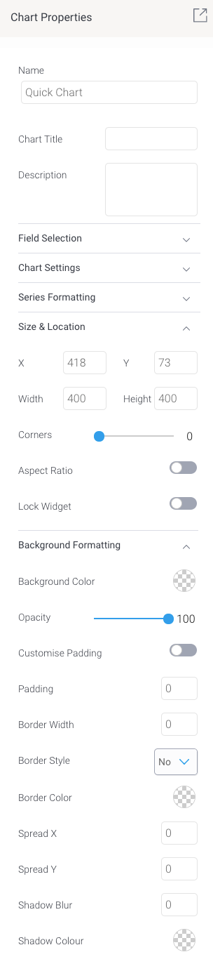
Blueprint Widget properties
This section covers other properties details of a Blueprint Widget.
| Section | ||||||||||||||||||||||||||||||||||||||||||||||||||||||||||||||||||
|---|---|---|---|---|---|---|---|---|---|---|---|---|---|---|---|---|---|---|---|---|---|---|---|---|---|---|---|---|---|---|---|---|---|---|---|---|---|---|---|---|---|---|---|---|---|---|---|---|---|---|---|---|---|---|---|---|---|---|---|---|---|---|---|---|---|---|
| ||||||||||||||||||||||||||||||||||||||||||||||||||||||||||||||||||