Page History
| Table of Contents | ||
|---|---|---|
|
Overview
Code Widgets are custom UI objects, designed to allow users to bring external app experiences into dashboards and create re-usable low code/no code widgets for other dashboard authors. Yellowfin also includes multiple out-of-the-box Code Widgets and Action Buttons, which are both explained in this section.
Note: these widgets are only supported in the canvas layout. These cannot be added to other types of dashboard layouts.
Code Widget examples
The following types of code widgets are available in Yellowfin out-of-the-box.
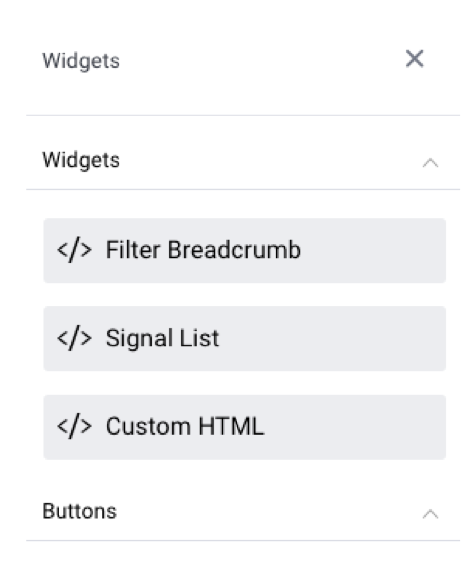

Code Widget type | Description | Filter Breadcrumb | Used to display a filter breadcrumb trail to aid in filter navigation on the dashboard. Learn more.|
|---|---|---|---|
Add a Signal List to a dashboard. Learn more. | |||
Drag in this widget anywhere on your canvas, and then jump to Code Mode to instantly start coding HTML within the widget’s tags. | Buttons | Expand this section to add buttons that perform actions and functions on a dashboard. Learn more here||
| Associated Reports | Add relevant reports as links rather than fully displaying them. |
User-generated Code Widgets
Yellowfin supports the use of custom code widgets that developers can code and package together. These can be added to the dashboard by importing them through the plugin manager. They will then appear in the Code Widget list for selection during the dashboard building process.
...
Yellowfin Code Widgets
Here's how to use the out-of-the-box Yellowfin Code Widgets.
Filter Breadcrumbs
This widget displays a breadcrumb trail of selected filter values on your dashboard. This is useful when you have co-dependent filters (where one filter selection updates another filter’s values), and you wish to display which filter values a dashboard user has applied.
...
| Anchor | ||||
|---|---|---|---|---|
|
Custom HTML
This widget allows you to add custom HTML anywhere on the dashboard canvas. HTML added through this widget is displayed on all modes of the dashboard.
...
Custom HTML Code Widgets allow you to see the output of custom HTML content added in Code Mode, in Visual Mode without previewing it.
Using the Custom HTML Code Widget
This widget is designed to be used by users with coding knowledge, specifically HTML, CSS, and JavaScript. This is because it requires the use of Code Mode to edit the widget.
| Note |
|---|
Ensure that you have the ‘Code Mode’ role function enabled for this to work properly. |
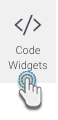
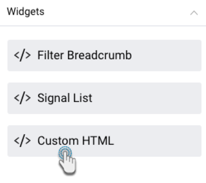
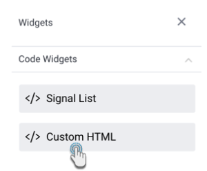
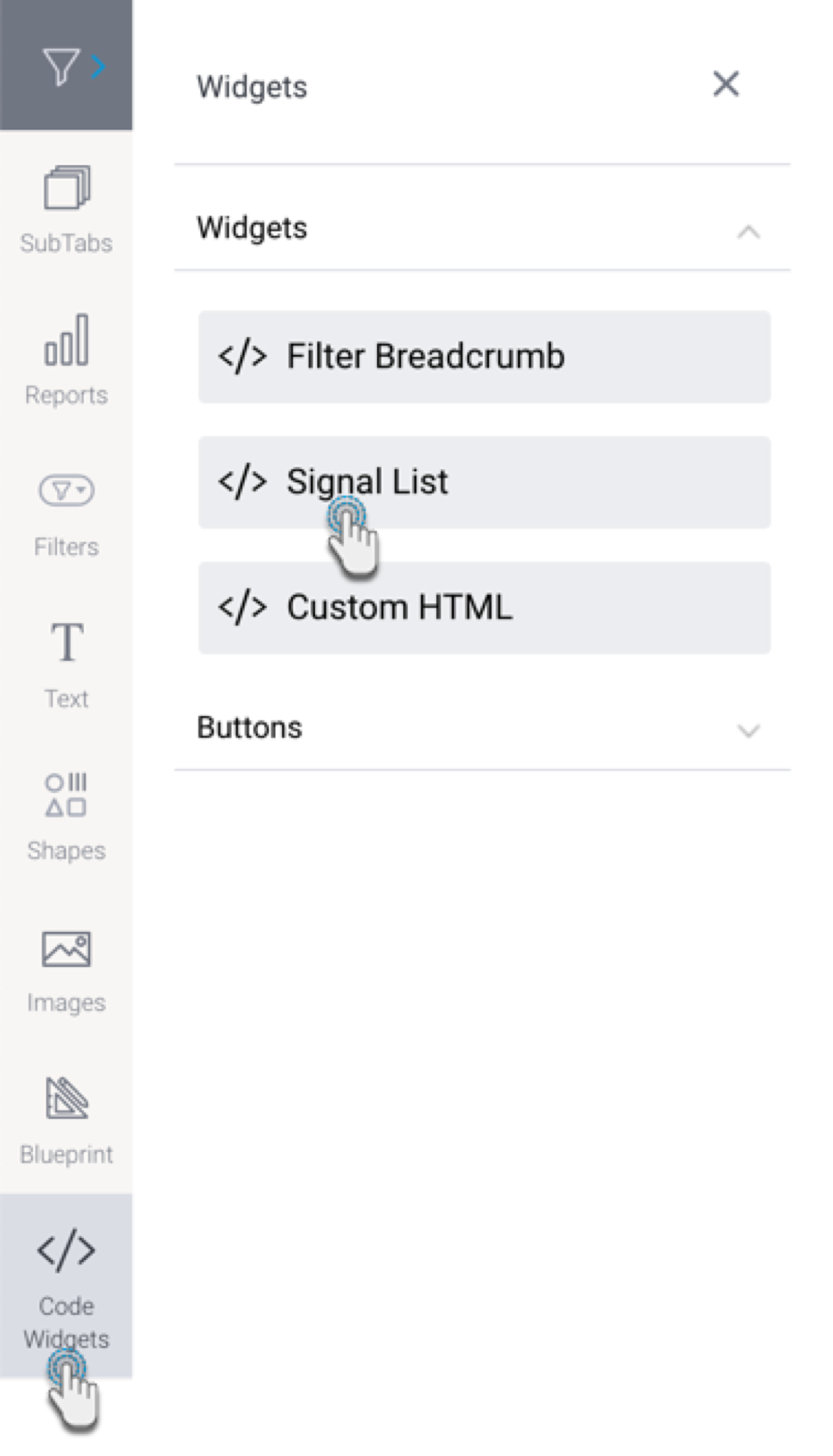
- Click on the Code Widgets button on the left.
- From the Code Widgets section in the list that appears, drag the Custom HTML widget onto the canvas.
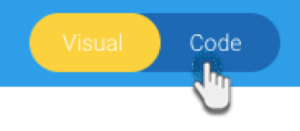
- Switch to Code Mode through to toggle on top of the dashboard.
- From the list of objects on the left, click on the Custom HTML object to highlight or navigate to the exact code section. Tip: this object list displays all objects added to the dashboard and is used to find the exact code for a particular object so it can be edited.
- Once located, enter your HTML code into the widget’s code.
- If you navigate back to Visual Mode, you will be able to see the output of your HTML content.
...
| Anchor | ||||
|---|---|---|---|---|
|
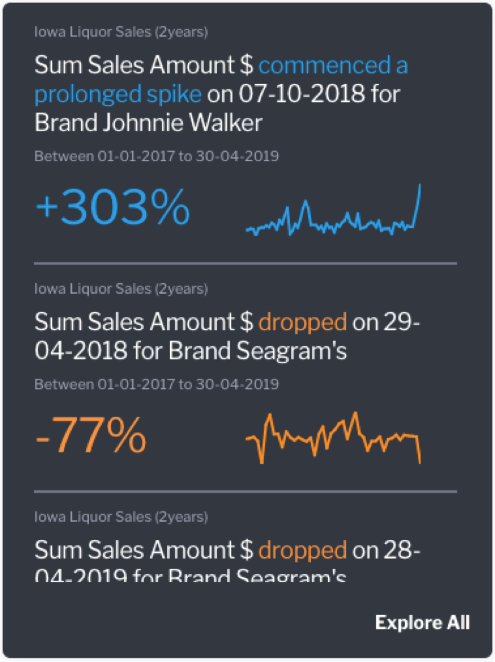
Signals List Code Widget
If you have Yellowfin Signals as part of your analytics suite, you can use this widget to add a contextual Signals List to your dashboard. This is a quick and easy way to incorporate automatically discovered insights that are relevant to the content on a dashboard. The Signal List widget will be updated to reflect new Signals discovered in real time (that is, Signals detected when the analysis is run, and if the widget filters are set to display them).
This list employs the use of color-coded Signals, that accentuate insights with positive results as blue, and those with negative results as orange.
Widget interaction
Users of your published dashboard will be able to see this list of signals, and interact with it.
- Open a Signal: Click on a signal in the list to navigate to its detail page.

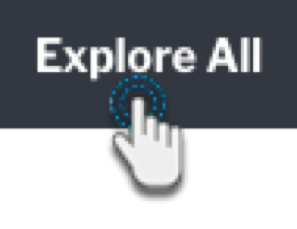
- View Signal List page: Click on Explore All to redirect users to the Signal List page, where they can further interact with the list, such as by rating or watching Signals, and assigning owners. If any filters are applied to the Signal widget listList Widget, they will be carried over to the Signals List page.
- Scroll list: Easy to scroll through the widget list; there is no restriction on the number of Signals displayed here.
Configuring the Signals List
...
Widget
This tutorial shows you how to add a Signals List widget, and configure it by applying filters to view Signals based on your preference. This allows you to control the Signals that will appear in this list.
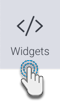
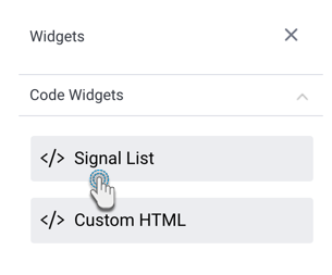
- Click on the Code Widgets Widgets button, and expand the Code Widgets section (expanded by default).
- Drag the Signal List widget onto the canvas.
- Upon doing so, the Properties panel will be updated to show properties of this widget.
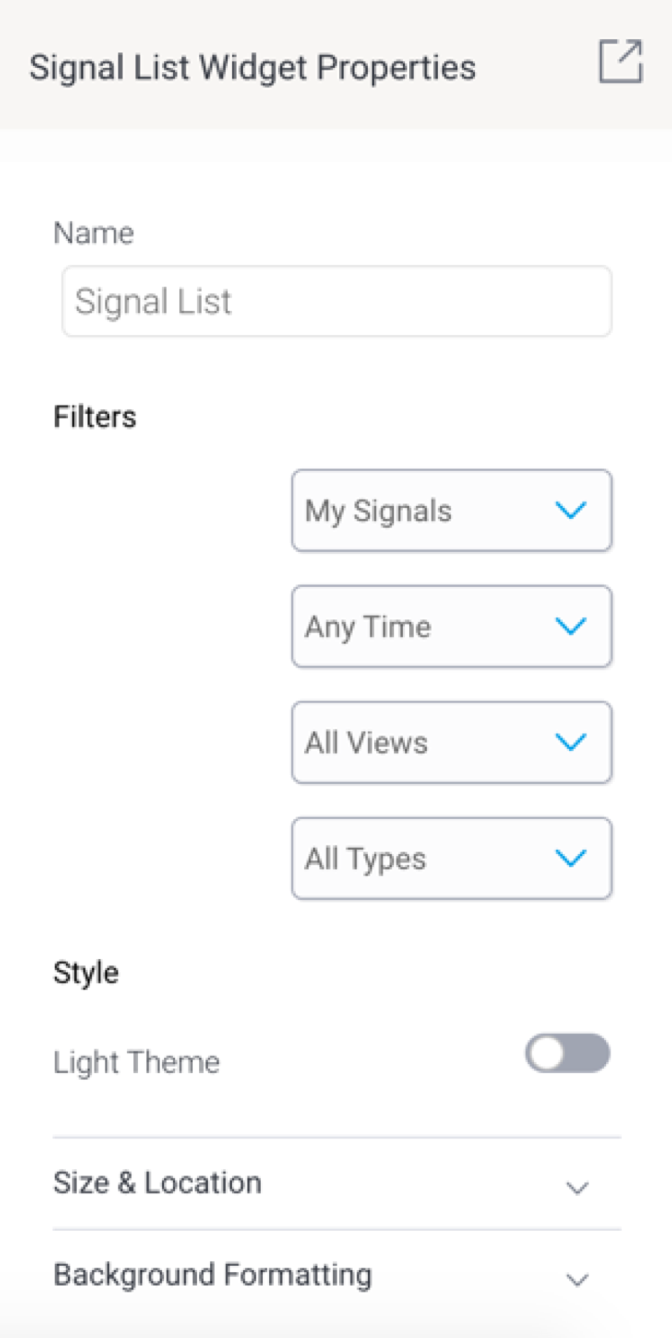
- You can select filters values to filter the signal widget list. The available options allow you to view Signals according to:
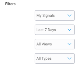
Signal Status: this includes Signals added to your watch list, ones that were recently viewed, those that have been closed, or dismissed signals.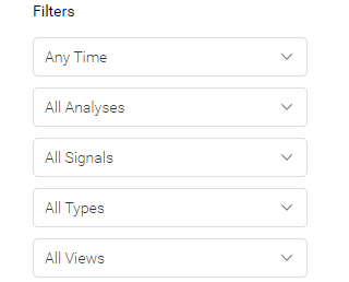
- Time: view signals according to a pre-selected time range, such as those occurring in the last 30 days. Choose Anytime if you do not want to limit signals according to time.
- Views: display signals Signal Analysis jobs: this filters Signals that were detected within a specified viewby a specific analysis configuration job.
- Signal Status: this includes Signals added to your watch list, ones that were recently viewed, those that have been closed, or dismissed signals.
- Signal Type: display signals of a specific type, such as only show Spikes and Drops.
- Views: display signals that were detected within a specified view.
- Note that the list will be saved according to the filters applied. This ‘filtered’ list will appear on the published dashboard.
- Refer to the properties section for a description on all properties related to this widget and how to configure them.
Signal Widget
...
properties
These are properties specific to the Signal List Widget.
Property name | Description |
|---|---|
Name | Allows you to update the name of the signal widget. |
Filters | This section offers multiple filters that you may update your signal widget list by. These are covered in the Signal filter section above. |
Style | |
Light Dark theme | Enable this toggle to display the Signal widget in a light dark theme, or disable it to keep the dark light theme. |
Size & location | |
X | Specify the x coordinates of the top left corner of the signal widget, in order to position it exactly on your dashboard canvas. |
Y | Specify the y coordinates of the top left corner of the signal widget, in order to position it exactly on your dashboard canvas. |
Height | Specify the height of the currently selected signal widget, in pixels, in order to resize it exactly. Note that the Signal widget width does not have a configuration field as it is not adjustable for this widget. |
Lock widget | Enable this toggle to lock the signal widget in its location. This stops you from moving or resizing it. This holds true even when selecting multiple widgets on the canvas. Note that the quick chart can still be customized. |
...