This section covers other properties details of a Blueprint Widget.
Section
Column
Column
Property name
Description
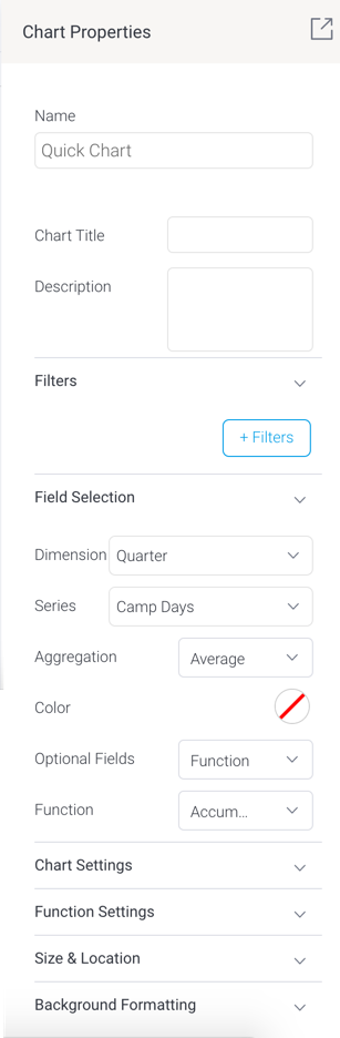
Name
Allows you to update the name of the selected Blueprint widget. This is ideal for code mode.
Chart title
Allows you to provide a title for the chart.
Description
Allows you to provide a description of the chart.
Filters
The +Filters button allows you to create a filter on the selected Quick Chart. Once the filter logic has been defined, it will appear in this area.
Field Selection
This section shows data fields to be selected for the Quick Chart. Note that the configurations shown here will differ according to the selected chart type.
For more information on the different settings in this section, refer to the wiki’s section on a selected blueprint chart types.
Chart Settings
This section allows you to apply chart settings on the Quick Chart. These will differ depending on the chart type selected.
Series Formatting
Allows you to configure settings related to chart series formatting, such as series color.
Size & location
X
Specify the x coordinates of the top left corner of the widget, in order to position it exactly on your presentation slide.
Y
Specify the y coordinates of the top left corner of the widget, in order to position it exactly on your presentation slide.
Width
Specify the width of the currently selected widget, in pixels, in order to resize it exactly.
Height
Specify the height of the currently selected widget, in pixels, in order to resize it exactly.
Corners
This option allows you to define the roundness of your widget border corners. Tip: For maximum circular edges, enter half the value of the widget height. For example, if the height is 400 pixels, then set the edge value to 200 pixels. Moreover, any value greater than 200 for the edge, will have no further effect in this example.
Aspect ratio
Enable this toggle to maintain the aspect ratio. This means when increasing or decreasing the widget size, it maintains its shape (i.e. the relationship between its width and height).
If this is disabled, the widget can be stretched out of shape either vertically or horizontally.
Lock widget
Enable this toggle to lock the widget in its location. This stops you from moving or resizing it. This holds true even when selecting multiple widgets on the slide. Note that the widget can still be customized.
Background formatting
Background color
Allows you to specify a background color for the widget.
Opacity
Allows you to specify the transparency of the widget's background color.
Customise padding
This option allows you to define a custom padding or buffer around the widget, in pixels, when enabled. This includes padding for each side to the widget. If disabled, you can still define an overall padding size.
Padding top
When custom padding is enabled, this allows you to define padding to be added to the top of the widget.
Padding bottom
When custom padding is enabled, this allows you to define padding to be added to the bottom of the widget.
Padding right
When custom padding is enabled, this allows you to define padding to be added to the right of the widget.
Padding left
When custom padding is enabled, this allows you to define padding to be added to the left of the widget.
Padding
This allows you to define an overall padding size for the widget. This size, defined in pixels will be constant for each widget side. To add different sized padding on any of the sides, enable the Customise Padding option.
Border width
This allows you to specify the thickness of the widget border.
Note: to make the border visible, you must define values for all three border properties.
Border style
This allows you to select a style for the widget border. Options include: dashed, solid, dotted, groove, and more.
Border color
This allows you to specify the color of the widget border.
Horizontal shadow
This option allows you to drop a horizontal shadow on the widget, by defining its size in pixels.
Vertical shadow
This option allows you to drop a vertical shadow on the widget, by defining its size in pixels.
Shadow blur
This option allows you to define the sharpness of the widget shadow. The smaller the value, the sharper and more defined the shadow will be. For a blurry or softer shadow, provide a bigger value.
Shadow color
This option allows you to set a color for the widget shadow.
Actions
Click Event
Select an event that will trigger when the selected widget is clicked. Event options include:
None:Use this if you do not wish the widget to trigger an event.
Next sub tab:Navigates the user to the next tab within the same presentation.
Previous sub tab:Navigates the user to the previous tab within the same presentation.
Reset filters:Allows users to clear filter selections, or in case default values are set, then reset filters to their default values.
Reset presentation:Refreshes the presentation by clearing any user interactivity performed on it, as well as removing all applied filters.
Go to report:Navigates users to a specified report. This report can be specified by providing its report UUID.
Go to sub tab:Navigates to any sub tab in the same presentation, where the sub tab is specified by its order number. For example to jump to the forth sub tab, enter 4 in the sub tab # field. Note that the sub tab order starts from number 1.
Go to URL: Navigates to an external link or page using the specified URL. You can also choose to open the new link in a new tab or window or in the current window. (See the below URL and Target settings for more information.)
Report ID
If navigating to a report using the ‘Go to report’ click event, provide the UUID of the report.
Sub Tab #
If navigating to a sub tab using the ‘Go to sub tab’ click event, enter the order number of the sub tab.
URL
If navigating to an external page using the ‘Go to URL’ click event, provide the full URL of the page.
Target
If navigating to an external page using the ‘Go to URL’ click event, specify the page target. Options include:
New Tab/Window:Opens the URL page in a new tab or window, depending on your browser’s settings. Note: The default for most browsers is a window, however users can use computer shorts (Ctrl in Windows, and Cmd in Mac) to open in a new tab instead.
Current Window:Open the page in the current window.
Parent Frame:If Yellowfin is embedded as an iFrame, the new page will open (that is, its contents will appear) in the parent frame. Note that the parent frame is the one within which the Yellowfin frame is embedded.
Current Frame: If Yellowfin is embedded as an iFrame, the contents of the URL page will open in the current frame. Note that the current frame is the one which embeds Yellowfin.