Page History
...
| Note |
|---|
You will require a Google API key to use this map. Learn more. |
| Anchor | ||||
|---|---|---|---|---|
|
Chart data options
Option | Description |
|---|---|
Geo Field | The field containing the geopoint or geo polygon data. |
Color | A metric field that is represented on the map. |
Tooltip | A value that is contained in the tooltip. |
...
- Click on the Create button and select Report to begin building your report.
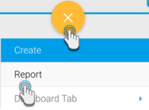
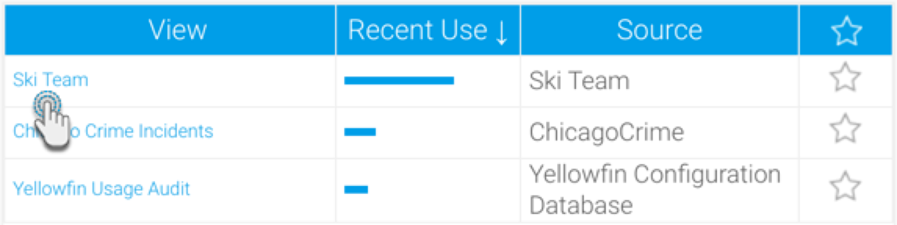
- Select your preferred View containing the geographical data. For the purpose of this example, we will choose Ski Team.
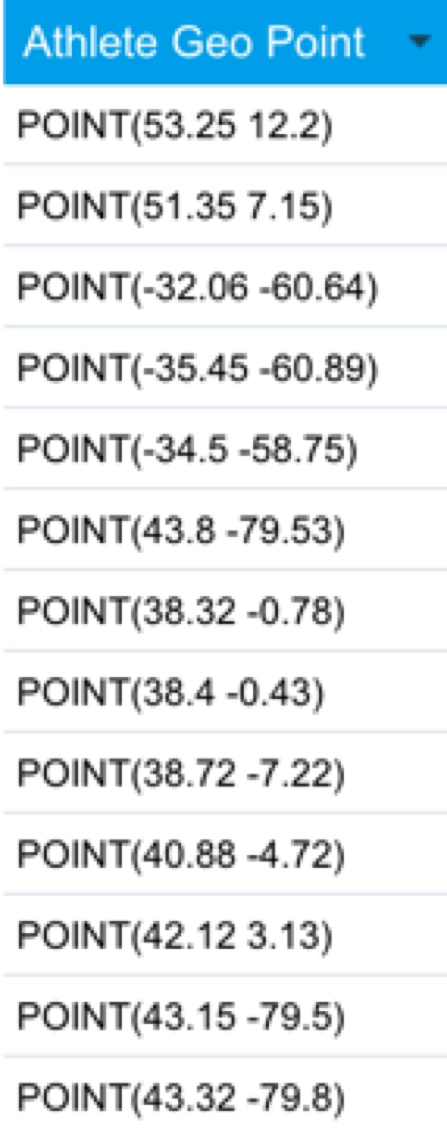
- When at the Report Builder page, add your required data, including the geopoint and metric fields to the report. For example, we will use Athlete Geo Point, and Invoiced Amount fields in our report.
- Formatting tip: By default, the report builder formats geopoint or geo polygon data to ‘Default Geometry’ (so it’s displayed like in the example below). However you can view geo points or polygons in their original form by changing the formatting.
- To do so, click on Format in the geopoint column menu, then select Edit.

- Then select ‘Raw Formatter’ from the Format field in the popup.

- Close the popup. The geopoint data will be visible in its original form in the report.
- Warning: Note that applying raw formatting on a large geopoint or geo polygon data set, may slow your report’s processing time.
- To do so, click on Format in the geopoint column menu, then select Edit.
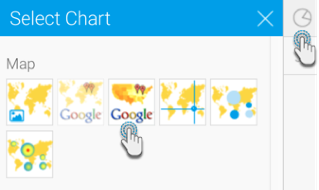
- Navigate to the Charts page, and expand the chart selection menu. Choose GIS Google Maps from this selection.
- Next, fill the required fields for your Google map chart, for example drag Athlete Geo Point to the Geo Field, and Invoice Amount to the Color Field. You can refer to the above Chart data options section for a description of all the fields.
- You will be able to see the map chart. The location data (if selected location data is Geo Points) will be displayed as:
 Clusters (Grouped Points); and
  Points.
The cluster behaves differently from a point. The number on the cluster indicates the number of points. As you zoom in, the clusters will open up to show the individual points. If you click on a cluster, its tooltip will display the values within it.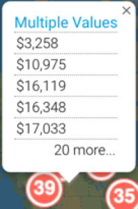
The single data point will show the value of the Color field.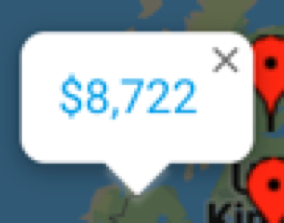
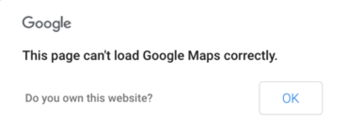
- Trouble shooting: If you see the following error message on your map, then ensure that you have a valid Google API key.
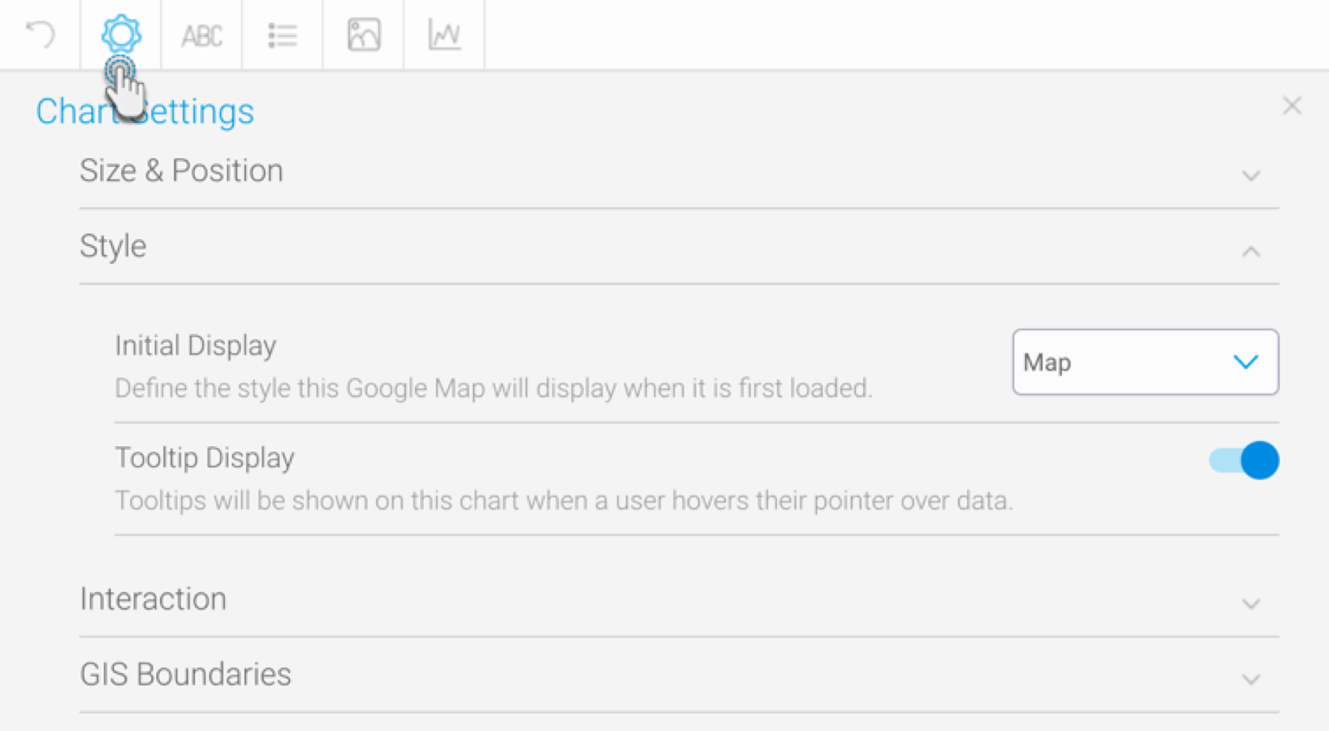
- You can also use the chart formatting settings to configure your Google chart. Refer to our chart formatting section for more information.
- Once done, save your map.
...