Overview
This section covers the Blueprint and Quick Chart functionality.
Blueprint
Blueprint functionality, available via the dashboard canvas, allows users to wireframe a dashboard design. Blueprint was designed to allow multiple users to collaborate on dashboard design, securely within the Yellowfin platform. The chart widgets within Blueprint can be further configured to create charts directly on the dashboard through Quick Charts.
Blueprint is ideal for cases where a consumer type user might not have access to the view or data discovery products, but can still design their ideal dashboards. Dashboard creators with the appropriate ‘create’ access can then build charts, directly from a prototype.
Quick Charts
These allow users to create charts directly on the dashboard canvas without going through Yellowfin Data Discovery’s report builder. This is done by using the Blueprint Widgets, which include some of the most widely used chart types.
Note: For more advanced reporting, use Yellowfin Data Discovery.
Blueprint Widget types
The following types of Blueprint Widgets are included in Yellowfin.
Chart icon | Chart name | Description |
|---|---|---|
| Number chart | For charts with numeric report results. |
| Pie chart | For pie or ring charts. |
| Column chart | For charts with vertical columns. |
| Line chart | For time series charts. These can appear as line charts. |
| Meter chart | For meter charts. |
| Bar chart | For horizontal bar charts. |
| Overlay chart* | For charts where a line chart is overlaid on a bar chart. The line chart represents a trend and the bar chart emphasizes specific values. |
| Map chart* | For map charts to showcase geographical data. |
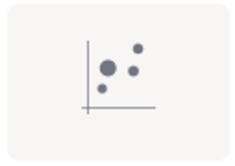
| Scatter chart* | For a scatter plot chart, where points are not joined. |
| Heat grid* | For a chart that plots the intensity of a metric across multiple categories. |
* These widgets are currently only used as Blueprints, without the functionality to extend them to Quick Charts. Users can, however, use the Advanced Report option to create these charts via the Chart builder in Yellowfin Data Discovery.
Basic Tutorial
A Quick Chart can instantly be created by dragging a Blueprint Widget and using the properties panel to configure the chart.
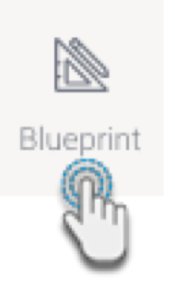
- Click on the Blueprint button on the left side to expand its panel.
- Drag a chart type of your choice onto the canvas. You can position and resize it to fit your design.
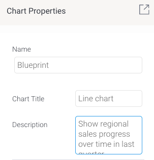
You can add a title and description for it in its properties panel (make sure the Blueprint Widget is selected on the canvas to make its properties panel appear).
Use the Activity Stream button (bottom right of the screen) to discuss and collaborate with other team members on your Blueprint further.
To create a Quick Chart (created directly in the dashboard) or even an advanced chart (created in the report builder, but added here upon publish), proceed with the following steps.
Click on Create Report. You’ll be faced with two options:
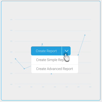
Create Simple Report: This option allows you to create a Quick Chart within the dashboard canvas.
Create Advanced Report: This allows you to create an advanced report. On doing so, you will exit the dashboard and navigate to the report builder in Yellowfin Data Discovery. Create a report as per normal, and publish it. Then close the Report page to jump back into the dashboard where your newly created advanced report will be displayed.
In this tutorial, we’ll be creating a Quick Chart, using the Create Simple Report button. Click on it to bring up the following form.
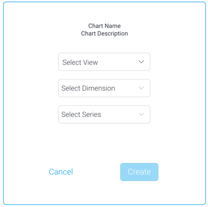
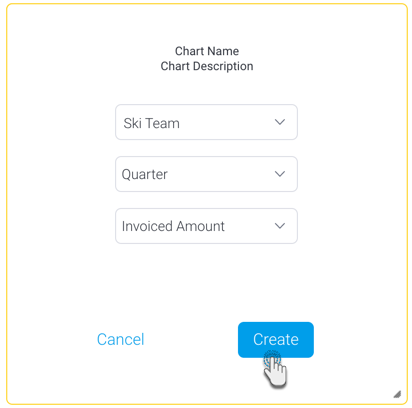
Select a view from the list. Then select a dimension and series (metric) field for the chart.
Click on the Create button.
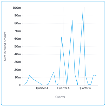
This will create a simple chart directly on the dashboard, as shown in the example below.
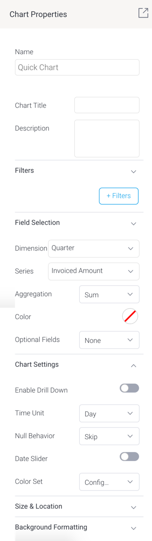
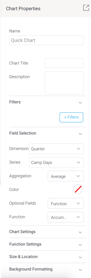
To further configure this chart, open the chart’s property panel, which will display additional fields, which vary for each chart type. Each chart will also differ based on the minimum set of fields to be defined for it.
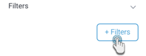
- You can create filters in your Quick Charts. Click on the +Filters button to define a filter condition.
- In the new popup create a filter condition. Upon saving it, the final filter logic will be displayed in the properties panel.
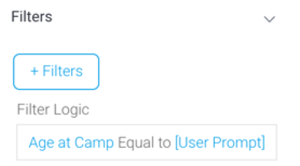
- Note, however, that to display a user prompt filter on the dashboard, you will need to use a Filter Widget (see here for how to).
- In the new popup create a filter condition. Upon saving it, the final filter logic will be displayed in the properties panel.
- Expand the Field Selection section and choose the data fields.
Then in the Chart Settings section, define additional settings.
Refer to the chart type section below for further details on their specific configurations.
- You will notice your chart autogenerating with each field and configuration you define. You do not require additional steps to save the chart.
- You may update other properties of this widget, such as its size and location on the canvas, and background details. See the properties panel for details on all widget properties.
Blueprint Chart Widget configurations
Learn how to configure each type of blueprint chart widget to generate a chart on your dashboard.
Number chart
Field | Description/Instruction |
|---|---|
Field Selection | |
Metric | Choose a metric field for your number chart |
Pie chart
Field | Description/Instruction |
|---|---|
Field Selection | |
Label | Choose a dimension field as the pie chart category. (These will make up the pie ‘slices’ or segments.) |
Size | Select a series fields, which serves as your metric or measurement field. |
Chart Settings | |
| Enable drill down | Allows you to enable drill down functionality on the chart. |
| Color set | Select a color set for the pie chart. Options include:
|
| Color | If ‘Monochrome’ is selected as the color set, then select a color. The pie chart colors will be based on different shades of this color. |
Chart type | Select what type of chart to generate, pie or ring. |
Other segment % | Define a percentage limit for the ‘other’ category of the pie chart. That is, all values below this will be merged together to form the other category. |
Show legend | Allows you to show or hide legends on this chart. |
Show labels | Allows you to show or hide labels on each category. |
Column chart
Define the following chart fields to generate a vertical column chart.
Field | Description/Instruction |
|---|---|
Field Selection | |
Dimension | Choose a dimension field for the chart. |
Series | Select a series fields, which serves as your metric or measurement field. |
| Aggregation | Apply an aggregation value on the primary series. You can aggregate the values with the following options:
|
| Color | Select a color for the chart. This will be applied to the primary series. |
Optional Fields | This is an additional field you may select for a slightly more advanced chart. Note that you may only select one of the following options:
|
Second series | If ‘Second series’ is selected as the optional field, then select a second metric field to be added to the chart. |
(Second series) Aggregation | Apply an aggregation value on the second series. You can aggregate the values with the following options:
|
| (Second series) color | If a second series is specified, then select a color to display this series in. |
Color field | If ‘Color field’ is selected as the optional field, then choose a dimension field as the color field. |
Function | If ‘Function’ is selected as the optional field, then select a chart function to be applied. Options include:
|
Chart Settings | |
| Enable drill down | Allows you to enable drill down functionality on the chart. |
Axis type | If the chart has a second series, then you can further configure the axis type. Options include:
|
Date unit | If you have selected a date dimension field, this setting allows you to change the date unit. Note: you cannot select a date unit lower than the unit defined in the view. |
Axis summary | Enable this setting to apply automatic abbreviation to axis labels. This is useful for charts with large numeric values. For example, 10,000,000 will be changed to 10m, making it easier to read. |
Sort by | Change the sort order of how dimension values are displayed. Sort these values by:
|
Sort order | Allows you to choose the sorting direction between ascending and descending.
|
| Trim values (toggle) | If your selected dimension field contains too many values to the point where it’s difficult to read your chart, enable this toggle to trim or cut out values from the chart. |
Trim display | If your dimension fields contain too many values to the point where it’s difficult to read your chart, you can use this setting to trim or cut out values from the chart.
|
Trim value | If value trim is enabled, specify the amount of values (N) to be cut out from the chart. |
Show other dimension | Enable this to sum all trimmed out values together and display under a separate ‘Other’ field. |
Color set | Define the color property of the chart.
|
Function settings | This section allows you to manage settings related to some of the chart functions. |
Function type | If the accumulation function is enabled on the chart, you can choose whether this value should be displayed as the accumulative % of the total line, or the running total. |
Value | If the Reference line function is selected, then specify the position of this line by providing the exact value. |
Label | If the Reference line function is selected, then provide its label. |
Color | If the Reference line function is selected, then specify its color. |
Line charts
Define the following chart fields to generate a line chart.
Field | Description/Instruction |
|---|---|
Field Selection | |
Dimension | Choose a dimension field for your quick chart. For line charts, these are limited to date fields to generate time series. |
Series | Select a series fields, which serves as your metric or measurement field. |
Aggregation | Apply an aggregation value on the series, you can aggregate the values with the following options:
|
| Color | Select a color for the chart. This will be applied to the primary series. |
Optional Fields | This is an additional field on your chart. Note that you may only select one of the following options:
|
Second series | If ‘Second series’ is selected as the optional field, then select a second metric field to be added to the chart. |
(Second series) Aggregation | Apply an aggregation value on the second series. You can aggregate the values with the following options:
|
| (Second series) color | If a second series is specified, then select a color to display this series in. |
Color field | If ‘Color field’ is selected as the optional field, then choose a dimension field as the color field. |
Function | If ‘Function’ is selected as the optional field, then select a chart function to be applied. Options include:
|
Chart Settings | |
Enable drill down | Allows you to enable drill down functionality on chart. |
| Time Unit | By default the time unit of the chart will be the same as that of the selected dimension field. But you may use this to change the default time unit. Note: you cannot select a date unit lower than the unit defined in the view. |
Null behaviour | Allows you to fill in any gaps, null or missing values in a time series chart. Options include:
|
Date slider | Allows you to include a date or time slider to the chart. |
Color set | Define the color property of the chart.
|
Function settings | This section allows you to manage settings related to some of the chart functions. |
Function type | If the accumulation function is enabled on the chart, you can choose whether this value should be displays as the accumulative % of the total line, or the running total. |
Trend type | If the Trend function is applied, then choose a trend type. Options include:
|
Forecast type | If the Forecast function is applied, then choose a trend type. Options include:
|
Value | If the Reference line function is selected, then specify the position of this line by providing the exact value. |
Label | If the Reference line function is selected, then provide its label. |
Color | If the Reference line function is selected, then specify its color. |
Meter chart
Define the following chart fields to generate a meter chart (also called a gauge chart). These are used to measure the rate of change of a measure against pre-defined targets.
Field | Description/Instruction |
|---|---|
Field Selection | |
Measure | The series or metric field that serves as the measure for the meter chart. |
| Aggregation | Select the type of aggregation to apply to the measure value. ‘Default’ applies the default aggregation applied at the view level to the selected measure field (if any is applied). Other options include:
|
Chart Settings | |
Target type | Allows you to select how to add a target value to the chart, to highlight it through needles or other indicators. Options include:
|
Target value | If Manual target type was selected, then provide the value of the target. |
Target | If 'Field' target type was selected as the target type, then choose a data field as the target (must be a numeric field). |
(Target) Aggregation | Apply an aggregation value on the target field. You can aggregate the values with the following options:
|
Bar chart
Define the following chart fields to generate a horizontal bar chart.
Field | Description/Instruction |
|---|---|
Field Selection | |
Dimension | Choose a dimension field for the chart. |
Series | Select a series fields, which serves as your metric or measurement field. |
| Aggregation | Apply an aggregation value on the primary series. You can aggregate the values with the following options:
|
| Color | Select a color for the chart. This will be applied to the primary series. |
Optional Fields | This is an additional field you may select for a slightly more advanced chart. Note that you may only select one of the following options:
|
Second series | If ‘Second series’ is selected as the optional field, then select a second metric field to be added to the chart. |
(Second series) Aggregation | Apply an aggregation value on the second series. You can aggregate the values with the following options:
|
| (Second series) color | If a second series is specified, then select a color to display this series in. |
Color field | If ‘Color field’ is selected as the optional field, then choose a dimension field as the color field. |
Function | If ‘Function’ is selected as the optional field, then select a chart function to be applied. Options include:
|
Chart Settings | |
| Enable drill down | Allows you to enable drill down functionality on the chart. |
Axis type | If the chart has a second series, then you can further configure the axis type. Options include:
|
Date unit | If you have selected a date dimension field, this setting allows you to change the date unit. Note: you cannot select a date unit lower than the unit defined in the view. |
Axis summary | Enable this setting to apply automatic abbreviation to axis labels. This is useful for charts with large numeric values. For example, 10,000,000 will be changed to 10m, making it easier to read. |
Sort by | Change the sort order of how dimension values are displayed. Sort these values by:
|
Sort order | Allows you to choose the sorting direction between ascending and descending.
|
| Trim Values (toggle) | If your selected dimension field contains too many values to the point where it’s difficult to read your chart, enable this toggle to trim or cut out values from the chart. |
Trim Display | If your dimension fields contain too many values to the point where it’s difficult to read your chart, you can use this setting to trim or cut out values from the chart.
|
Show Other Dimension | Enable this to sum all trimmed out values together and display under an ‘Other’ field. |
Color set | Define the color set of the chart.
|
Function settings | This section allows you to manage settings related to some of the chart functions. |
Function type | If the accumulation function is enabled on the chart, you can choose whether this value should be displays as the accumulative % of the total line, or the running total. |
Value | If the Reference line function is selected, then specify the position of this line by providing the exact value. |
Label | If the Reference line function is selected, then provide its label. |
Color | If the Reference line function is selected, then specify its color. |
Blueprint Widget properties
This section covers other properties details of a Blueprint Widget.
Property name | Description |
|---|---|
Name | Allows you to update the name of the selected Blueprint widget. This is ideal for code mode. |
Chart title | Allows you to provide a title for the chart. |
Description | Allows you to provide a description of the chart. |
| Filters | The +Filters button allows you to create a filter on the selected Quick Chart. Once the filter logic has been defined, it will appear in this area. |
Field Selection | This section shows data fields to be selected for the Quick Chart. Note that the configurations shown here will differ according to the selected chart type. For more information on the different settings in this section, refer to the wiki’s section on a selected blueprint chart types. |
Chart Settings | This section allows you to apply chart settings on the Quick Chart. These will differ depending on the chart type selected. |
Function Settings | This section allows you to manage settings related to some of the chart functions, if a function is applied. |
Size & location | |
X | Specify the x coordinates of the top left corner of the widget, in order to position it exactly on your dashboard canvas. |
Y | Specify the y coordinates of the top left corner of the widget, in order to position it exactly on your dashboard canvas. |
Width | Specify the width of the currently selected widget, in pixels, in order to resize it exactly. |
Height | Specify the height of the currently selected widget, in pixels, in order to resize it exactly. |
Corners | This option allows you to define the roundness of your widget border corners. Tip: For maximum circular edges, enter half the value of the widget height. For example, if the height is 400 pixels, then set the edge value to 200 pixels. Moreover, any value greater than 200 for the edge, will have no further effect in this example. |
Aspect ratio | Enable this toggle to maintain the aspect ratio. This means when increasing or decreasing the widget size, it maintains its shape (i.e. the relationship between its width and height). If this is disabled, the widget can be stretched out of shape either vertically or horizontally. |
Lock widget | Enable this toggle to lock the widget in its location. This stops you from moving or resizing it. This holds true even when selecting multiple widgets on the canvas. Note that the widget can still be customized. |
Background formatting | |
Background color | Allows you to specify a background color for the widget. |
Opacity | Allows you to specify the transparency of the widget's background color. |
Customise padding | This option allows you to define a custom padding or buffer around the widget, in pixels, when enabled. This includes padding for each side to the widget. If disabled, you can still define an overall padding size. |
Padding top | When custom padding is enabled, this allows you to define padding to be added to the top of the widget. |
Padding bottom | When custom padding is enabled, this allows you to define padding to be added to the bottom of the widget. |
Padding right | When custom padding is enabled, this allows you to define padding to be added to the right of the widget. |
Padding left | When custom padding is enabled, this allows you to define padding to be added to the left of the widget. |
Padding | This allows you to define an overall padding size for the widget. This size, defined in pixels will be constant for each widget side. To add different sized padding on any of the sides, enable the Customise Padding option. |
Border width | This allows you to specify the thickness of the widget border. Note: to make the border visible, you must define values for all three border properties. |
Border style | This allows you to select a style for the widget border. Options include: dashed, solid, dotted, groove, and more. |
Border color | This allows you to specify the color of the widget border. |
Horizontal shadow | This option allows you to drop a horizontal shadow on the widget, by defining its size in pixels. |
Vertical shadow | This option allows you to drop a vertical shadow on the widget, by defining its size in pixels. |
Shadow blur | This option allows you to define the sharpness of the widget shadow. The smaller the value, the sharper and more defined the shadow will be. For a blurry or softer shadow, provide a bigger value. |
Shadow color | This option allows you to set a color for the widget shadow. |
| Actions | |
| Click Event | Select an event that will trigger when the selected widget is clicked. Event options include:
|
| Report ID | If navigating to a report using the ‘Go to report’ click event, provide the UUID of the report. |
| Sub Tab # | If navigating to a sub tab using the ‘Go to sub tab’ click event, enter the order number of the sub tab. |
| URL | If navigating to an external page using the ‘Go to URL’ click event, provide the full URL of the page. |
| Target | If navigating to an external page using the ‘Go to URL’ click event, specify the page target. Options include:
|
Quick Charts in Imported Dashboards
Imported dashboards containing Quick Charts, will have the Quick Charts appear in the ‘Report’ widget panel, and behave as regular report objects, meaning users will not be able to further configure them as Quick Charts (i.e. via the Properties panel). These charts can however be viewed and edited as regular reports in the dashboard.