Overview
Code widgets are custom UI objects designed to allow users to bring external app experiences into presentations and create re-usable low code/no code widgets for other presentation authors. Yellowfin includes multiple out-of-the-box code widgets and action buttons, which are both explained in this section.
Code widget examples
The following types of code widgets are available by default in Yellowfin.
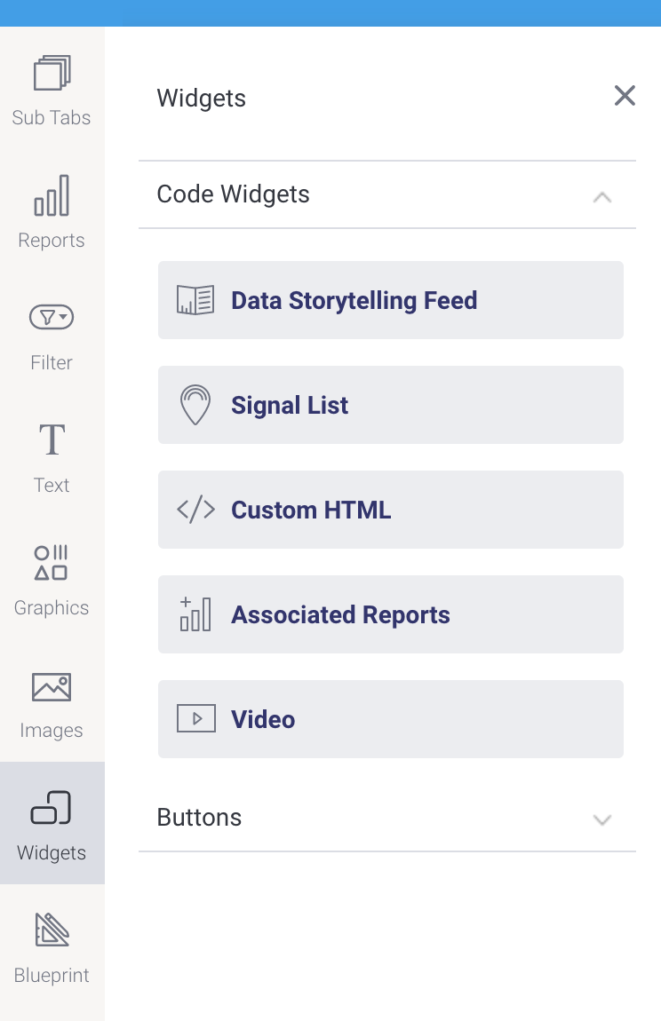
Code Widget type | Description |
|---|---|
| Data Storytelling Feed | Add a data storytelling feed, based on a Yellowfin content folder. The feed will display a list of stories contained within a folder or sub folder. |
Signal List | Add a signal list, if Yellowfin Signals is part of your analytics suite, as a quick and easy way to incorporate automatically discovered insights that are relevant to the content in a presentation. |
Custom HTML | Drag this widget anywhere on your slides, and then jump to Code Mode to instantly start coding HTML within the widget’s tags. |
| Associated Reports | Add relevant reports as links rather than displaying them. |
| Video | Embed videos from popular online video platforms including YouTube, Dailymotion, TED and Vimeo. |
Create your own widget
Yellowfin gives you full freedom to implement your own widget, with our JS API providing the tools that developers need to extend the functionality of Yellowfin to suit individual business needs. These can be added to the dashboard by importing them through the plugin manager. They will then appear in the Code Widget list of code widgets for selection during the dashboard building process. Take a look at the guide to creating a code widget for further information and resources.
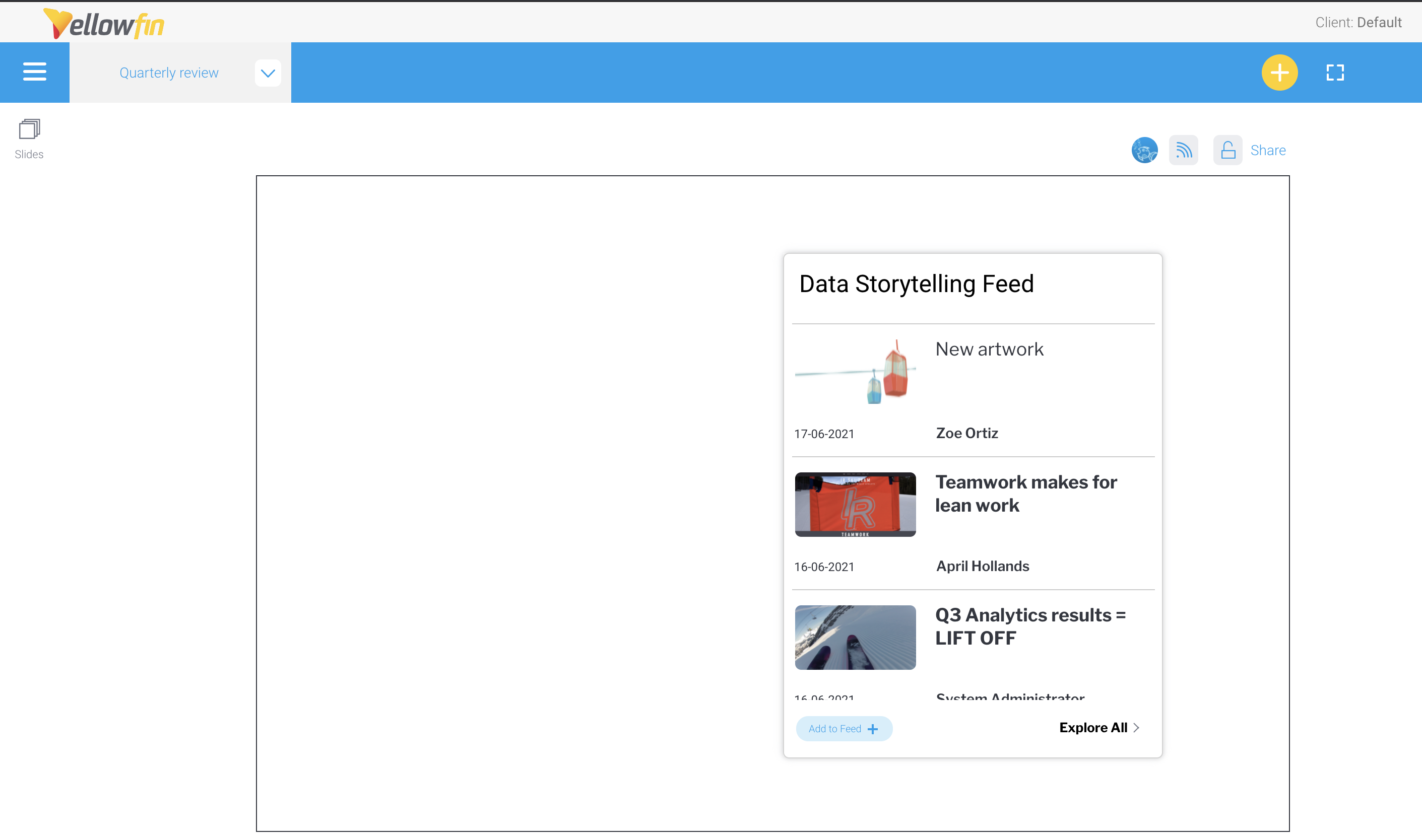
Data storytelling feed widget
Yellowfin 9.6 offers a data storytelling feed widget that works like a news feed for Yellowfin presentations. The widget displays a list of the most recent stories from a folder or sub folder location that you choose.With this widget, presuming you have the access required, you can:
- add one or more data storytelling feeds to a dashboard or a presentation and customize their display;
- manage data storytelling templates for regular use (to save time setting up filters etc); and,
- create new stories from templates.
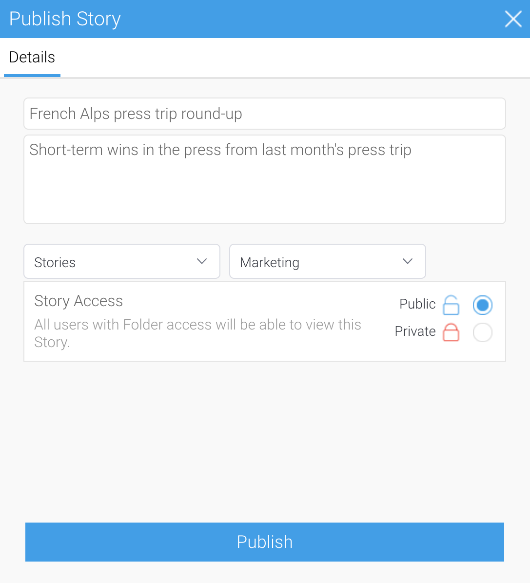
Add data storytelling feeds to a presentation
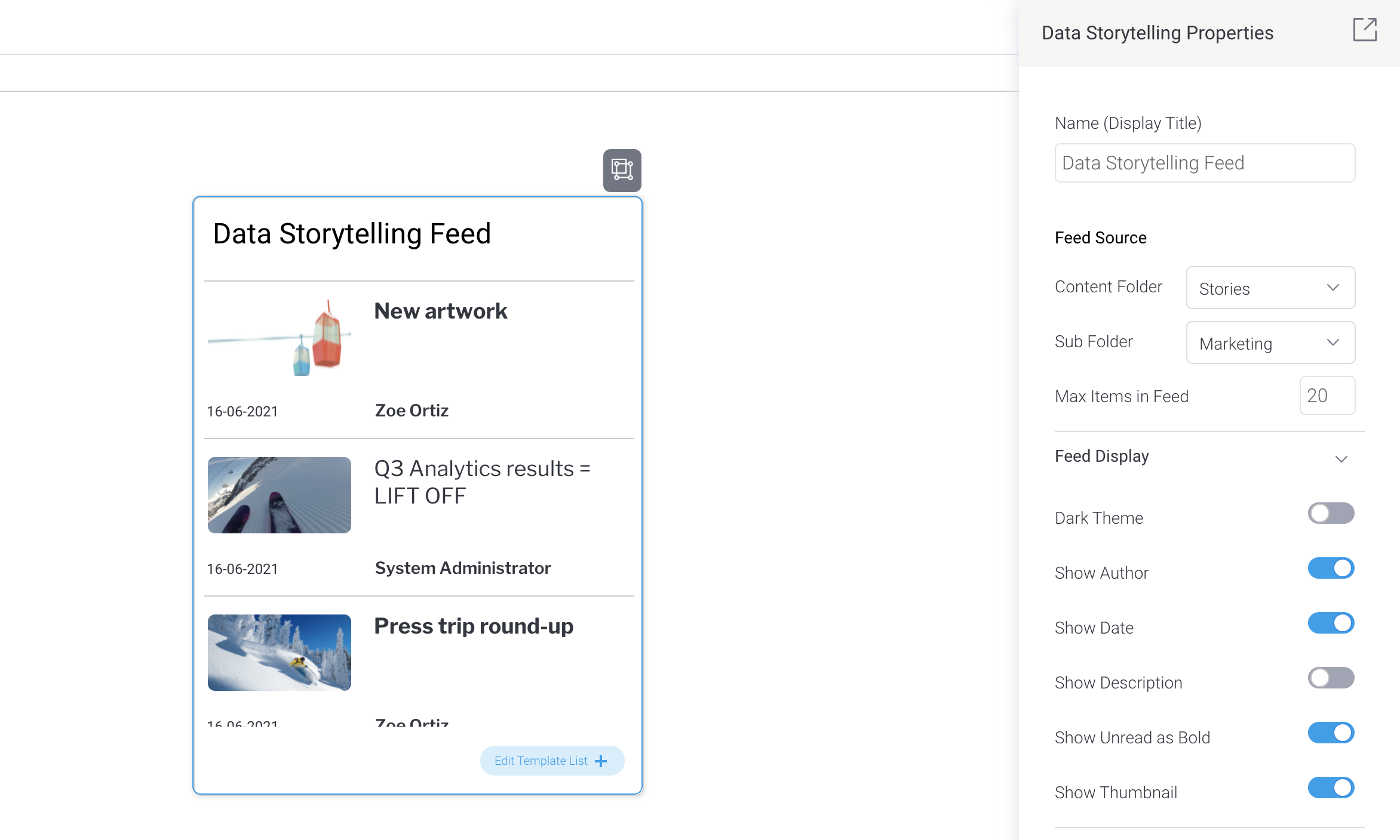
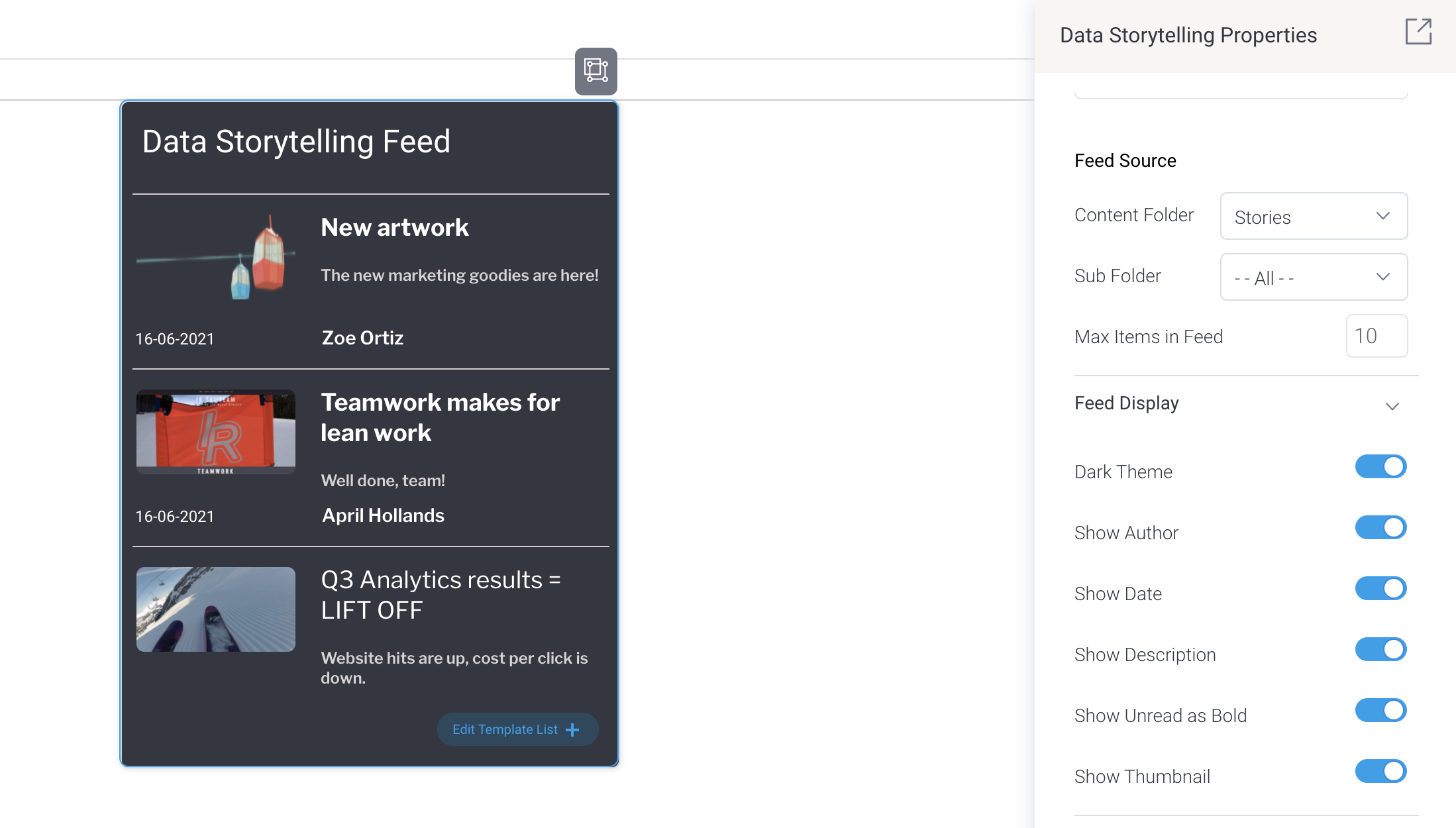
When you add a data storytelling feed to your dashboard, you can apply all the usual formatting, such as the size of the object and any background formatting. You can also control a variety of data storytelling-specific display options, outlined in the table below.
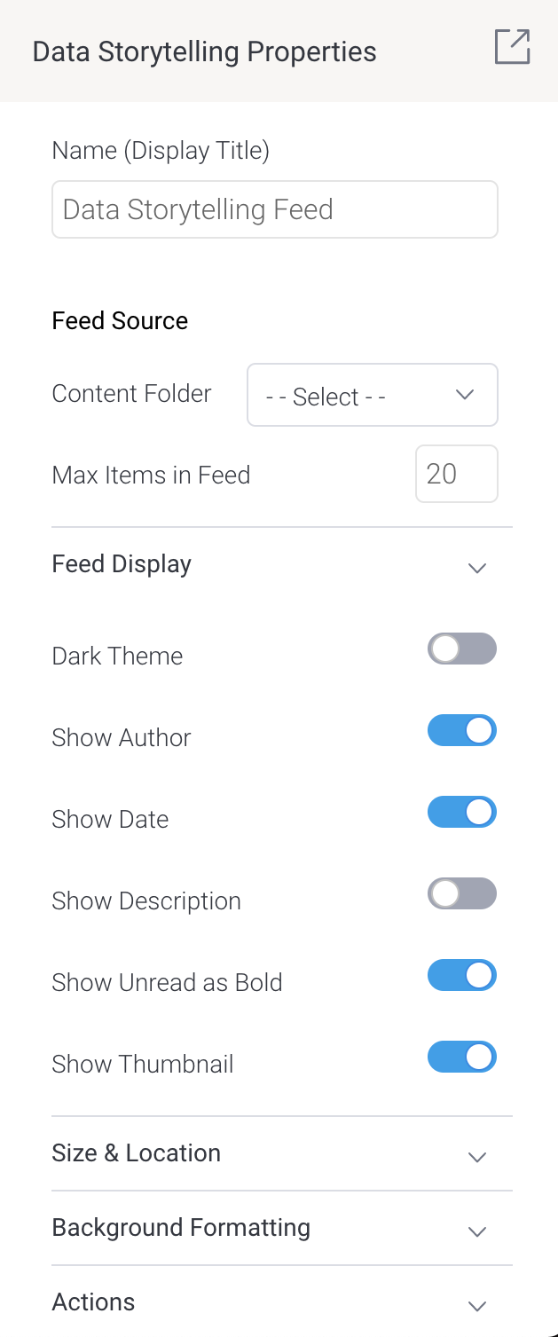
Field | Description |
|---|---|
Name (Display Title) | Type the title text that you would like to be displayed at the top of the widget. Leave it blank if you don’t want a title. If you’re a developer, make sure you use the publishUUID if you wish to identify this widget in your code. |
Content Folder | Select the content folder that contains the source of your storytelling feed. By default, stories saved in all the sub folders will be displayed in the feed. |
Sub Folder (visible only after selecting a content folder) | If you only wish to display the contents of a particular sub folder, select it here. Make sure its parent folder has already been selected in the Content Folder field above. By choosing a sub folder, only the contents of the sub folder will be displayed in the feed. |
Dark Theme | Choose between the light and dark color themes for your feed. |
Show Author | Toggle on to display the name of the person who created each item in the feed. |
Show Date | Toggle on to display the date that each item was last published. |
Show Description | Toggle on to display the description of each item in the feed. |
Show Unread as Bold | Toggle on to display bold text for unread items in your storytelling feed. |
Show Thumbnail | Toggle on to display a thumbnail version of the main image for each item in the feed, if an image exists. |
Steps to add a data storytelling feed
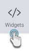
- On a presentation of your choice, click on the Widgets tool on the left
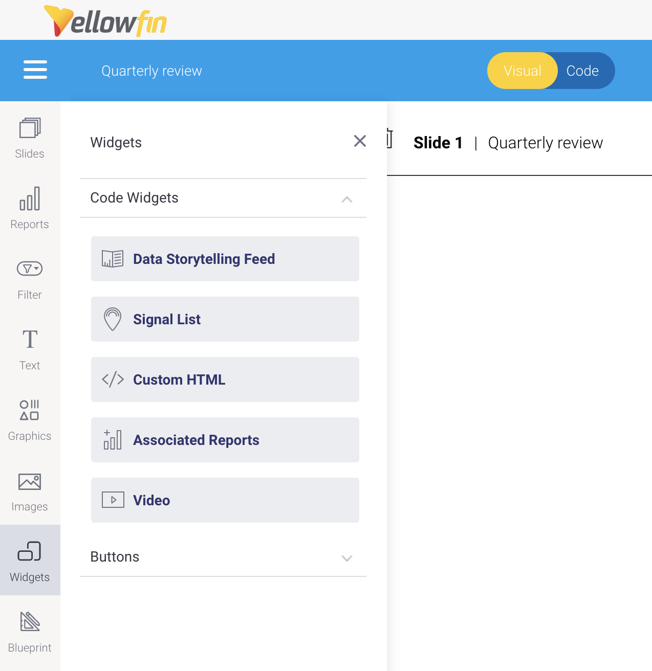
- Use your mouse to drag the Data Storytelling Feed option onto your slide
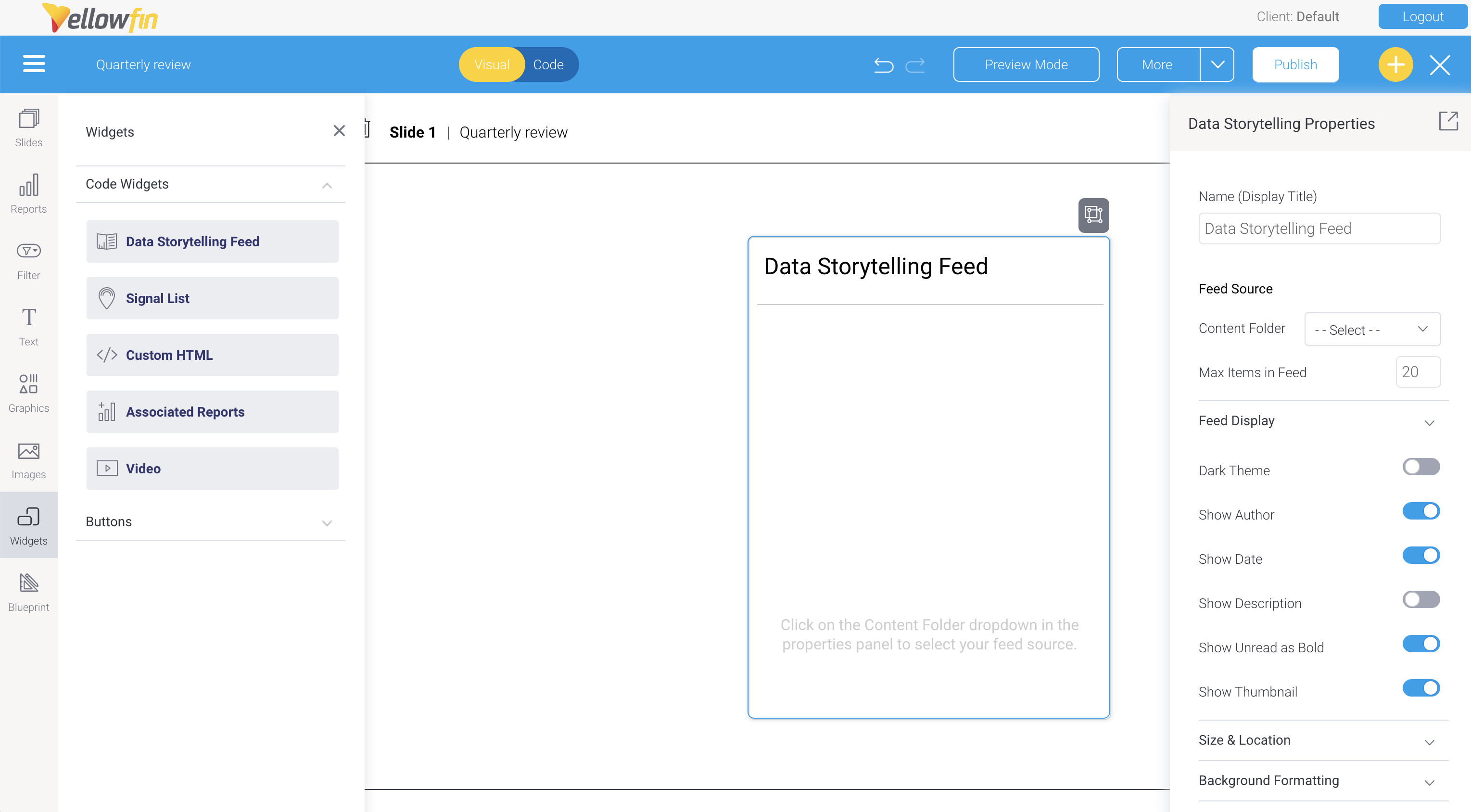
- In the Data Storytelling Properties panel on the right, select a folder and, if required, any sub folder that contains storytelling content
- Check that the feed is populated with stories and adjust any of the options in the Data Storytelling Properties panel to customize the feed
Manage storytelling templates
A storytelling template lets you create new content based on existing stories that you have access to view. This is useful when you create similar content regularly. For example, if you publish a new story every month with an embedded table and charts containing last month’s sales figures, you can make this into a template for future use.
Templates are managed from within the storytelling widget during presentation or dashboard editing. Follow the steps below to select and deselect storytelling templates.
Steps to manage templates
- Ensure you’re editing a presentations with a data storytelling feed already added
- Click on the Edit Template List button at the bottom of the feed
Checkboxes will appear next to each item in your scrollable feed: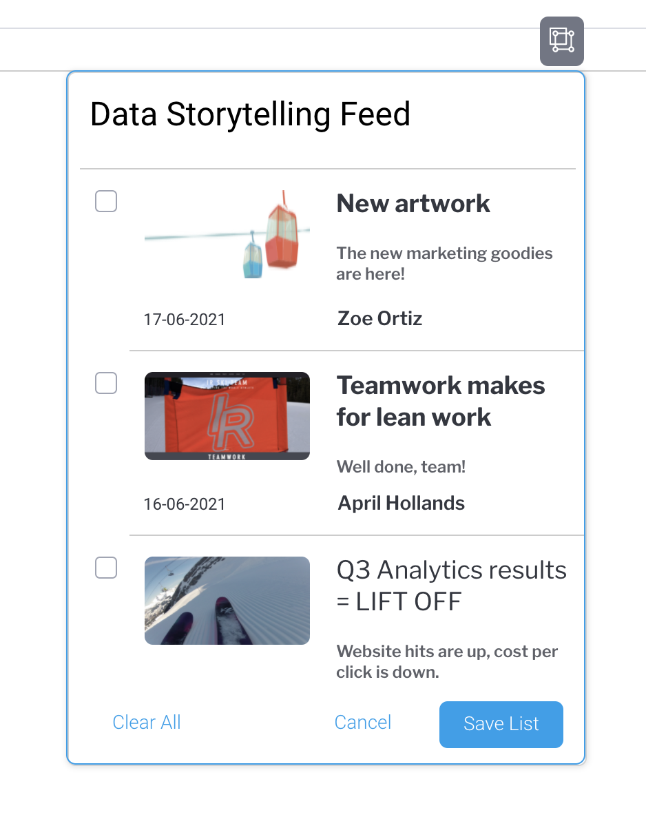
- Use the checkboxes to select (or deselect) any stories you wish to use as templates
- Click on the Save List button
Create new storytelling content from templates
You can create new storytelling content directly from a presentation or a dashboard. Using an existing template means content, such as any filters, images and text, will be copied into a new story.
For regular content that you produce, this saves time in recreating filters for tables and charts that you wish to include. Instead, you can tweak the existing content and filter values to suit your updated content. When you update a filter in a new story, the original template remains unchanged, leaving your original story intact.
TIP: Make sure the presentation already has a data storytelling feed on it and that you’re viewing the presentation in either publish or preview mode.
From the feed on a presentation or a dashboard, you can:
- create new content based on an existing template; or,
- create a new, empty story
All new content will automatically be stored in the same sub folder that the feed is already set to use. This means it will automatically be added to your data storytelling feed on the presentation slide or dashboard as soon as you’ve published it.
Steps to create new storytelling content from templates
- Ensure you’re viewing a presentation with a data storytelling feed already added, either in preview mode or already published
- In the bottom left corner, click on the Add to Feed button to display the Create New Feed Item dialog box
Any stories you selected to use as templates will be displayed as a list in this dialog box: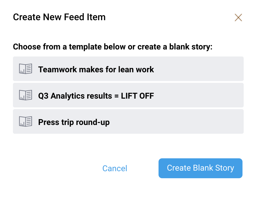
- Either click on one of the existing templates listed to create a copy of an existing story, or click on the Create Blank Story button in the bottom right corner to create a new, empty story without any content
The story will appear in edit mode, with Copy added to its title: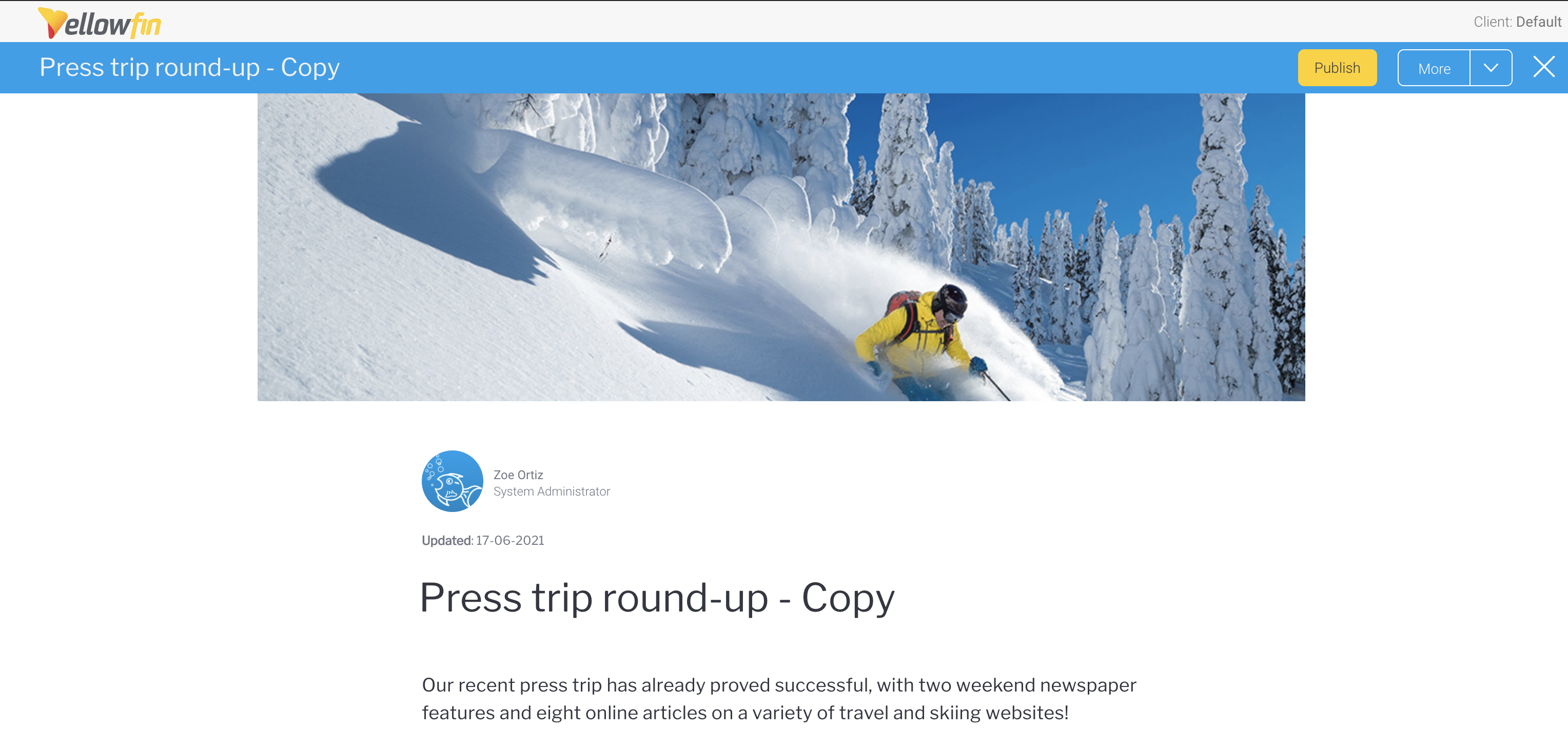
- Adjust any filters and content according to your requirements (for more information on writing stories, start here)
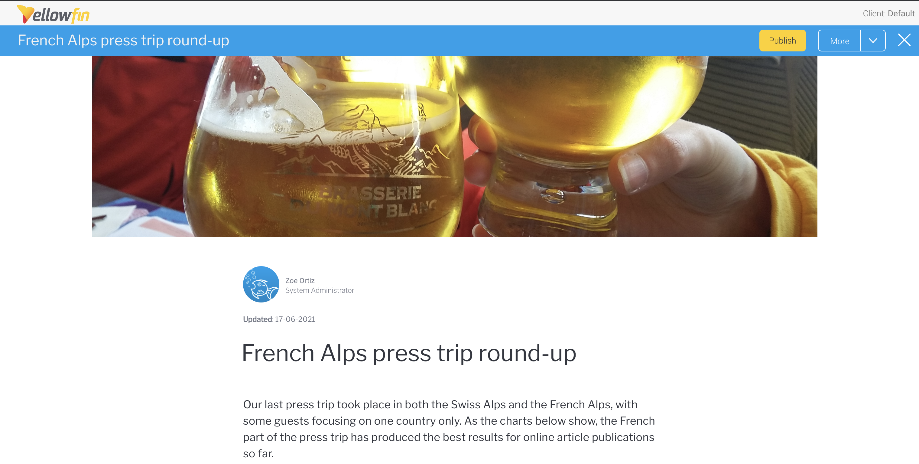
- Click on the Publish button at the top of the story
- Save the story to the same folder location as the original story (and, depending on your feed settings, the same sub folder location) if you wish to display it in your story feed, then click on the Publish button
- Close the published story to return to your dashboard with the data storytelling feed you added earlier
The new story will appear at the top of the feed: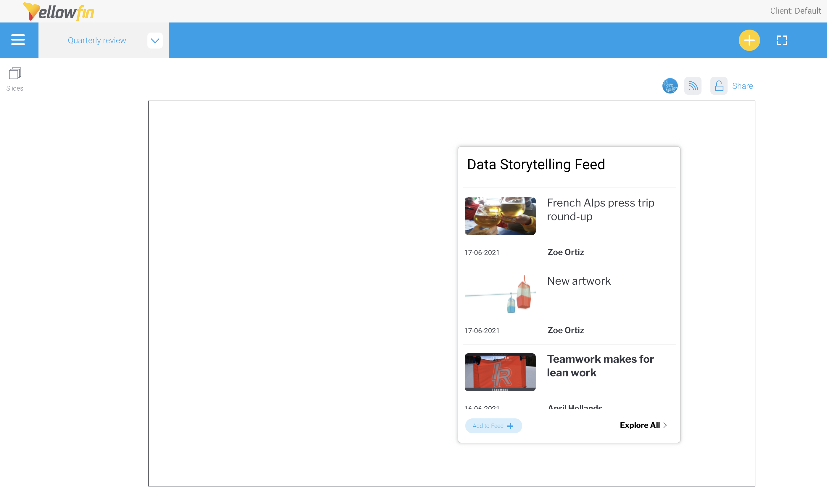
Signal List code widget
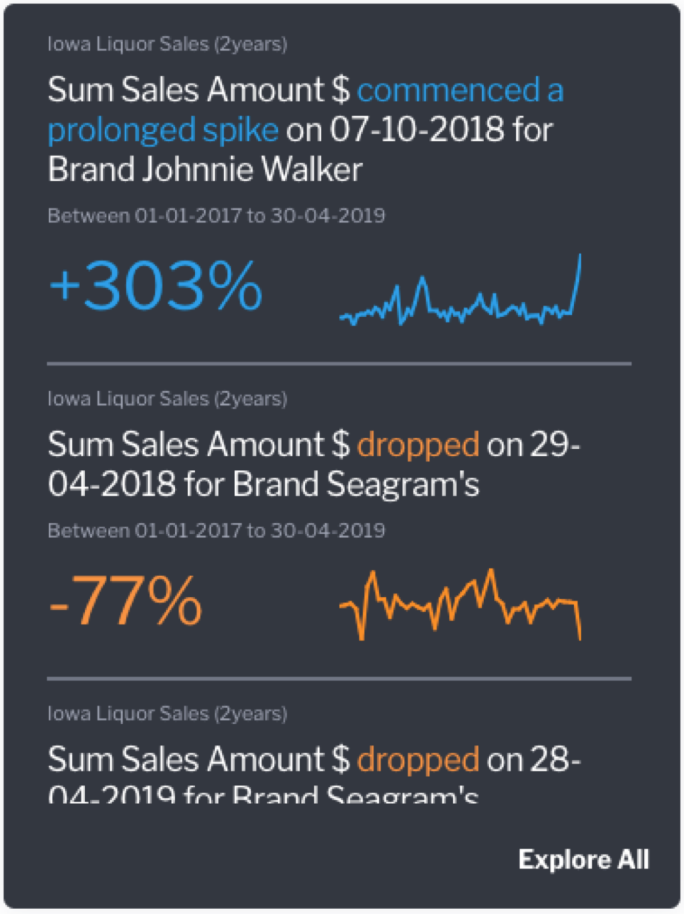
If you have Yellowfin Signals as part of your analytics suite, you can use this widget to add a contextual Signals List to your presentation. This is a quick and easy way to incorporate automatically discovered insights that are relevant to the content on a presentation. The Signal List widget will be updated to reflect new Signals discovered in real time (that is, Signals detected when the analysis is run, and if the widget filters are set to display them).This list employs the use of color-coded Signals, that accentuate insights with positive results as blue, and those with negative results as orange.
Widget interaction
Users of your presentation will be able to see this list of signals, and interact with it.
- Open a Signal: Click on a signal in the list to navigate to its detail page.
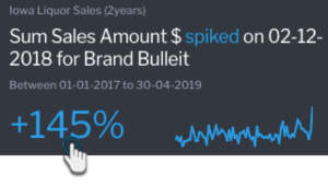
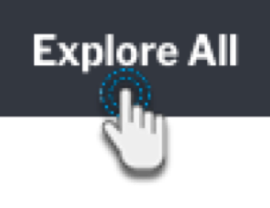
- View Signal List page: Click on Explore All to redirect users to the Signal List page, where they can further interact with the list, such as by rating or watching Signals, and assigning owners. If any filters are applied to the Signal List widget, they will be carried over to the Signals List page.
- Scroll list: Easy to scroll through the widget list; there is no restriction on the number of Signals displayed here.
Configuring the Signals List widget
This tutorial shows you how to add a Signals List widget, and configure it by applying filters to view Signals based on your preference. This allows you to control the Signals that will appear in this list.
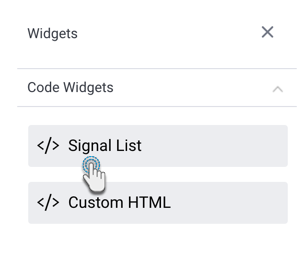
- Click on the Widgets button, and expand the Code Widgets section (expanded by default).
- Drag the Signal List widget onto the slide.
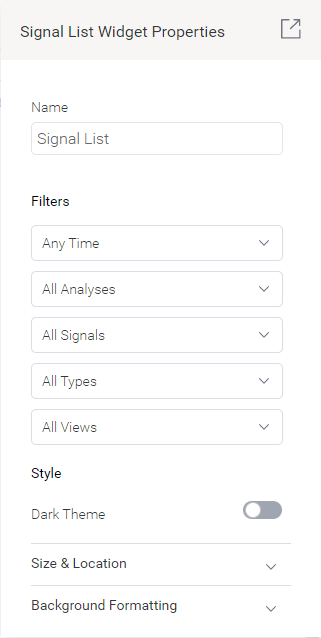
- Upon doing so, the Properties panel will be updated to show properties of this widget.
- You can select filters values to filter the signal widget list. The available options allow you to view Signals according to:
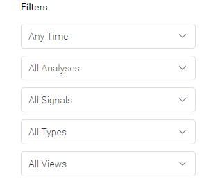
- Time: view signals according to a pre-selected time range, such as those occurring in the last 30 days. Choose Anytime if you do not want to limit signals according to time.
- Signal Analysis jobs: this filters Signals that were detected by a specific analysis configuration job.
- Signal Status: this includes Signals added to your watch list, ones that were recently viewed, those that have been closed, or dismissed signals.
- Signal Type: display signals of a specific type, such as only show Spikes and Drops.
- Views: display signals that were detected within a specified view.
- Note that the list will be saved according to the filters applied. This ‘filtered’ list will appear on the presentation.
- Refer to the properties section for a description on all properties related to this widget and how to configure them.
Signal Widget properties
These are properties specific to the Signal List Widget.
Property name | Description |
|---|---|
Name | Allows you to update the name of the signal widget. |
Filters | This section offers multiple filters that you may update your signal widget list by. These are covered in the Signal filter section above. |
Style | |
Dark theme | Enable this toggle to display the Signal widget in a dark theme, or disable it to keep the light theme. |
Size & location | |
X | Specify the x coordinates of the top left corner of the signal widget, in order to position it exactly on your presentation slide. |
Y | Specify the y coordinates of the top left corner of the signal widget, in order to position it exactly on your presentation slide. |
Height | Specify the height of the currently selected signal widget, in pixels, in order to resize it exactly. Note that the Signal widget width does not have a configuration field as it is not adjustable for this widget. |
Lock widget | Enable this toggle to lock the signal widget in its location. This stops you from moving or resizing it. This holds true even when selecting multiple widgets on the slide. Note that the quick chart can still be customized. |
Custom HTML
This widget allows you to add custom HTML anywhere on the presentation slide. HTML added through this widget is displayed on all modes of the presentation.Although HTML is supported in the Present code editor, the actual output of custom HTML in Code Mode will not render on Visual Mode. To see the actual output, you must preview the presentation.
Custom HTML code widgets allow you to see the output of custom HTML content added in Code Mode, in Visual Mode without previewing it.
Using the Custom HTML Code Widget
This widget is designed to be used by users with coding knowledge, specifically HTML, CSS, and JavaScript. This is because it requires the use of Code Mode to edit the widget.
Ensure that you have the ‘Code Mode’ role function enabled for this to work properly.
- Click on the Widgets button on the left.
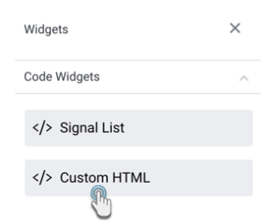
- From the Code Widgets section in the list that appears, drag the Custom HTML widget onto the slide.
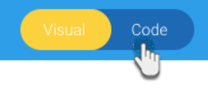
- Switch to Code Mode through to toggle on top of the presentation.
- From the list of objects on the left, click on the Custom HTML object to highlight or navigate to the exact code section. Tip: this object list displays all objects added to the presentation and is used to find the exact code for a particular object so it can be edited.
- Once located, enter your HTML code into the widget’s code.
- If you navigate back to Visual Mode, you will be able to see the output of your HTML content.
Video widget
The video widget was introduced with Yellowfin 9.6. It provides an easy way to add videos to dashboards and presentations using a URL as a video source. The video widget can be used to share videos from popular video platforms including YouTube, Dailymotion, Vimeo and TED (Talks).Add a video to a presentation
In Present preview and publish modes, all videos can be viewed like any embedded video.
In Present edit mode, videos cannot be viewed, and videos from Vimeo and TED won’t display a custom preview image.
- On a presentation slide of your choice, click on the Widgets tool on the left
- Use your mouse to drag the Video option onto your slide
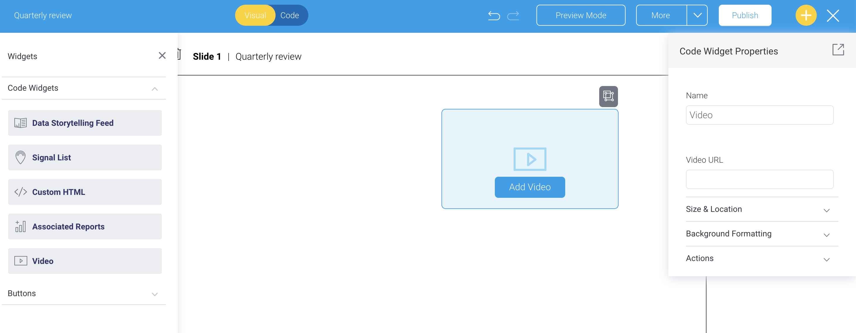
- In the properties panel on the right, click on the Video URL field and paste a URL to a video (for example, https://www.youtube.com/watch?v=yKP7jQknGjs)
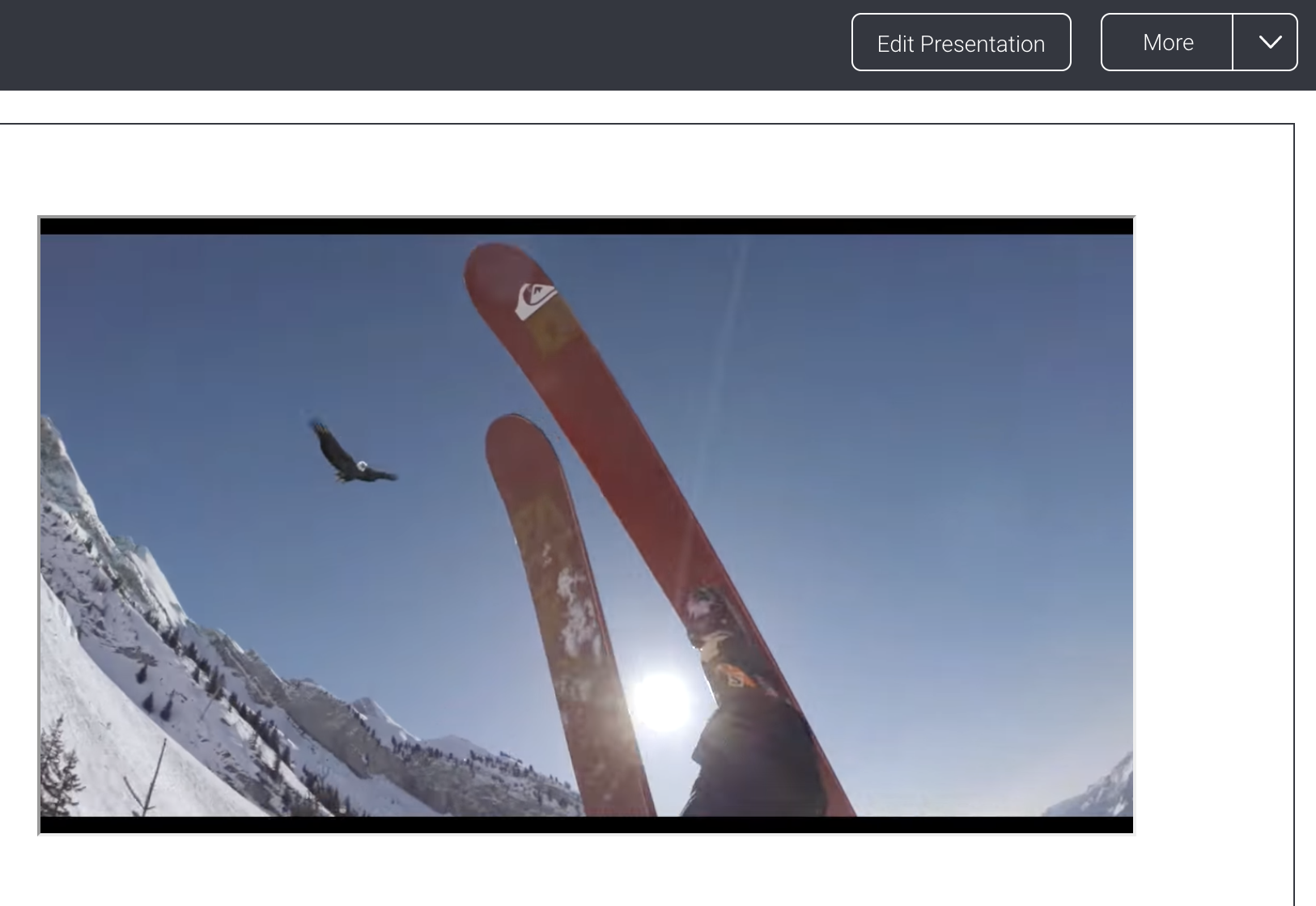
Depending on the video platform, the video placeholder on your dashboard will change to either a preview image, like this: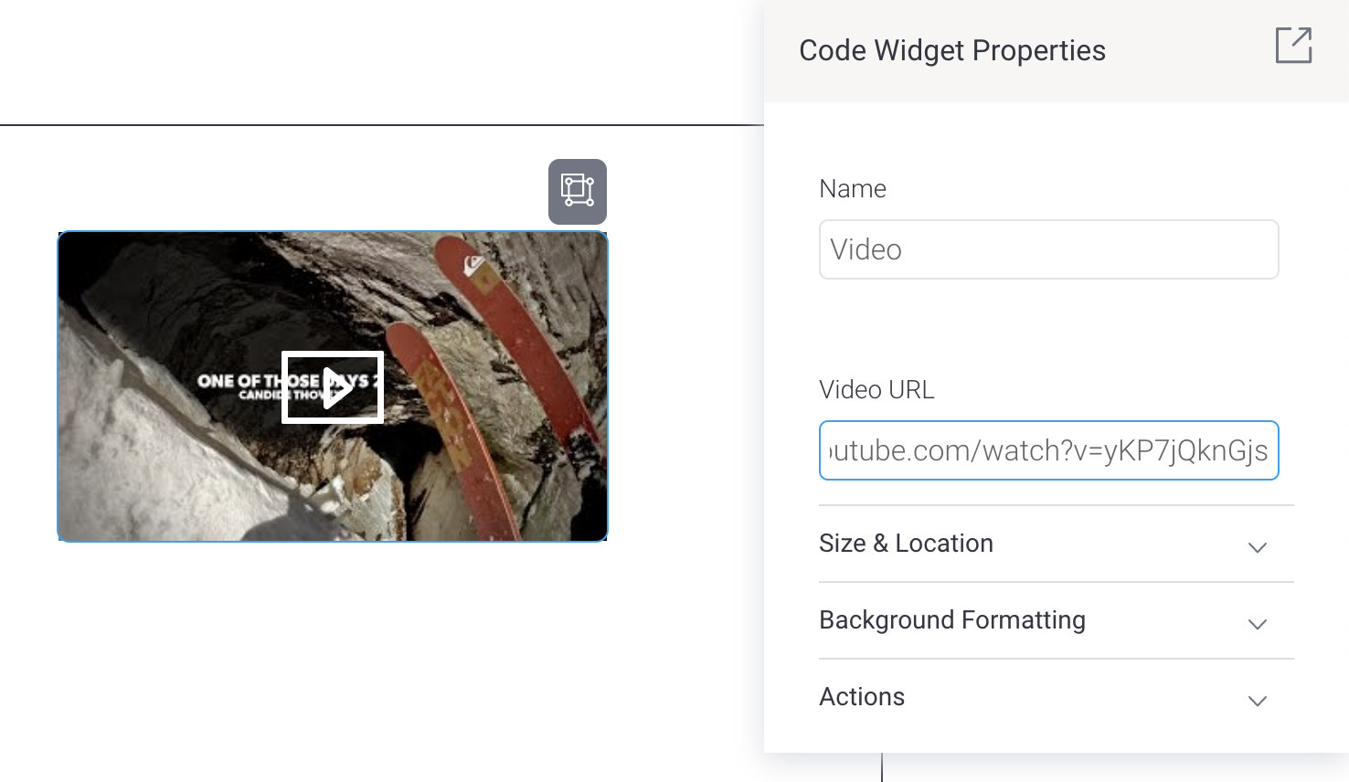
...or a generic graphic, like this: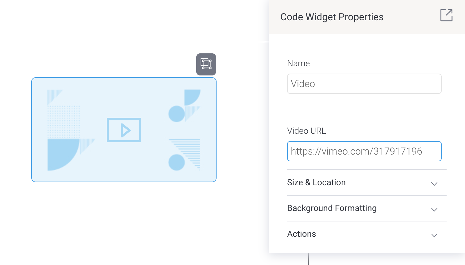
- If you wish to resize the video, drag and drop any corner of the widget placeholder
- Click on the dashboard’s Preview button
- Click on the video to trigger it to play