Overview

The Content Settings page allows administrators to configure a wide range of defaults and formatting settings for content. Navigate to Menu > Administration >  Content Settings to change the settings that fall under the following tabs:

  1. Report settings
  2. Chart settings
  3. Dashboard settings
  4. Storyboard settings
  5. Signals settings
  6. Content settings

top


Report settings


OptionDescription
Default fontSelect the default font for Yellowfin content, including report details, tables, charts, dashboards, and even PDF exports. Learn more.


Option

Description

Report Title

Title

Define the font formatting to be applied to the Report Title.

Description

Define the font formatting to be applied to the Report Description.

Border

Define a border for the Report Title & Description if one is required.

Background

Define a custom background color for the Report Title & Description area if required.

Column & Row Headings

Text

Define the font formatting to be applied to table Column and Row headings.

Background

Define the background color to be applied to table Column and Row headings.

Header Height

Define the height of the table headers in pixels.

Header Padding

Define the space between the text in each header cell and the cell border in pixels.

Cross Tab Metric Headings

Text

Define the font formatting to be applied to cross tab metric headings.

Background

Define the background color to be applied to table cross tab metric headings.

Header Height

Define the height of the table headers in pixels.

Header Padding

Define the space between the text in each header cell and the cell border in pixels.

Cross Tab Column Values

Text

Define the font formatting to be applied to cross tab column values.

Background

Define the background color to be applied to table cross tab column values.

Header Height

Define the height of the table headers in pixels.

Header Padding

Define the space between the text in each header cell and the cell border in pixels.

Cross Tab Row Values

Text

Define the font formatting to be applied to cross tab row values.

Background

Define the background color to be applied to table cross tab row values.

Header Height

Define the height of the table headers in pixels.

Header Padding

Define the space between the text in each header cell and the cell border in pixels.

Data

Text

Define the font formatting to be applied to table cells.

BackgroundDefine a custom background color for the Report data area if required.

Cell Height

Define the height of the table rows in pixels.

Cell Padding

Define the space between the text in each cell and the cell border in pixels.

Cell Spacing

Define the space between each cell in pixels.

Row Shading

Define an alternate row shading color for the body of tabular reports.

Row Highlight

Define a highlight color displayed when the mouse pointer hovers over a row.

Border
PositionDefine where borders should be displayed around the edges of the cell.
ColorDefine the color of the cell borders.
WidthDefine the thickness of the cell borders.

Section Title

Text

Define the font formatting to be applied to Report Section titles.

Background

Define a background color for Report Section titles.

Header & Footer

Header

Define the contents of the left, middle, and right page header areas used in report exports. The following components are available:

  • Date: this will insert the current date into the header when the report is exported, printed, or shared.
  • Page No: this will insert a page number on each page of the report when it's exported, printed, or shared.
  • Description: this will insert the report description into the header when the report is exported, printed, or shared.
  • Title: this will insert the report title into the header when the report is exported, printed, or shared.
  • Time: this will insert the current time into the header when the report is exported, printed, or shared.
  • Space: this will insert a space into the header, for use between two components, for example: date space time.
  • New Line: this will insert a line break into the header, for use between components, for example: title new line description.
  • Text: this will allow the administrator to provide custom text to be used in the header.
  • Image: this will allow the administrator to select an image to use in the header, such as a logo.

Footer

Define the contents of the left, middle, and right page footer areas used in report exports. The following components are available:

  • Date: this will insert the current date into the footer when the report is exported, printed, or shared.
  • Page No: this will insert a page number on each page of the report when it's exported, printed, or shared.
  • Description: this will insert the report description into the footer when the report is exported, printed, or shared.
  • Title: this will insert the report title into the footer when the report is exported, printed, or shared.
  • Time: this will insert the current time into the footer when the report is exported, printed, or shared.
  • Space: this will insert a space into the footer, for use between two components, for example: date space time.
  • New Line: this will insert a line break into the footer, for use between components, for example: title new line description.
  • Text: this will allow the administrator to provide custom text to be used in the footer.
  • Image: this will allow the administrator to select an image to use in the footer, such as a logo.

Text

Define the font formatting to be applied to header and footer text used in report exports.

Report Summary

Text

Define the font formatting to be applied to Report Summary text.

Default Chart Color

Specify the default chart color to be used in Report Summary charts.


Option

Description

Filter Location

Select the default location for User Prompt filters to be displayed on the Report page.

Filter Width

Select the default length for User Prompt filter values display.

Drill Through Popup

Allow Drill Through reports to display in a lightbox if configured to use the 'Popup New Window' option.

Filter Breadcrumb Content

Select whether filter breadcrumbs should have a fixed width or be resized to fit their content.


Option

Description

Allow Share

This will allow Private Report Writers to assign other users access to their report.

Watermark

Select an image to use as a watermark on Private Reports.

Report Marker

Enter text to be used as a marker below the description for all Private Reports.


Option

Description

Watermark

Select an image to use as a watermark on Public Reports.

Approved Reports Watermark

Select an image to use as a watermark on reports that have been approved.

Watermark DisplaySelect whether watermarks should always be displayed on applicable reports, or only when such reports are exported.

Report Marker

Enter text to be used as a marker below the description for all Public Reports.


Option

Description

Report Data Preview

Enable this to display a live preview of the report table on the report data page as it is being built.

Report Preview Row Limit

Define a default limit for the number of rows that will be displayed in the report table preview. Note that this default limit is applied to all reports, however, it can be overridden at the report level.

Report Active Row Limit

Define a default limit for the number of rows that will be displayed in the final output of an active report. Note that this default limit is applied to all reports, however, it can be changed at the report level.

Chart Data PreviewDisplay a live preview of the chart on the chart builder.
Display Filter ValuesDefine if, by default, a legend of filter values applied to the report is displayed, and where.
Display Access Filter ValuesDisplay access filter values in the filter legend on the report. The standard filter legend must be enabled to see these values.
Autorun Reports with FiltersDefine if, by default, the default and remembered filter values are applied and the report is run on the first load.
Filter Run Delay

Define in seconds, how quickly a filter set should be run after a value is selected or changed when Auto Run Filter is enabled.

Unique Report NamesSpecify if reports need to be saved with unique names in the system.
Email long running reports

Enable or disable the option to send long-running reports as emails. By default, reports are emailed as PDF attachments, however, this can be changed to CSV, DOCX, or XLSX, depending on the user access level.

Post long running reports on timelineDisplay the option to post long running reports on timeline once loaded.
Approval FlagAn icon is displayed in the top toolbar indicating the report's approval status. This is only displayed for activated reports that are saved into a content folder that requires approval.
Approval PersonThe name and avatar of either the report creator or approver, based on approval status, will be displayed in the top toolbar.


Option

Description

Canvas FontsDefine fonts to be available in the canvas editor. The value on the left should be the CSS Font Family name, and the value on the right should be the label you want to display in the canvas font selector.


Option

Description

Broadcast Tabbed Co-Displays

Select whether to export tabbed co-display reports with the main report as a single XLSX file for broadcasts.


top


Chart settings


Option

Description

Chart Image Format

Specify the image format for charts to be generated as. Options include PNG or JPG.

Draggable Thumbnails

Allow you to open a chart in a new window and drag the image into an open program or save it for later use.


Option

Description

Animated Chart Loading

Animate the chart as it loads.

Display Animation

Animate the chart multiple times per session - each time the chart is reloaded, filtered, or changed.

Per Session

Define the number of times charts animate within a session, this is animations across the system, not per chart.


Option

Description

Active Chart Highlighting

Allow users to hover over an area on a chart with the mouse to highlight it.

Active Outline

Define the color to outline the current active area.

Active Fill

Define the color to fill the current active area.

Tooltip Outline

Define the color to be used to outline chart tooltips.

Tooltip Background

Define the background color to be used for chart tooltips. Define two different colors to use a gradient.

Tooltip Title

Define the color of the Title text in chart tooltips.

Tooltip Text

Define the font and color of the descriptive text in chart tooltips.


Option

Description

Default Style

Use only one color per category or series by default.

Colors

Define grids of color to be applied to charts by default. The first grid is for solid colors, the second is used to perform gradient shading when enabled.

Map Colors

Define the default colors to be used for maps. The first part of the range is allocated to negative numbers, the middle to zero, and the second part to positive values.

Chart Background

Define the default chart background color. Leave blank to set as transparent.

Plot Background

Define the default plot background color. Leave blank to set as transparent.

Annotation Range Default

Define the default color to be used for Annotation Range highlighting on charts.

Bubble Shading Style

The bubbles will consist of two colors shaded together to give a rounded effect.


Option

Description

Width

Define the default thickness of lines used in charts.

Shapes

Line Shapes mark each data point on line charts.


Option

Description

Title

Define the font formatting to be applied to Chart Title text.

Axis Title

Define the font formatting to be applied to Chart Axis Title text.

Axis Label

Define the font formatting to be applied to Chart Axis Label text.

Legend

Define the font formatting to be applied to Chart Legend text.

Label

Define the font formatting to be applied to Chart Label text.

Series Selection

Define the font to be applied to Chart Series Selection text.


Option

Description

GIS Base Layer

Specify whether or not to display a base layer underneath maps to provide location context by default.

Google API Access

Specify if Google Maps can be used. These require internet access to work.

Google Maps Point Limit

Specify the maximum number of single points to be displayed at any one time.

Google GIS Label Background

Define the color to be used for Map Label backgrounds.

Google GIS Label Border

Define the color to be used for GIS Maps Label borders.

Google Maps API KeyProvide the Google Maps API Key to be used to generate Google Maps.
Google Maps Premium API KeySpecify whether or not to interpret this API key as a premium ClientID.


Option

Description

Default Gridlines

Select which gridlines will be shown by default. Options include:

  • Numeric Axes: Displays gridlines for axes of only numeric fields. Axes of dimension fields will not show gridlines.
  • Horizontal Axis: Displays gridlines for only the horizontal axis.
  • Vertical Axis: Displays gridlines for only the vertical axis.
  • All Axes: Displays gridlines for all axes.
  • None: Does not display any gridlines.

X Gridline Color

Define the color to display horizontal axis Gridlines by default.

Y Gridline Color

Define the color to display vertical axis Gridlines by default.

Horizontal Axis Color

Define the color of the horizontal axis by default.

Horizontal Axis Thickness

Define the thickness of the horizontal axis by default.

Vertical Axis Color

Define the color of the vertical axis by default.

Vertical Axis Thickness

Define the thickness of the vertical axis by default.

Axis Formatting

This configures the formatting of the numeric axis on all (non-auto) charts. Choose from the following options:

  • Column Formatting: This looks for formatting that has been manually applied to the underlying chart column text via the Column Formatting panel when editing reports, and applies it to the chart as well.
  • Summarize Value: This abbreviates or summarizes the numeric axis labels in charts. For example, 100,000,000 will be abbreviated to 100m, making it easier to read.
  • Custom: This allows users to apply further custom settings on the axis. Enabling this will bring up the Prefix, Suffix, Hide Negative Prefix, and Decimal Places settings for the axis.

Prefix

Define a prefix to be applied to the values displayed on the axis. This is a character to display before the value, such as $.

Suffix

Define a suffix to be applied to the values displayed on the axis. This is a character to display after the value, such as %.

Hide Negative Prefix

Select whether negative values should display or hide the '-' negative prefix. If the toggle is enabled, the negative prefix will be hidden.

Decimal Places

Define the number of decimal places to display on the axis label text.


top


Dashboard settings


Option

Description

Action Buttons

If enabled, portlet buttons will always appear. If disabled, portlet buttons will only be displayed when the user hovers over a portlet.

Note that this also controls the visibility of object buttons in dashboards.

Note: The following setting has been removed from the newer versions of Yellowfin: Title Background Image.


Option

Description

Apply Style

Specify the default display of the filter Apply button or text.

Left Nav Filter Panel Style

This option alters the display of filters when the Left Filters option is toggled on in the Dashboard Properties panel. Toggle between Single Panel (Modern - Yellowfin 9 style) and Slide-Out (Traditional - Yellowfin 8 and earlier style).

  • Single Panel (Modern): This option displays filters with their usual look of checkboxes, radio buttons, fields etc, in line with how they're displayed in reports.
  • Slide-Out (Traditional): This option displays filters as text, with additional slide-out left panels for value selection, matching the style used in Yellowfin releases earlier than Yellowfin 9.

Note: The following setting has been removed from the newer versions of Yellowfin: Filter Location.


Option

Description

Default Dashboard Width

Define the default width of the dashboard in pixels or % of the current window.

Alignment

Specify the default alignment of the dashboard.

Lock Table Headings

Specify if column and/or row heading should be locked when displayed on the dashboard.

Hide Dashboard Tab NavigationSpecify if dashboard tabs should be displayed above a dashboard. Enable this toggle to hide them.
Preserve Report Column Widths on DashboardsIf enabled, dashboards containing reports will preserve any pre-set column widths set within the report. If the total width of a table with pre-set column widths is greater than the width allocated on a dashboard, scroll bars will appear to scroll from side to side.
If disabled, dashboards containing  reports will automatically resize the column widths of a table so that it fits the allocated space on the dashboard., without needing scroll bars.
Enable Dashboard Footers for Static Layouts

Toggle this option on to enable dashboard footers (for static layouts only). These were available in Yellowfin 8, then suspended in Yellowfin 9.0. They were reinstated in Yellowfin 9.6. If you had previously configured a custom footer in an earlier version of Yellowfin, re-enabling this setting will re-enable your old custom footer for all dashboards.

If your Yellowfin deployment contains Primary and Client Orgs, this setting can be applied individually to each org. When this setting differs between orgs, footer visibility may be affected. A Primary Org with footers enabled will display its dashboards with footers at Primary Orgs and Client Orgs. A Primary Org without footers enabled will not display any footers on its dashboards, even if the Client Org has footers enabled.

Note: The following settings have been deprecated in the newer versions of Yellowfin: Tab buttons, Associated Reports Location, My Content Location, and Search Location.


Option

Description

Page Refresh

Each time the user changes the tab they are viewing, only the items relevant to the tab are reloaded, such as reports, filters, units, etc. This is only compatible with browsers that support HTML5.

Dashboard Loading

Display a colored overlay on a tab to show that it is loading.

Dashboard Report Loading

Display loading indicators when reports are viewed on a tab for the first time. Available options include:

  • "Loading Report" message.
  • Colored Overlay.
  • Loading Animation.

Dashboard Report Refresh

Display loading indicators when reports are refreshed on a tab. This includes loading due to filtering, brushing, drilling, and refresh schedules. Available options include:

  • "Loading Report" message.
  • Colored Overlay.
  • Loading Animation.
Report Loading

Define how to load reports on a tab. Options include:

  • Sequential: load the reports one by one.
  • Concurrent: load all reports at the same time.

Schedule Page Refresh

Schedule the refresh of all reports on the dashboard tab being viewed.

Schedule Page Refresh Frequency

Set the page refresh frequency, in minutes, for the dashboard tab being viewed.


top


Storyboard settings


Option

Description

Slides Preloaded

Define the number of slides to be preloaded either side of the current slide.

Slides Loaded at Once

Define the total number of slides to be loaded at any one time.


Option

Description

Lock Table Headings

Specify if table headings should be locked when displayed in a slide.


top


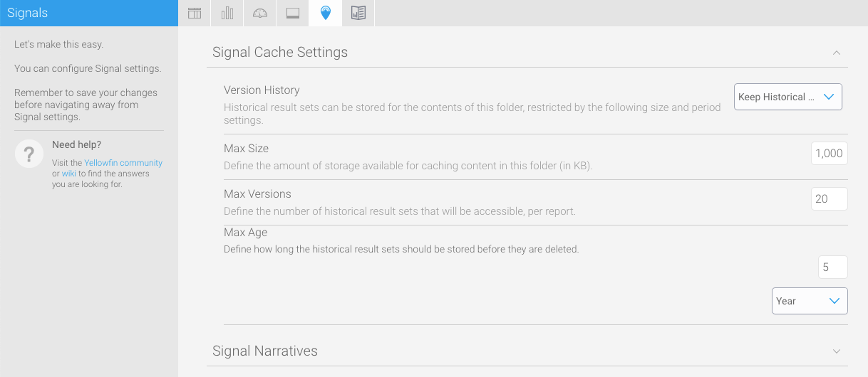
Signals settings

These settings maintain the cache that stores reports created for Signal analysis.

Option

Description

Version History

The version history allows you to store the data returned from a Signals analysis. Includes the following options:

  • Current version only: This option switches off caching. This results in the data being fetched from the source when looking at a Signal, since it isn’t being cached/stored.

  • Keep historical versions: This option will cache all previous data result sets from a Signal analysis. Note that this option can quickly build up quite a large amount of data, so use this option sparingly.

Max Size

The maximum size for Signal analysis data to be saved in cache or in the database where version history is required.

Max Version

This maximum versions of analysis report to save. This does not affect Signals as each Signal only has a single report.

Max Age

The maximum age a Signals report can be cached for. Reports older than this age will be deleted.


Option

Description

Suppress Access Filters

This setting allows you to show or hide access filter values from being mentioned in Signal narratives. By default access filters will be referenced in a narrative, but you can choose to turn it off.

Signal narratives also take formatted data values into account, for example, reference codes applied to data


top


Content settings

These settings relate to Yellowfin Stories and other content.

These settings maintain the cache that stores reports created for Signal analysis.

Option

Description

Overview Video

Displays an overview or tutorial video before the first story is created.
Video LinkLink for the Story tutorial video.


top