Overview
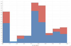
Shows the number of times a given value occurs in the dataset.Chart Data Options
Option | Description |
|---|---|
Horizontal Axis | Select the metric you wish to analyse the distribution of. |
Colour | Optional: You can select one field to split your values by colour. |
Histogram Tutorial
Summary
In order to set up a Histogram Chart you will need:
- Create a report with chart display
- Select a field to use as the Horizontal Axis
- Select a field to use as the Colour (optional field)
- Enable the display of duplicate records
- Create your chart, selecting Histogram as the type under the Analytical heading
- Provide the Horizontal Axis and Colour options
- Customise the Chart as required
- Proceed to the Output step
- Save your report
Tutorial
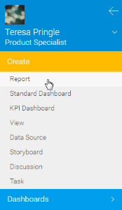
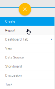
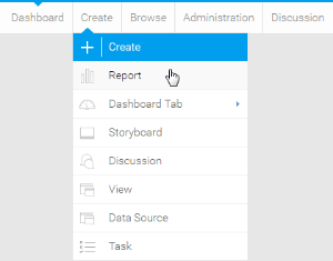
1. Start the Report creation process by using one of these methods:
- Left Side Nav - open the left side navigation panel, click on Create, select the Report option
- Top Right Button - click on the create button, select the Report option.
- Toolbar - click on the Create link in the toolbar, select the Report option.
You will now see the New Report lightbox.
| Left Side Nav | Top Right (with Left Side Navigation enabled) | Toolbar |
|---|---|---|
 |  |  |
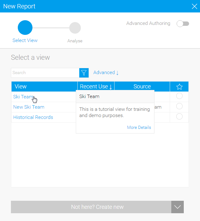
2. Click on the Ski Team view in order to use the fields defined within it for creating the report.
3. You will now be taken to the Data step of the Report Builder.
4. Add Gender and Camp Rating to Columns.
5. Add Camp Rating to Filters.
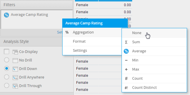
6. Remove the aggregation from both copies of the Camp Rating field.
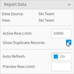
7. Enable the Show Duplicate Records option.
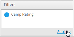
8. Open the filter Settings menu.
9. Set Camp Rating to be Different From 0.
10. Proceed to the Charts step of the builder.
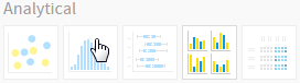
11. Select the Histogram chart from the Analytical section of the charts panel on the right of the screen.
12. Set the following components:
- Horizontal Axis: Camp Rating
- Colour: Gender
13. Save your report