Getting Started
There are three different types of KPI Report available in Yellowfin:Spot | Basic KPI Report that allows you to set up a KPI without displaying any additional information, other than the value itself. |
Categorical | KPI Report that splits what's displayed on the tab into categories when viewed as a report. This allows you to display break up the value into categories for further examination. |
Time | KPI Report that allows you to show a trend according to time series data, rather than real-time trends. It also allows you to show more detail in the report (like a Categorical KPI). |
You will need to create at least one of these before attempting this tutorial.
See KPI Report Tutorial for more information.
Creating a KPI Tab
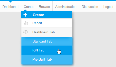
1. Now that you have created a KPI Report, you can create a KPI Tab. Click on the  Add Tab link and select the KPI Tab option. This will bring up a blank tab, ready for reports to be added.
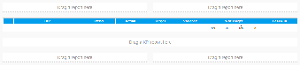
2. As you will have noticed, this tab looks a little different to the other tabs you have worked with so far. The empty scale in the middle will be filled with your KPI Report.
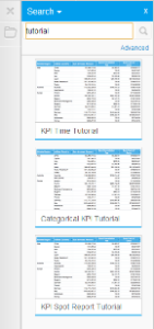
3. To add a report to the dashboard you will need to search for it in the list of active reports. Type KPI Tutorial into the search box and click on  to see results.
4. Add all three of the KPI reports to your tab, you will need to drag them into the KPI Report portlet in the middle.
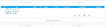
5. Your tab should now look like the one pictured.
6. You have now finished creating your KPI Tab so it's time to Save and Activate it.
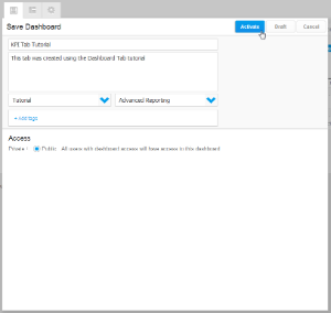
7. Click on the Save Menu and enter KPI Tab Tutorial in the Name field.
8. Type This tab was created using the Dashboard Tab tutorial in the Description box.
9. Click Activate to finish.
Reading and using the KPI Tab
Now that you have a finished KPI Tab and Report it's time to learn what it all means.
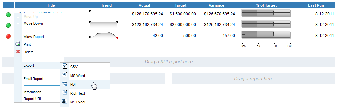
1. Click on the  next to the name of the KPI Report. This opens up the menu pictured.
2. From here you can reorder your KPI Reports (if you have more than one, and if the tab is in Edit mode) by clicking on the Move Up and Move Down options
3. You can view the original report by either clicking on the View Report option or clicking on the name of the report itself
4. You can select the Print option to generate a hard copy of the report
5. You can the Delete option to remove the report from the tab
6. You can Export the report to various other programs. A list will open when you click on the option, simply choose the program you wish to export to and it will do it for you
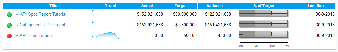
7. Now, remember the conditional formatting alerts you set earlier? They appear to the left of the report title.
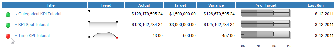
8. The Trend field is displayed using a Sparkline Graph. This compares the current version of the KPI report run with the previous version, indicates change and whether it is positive or negative.
Note: the sparkline only appears for the time KPI as this is using historical data. The other KPIs will generate a sparkline when they have run more than once.
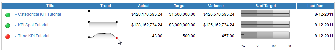
9. The next fields display the Actual, which is the current value of the metric, the Target, which you set earlier, and the Variance between the two.
10. The % of Target is a Bullet Chart that helps visualise performance and lets you compare all metrics on an equal basis.
11. Finally, the Last Run field tells you when the report was refreshed.
12. You have now finished with KPI Tabs.