Overview
Type | Icon | When to Use |
|---|---|---|
Meter |
| You want to measure the rate of change of a measure against pre-defined targets. Useful for dashboard reporting. |
Thermometer |
| Vertical representation of the meter chart, indicating a range of qualitative indicators. |
Dial |
| Used to communicate key performance indicators. |


Chart Data Options
Option | Description |
|---|---|
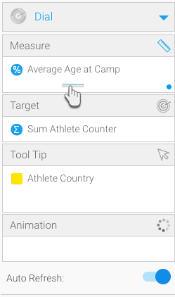
Measure | The metrics you add to this field will serve as the measure for your chart. Typically a numeric value such as $. |
| Target | Add a target to you chart, which is highlighted through needles or other indicators. |
| Tool Tip | You can drag a field here to display specific details in the cursor’s tool tip. |
| Animation | This feature displays animated or moving data on your meter charts. |
Meter Chart Tutorial
Part 1: Create Reports with Conditional Formatting
- Create a new report by navigating to Create button > Report
- Choose a View by clicking on its name
- On reaching the report builder, drag tables to include in your report (Note: at least one of the tables should be a metrics)
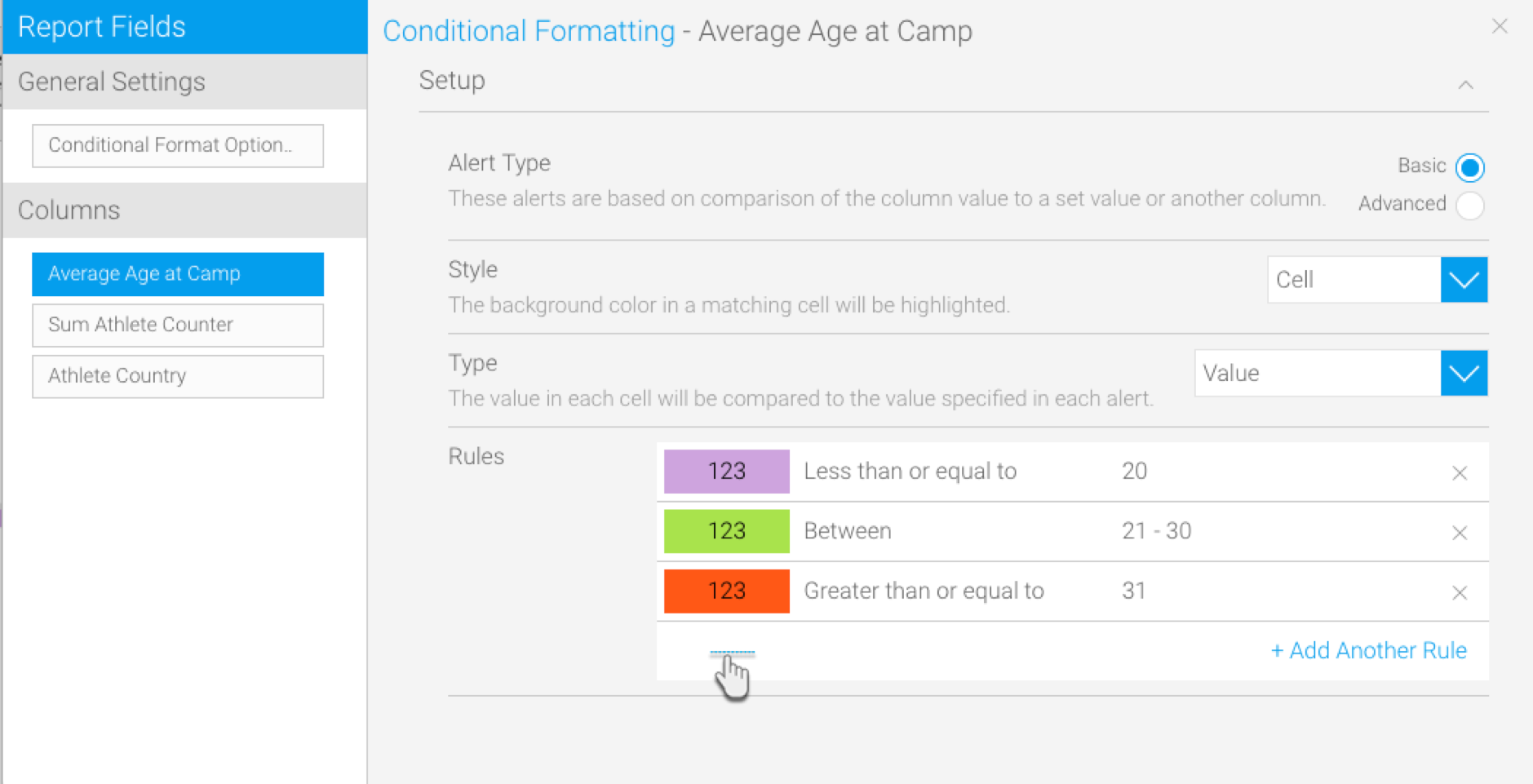
- Click on the Conditional Formatting icon
- In the new popup window that appears, select a column to make it your means of measure
- Next, click on the +Add Another Rule link to create a conditional rule; another popup window will appear
- Add a few rules through the new popup window that appears – establishing a range of measure with differentiating formatting for each (For example, you can create three rules with: one with a less than value, an equal to value and one with a greater than value, assigning them each a unique color)
- Add a few rules through the new popup window that appears – establishing a range of measure with differentiating formatting for each (For example, you can create three rules with: one with a less than value, an equal to value and one with a greater than value, assigning them each a unique color)
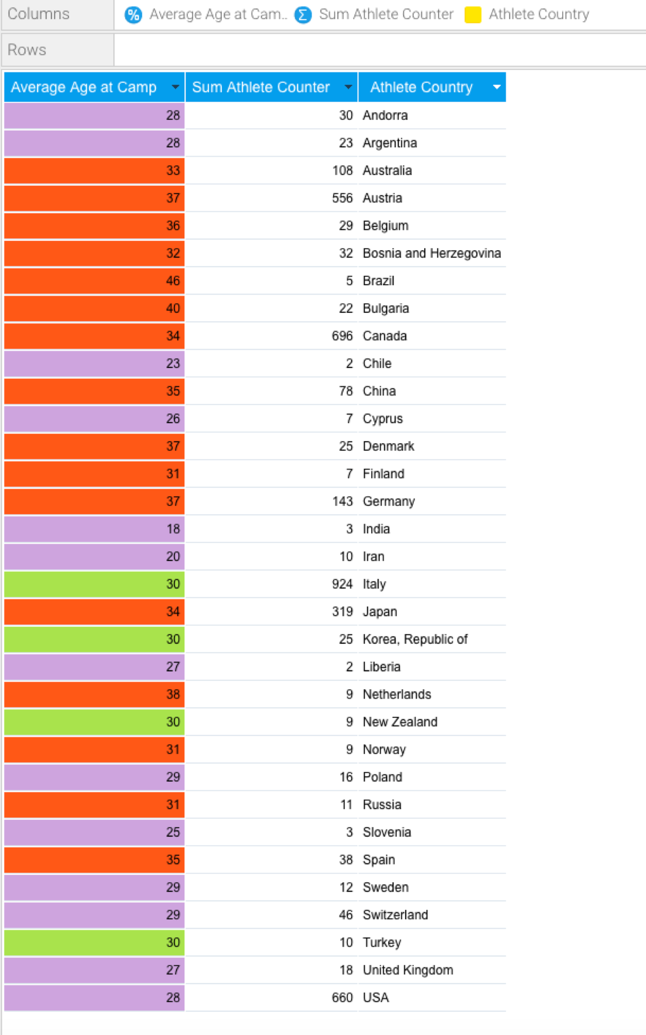
The selected column will be highlighted according to the conditional formatting chosen by you, as can be seen in our example below
It’s best to save this report before continuing.
Part 2: Selecting a Meter Chart
Once you’ve created your report and applied conditional formatting to it, continue with the procedure below to create meter charts:
- If you had saved the report after creating it, reopen it in the chart mode (Double-click Report > Edit > Charts)
- (Or if you currently have the report opened in another view, use the Charts button to move to the chart building page)
- Click on the chart icon on the right most side and select one of the three meter chart types
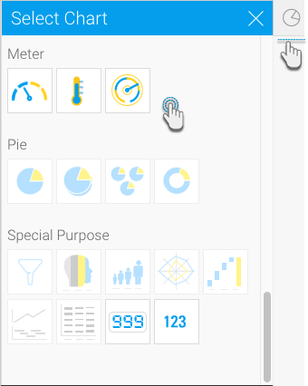
- Note: In our example, we will depict the process of creating the regular meter chart.
- After selecting the meter icon from the chart list, establish a measure by dragging the metrics you had previously applied the conditional formatting rules to the measure field
Part 3: Tweaking the Chart's Settings
You can apply any type of formatting to your meter charts. There are no restrictions on any of the setting fields.
For the meter chart setting to be applied, the conditional formatting feature must be enabled.
- Click on the meter format icon on top of the chart canvas

- Then apply formatting conditions to your chart. Below is a description of these fields with examples.
The following table discusses all the meter formats:
Feature | Description | With feature | Without feature |
Outline | |||
Show Outline | This option can make an outline appear around the chart |  |  |
Outline Color | Note: This setting will only appear if you Show Outline feature is switched on. You can use this option to select a colour for the chart outline. |
|
|
Outline Width | Note: This setting will only appear if you Show Outline feature is switched on. Fidget with this setting to alter the width of the chart outline. |
|
|
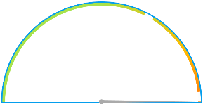
Example: With the Show Outline switched on and a blue outline colour of 5 cm set up for it, here’s a glimpse at what the meter chart would look like.
| |||
Ticks | |||
Show Tick Lines | This dropdown list lets you choose whether to include tick lines in the chart; you can also opt for only the major, minor or both types of scale increments. |
|
|
Tick Line Color | Use this to toggle the color of the tick lines. |
|
|
Major Tick Units | Set the increment level of the major tick units. Warning: If you add a lesser value in this field, the data on the labels will go missing. Note: The chart will display up to 20 units max, evenly spacing them out. |
|
|
Major Tick Length | Alter the length of the major tick units. |
|
|
Minor Tick Length | You can change the size of the minor ticks as well. |
|
|
Show Tick Labels | Enable this setting to display labels against the major ticks. |
|
|
Font | This appears if you have opted to show tick labels. You can alter the labels’ font, including changing the type of font, its colour, scalability and even bold or italic styles. |
|
|
Summarize | Switch on this setting to summarize or shorten the tick labels if they have a numeric value. |
|
|
Decimal Places | If the above setting is on, use this to establish a decimal place for the tick labels. |
|
|
Rounding | Select how to round off numeric labels. |
|
|
Color Band | |||
Conditional Format | Leave this setting enabled to apply the conditional formatting rules you created to the meter chart. Note: If disabled, the meter chart will go back to its default look. |
|
|
Gradient | Use this button to apply the gradient effect to your meter. |
|
|
Color | Note: This will only appear if you disable the conditional format button. If you have opted for the default look for your meter chart, you can change the color of the chart band through here. |
|
|
Opacity | You can control the opacity of the chart’s color band through here. |
|
|
Width | You can set the color band’s width using this. |
|
|
Offset | Use this field to add space between the color band and the outline. |
|
|
Background Color | You can choose a background colour |
|
|
Background Opacity | Toggle with the background transparency with this feature. Note: The level of opacity will be a percentage of the color band’s opacity value. |
|
|
Value Indicator | |||
Show Needle | Use this to show or hide the needle indicator |
|
|
Needle Point Color | If the needle is being displayed, you can select any colour for its pointer part |
|
|
Needle Dot Color | If you’re displaying a needle, use this to set a color for its dot part |
|
|
Show Value Tick | If you’ve chosen to hide the needle indicator, you can highlight a tick as an indicator by enabling |
|
|
Value Tick Length | If you’ve opted for a tick indicator, you can alter its length through this field |
|
|
Value Display | |||
Show Value Display |
|
|
|
Value Font |
|
|
|
Summarize |
|
|
|
Decimal Places |
|
|
|
Rounding |
|
|
|
Show Field Name |
|
|
|
Field Name Font |
|
|
|
General Target Settings | |||
Manual Target |
|
|
|