Overview
Tooltips are a great way of finding out values of data points. Hovering the cursor over a chart point will reveal the tooltip to reveal exact values and interact with the data.
Colour-coded Multiple Values
In case of multiple data in charts, the tooltips easily distinguishes between them by marking each value with a different colour. The example below shows this for a time series chart:
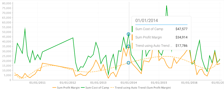
Total Values Calculated
For multiple values, the total is also included in the tooltip, along with the individual ones.

Chart Type Icons
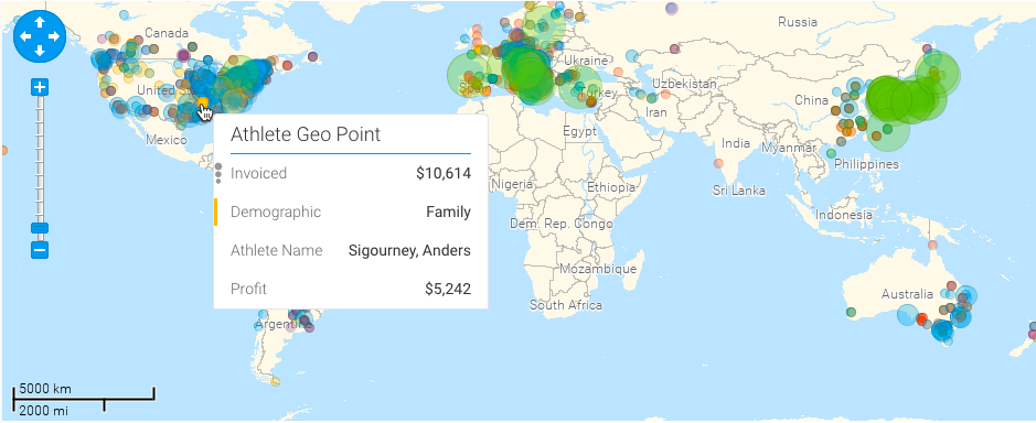
Icons will appear in the tooltip based on the type of data displayed in the chart. For example, for scatter charts, the following icon will be shown in the tooltip:
Tooltip Functions
Here are some of the functions you can perform using the tooltip:
You can view the exact value of a data point, or multiple data points using the tooltip. On making the tooltip appear, you will be able to also view any functions that can be performed.
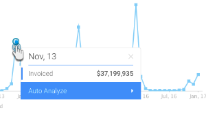
- For a single data point, simply hover your cursor over a point or bar in a chart to make the tooltip appear.
- Then right-click to extend the tooltip.
- The tooltip will clearly indicate the exact select value name (date, region or any type) and provide its value.
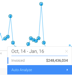
- But to discover the values of multiple data points, select them through brushing (dragging and selecting).
- The tooltip will display the exact values of the selected points with their combined result.
You can filter data on a chart by using these options.
| Option | Description |
|---|---|
| Keep | This saves the selected data point and removes the rest. Note: keep works best for big charts when you want to select a few values and keep them. |
| Exclude | This deletes the selected point(s) and keeps the rest. |
| Reset | This appears when a chart has been filtered, to undo that action and go back to displaying the original chart data. |
- Make the tooltip appear on a selected data point(s), and select the Filter option.
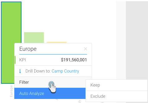
- Click on Keep to save the selected data. The rest of the content will be removed from the chart.
- Or click on Exclude to delete the chosen data. It will disappear from the chart.
- On performing either of these actions, a new option will be added to the Filter menu called Reset.
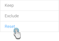
- Use this to undo the filtering done on the chart. The chart will go back to its original form.
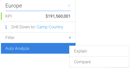
If a chart has drilling information (click here to find out more about this), then the tooltip will display the type of drilling, and then next level the data goes to.
- Ensure that the chart has drilling capability.
- Make the tooltip appear on a single data point, and choose the Drill option.
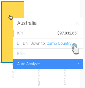
- Our example above shows that the drilling functionality is a Drill Down, and the next level the data will drill down to is Camp Country.
- If you perform bring up the tooltip in this next level, it will reveal more drilling options.
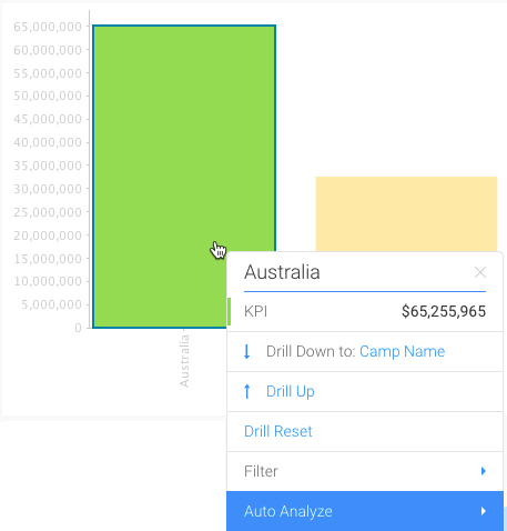
- Click on the next drill down option to go further down the data hierarchy.
- Or click Drill up to go back to the previous level.
- You can always use Drill Reset to go back to the original chart content.
The Auto Analyze option in the tooltip is used to find out the Instant Insights on your chart. Learn how to do that here.