Page History
| Anchor | ||||
|---|---|---|---|---|
|
| Table of Contents | ||
|---|---|---|
|
Overview
| Styleclass | ||
|---|---|---|
| ||
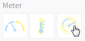
Type | Icon | When to Use |
|---|---|---|
Meter |
| You want to measure the rate of change of a measure against pre-defined targets. Useful for dashboard reporting. |
Thermometer |
| Vertical representation of the meter chart, indicating a range of qualitative indicators. |
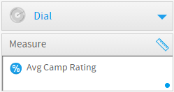
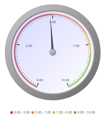
Dial |
| Used to communicate key performance indicators. |
Numeric Display |
| Shows the value of a metric on a digital display. |


Chart Data Options
Option | Description |
|---|---|
Measure | Typically a numeric value such as $. An item that you want to measure on your Chart |
Meter Chart Tutorial
| Styleclass | ||
|---|---|---|
| ||
Summary
In order to set up a Meter Chart you will need:
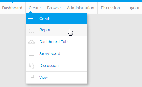
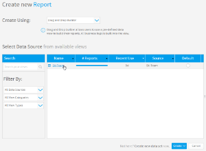
- Create a report with chart display
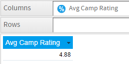
- Select a field to use as the Measure
- Create your chart, selecting Meter as the type
- Provide the Measure option
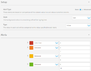
- Customise the Chart as required
- Proceed to the Output step
- Apply Conditional Formatting if the chart requires it
- Save your report
Tutorial
| Section | ||||||||||
|---|---|---|---|---|---|---|---|---|---|---|
|
| Section | ||||||||||
|---|---|---|---|---|---|---|---|---|---|---|
|
| Section | ||||||||||
|---|---|---|---|---|---|---|---|---|---|---|
|
| Section | ||||||||||
|---|---|---|---|---|---|---|---|---|---|---|
|
| Section | ||||||||||
|---|---|---|---|---|---|---|---|---|---|---|
|
| Section | ||||||||||
|---|---|---|---|---|---|---|---|---|---|---|
|
| Section | ||||||||||
|---|---|---|---|---|---|---|---|---|---|---|
|
| Section | ||||||||||
|---|---|---|---|---|---|---|---|---|---|---|
|
| horizontalrule |
|---|
| Styleclass | ||
|---|---|---|
| ||