Overview
In the chart data panel you will be prompted to select the series you wish to use in your chart and also edit the series style options. Having selected your chart type, the data selection panel will be refreshed to display the appropriate options for the chart.
Standard Components
Icon | Component | Description |
|---|---|---|
| Horizontal Axis | The field used to define the horizontal axis of the chart. Depending on the chart type selected, this may be either a dimension or metric field. |
| Vertical Axis | The field used to define the vertical axis of the chart. Depending on the chart type selected, this may be either a dimension or metric field |
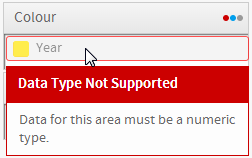
| Colour | The field used to define the colours used in the chart. Depending on the chart type selected, this may be either a dimension or metric field. |
| Size | The field used to determine the size of bubbles in the chart. This will be a metric or aggregated dimension field. |
| Animation | A Date or Time field that can be used as frames to animate the chart. Each value of the animation field will generate a unique frame in the animation. |
Specialty Components
Icon | Component | Description |
|---|---|---|
| Image | Choose the relevant image that you want to use to display your data. Used for Raster Maps, Comparative Infographics, and Proportional Infographics. |
| Region | The region is the field that has reference codes associated with areas on the map. Used for Raster Maps. |
| Label | The label for the roll over bubble. Used for Google Maps. |
| Description | A description that is contained in the roll over bubble. Used for Google Maps. |
| Link | A hyperlink that can be embedded into the bubble to take the user to an external site/report. Used for Google Maps. |
| Latitude | The Latitude coordinates field. Used for Google Maps. |
| Longitude | The Longitude coordinates field. Used for Google Maps. |
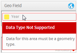
| Geo Field | This is the field in your report that contains the GIS data types. Used for Google GIS Maps, GIS Maps, GIS Bubble Maps, GIS Heat Maps. |
| Tool Tip | The field to be used for tool tip text. Used for Google GIS Maps, GIS Maps, GIS Bubble Maps. |
| Measure | Meter charts only display a single value – select the series to be used for this value. Used for Meters. |
| Radar | This is the category field used for the radar spokes. Used for Radars. |
| Events | Binary values that signify if the event was occurring on each of the time values. Used for Events. |
| Value | A metric the user created to display a trend line on the chart. Used for Financial Lines and Events. |
| Volume | Number of shares traded in the time period. Used for Financial Lines, High Low, Candlestick. |
| Trend | A metric the user created to display a trend line on the chart. Used for Financial Lines, High Low, Candlestick. |
| Start | Share value at the beginning of the time period (commonly: day). Used for High Low, Candlestick. |
| End | Share value at the end of the time period (commonly: day). Used for High Low, Candlestick. |
| High | The highest value the share reached in the time period. Used for High Low, Candlestick. |
| Low | The lowest value the share reached in the time period. Used for High Low, Candlestick. |
Validation
To help ensure the correct fields are used in the chart building process, validation messages will be displayed to aid the user.Mandatory vs. Optional Fields
In order to inform the user which fields are mandatory and which are optional for a selected chart type, a red circle is displayed in the component area for required components.

Component Validation
In order to help the user work out how to populate chart component areas, if the wrong field type is dragged into a component a validation message will be displayed.
Date Types | Geometry Types | Numeric Types |
|---|---|---|
|
|
|