This page contains procedures related to the sorting functionality.
Sorting by Grouped Data
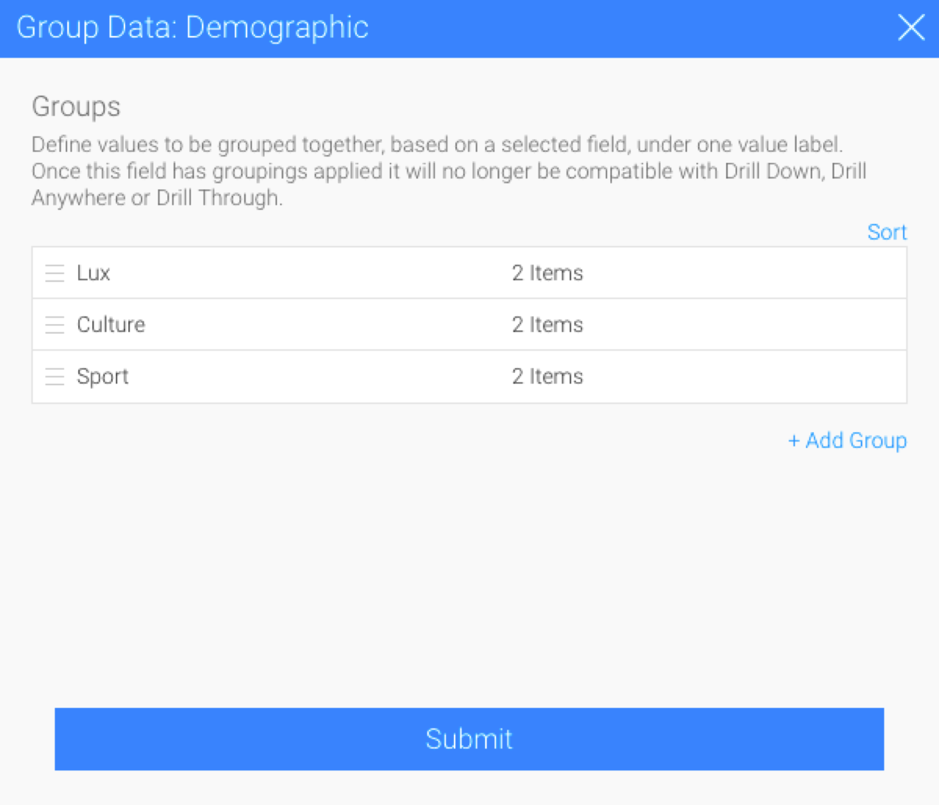
Create group data in your report. (See how to do this here.) As an example, we have created a report based on athlete information, and grouped their demographic details.
Change the order of the group data by clicking on the order icon and dragging the values, and click on Submit.

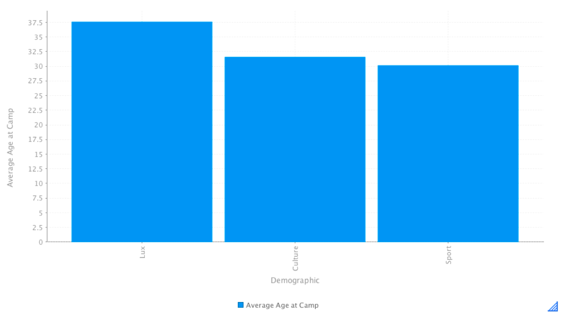
Here is how they appear sorted in our example (Lux, Culture, Sport):
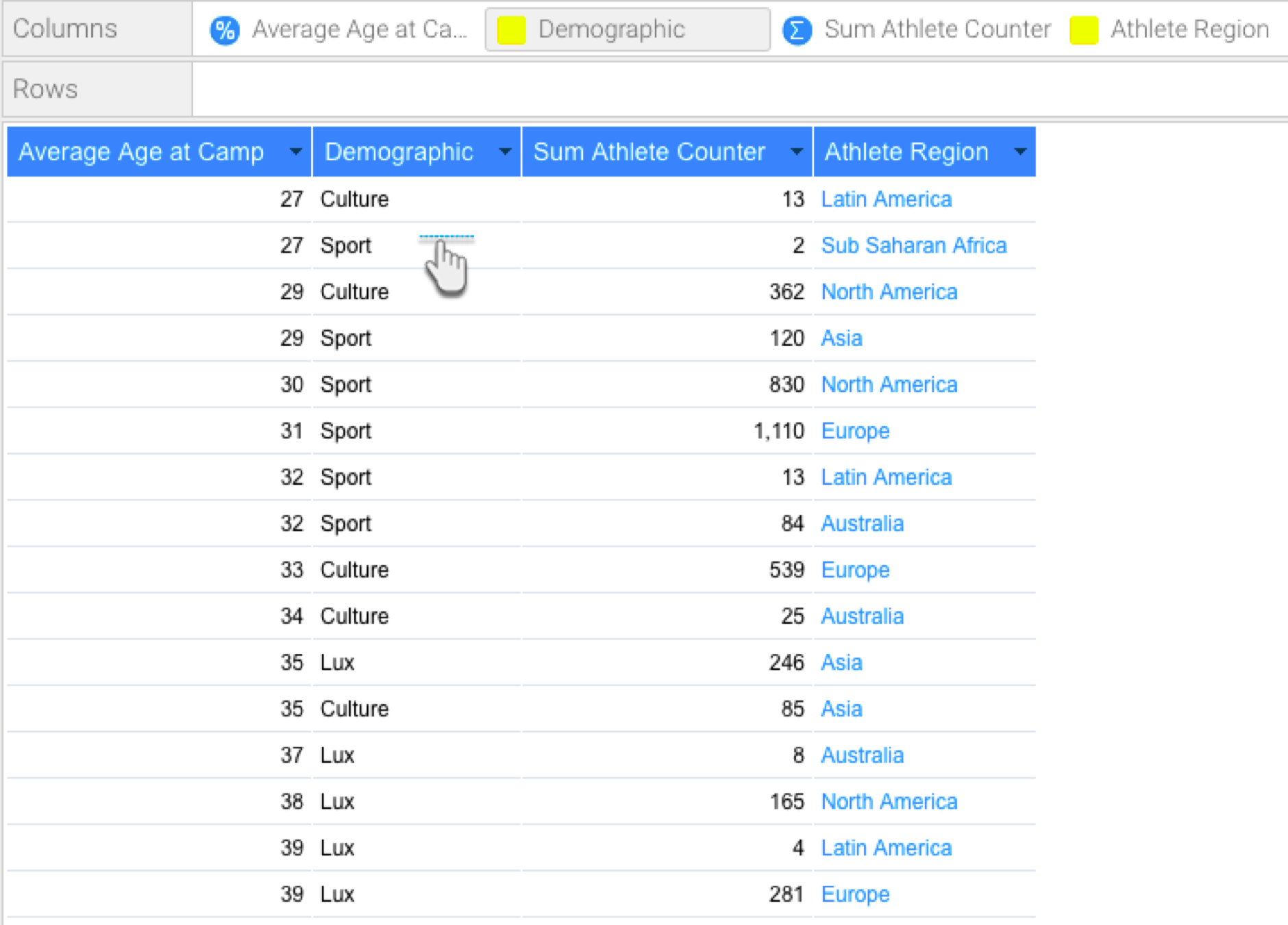
Note that the group sort order is different to how the data appears in the report column. For example (Culture, Sport, Lux):
In the chart builder, set the demographic field as either the horizontal or vertical axis. By default, the values of this field will appear on your chart as they do in the report column.
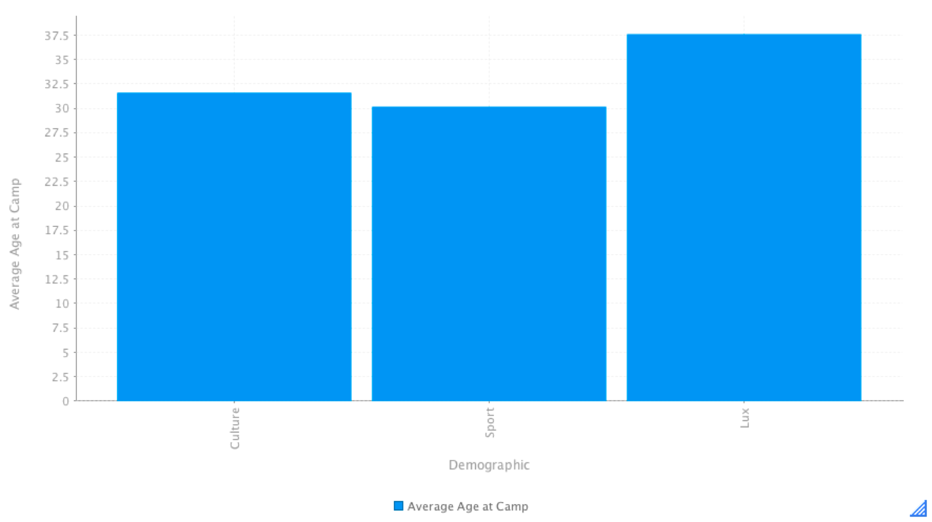
To change the sort order of this field through the chart builder, continue with the following steps:
Hover over your group data field to make the drop-down menu icon appear, and click on it.
Then select Sort By and click on Group Order.
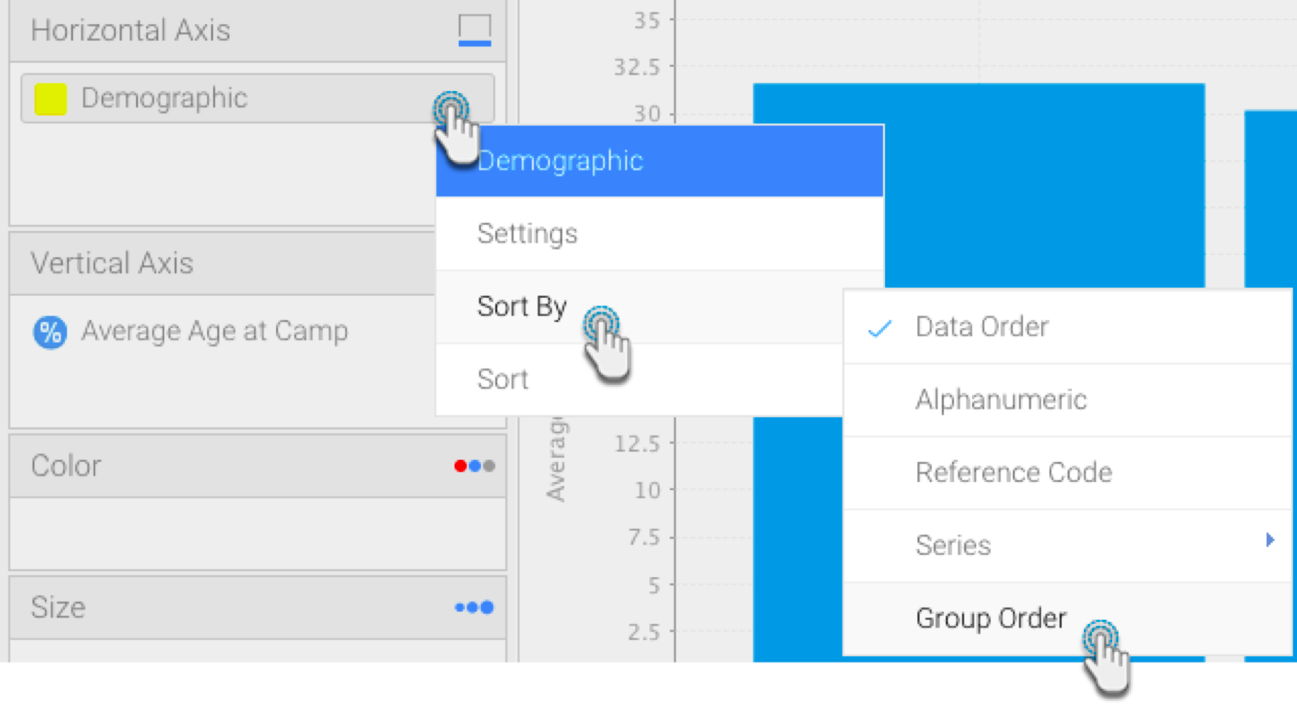
The chart bars will be re-ordered according to the order of the group data.
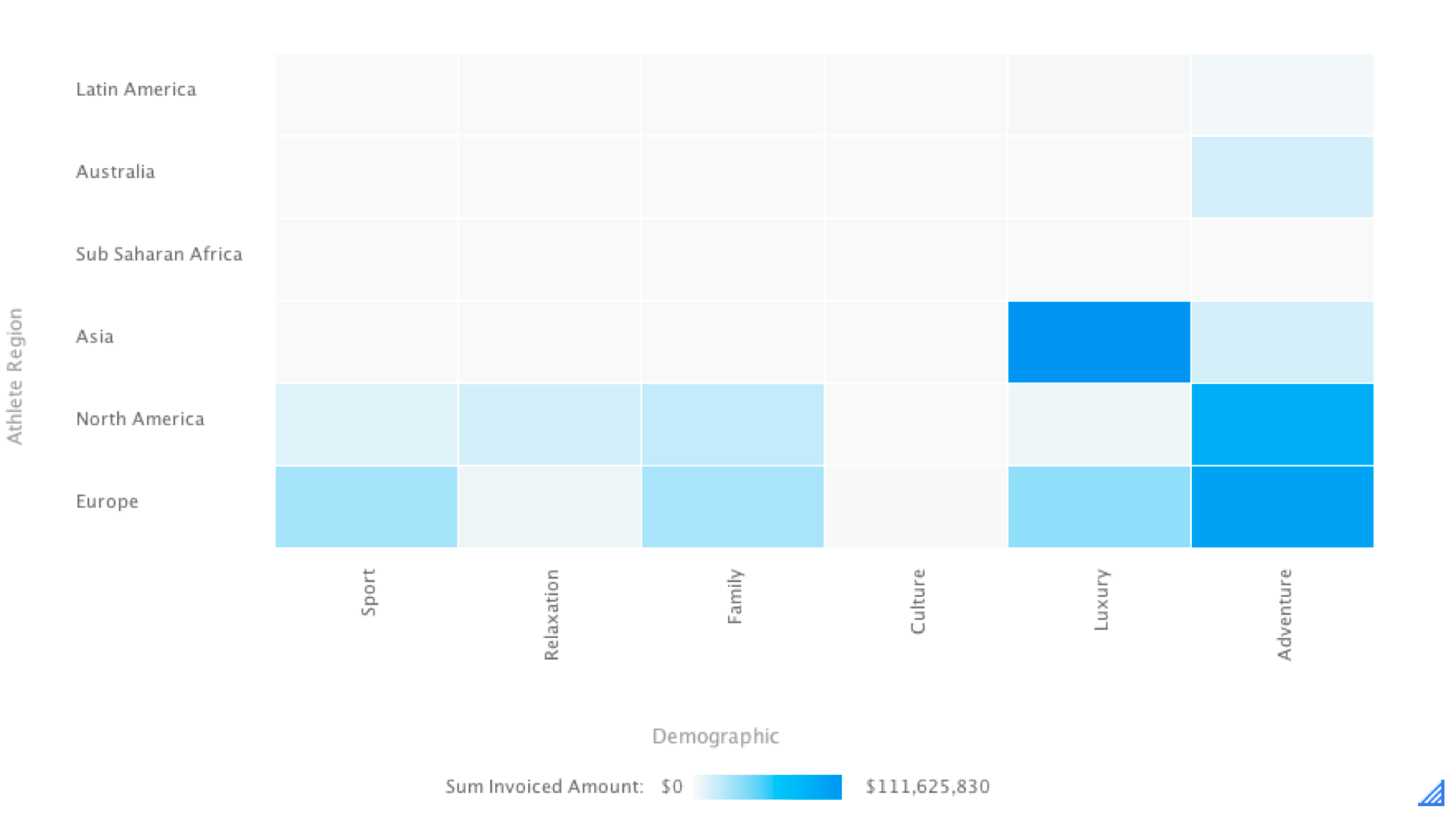
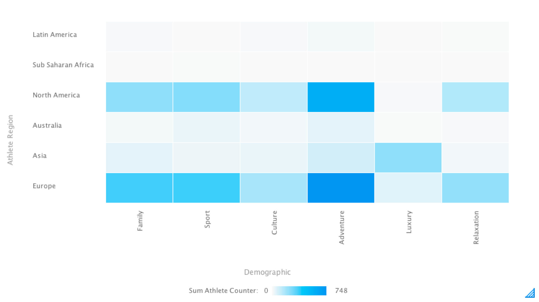
Series Sort on Heat Grid
You can sort your heat grids by series. This way you can have separate sort orders on your report tables and charts.
This gives you more control over your chart’s appearance. If a chart shows the max value right next to the min value, for example, you can change it.
- Create a heat grid, ensuring that a metric value is added to the colour or size fields in your chart builder.
- Open the field menu in one of the axis. (Select one of the fields placed in an axis, and hover your cursor to make the menu icon appear.)
- Select Sort By and then Series.
- Then click on the metric value used in your chart.
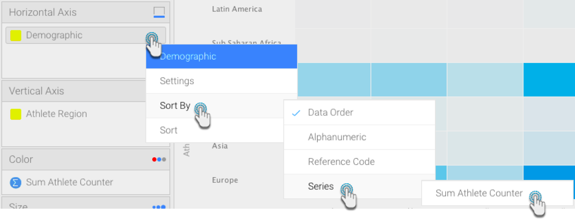
- Your heat grid will be sorted accordingly.