This guide contains tips on customizing your chart colors.
Custom Series Colors
The procedure below demonstrates how to select custom chart colors for a dimension field. This can be used to highlight each demographic series with a different color of your choice.
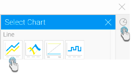
- Select your report data, and navigate to the Charts page.

- Select a chart that supports color. For our example, we will use a basic line chart. (To select a chart, expand the chart selection icon on the right side and click on a chart type.)
- After selecting your axes fields, drag a dimension field to the color textbox.
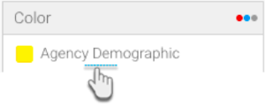
- The chart will be colour-coded according to the dimension field series. But you can change this to specify which colors should be applied.
- Expand the menu of the color field, click Color and choose the Default type (this is the default selection). You can also use these settings to apply the reference code colours if they have been defined in the report for that field, or monochrome to define a color scheme with different shades of the same color.
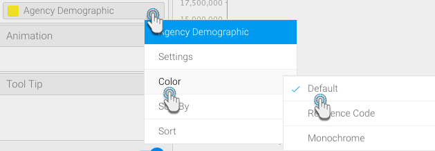
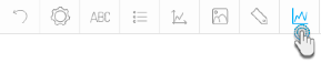
- Next open the correct settings by either clicking on the Chart Series settings icon, or expanding the color field menu and selecting the Settings option.
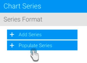
- When at the settings page, click on the + Populate Series button on the left side panel. This will populate the panel with all the dimension series. (Note: you can also add an individual dimension series by using the + Add Series button, provided the added series exists as the field’s value.)
- Select a series which you want to assign a custom color to; its details will appear on the form in the right side of the settings page.
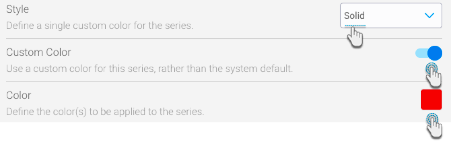
- Click on the Style dropdown, and choose Solid.
- Enable the Custom Color toggle, and when the Color setting field appears, select a color to be applied to that series.
- You can repeat these steps for other series, and assign them their own colors.