Like what you see? Have a play with our trial version.

Error rendering macro 'rw-search'

null

Versions Compared

Key

  • This line was added.
  • This line was removed.
  • Formatting was changed.
Comment: Updated for 9.3 release.

...

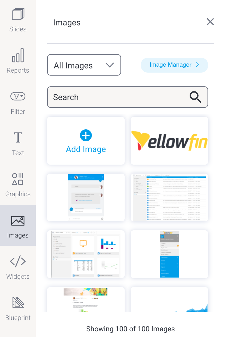
Add images to your dashboards via Image Widgetsthe image widget. The widget provides a number of ways to insert an image to match what you're trying to do.

Image Added


FeatureDescription

Image Added

Use the dropdown to filter by recently accessed images, images uploaded by the logged in user (My images), or images that have been saved as Corporate images

Image Added

Use the search bar to refine the list of images — useful for anyone who has built a substantial library of images and knows what they're looking for. Type some text and use your Enter key to see the results of your search.

Image Added

Click on or drag this button for fast access to upload a new image. After clicking on this button and selecting your image to upload, you have the option to resize and crop it. You can also add a name and description to use with future image searches.

Image Added

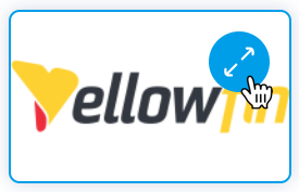
Hover over the top right corner of any existing image and click on the blue circle to see an enlarged version of the image. From there you can also view and edit the image properties and delete the image if required.
From here, you can click and drag the image you want to use onto the Presentation canvas

Image Added

You can perform all of the above within the Image Manager. From the Image Manager, you can also change the sort order and information displayed for each image.

How to add images

  1. Click on the the Images button  button on the left side of the screen.

    Image Modified

    The panel will expand to display images (if images are already present in your instance), or an option display  a list of searchable images and a button to add a new oneimage if required.

    Image Added

  2. Drag the the Add New Image widget onto  button to the dashboard.
    Image Removed

    Image Added

  3. This will bring up the image manager. Select pre-existing images to add to your dashboard.
    Image Removed
  4. Alternatively, you can add a new image. Click on the Add button on the image manager.
  5. the Image Upload screen, where you can drag and drop files or upload from your computer.

    Image Added

  6. Once the file is uploaded, a preview will appear. Here, you can crop and resize the image, and give it a name and description.

    Image Added

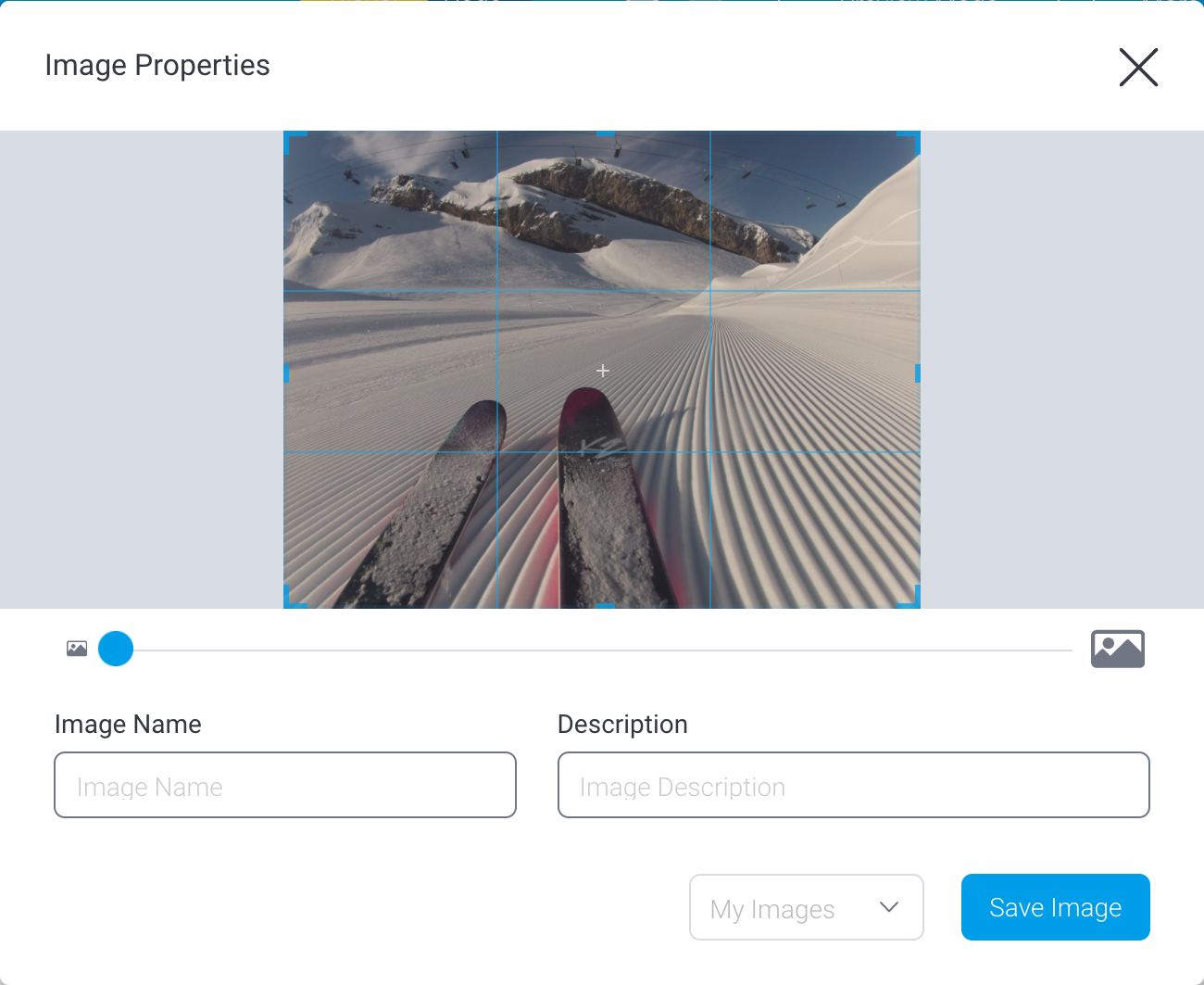
  7. When your image is ready, click on the dropdown to select a storage location. The default location is the folder called My Images. which is your own secure storage area. To share an image with others, use the Corporate Images folder.

    Image Added

    Note: By default, Corporate Images is read-only for all user roles: to make it accessible, system administrators need to edit the role, expand the Administration section and click on the checkbox for Save Corporate Images.

  8. Click on the Save Image button when you're ready.
    The image will automatically be added to your dashboard.

    Image Added

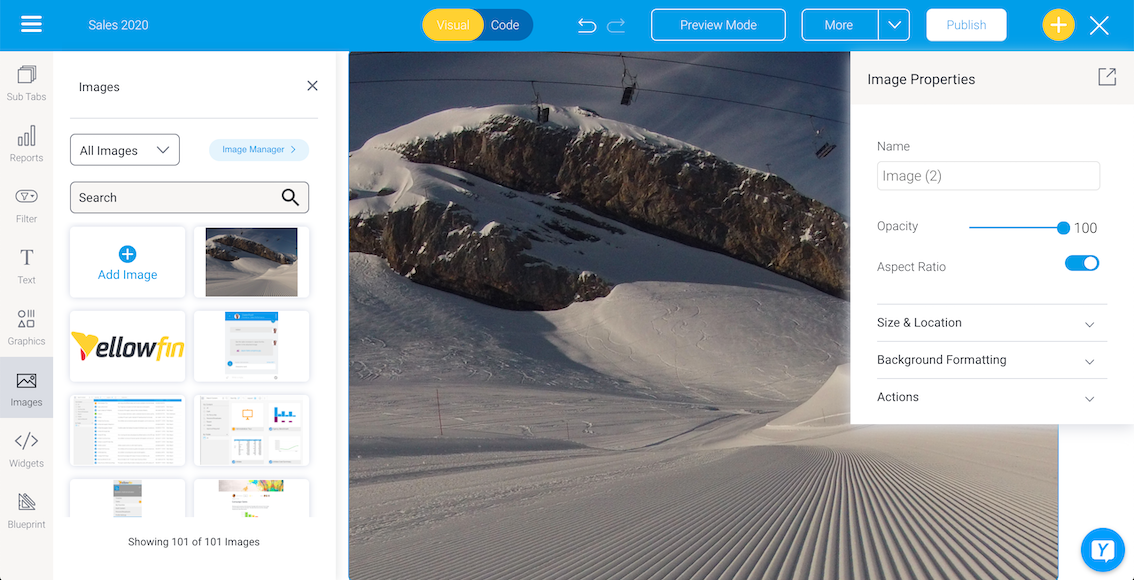
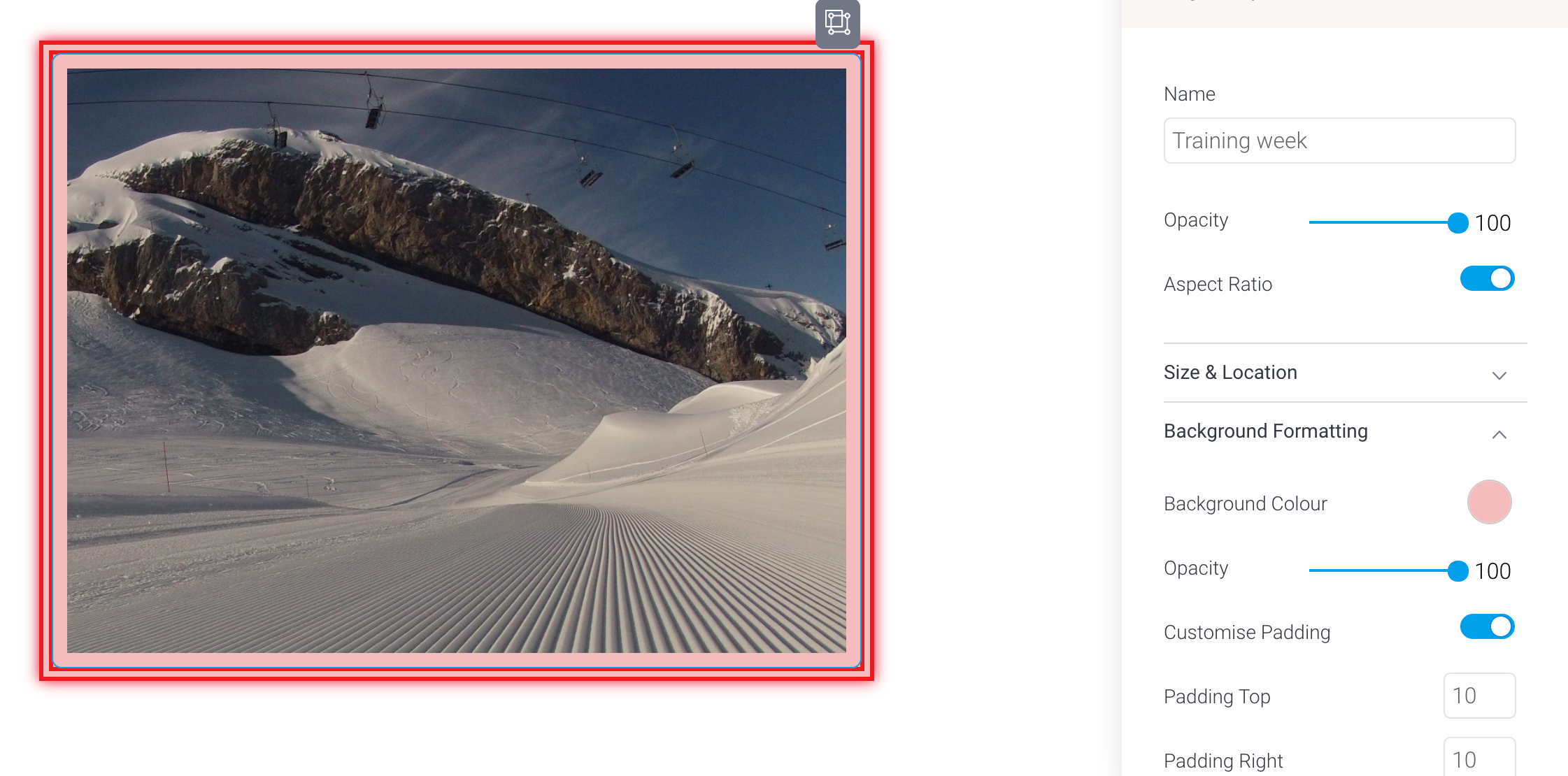
  9. Customize the image via the Image Properties panel on the right. This panel appears whenever you click on an image. Refer to the table In this popup, either drag in an image, or click and browse to select an image to be added.
    Image Removed
    You can customize the image widget via its properties panel. This panel appears on the right side once the Image Widget is selected. Refer to the Properties section below to learn more.
  10. You can also add an action event that will be triggered when this image widget is clicked. See the the Actions section  section in the widget's property properties table below for more information.
  11. Additional options are available by right-clicking and using the menu that appears. Learn more about the menu options here.options here.


How to replace images

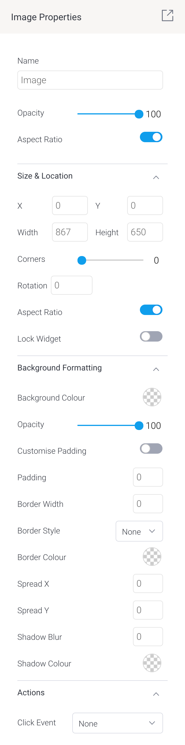
There might be times where you'd like to replace one image for another without losing the properties of the existing image. Image properties include image name, size, opacity, location, background color, borders, padding and more. To preserve the properties of an existing image, use the Replace Image tool.

  1. Click on an existing image. In our example, we've set a few options to illustrate the point: take note of the options in the Image Properties panel on the right. 

    Image Added

  2. Right click on the image to show a pop-up menu.

    Image Added

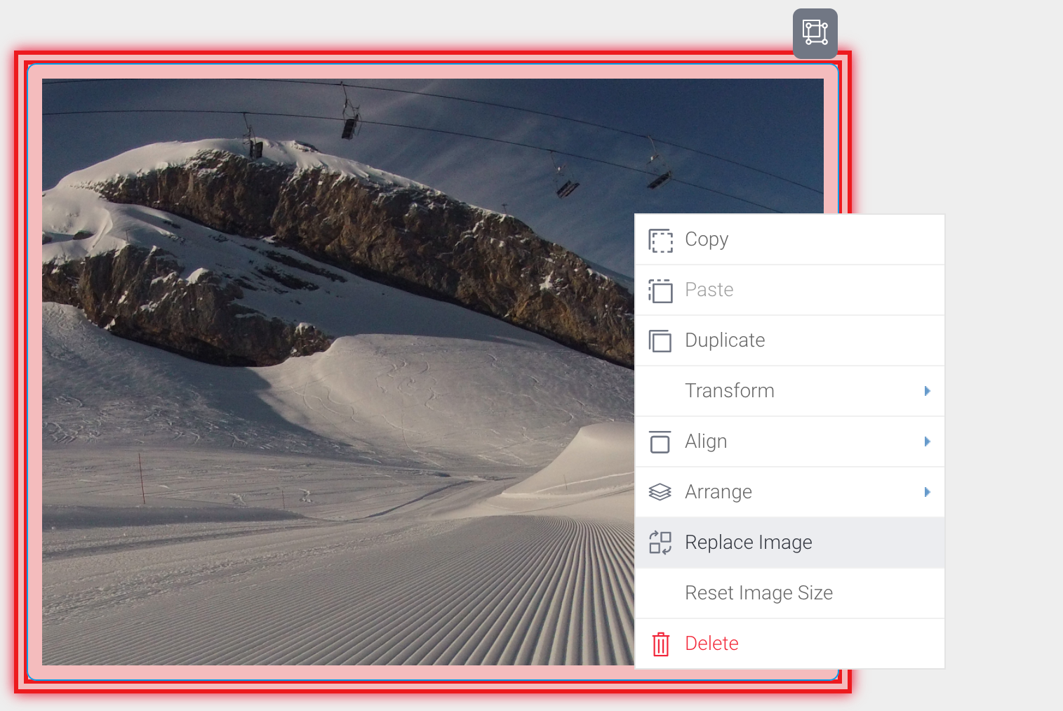
  3. Click on Replace Image to display the Image Manager.

  4. Locate the replacement image from the list of images, or upload it, then click on it.

    The old image will be replaced with the new image:

    Image Added

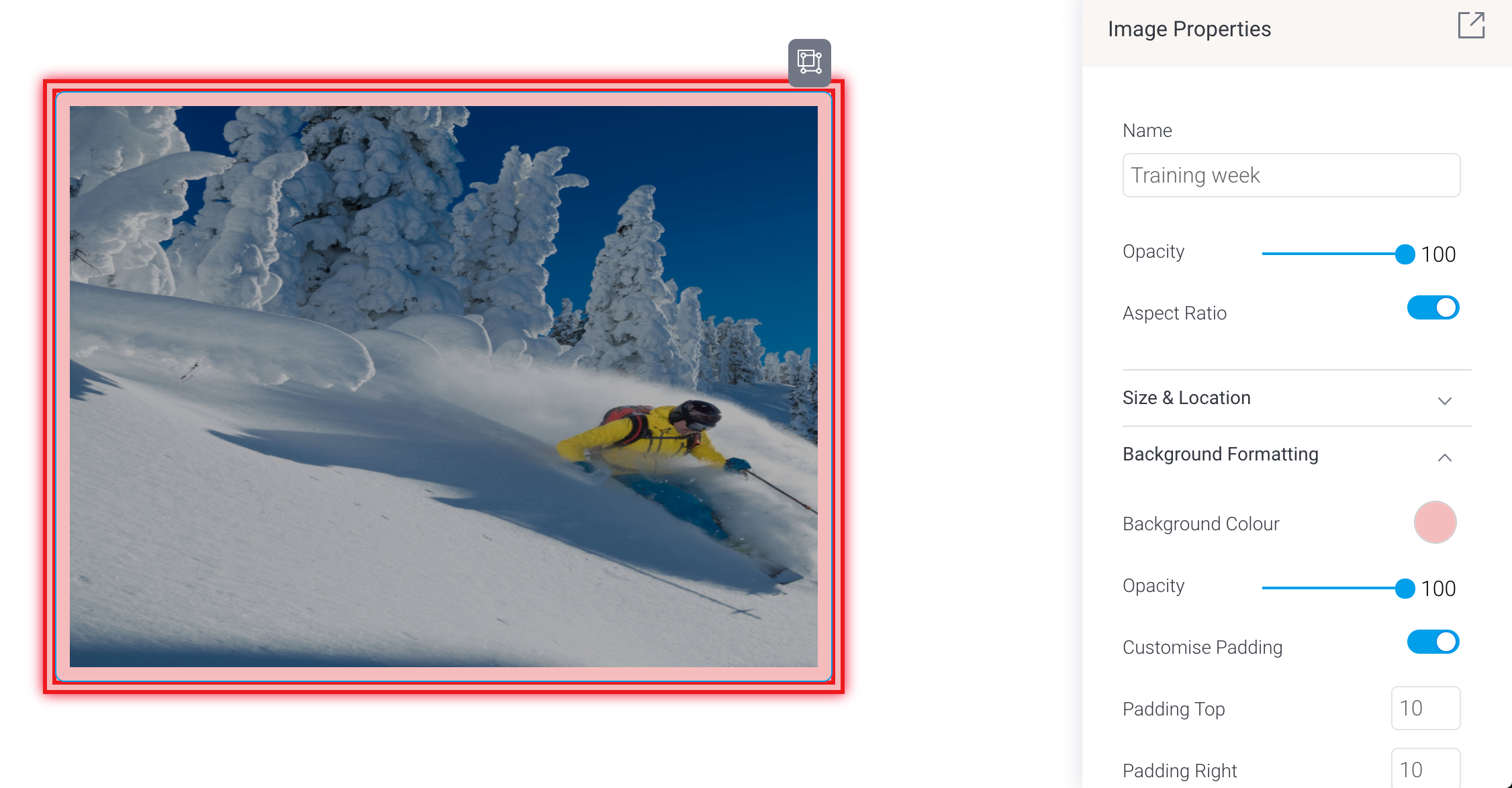
  5. Check the Image Properties panel: the properties from the previous image should persist, which might cause a stretched image if the new image is a different size.

  6.  If the image is skewed, right-click on it and click on Reset Image Size from the pop-up menu. The image will be reset to its original size without losing any of its other properties.

    Image Added


...

Image Widget properties


Section


Column

Image RemovedImage Added


Column


Property name

Description

Opacity

This allows you to specify the transparency of the fill (inside) color of the selected shape. The higher the number, the stronger the color.

Size & Location

X

Specify the x coordinates of the top left corner of the image widget, in order to position it exactly on your dashboard canvas.

Y

Specify the y coordinates of the top left corner of the image widget, in order to position it exactly on your dashboard canvas.

Width

Specify the width of the image widget, in pixels, in order to resize it exactly.

Height

Specify the height of the image widget, in pixels, in order to resize it exactly.

Corners

This option allows you to define the roundness of the widget’s border corners. Tip: For maximum circular edges, enter half the value of the widget height. For example, if the height is 130 pixels, then set the edge value to 65 pixels. Moreover, an edge value greater than 65, will have no further effect in this example.

Rotation

Specify the amount to rotate the selected image widget clockwise, in degrees.

Aspect ratio

Enable this toggle to maintain the aspect ratio. This means when increasing or decreasing the image’s size, it maintains its shape (i.e. the relationship between its width and height).

If this is disabled, the image can be stretched out of shape either vertically or horizontally.

Lock widget

Enable this toggle to lock the image in its location. This stops you from moving or resizing the image. This holds true even when selecting multiple widgets on the canvas. Note that a locked image widget can still be customized, such as by adding a shadow, or a background color. 

Background formatting 

Background color

Allows you to specify a background color for the image widget. 

Opacity

Allows you to specify the transparency of the background color on the image widget.

Customise padding

This option allows you to define a custom padding or buffer around the widget, in pixels, when enabled. This includes padding for each side to the widget. If disabled, you can still define an overall padding size.

Padding top

When custom padding is enabled, this allows you to define padding to be added to the top of the widget.

Padding bottom

When custom padding is enabled, this allows you to define padding to be added to the bottom of the widget.

Padding right

When custom padding is enabled, this allows you to define padding to be added to the right of the widget.

Padding left

When custom padding is enabled, this allows you to define padding to be added to the left of the widget.

Padding 

This allows you to define an overall padding size for the shape widget. This size, defined in pixels will be constant for each side of the widget. To add different sized padding on any of the sides, enable the Customise Padding option.

Border width

This allows you to specify the thickness of the widget border.

Note: to make the widget border visible, you must define values for all three border properties.

Border style

This allows you to select a style for the widget border. Options include: dashed, solid, dotted, groove, and more.

Border color

This allows you to specify the color of the widget border.

Horizontal shadow

This option allows you to cast a horizontal shadow on the image and define its size in pixels.

Vertical shadow

This option allows you to cast a vertical shadow on the image and define its size in pixels.

Shadow blur

This option allows you to define the sharpness of the shadow. The smaller the value, the sharper and more defined the shadow will be. For a blurry or softer shadow, provide a bigger value.

Shadow color

This option allows you to set a color for the shadow. This must be defined to make the shadow visible.

Actions
Click Event

Select an event that will trigger when the selected widget is clicked. Event options include:

  • None: Use this if you do not wish the widget to trigger an event.
  • Next sub tab: Navigates the user to the next tab within the same dashboard.
  • Previous sub tab: Navigates the user to the previous tab within the same dashboard.
  • Reset filters: Allows users to clear filter selections, or in case default values are set, then reset filters to their default values.
  • Reset dashboard: Refreshes the dashboard by clearing any user interactivity performed on it, as well as removing all applied filters.
  • Go to report: Navigates users to a specified report. This report can be specified by providing its report UUID. 
  • Go to sub tab: Navigates to any sub tab in the same dashboard, where the sub tab is specified by its order number. For example to jump to the forth sub tab, enter 4 in the sub tab # field. Note that the sub tab order starts from number 1.
  • Go to URL: Navigates to an external link or page using the specified URL. You can also choose to open the new link in a new tab or window or in the current window. (See the below URL and Target settings for more information.)
Report IDIf navigating to a report using the ‘Go to report’ click event, provide the UUID of the report.
Sub Tab #If navigating to a sub tab using the ‘Go to sub tab’ click event, enter the order number of the sub tab.
URLIf navigating to an external page using the ‘Go to URL’ click event, provide the full URL of the page.
Target

If navigating to an external page using the ‘Go to URL’ click event, specify the page target. Options include:

  • New Tab/Window: Opens the URL page in a new tab or window, depending on your browser’s settings. Note: The default for most browsers is a window, however users can use computer shorts (Ctrl in Windows, and Cmd in Mac) to open in a new tab instead.
  • Current Window: Open the page in the current window.
  • Parent Frame: If Yellowfin is embedded as an iFrame, the new page will open (that is, its contents will appear) in the parent frame. Note that the parent frame is the one within which the Yellowfin frame is embedded.
  • Current Frame:  If Yellowfin is embedded as an iFrame, the contents of the URL page will open in the current frame. Note that the current frame is the one which embeds Yellowfin.


...