Page History
| Anchor | ||||
|---|---|---|---|---|
|
| Table of Contents | ||
|---|---|---|
|
Overview
| Styleclass | ||
|---|---|---|
| ||
Chart Data Options
Option | Description |
|---|---|
Horizontal Axis | Select the metric or date to use as the x axis measurement. |
Vertical Axis | Select the metric or date to use as the y axis measurement. |
Size | Optional: Select a metric to set the size of each bubble. |
Colour | Optional: You can select one field to split your values by colour. |
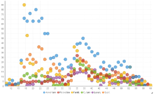
Scatter Chart Tutorial
| Styleclass | ||
|---|---|---|
| ||
Summary
In order to set up a Scatter Chart you will need:
- Create a report with chart display
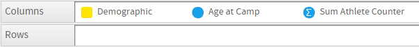
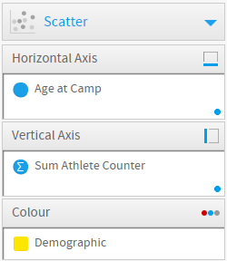
- Select a field to use as the Horizontal Axis
- Select a field to use as the Vertical Axis
- Select a field to use as the Size (optional field)
- Select a field to use as the Colour (optional field)
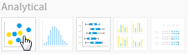
- Create your chart, selecting Scatter as the type under the Analytical heading
- Provide the Horizontal Axis, Vertical Axis, Size, and Colour options
- Customise the Chart as required
- Proceed to the Output step
- Save your report
Tutorial
| Section | ||||||||||||||||
|---|---|---|---|---|---|---|---|---|---|---|---|---|---|---|---|---|
|
| Section | ||||||||||
|---|---|---|---|---|---|---|---|---|---|---|
|
| Section | ||||||||||
|---|---|---|---|---|---|---|---|---|---|---|
|
| Section | ||||||||||
|---|---|---|---|---|---|---|---|---|---|---|
|
| Section | ||||||||||
|---|---|---|---|---|---|---|---|---|---|---|
|
| Section | ||||||||||
|---|---|---|---|---|---|---|---|---|---|---|
|
| Section | ||||||||||
|---|---|---|---|---|---|---|---|---|---|---|
|
| horizontalrule |
|---|
| Styleclass | ||
|---|---|---|
| ||